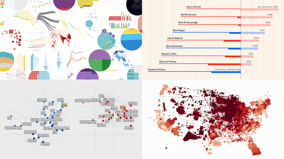
 Another long seven-day wait is over, and DataViz Weekly‘s already here to introduce you to new awesome data visualizations we have met these days around the Web. Let’s see what we’ve got this time!
- COVID-19 growth rates in each U.S. county — Benjamin Schmidt
- World development indicators — The World Bank
- Timelines for new and all current federal judges — ProPublica
- Colors of the U.S. election maps on different media — SBS News
Data Visualization Weekly: November 13, 2020 — November 20, 2020
COVID-19 Growth Rates in Each U.S. County
Rotation turns out to be a powerful animated data visualization technique. Check it out. Benjamin Schmidt, Director of Digital Humanities at New York University, created an impressive map that shows COVID-19 cases across the United States of America over time. Visualizing county-level data from Johns Hopkins University, he decided to use the speed of spin to represent an additional dimension of the data.
In the visualization, the size of each county shows the total number of coronavirus cases registered in that area during the previous two weeks, i.e. infection counts. Color is used to depict cases per capita, i.e. infection rates. And here’s the most interesting part: Rotation visualizes the rate of change in the number of cases over the previous week. Plus, it is possible to choose angular distortion instead of spin if you’d like to experience another peculiar view of the same data.
Feel free to play with this compelling visualization on Observable. Try additional options and sliders to adjust something. For more information about the project and how it was built, don’t miss out on the creator’s notes right there.
World Development Indicators
As the worst global crisis in a lifetime, the pandemic has had a significant impact on the world’s progress towards the Sustainable Development Goals (SDGs) set by the United Nations in 2015 to be achieved by 2030. You can actually see that at a glance across a new large publication just published by the World Bank. The 2020 Atlas of Sustainable Development Goals is a great visual guide to where we are on that difficult path.
Visualizing data from the World Development Indicators database maintained by the World Bank itself and from a number of other relevant sources, the Atlas sheds light on trends and challenges within all the seventeen Goals: no poverty, zero hunger, good health and wellbeing, quality education, gender equality, clean water and sanitation, and so on. There is an individual graphic-based story for each Goal, representing the corresponding rates and indicators in informative charts. The impact of COVID-19 on SDGs is highlighted where the appropriate data is available.
There are a lot of various charts to see in the Atlas. Generally speaking, long-term progress is noticeable and there are grounds for optimism.
Timelines for New and All Current Federal Judges
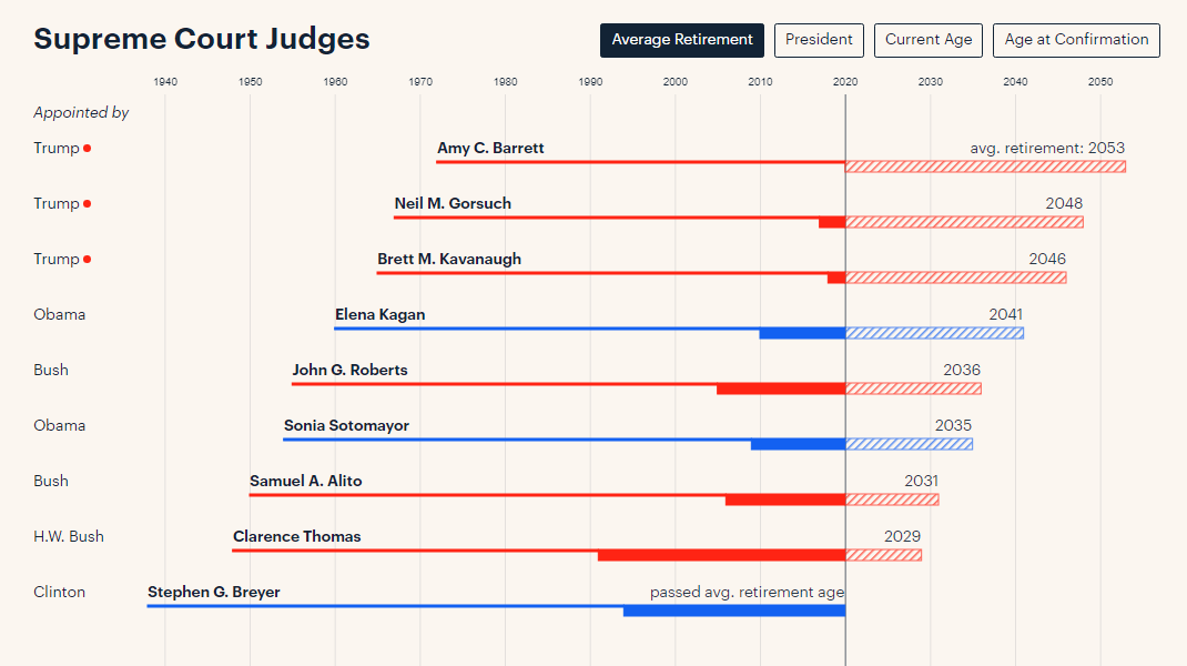
Federal judicial appointments are lifetime. So even if Donald Trump remains a one-term president of America, his appointees’ impact on law and politics through courts may be tangible for many years to come. The thing is, he has already succeeded to appoint many young judges to the Supreme Court, appeals courts, and district courts, who can potentially serve for as long as several decades.
To provide a better understanding of the balance in the federal judiciary and how Trump’s appointments may affect it, ProPublica’s Moiz Syed created a timeline for each current federal judge, visualizing their birth year, age at the time of appointment, and the average retirement age for the corresponding position.
Look at the charts on ProPublica. By default, they are sorted by average retirement. But you can also arrange them by president, current age, or age at appointment.
Colors of U.S. Election Maps on Different Media
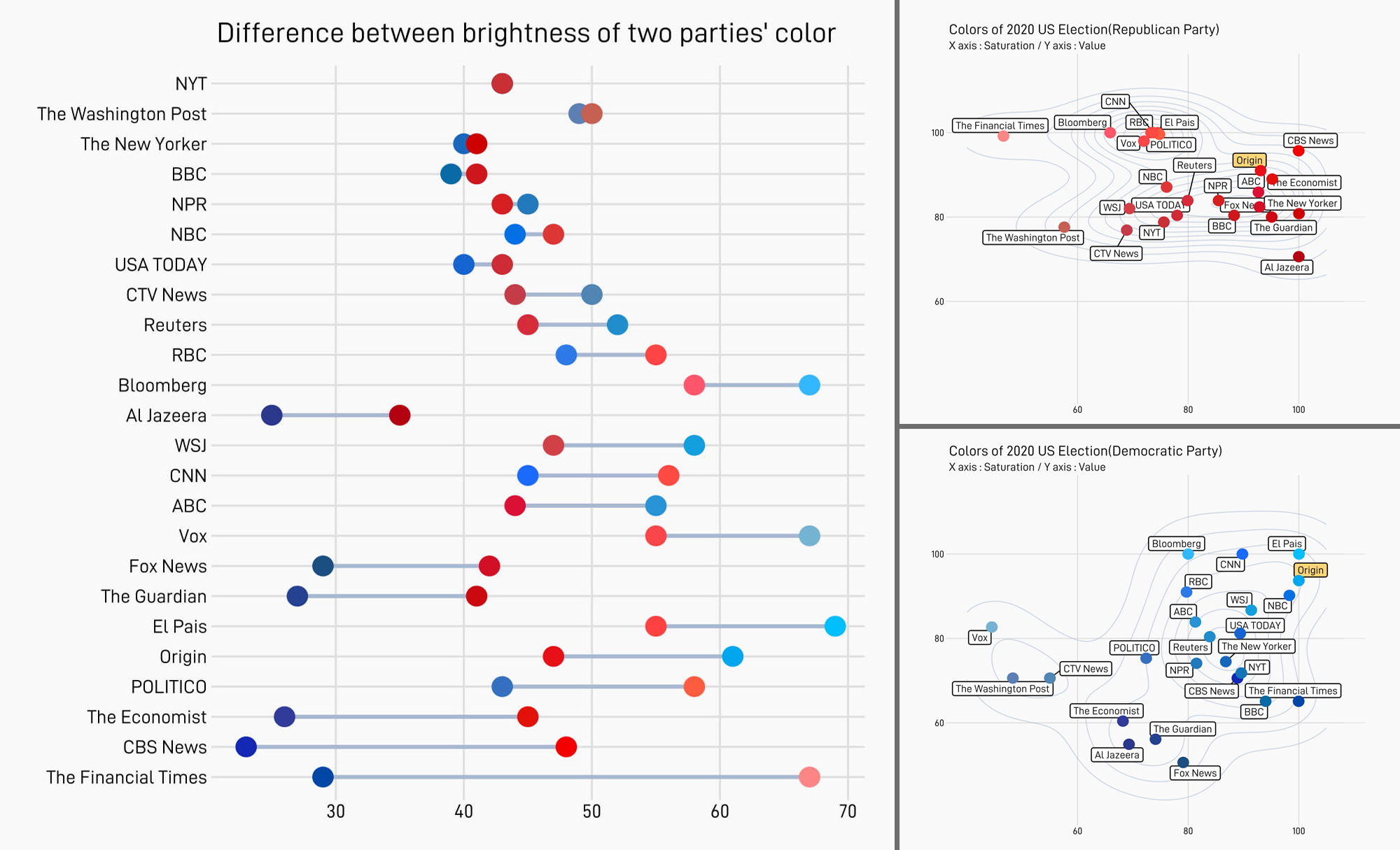
Inspired by our curated collection of U.S. election maps from a recent special edition of DataViz Weekly, the Data Journalism Team at South Korea’s SBS News investigated the color schemes employed in those visualizations. In particular, they plotted saturation (X) and brightness (Y) for the Democratic blue and Republican red colors used by different media, in two scatter charts, and added the corresponding data for the parties’ original colors for comparison.
They also decided to analyze how much contrast each blue-red pairing has. Hue and saturation were changed to zero in order to turn the two colors from each map into black and white tones only. Then, the difference between the resulting pure brightness values for blue and red in each source was visualized in a cool dumbbell chart sorted by the amount of that difference.
While there are electoral maps from 24 media outlets featured in our piece, these charts only show 23. As Jenn Lee from the SBS News’ Data Journalism Team told us, German DW and Canadian CTV News were found to use the same colors and the team decided to include only one of them in these visualizations (CTV News).
Check out the charts by yourself for a closer look at famous media’s color choices for their 2020 U.S. election data visualization projects. See and read much more in the original newsletter; it’s written in Korean, so either enjoy it as is (if that’s your native language or if you just speak Korean) or prepare to use Google Translate (still helpful enough).
***
Thank you for your attention. Stay tuned for our curated collections of awesome graphics from all over the Web, on Data Visualization Weekly.
- Categories: Data Visualization Weekly
- No Comments »