COVID-19 Risk Assessment App Pandemonium Uses AnyChart for Data Visualization
January 26th, 2022 by AnyChart Team We continue to support initiatives addressing the pandemic crisis by providing them with a full-featured free license for any of our data visualization tools. Today we are honored to be among the first to talk about a new project that joined this program, an innovative COVID-19 risk assessment app and framework called Pandemonium where all charts and maps are powered by AnyChart.
Built by Quantum Risk Analytics, Inc., a charitable nonprofit founded by MIT alumni, Pandemonium uses sophisticated machine learning algorithms to more accurately model the disease spread and provide a highly personalized evaluation of infection risks. It’s not yet publicly launched as the developers want to add a few more major features and data sources before the official release. But the app is already in the testing phase that the team encourages anyone to join.
We asked Richard Hamlin, CEO at Quantum Risk Analytics, Inc., to tell us more about Pandemonium, how it works, and how our data visualization solutions are used. Read on to know all the details.
- Categories: AnyChart Charting Component, AnyMap, Big Data, Dashboards, HTML5, JavaScript, Success Stories
- No Comments »
New Interesting Visualizations on Jobs, Climate, TV Shows, Pandemic — DataViz Weekly
October 8th, 2021 by AnyChart Team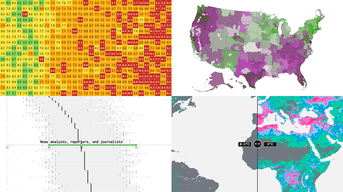 For all who already have an eye for data visualization or only want to get it, DataViz Weekly is here with an overview of four new interesting projects curated from around the web!
- U.S. jobs by age of workers — Nathan Yau
- Probable climate futures based on different scenarios — Probable Futures
- Average IMDb scores of all TV series by episode — Jim Vallandingham
- Vaccination vs hospitalization rates across the United States — The Washington Post
Read on to learn more about each and check them out!
- Categories: Data Visualization Weekly
- No Comments »
Visualizing Mortality Statistics and Satellite Imagery Data — DataViz Weekly
September 10th, 2021 by AnyChart Team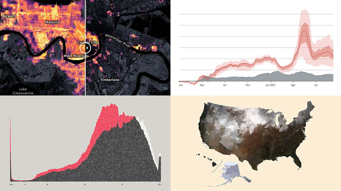 This week, we have come across a number of wonderful new data visualization projects out there. Here are the four that we’ve found most interesting and decided to showcase today in DataViz Weekly. Join us for a quick overview of these works and check them out!
- Black mortality gap in America — The Marshall Project
- Excess deaths worldwide during the COVID-19 pandemic — The Economist
- Ida-caused power outage in New Orleans as seen from space — NASA Earth Observatory
- Average seasonal colors of the United States — Erin Davis
- Categories: Data Visualization Weekly
- No Comments »
Excellent Examples of Data Graphics from Around Internet — DataViz Weekly
August 27th, 2021 by AnyChart Team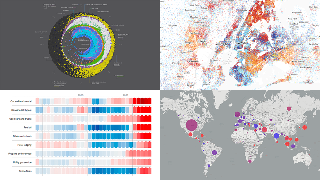 Are you ready for another set of excellent data graphics examples? It’s time! The following projects made it to the newest DataViz Weekly digest — see the list below and keep reading for a closer look!
- Average weekday in the life of Americans — Nathan Yau
- Race and ethnicity across the United States — CNN
- Inflation in the United States — NYT Opinion
- COVID-19 spread across the world over time — Olivia Jack
- Categories: Data Visualization Weekly
- No Comments »
Data Visualization for COVID-19 Dashboard Tracker Using AnyChart JS Charts
April 12th, 2021 by AnyChart Team![]() Data visualization has played an important role during the COVID-19 pandemic, allowing governments, scientists, healthcare professionals, and the general public to better understand different aspects of the crisis. There are many illuminating projects all over the web that leverage charts and maps to effectively communicate what the coronavirus statistics have to say. Some of them are using our data visualization tools under a free license provided as part of the special initiative we announced last spring to support the global COVID-19 data analysis effort.
Data visualization has played an important role during the COVID-19 pandemic, allowing governments, scientists, healthcare professionals, and the general public to better understand different aspects of the crisis. There are many illuminating projects all over the web that leverage charts and maps to effectively communicate what the coronavirus statistics have to say. Some of them are using our data visualization tools under a free license provided as part of the special initiative we announced last spring to support the global COVID-19 data analysis effort.
We told you about two examples of such projects earlier: StopCorona and iConcepts SARS-CoV-2 Stats. Now let us introduce you to another interesting resource — COVID-19 Dashboard Tracker by Maxime des Touches. Launched more than a year ago, while Maxime was yet a computer science student, it has turned from a simple online data table into a complex interactive data visualization project offering up-to-date insight into how the pandemic unfolds in France and worldwide.
Maxime kindly agreed to talk to us about his COVID-19 tracker, experience using AnyChart, and the pandemic in general. Check out our quick interview, glance at a few screenshots, and try his open-source dashboard by yourself. (Stack: HTML/jQuery/JSON.)
- Categories: AnyChart Charting Component, AnyStock, Big Data, Dashboards, HTML5, JavaScript, Stock Charts, Success Stories
- No Comments »
Fresh Great Data Visualization Projects on Thanksgiving, COVID, and Tree Equity — DataViz Weekly
December 4th, 2020 by AnyChart Team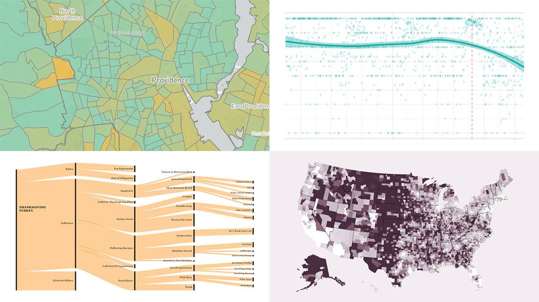 Hey everyone! Continuing to curate the best charts, maps, and infographics from around the Internet, we invite you to meet four fresh great data visualization projects worth checking out.
Today on DataViz Weekly:
- Visualizing the ways the Thanksgiving turkey leftovers were used — Nathan Yau
- Understanding the scale of 250,000 deaths from the coronavirus — The Washington Post
- Finding a correlation between scented candle reviews on Amazon and COVID-19 — Kate Petrova
- Evaluating tree equity in American city neighborhoods — American Forests
- Categories: Data Visualization Weekly
- No Comments »
Power of Data Visualization in Four New Compelling Examples — DataViz Weekly
November 27th, 2020 by AnyChart Team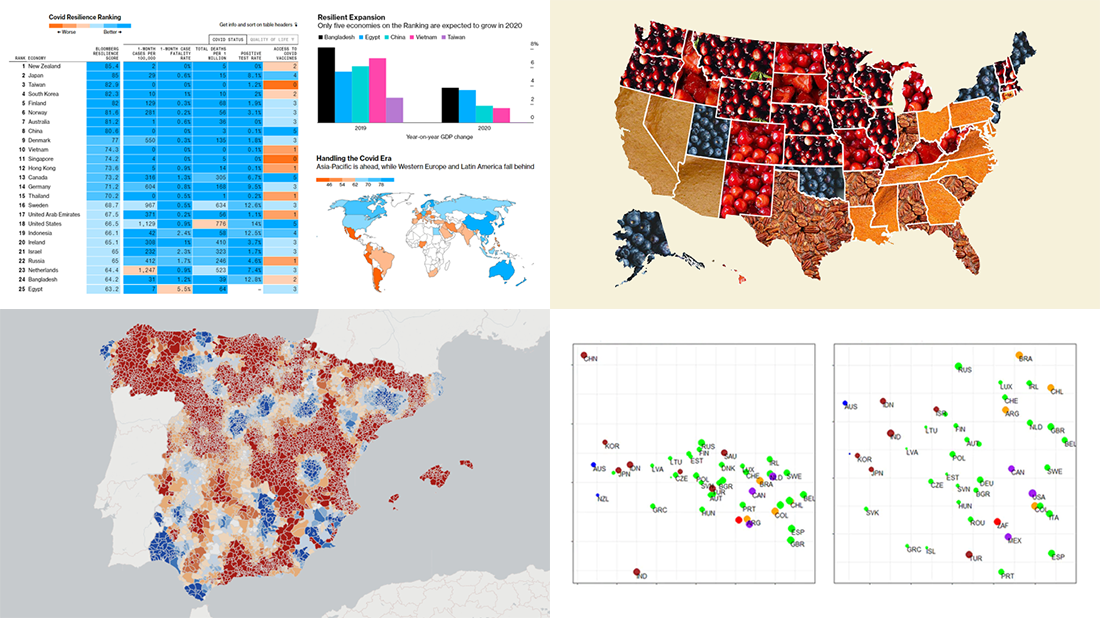 If you love good data visualizations, you’ve come to the right place at the right time! Every Friday, we choose the four most interesting projects making good use of charts and maps, from those we have come across out there just lately, and introduce you to them. Here are the visualizations we’re going to tell you about this time on DataViz Weekly:
- (False?) dichotomy between saving lives and saving the economy during the second wave — Michael Smithson on The Conversation
- COVID Resilience Ranking revealing the best and worst places to stay during the pandemic — Bloomberg
- Length of summers in Spain since 1950, by municipality — Predictia
- The most popular Thanksgiving pie in each state — Instagram
- Categories: Data Visualization Weekly
- No Comments »
Exploring Data About COVID-19, Road Curvature & U.S. Elections — DataViz Weekly
October 23rd, 2020 by AnyChart Team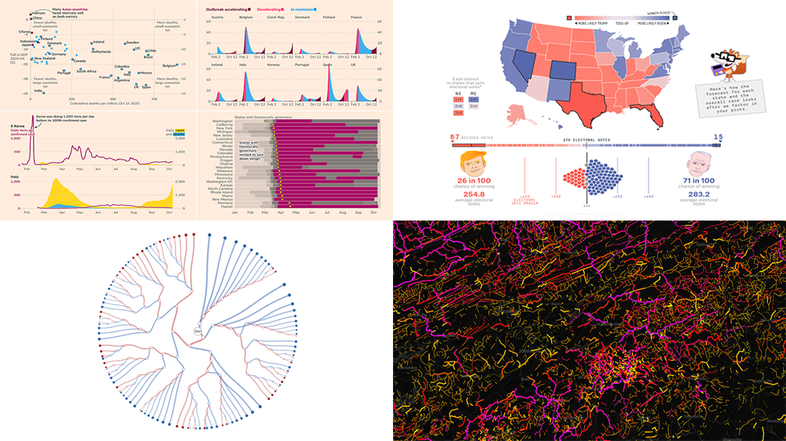 Meet a set of new amazing visualizations we’ve spotted and admired lately. Below is a list of the projects featured today on DataViz Weekly. Keep reading to learn about each and then check them out right away.
- Global COVID-19 crisis in data — FT
- Twisty roads worldwide — Adam Franco
- Ways Biden or Trump could win — FiveThirtyEight
- Electoral College Decision Tree — Kerry Rodden
- Categories: Data Visualization Weekly
- No Comments »
Awesome Fresh Data Visualization Projects for Inspiration — DataViz Weekly
September 4th, 2020 by AnyChart Team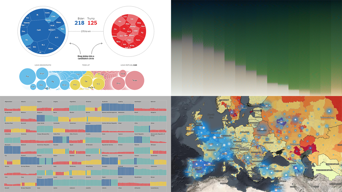 Celebrating the first Friday of September, don’t miss these awesome fresh data visualization projects for inspiration! We have recently met them around the web and are glad to introduce you to them in a quick overview. So our new picks for DataViz Weekly include:
- COVID-19 situation in Europe, a subnational view — WHO/Europe
- Potential outcomes of the U.S. presidential election — The New York Times
- State of democracy worldwide since 2006 — Preity Lodha
- Colors of the American landscape vs electoral map colors — The Upshot
- Categories: Data Visualization Weekly
- 1 Comment »
Visualizing COVID-19 Pandemic Data for Austria Using AnyChart JS Charts
June 25th, 2020 by AnyChart Team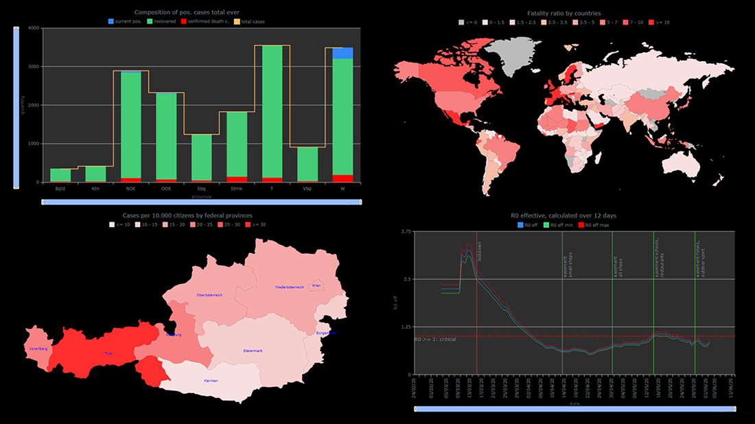 The COVID-19 pandemic persists as a global emergency, and we continue to support initiatives that contribute to tackling the coronavirus crisis. Specifically, we allow COVID-19 analytics projects to use our data visualization tools for free under a non-profit license.
You already know about StopCorona, a COVID tracker by Diffco, which is one such resource. Today, we want to meet you with another noteworthy project using AnyChart to visualize the pandemic statistics — iConcepts SARS-CoV-2 Stats. Created by Austrian part-time web developer Juergen Hoefer and featured on the official Open Data Austria portal, it shows the COVID-19 statistics for Austria (and worldwide) from different perspectives, in countless interactive charts powered by our JavaScript (HTML5) charting library.
We asked Juergen a few questions to learn more about this project and his experience visualizing COVID-19 pandemic data with the help of AnyChart. Read the answers and take a glance at several quick chart examples from his website. (Stack: HTML/CSV.)
- Categories: AnyChart Charting Component, AnyMap, Big Data, HTML5, Success Stories
- 1 Comment »