 The COVID-19 pandemic persists as a global emergency, and we continue to support initiatives that contribute to tackling the coronavirus crisis. Specifically, we allow COVID-19 analytics projects to use our data visualization tools for free under a non-profit license.
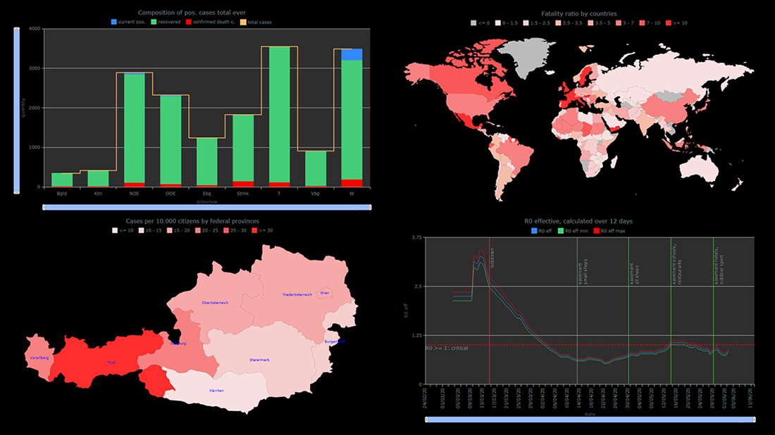
You already know about StopCorona, a COVID tracker by Diffco, which is one such resource. Today, we want to meet you with another noteworthy project using AnyChart to visualize the pandemic statistics — iConcepts SARS-CoV-2 Stats. Created by Austrian part-time web developer Juergen Hoefer and featured on the official Open Data Austria portal, it shows the COVID-19 statistics for Austria (and worldwide) from different perspectives, in countless interactive charts powered by our JavaScript (HTML5) charting library.
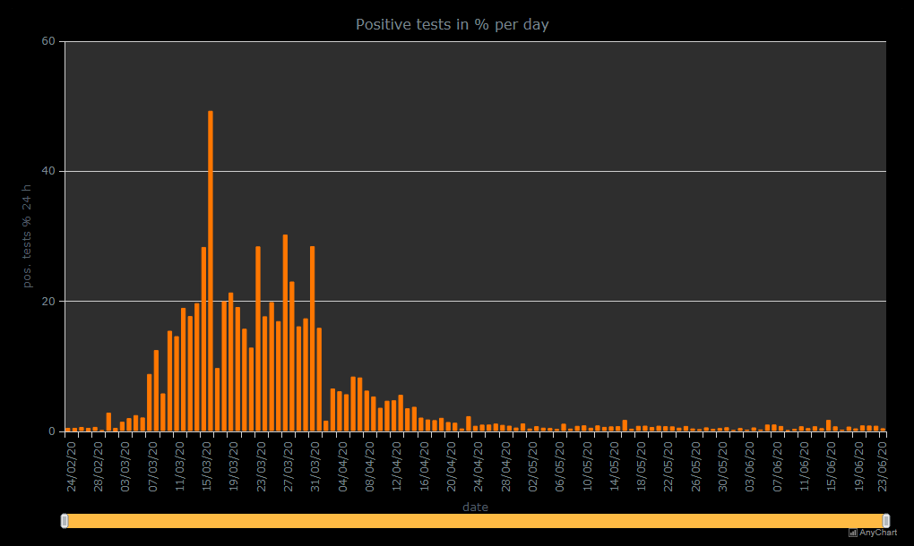
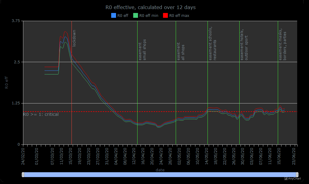
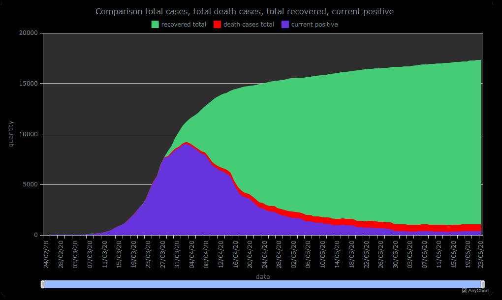
We asked Juergen a few questions to learn more about this project and his experience visualizing COVID-19 pandemic data with the help of AnyChart. Read the answers and take a glance at several quick chart examples from his website. (Stack: HTML/CSV.)
AnyChart: To start with, please tell our community about yourself. What do you do?
Juergen Hoefer: I am a sales representative at a healthcare company in Austria. I have always been interested in computers and programming, though, so I learned a bit of web development by myself and started to build websites. At first, it was just a hobby. Then, when I worked at PlayStation Austria (Sony Computer Entertainment Austria), I understood much about business management and marketing and decided to make it a part-time business (iconcepts.at). Now I hope to make it my full-time occupation one day.
A: How did the idea of this COVID-19 data project first come? Why did you decide to create it?
JH: I watched Austria’s chancellor and ministers representing a lot of numbers, data and facts, and I was very critical about the restrictions, special laws and the lockdown, so I started to look into official data from the government in Excel, calculating some values which are not published, to view the data from different angles.
Also, I noticed that the media did not really bring data in relation, which was a problem because, for example, absolute numbers of confirmed cases alone, without the number of tests, are not too useful.
So I decided to create my own information center (just for myself). After discussing it with friends, I published my data tables and charts on my website, just in PDF files. It was the start of this project.
A: What is your project now, in reality? Is it exactly what you wanted to build?
JH: It’s still my own private project, but after implementing the interactive charts from AnyChart, I got listed at the Austrian government’s website Open Data Austria and your DataViz Weekly blog, the numbers of visitors literally exploded.
Today the project is wider than I planned or expected, but now it’s my “baby” and I will do some little updates in future from time to time (to publish some new charts, especially in the section ‘Worldwide’).
I think, without the charts from AnyChart, if this project only provided data in tables and some simple charts in PDF files as initially, it could hardly have this unexpected success.
A: What role does data visualization play in it? Why do you need it and how is it helpful?
JH: Data visualization is the heart of this project. I think data is best readable as charts and graphics and most people are able to understand data better if they see it visualized. It greatly helps people to see the power of data.
A: How do you work with COVID-19 pandemic data and use AnyChart to visualize it?
JH: In my project, I use the data the government provides daily as CSV, import them in Excel sheets which automatically calculate the parameters I need, then export these sheets in the CSV format that I need for AnyChart and upload them via FTP to the data directory on my webspace. I do the same with data from the ECDC who also provides the data daily for download. So I only use official data about the COVID-19 pandemic.
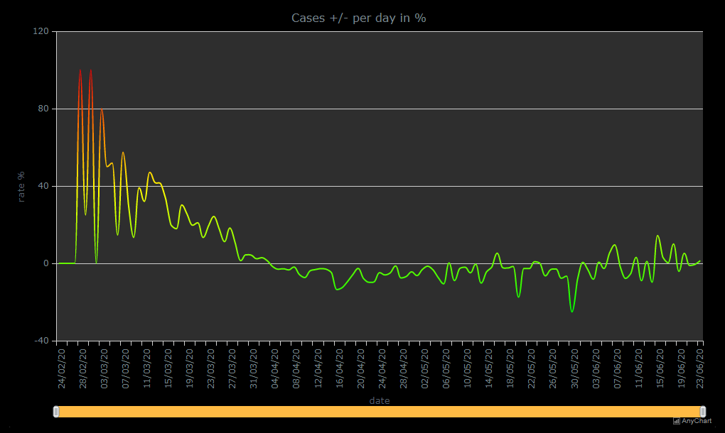
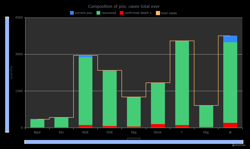
I use different kinds of chart types provided by AnyChart, depending on the kind of data I want to visualize: line charts, column charts, circular gauges, and so on.
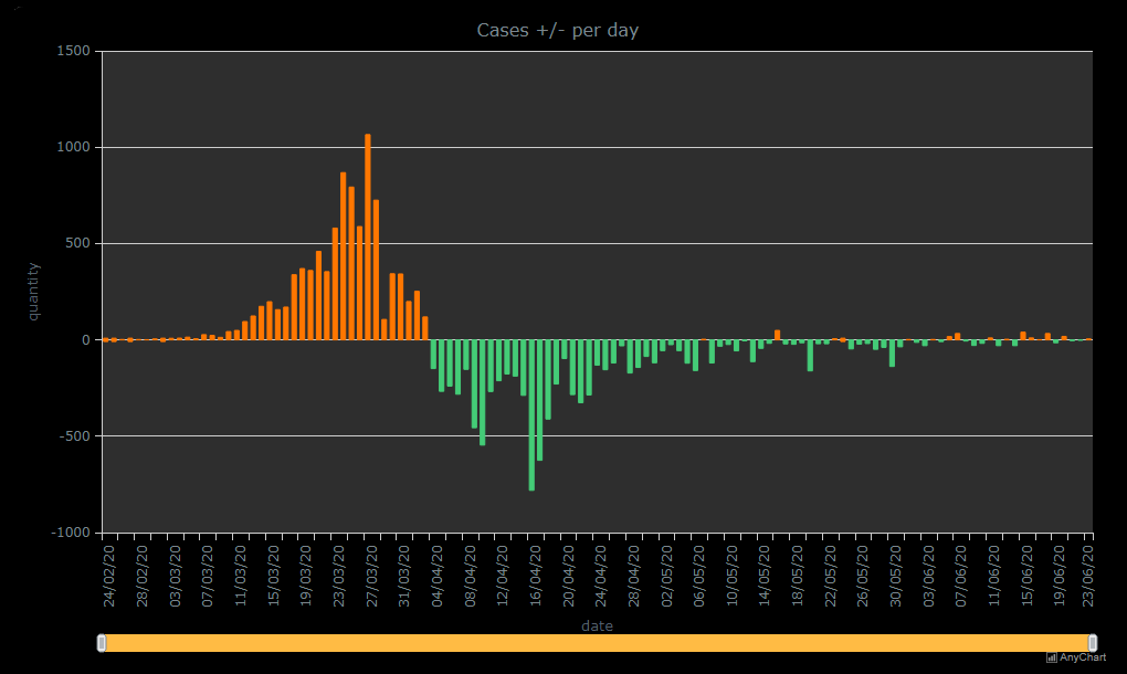
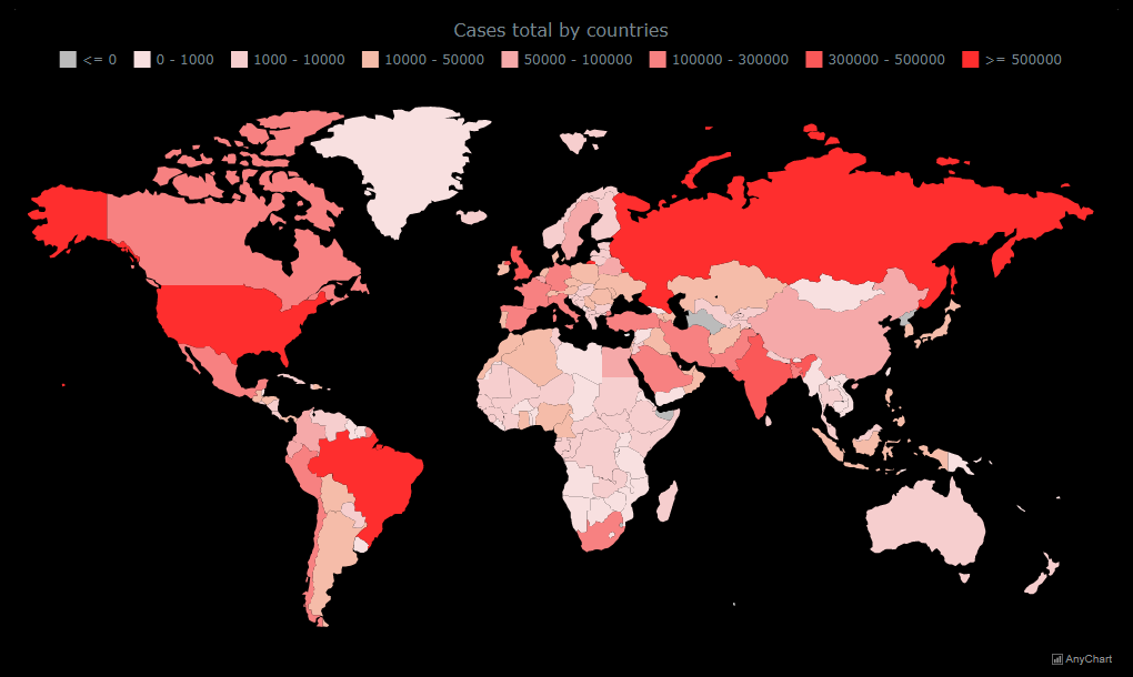
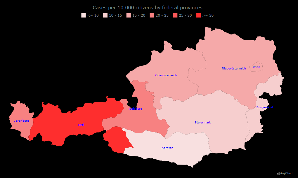
The most impressive for me are the map charts, and combined charts with lines and columns comparing some data series in one visualization.
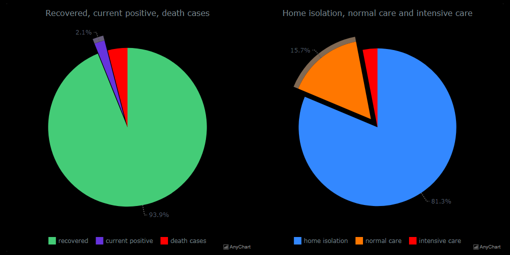
Also very helpful are pie charts, they visualize the percentage of some terms which is very impressive.
A: What technology stack is your project built on? Was integration of AnyChart into your stack somewhat seamless and easy enough or did you face any substantial problems?
JH: Nothing special, the truth is I kept the project very simple using HTML including your JS library and using data with linking CSV files. Using AnyChart was really new for me, but the online charting documentation helps a lot. Also the Playground is very helpful. The one and only thing which was a little bit tricky for me (I already told you that all my knowledge about programming has been self-learned) was bringing the CSV data into maps, but with the really very fast AnyChart Support and the quick answers including explanations and examples, this was not really a problem.
A: Why did you choose AnyChart? What do you like most about our charting library?
JH: I have seen some “interactive” charts on the web, and I was ready to learn something new, so I was looking for a solution on the internet. I found some, but most of them are not really interactive apart from some few hover effects.
The reason why I chose AnyChart is that these charts are really interactive. Clicks, right clicks, full screen, selecting data ranges, excluding data points directly in the charts, and so on. All this was really impressive for me, so i decided to give it a try and my first experiences and results with AnyChart were really awesome. Today I am very happy about my decision for AnyChart.
A: Please tell us how we can further improve AnyChart. What do you think our charting library lacks and what would you like to see in the future versions?
JH: Hard to say… Well, AnyChart already has much more than my little project might need. Maybe the one and only thing is to provide map images (SVG) also with districts, but this is “whining at a very high level”, I am aware this is a lot of work to provide these files for every country and Austria is not the “navel of the world”.
A: When asked by a friend which JS charting library to choose for data visualization, how would you recommend AnyChart and explain why in just one or two phrases?
JH: Using AnyChart is intuitive with a lot of different kinds of charts. It offers many opportunities and options of interactivity, and user support is really fast, very friendly and helpful.
A: What do you think about the COVID-19 pandemic crisis?
JH: In my opinion, people are mostly divided into two camps. The trivialized and the panicked. This is very dangerous. For me, the right way to handle this crisis is a mix of it. Not to fall in panic, but to bring the necessary attention to this COVID-19 pandemic. It’s good to prevent some situations where you can get infected, be respectful and protect the risk group with social distancing (for them, this virus is really dangerous), and do your daily work as normal, but always with the thought in mind that we are living in an extraordinary era for now. Be considerate to other people.
I am sure this topic will keep us busy for a longer time, but if everybody is respectful to each other and follows some simple rules helping to keep the virus under control, we will overcome it. Be careful, respectful, and above all, stay healthy!
Want to share your AnyChart story? Contact us.
See more customer stories and don’t miss out on our selected case studies.
- Categories: AnyChart Charting Component, AnyMap, Big Data, HTML5, Success Stories
- 1 Comment »