 Hey everyone! Here’s DataViz Weekly with a quick presentation of four new data graphics projects that we’ve found worth checking out. Look at these stunning examples of charts and maps in action!
- Areas with the humanity’s lowest impact on the natural world — National Geographic
- COVID-19 in Austria (and worldwide) — Jürgen Höfer
- Age of buildings in Saint Petersburg (Russia) — Nikita Slavin
- Chronic health conditions by income and race — NYT
Data Visualization Weekly with Interesting New Data Graphics: June 5, 2020 — June 12, 2020
Human Impact on Nature
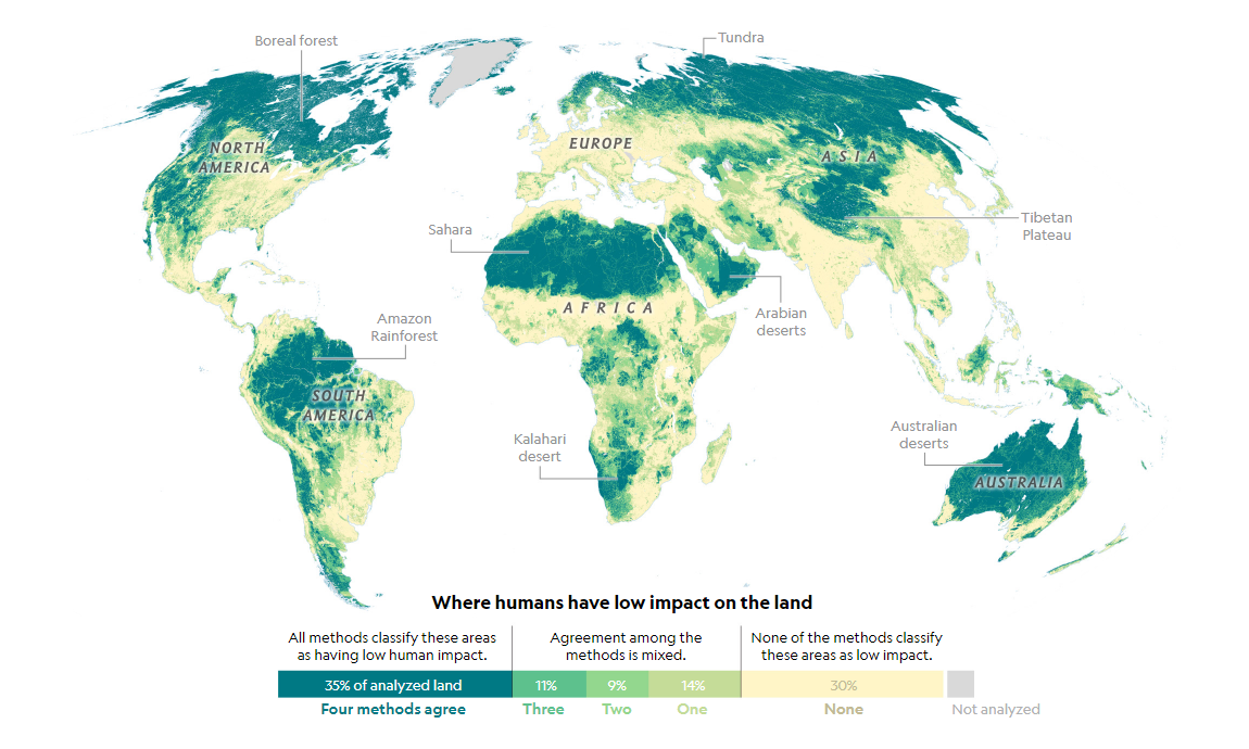
In a new article on National Geographic, environmental writer and reporter Emma Marris discusses a map published last Friday in the Global Change Biology journal. The visualization, building on four independently created scientific models, allows us to see where humans’ impact on the natural world is minimal.
The models that this new analysis knits together include maps from the Global Human Footprint index, as well as the Anthropogenic Biomes, Global Human Modification, and Low Impact Areas projects. All of them were found to overlap pretty well.
Discover the wildest places on Earth and read the article to learn how this map and the findings could be interpreted and utilized in reality.
COVID-19 in Austria
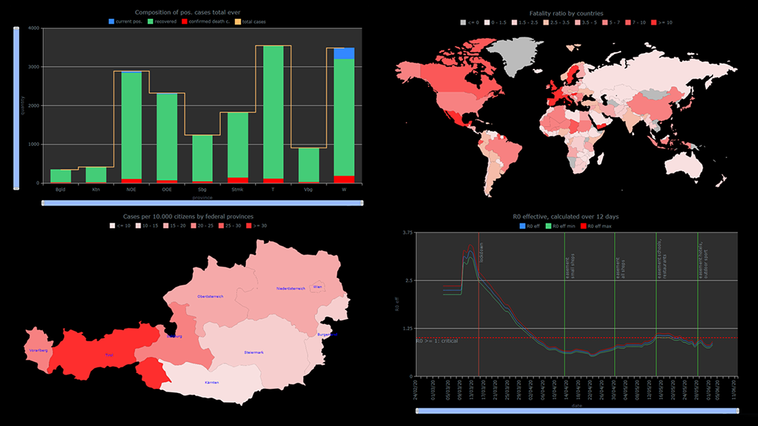
Remember StopCorona, a COVID-19 tracker which uses AnyChart to chart pandemic data? Now, we would like to put a spotlight on another interesting new data graphics project showing coronavirus statistics in an insightful manner with the help of our JavaScript charting library. Austrian IT marketer Jürgen Höfer created a whole bunch of compelling interactive charts (and maps) that provide a look at the SARS-CoV-2 outbreak data from different angles.
Available in German and English, iConcepts.at/COVID19 focuses on graphically representing the COVID-19 statistics for Austria and its states based on open data from the Federal Ministry for Social Affairs, Health, Care and Consumer Protection of Austria (BMSGPK). In addition, there you will find graphics for the worldwide figures from the European Center for Disease Prevention and Control (ECDC) and Johns Hopkins University’s Center for Systems Science and Engineering (JHU CSSE). The website is updated on a daily basis as these sources provide new numbers. Check it out.
Just like StopCorona, this project is allowed to use AnyChart under a non-profit license, i.e. for free. If you are building a COVID-19 data analytics app, get in touch with us to apply for the same option.
Age of Buildings in Saint Petersburg, Russia
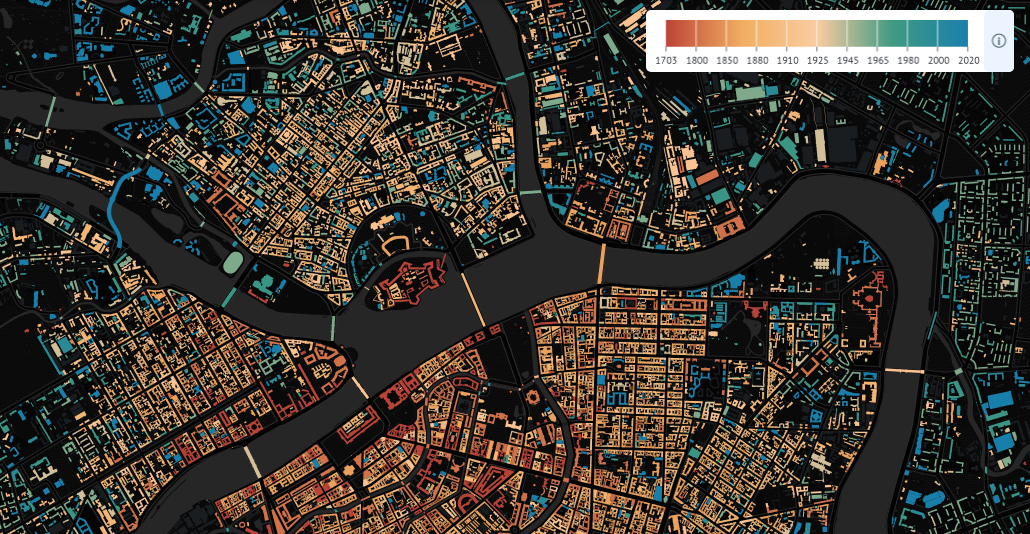
Cartographer Nikita Slavin created a beautiful interactive map that shows the age of about 56,000 buildings in Saint Petersburg, Russia. For this project, he visualized data from the city’s Open Data portal, CityWalls.ru, and OpenStreetMap.
Under the map, you will find a column chart displaying the number of houses built by decade. Click the bars to filter out the map view accordingly.
Explore the architecture of St. Petersburg using this cool data visualization. See the year of construction (from 1700s to the present time), architectural style, architect’s name, and more information about the buildings throughout the city (often called “the northern capital of Russia”).
Chronic Health Conditions by Income and Race
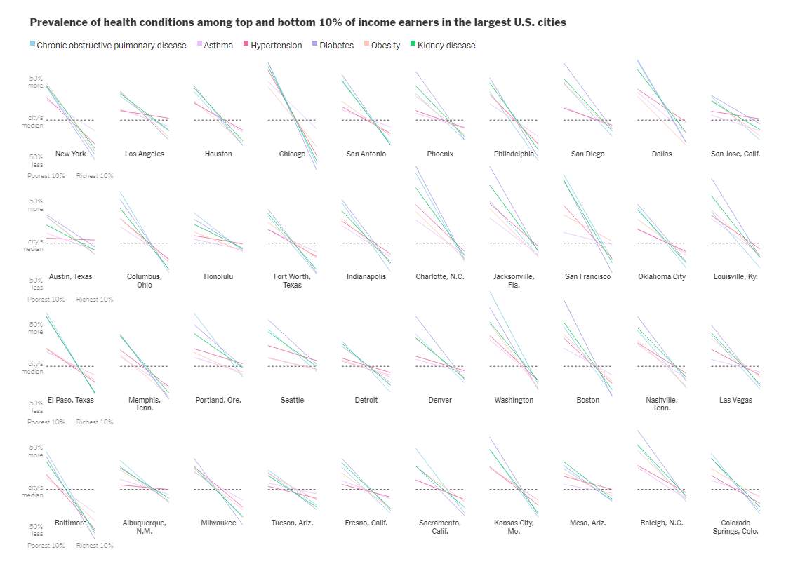
Yaryna Serkez, a graphics editor for The New York Times Opinion, created an impressive piece delving into what people are most likely to die from the novel coronavirus. According to scientists, pre-existing health conditions, such as chronic obstructive pulmonary disease, hypertension and diabetes to name a few, are definitely a significant factor. However, those underlying medical conditions do not affect everyone equally as income and race are likely to determine who is at most risk.
Look at the charts showing prevalence of health conditions among the richest and poorest 10% of Americans in the 40 largest U.S. cities. Scroll further down the article to see the distribution of those conditions across census tracts by median household income and race. Household income data is taken from the American Community Survey. The source of the disease prevalence data used in this analysis is CDC.
***
When you complete a cool data visualization work or come across someone else’s charts worth sharing, let us know so we can consider featuring those in DataViz Weekly. In the meantime, we hope you like our regular blog feature. Every week, we curate new data graphics worth seeing. Stay tuned.
- Categories: Data Visualization Weekly
- 1 Comment »