Newest Collection of Effective Data Visualization Examples — DataViz Weekly
December 16th, 2022 by AnyChart Team It’s easier to analyze data when it is visualized in the form of a chart or a map. On DataViz Weekly, we share with you some vivid examples we have recently seen out there. Here’s our newest collection!
- Blackouts in Kyiv — Volodymyr Agafonkin
- Earth’s slowest-warming parts — The Washington Post
- Twitter Blue subscribers — The New York Times
- Land use in the United Kingdom — Bloomberg
- Categories: Data Visualization Weekly
- No Comments »
Visualizing Data on Global Population, Mariupol Destruction, Mississippi River Exports, Air Traffic — DataViz Weekly
November 18th, 2022 by AnyChart Team It’s Friday, which means it’s time for DataViz Weekly to shine and illuminate the best we’ve recently seen in data visualization! Meet the following projects and check them out!
- Your place among the 8-billion population — The Washington Post
- Destruction of Mariupol in a time-lapse record — Conflict Observatory
- U.S. exports through the Mississippi River — Bloomberg Green
- Global air traffic on a single day — Carlos Bergillos
- Categories: Data Visualization Weekly
- No Comments »
Coolest New Data Graphics to Not Miss Out On — DataViz Weekly
November 4th, 2022 by AnyChart Team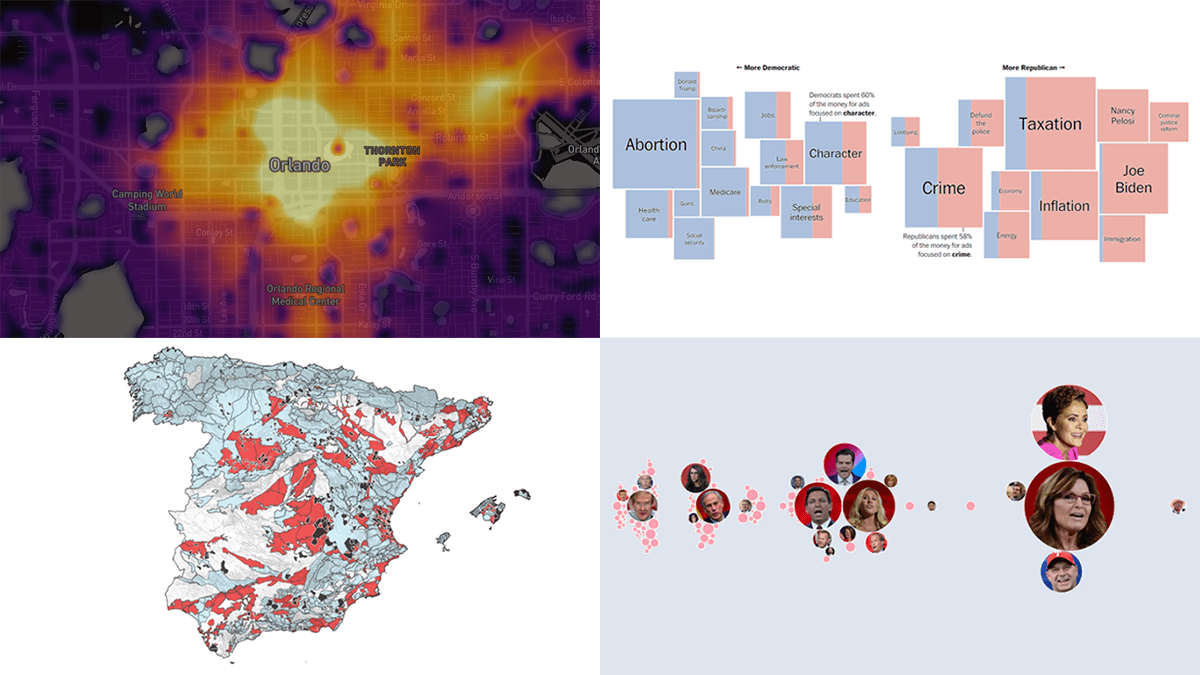 DataViz Weekly is where we curate the coolest data graphics published just about now around the web. Check out our new collection!
- Top topics in political ads ahead of the U.S. midterms — The Washington Post
- Republican candidates spreading election denial online — Bloomberg
- Access to essential services in cities — Leonardo Nicoletti, Mikhail Sirenko, Trivik Verma
- Tap water contamination across Spain — DATADISTA
- Categories: Data Visualization Weekly
- No Comments »
Stunning New Data Visualization Examples Around Internet — DataViz Weekly
October 21st, 2022 by AnyChart Team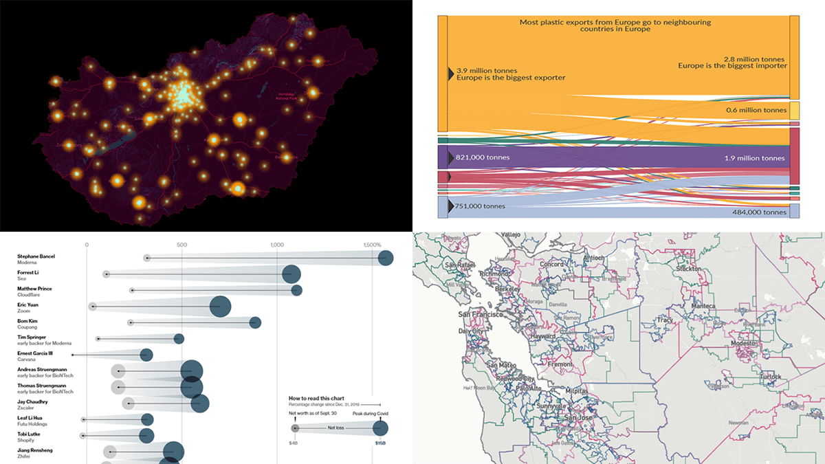 Continuing our regular series DataViz Weekly, we’re glad to bring to your attention several stunning data visualization projects as great new examples of professional charting and mapping in action!
- Global plastic waste trade — Our World in Data
- Teacher protests in Hungary — ATLO
- Rise and fall of COVID-19 billionaires — Bloomberg
- All U.S. midterm elections where you live — USAFacts
- Categories: Data Visualization Weekly
- No Comments »
Visual Representations of Data in Select New Stories — DataViz Weekly
August 19th, 2022 by AnyChart Team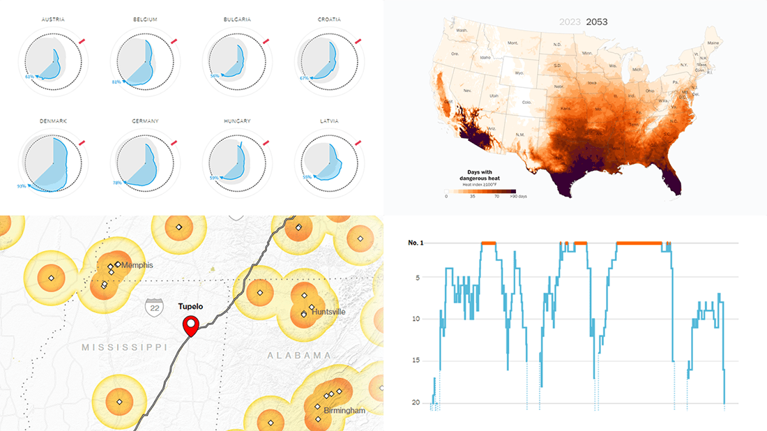 We continue to curate roundups of our favorite data graphics we see each week. Keep reading this new DataViz Weekly to check out four recent stories with cool visualizations that are totally worth a look!
- European gas storage levels — Reuters
- EV charging along popular American roads — Bloomberg
- Serena Williams’s career in tennis — The New York Times
- Perilous heat waves in the U.S. by 2053 — The Washington Post
- Categories: Data Visualization Weekly
- No Comments »
Bringing Data to Life with Exemplary Visualizations — DataViz Weekly
August 5th, 2022 by AnyChart Team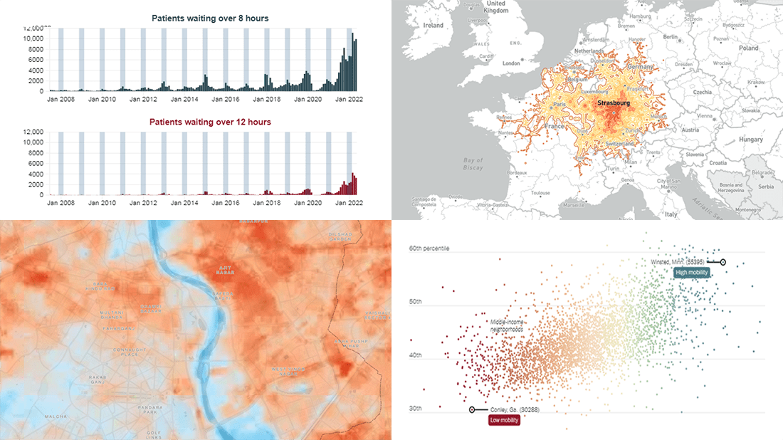 We’ve seen a lot of good new visualizations over the last week. Here are four projects with the best ones, amazing illustrations of how data can (and should) be brought to life with the right graphics. Featured today on DataViz Weekly:
- Five-hour train ride destinations in Europe — Benjamin Td
- Scotland’s NHS waiting times — DC Thomson
- Cool spots inside sweltering cities — Bloomberg Green
- Friendships between poor and rich as a factor of economic mobility — The Upshot
- Categories: Data Visualization Weekly
- No Comments »
Top Recent Data Graphics from Around Internet — DataViz Weekly
July 8th, 2022 by AnyChart Team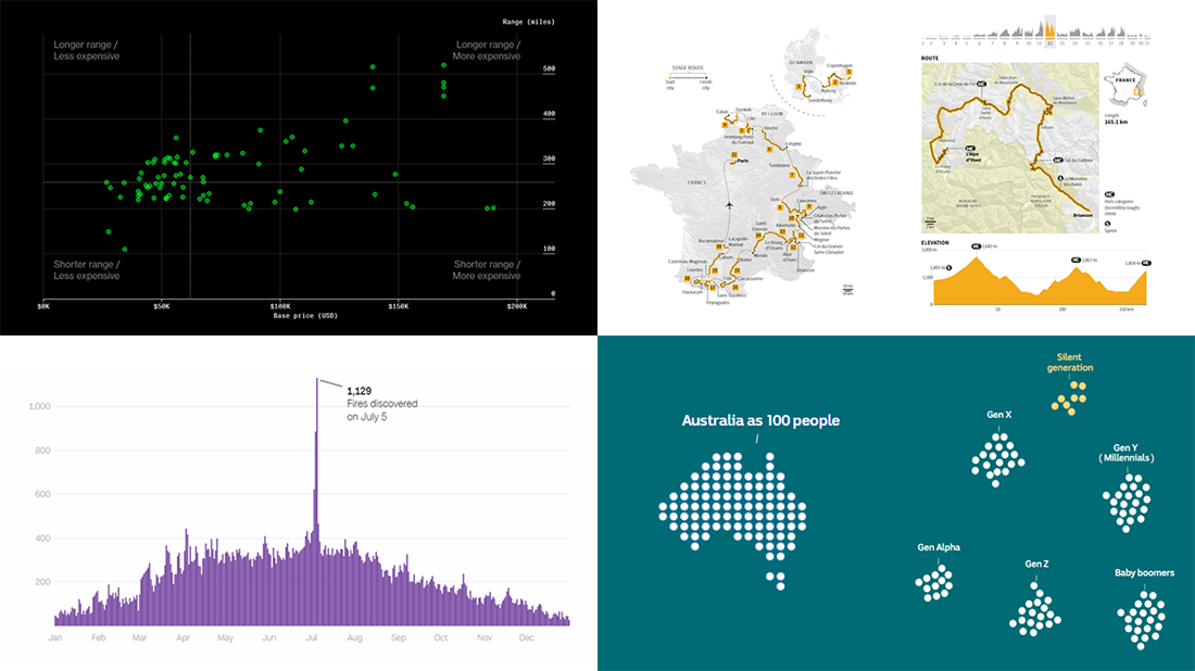 DataViz Weekly is here with an overview of the top data graphics recently published around the internet! Today we are pleased to tell you about the following visualizations:
- Electric car models in comparison — Bloomberg Green
- Australia as 100 people (according to the 2021 census) — ABC News
- Human-caused wildfires in the U.S. around Independence Day — CNN
- 2022 Tour de France route — Reuters
- Categories: Data Visualization Weekly
- No Comments »
Fresh Collection of Interesting Charts & Maps — DataViz Weekly
June 10th, 2022 by AnyChart Team A lot of visualizations appear every day all over the web. On DataViz Weekly, we share with you those that we’ve found especially noteworthy. Check out our fresh collection of interesting charts and maps!
- Inequality and health in Brussels — Médor
- Noise pollution in Paris, London, and New York City — Possible
- Manhattan migration patterns — Bloomberg
- Commonness of divorce in the United States — FlowingData
- Categories: Data Visualization Weekly
- No Comments »
Visualizing Abortion Data & Impact of Overturning Roe v. Wade — DataViz Weekly
May 13th, 2022 by AnyChart Team A leaked draft of a U.S. Supreme Court opinion suggests that the 1973 Roe v. Wade decision, establishing federal constitutional protection of abortion rights, could be overturned. If the justices strike down the ruling, each state will be able to determine the legality of abortions.
The document, which was later confirmed to be authentic, cast abortion rights back into the center of the political discourse in the United States. In the wake of that, we decided to make a special edition of DataViz Weekly to show you how some of the top publications — The Washington Post, Bloomberg, Reuters, and FiveThirtyEight — used data visualization to communicate the situation with abortions in the country and what is likely to change if the Supreme Court eventually overturns Roe.
- Categories: Data Visualization Weekly
- No Comments »
Great New Charts & Maps Worth Seeing — DataViz Weekly
April 8th, 2022 by AnyChart Team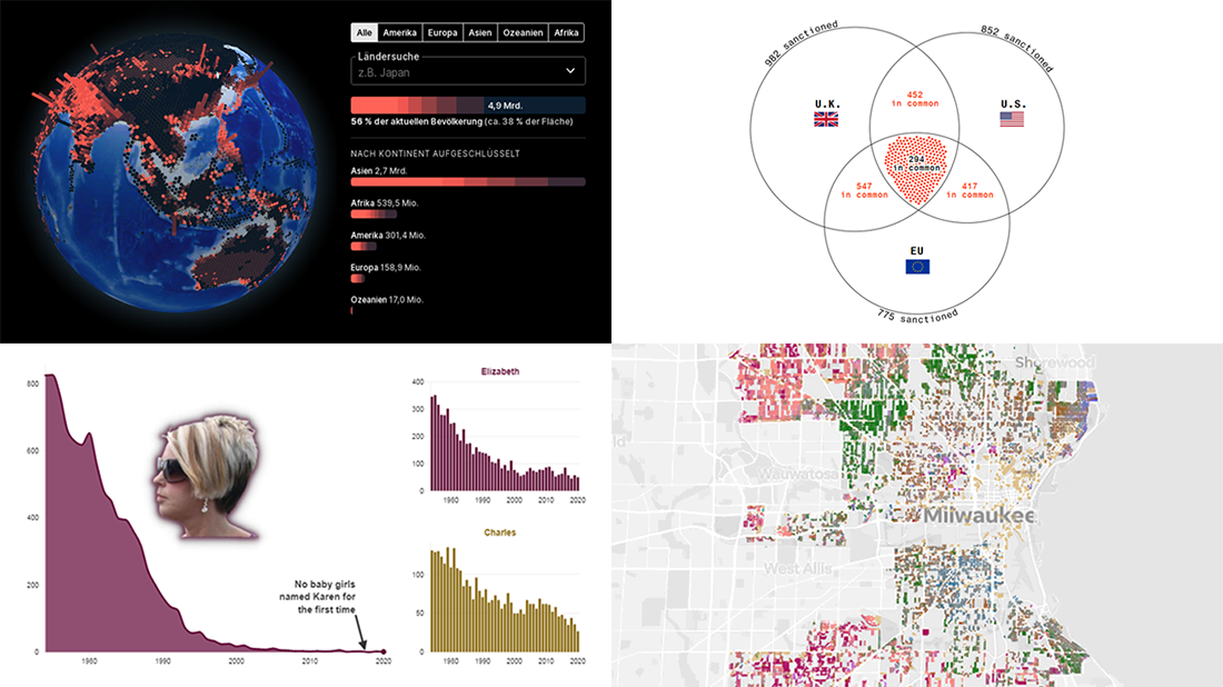 Ready for a new selection of great charts and maps? Join us in checking out four awesome data visualization projects we have come across this week! Today on DataViz Weekly:
- Uninhabitable locations worldwide by 2100 — Berliner Morgenpost
- Sanctions against Russian oligarchs — Bloomberg
- Baby naming trends in Scotland — The Courier
- Milwaukee architectural home styles — The Milwaukee Journal Sentinel
- Categories: Data Visualization Weekly
- No Comments »