 We’ve seen a lot of good new visualizations over the last week. Here are four projects with the best ones, amazing illustrations of how data can (and should) be brought to life with the right graphics. Featured today on DataViz Weekly:
- Five-hour train ride destinations in Europe — Benjamin Td
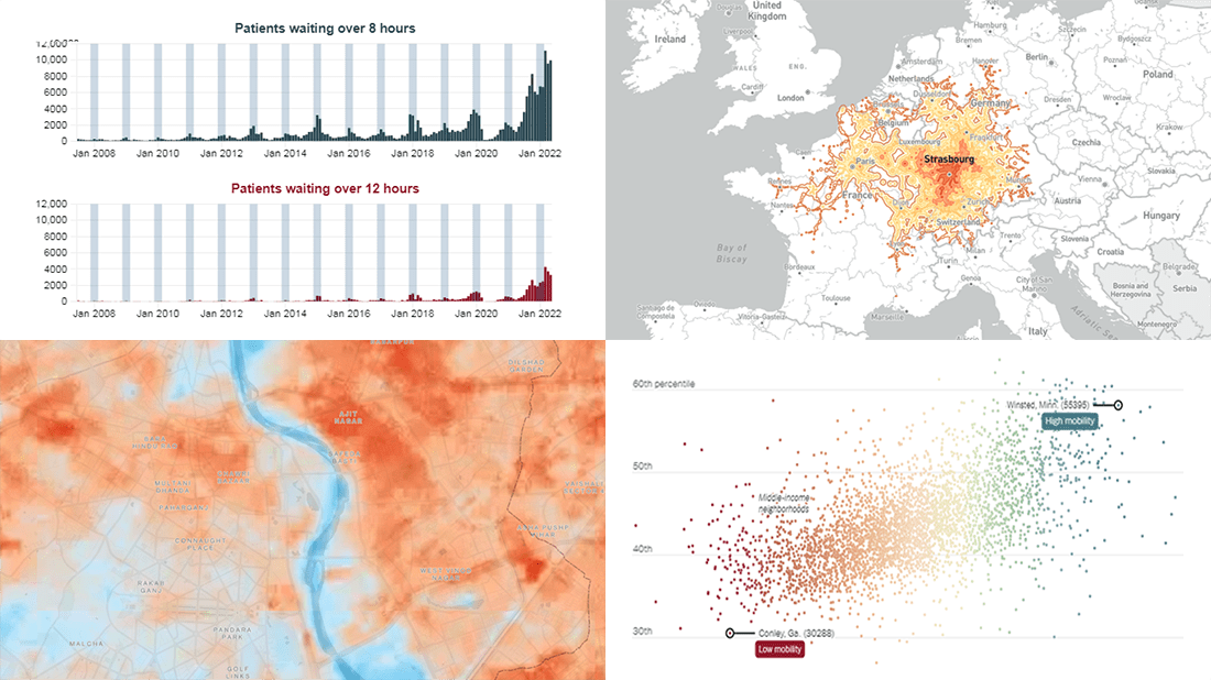
- Scotland’s NHS waiting times — DC Thomson
- Cool spots inside sweltering cities — Bloomberg Green
- Friendships between poor and rich as a factor of economic mobility — The Upshot
Data Visualization Weekly: July 29, 2022 — August 5, 2022
Five-Hour Train Ride Destinations in Europe
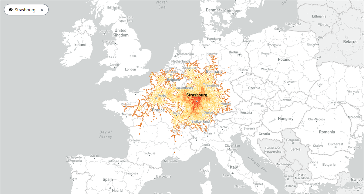
How far away can you go by train from the nearest station in up to five hours? A new interactive map provides the answer for Europe.
Inspired by the direkt.bahn.guru project by Julius Tens, Benjamin Td visualized travel time data in isochrones. Hover over a railway station in Europe and see which destinations are reachable from that location in one, two, three, four, and five hours. For example, the screenshot above displays isochrones from Strasbourg, France.
Explore where you can get to within a five-hour train ride from major stations in Europe, at chronotrains-eu.vercel.app.
Scotland’s NHS Waiting Times
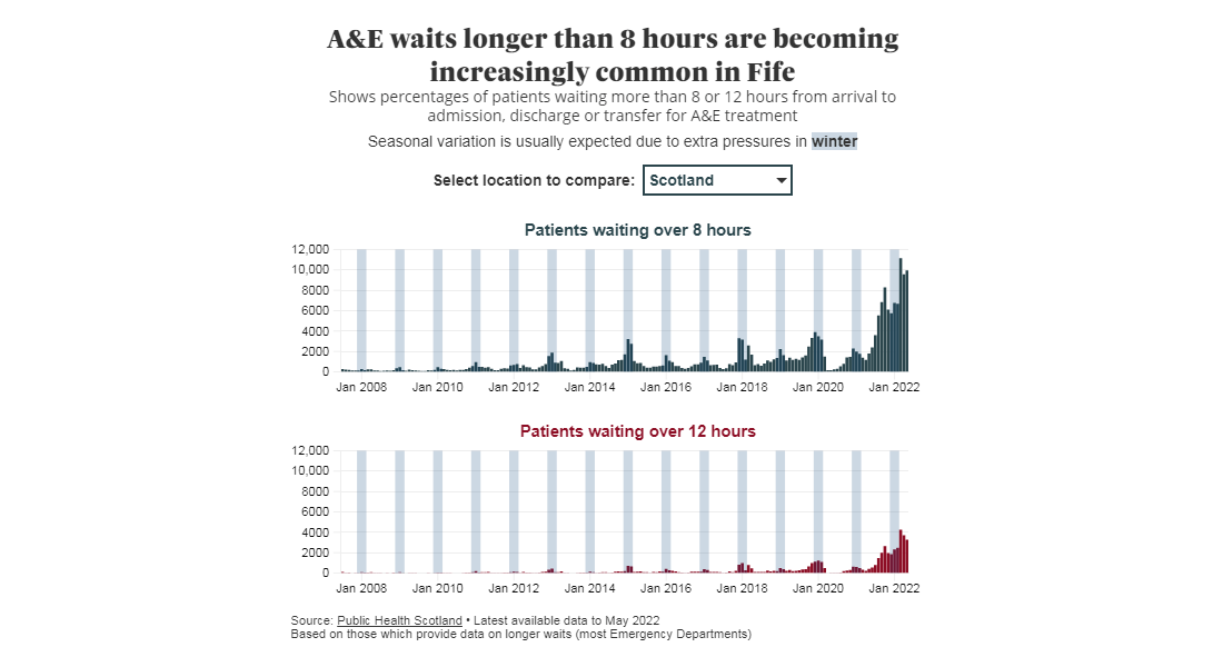
The COVID-19 pandemic has overwhelmingly impacted healthcare systems around the globe. One of the effects is a longer wait.
Look at Scotland, for example. DC Thomson’s Lesley-Anne Kelly, Emma Morrice, and Joely Santa worked with Public Health Scotland’s data and created nine trackers of waiting times for different health services in Scotland. Published on The Courier and on The Press and Journal, each tracker is like a standalone visual story with multiple charts showing where the pinch points are and how the situation is changing. The journalists say the graphics will be updated as new data arrives.
Find out what has been going on with Scotland’s NHS waiting times, on The Courier or on The Press and Journal. Also, don’t miss this Derek Healey’s article explaining some more about the issue.
Cool Spots Inside Sweltering Cities
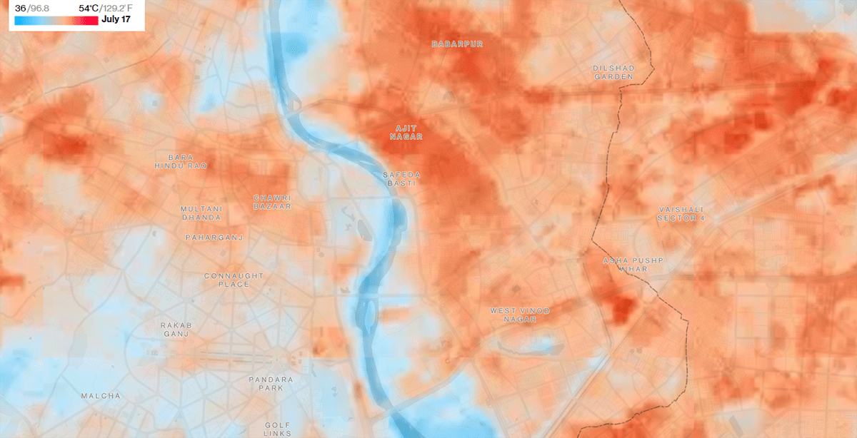
The extreme heat waves caused by climate change make cities sweltering. But in some urban areas, temperatures can be tangibly lower than in others.
Laura Millan, Hayley Warren, and Jeremy Scott Diamond Green of Bloomberg used new high-resolution imagery and data from satellites to map heat differences across London, Delhi, Fez, Los Angeles, and Seville. This allowed the team to identify the coolest locations and delve into the reasons for lower temperatures in such spots. Greenery, water, and reflective materials are what actually works in the fight against the heat.
Check out where the coolest (and warmest) areas are located in some of the world’s hottest cities and learn more, on Bloomberg Green.
Friendships Between Poor and Rich as Factor of Economic Mobility
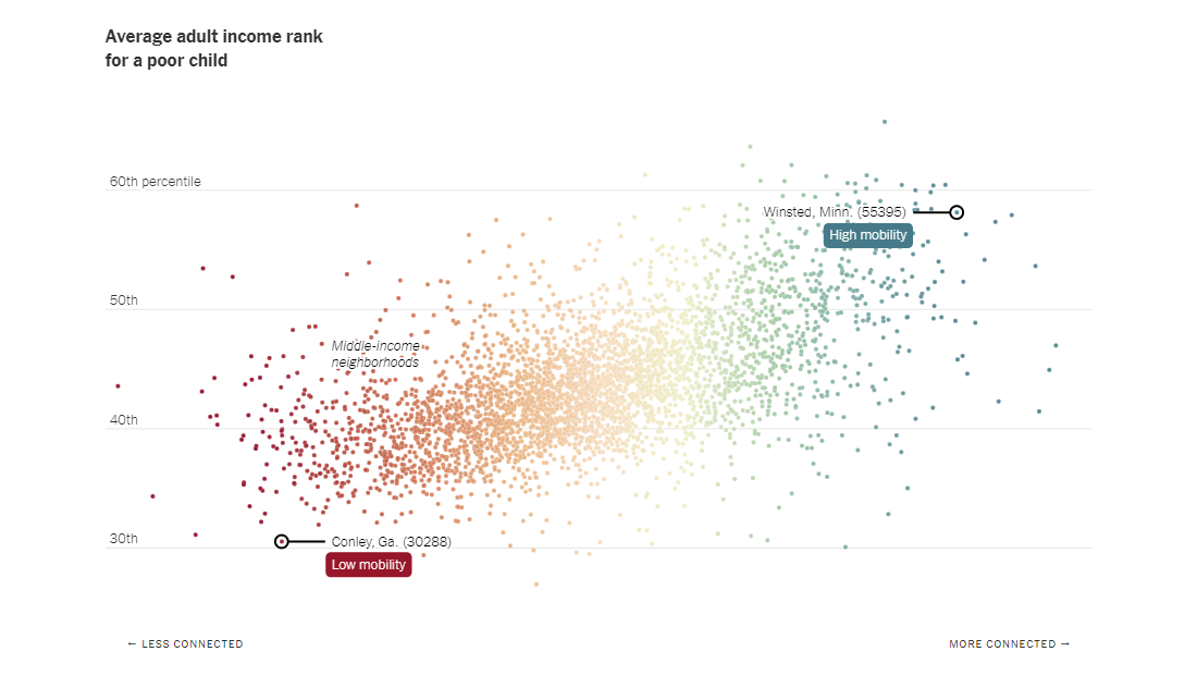
A new study shows income mobility is more common in communities where people have more cross-class friendships. To put it simply, the more rich friends poor children have, the more they will likely earn as adults.
Published this week in the Nature journal, the study is based on an analysis of friendship connections on Facebook of over 70 million Americans. Its key points are overviewed by The New York Times’s The Upshot in a scrollytelling-format story with a series of telling visualizations, charts and maps. The major discovered trend is clearly visible on the graph pictured above: the higher the level of economic connectedness (i.e. the more friendships between the poor and rich), the higher the income mobility.
See more on cross-class friendships as a key to reducing poverty, on The Upshot. The piece was created by Claire Cain Miller, Josh Katz, Francesca Paris, and Aatish Bhatia.
***
Thanks for your interest in awesome data visualizations and our blog! The next DataViz Weekly roundup will be out next Friday. Stay tuned!
- Categories: Data Visualization Weekly
- No Comments »