 Continuing our regular series DataViz Weekly, we’re glad to bring to your attention several stunning data visualization projects as great new examples of professional charting and mapping in action!
- Global plastic waste trade — Our World in Data
- Teacher protests in Hungary — ATLO
- Rise and fall of COVID-19 billionaires — Bloomberg
- All U.S. midterm elections where you live — USAFacts
Data Visualization Weekly: October 14, 2022 — October 21, 2022
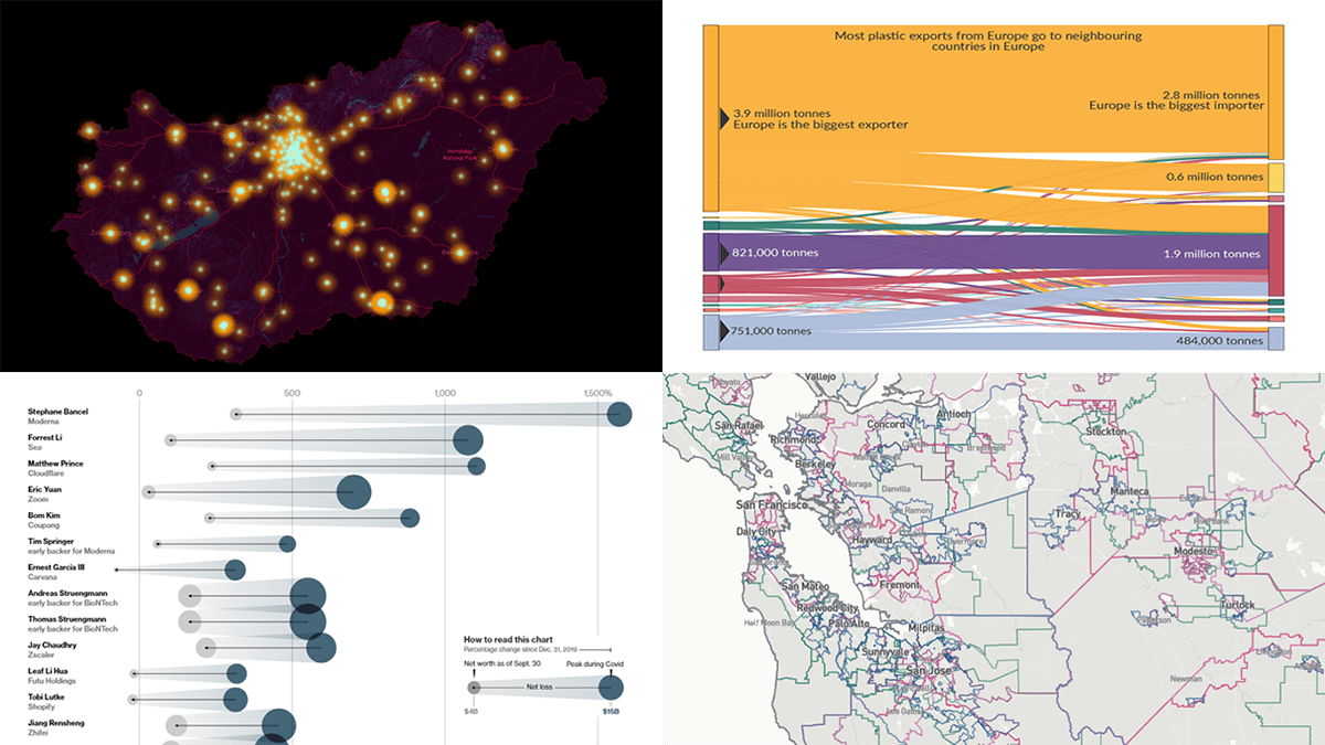
Global Plastic Waste Trade
The largest share of global plastic pollution emissions to the oceans comes from low and middle-income countries. But it’s not only their own waste.
Hannah Ritchie, Head of Research at Our World in Data, looked at global plastic waste trade using data from the United Nations Comtrade database and an OECD report. The charts she made for this analysis reveal the overall scale and show which countries are the biggest importers and exporters. The Sankey diagram you see above nicely represents the plastic waste trade flows across the world.
Check out the charts in the study on Our World in Data.
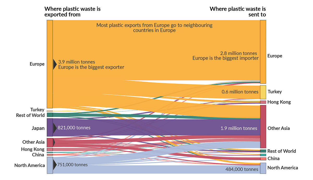
Teacher Protests in Hungary
These weeks, Hungary has seen thousands of people protesting against the government’s policy in education.
ATLO, the data team of Budapest-based investigative news outlet Átlátszó, mapped the scale of the demonstrations. Each point marks an educational institution that has published a statement in support of the movement. Hover over a point to see the name of the school and the number of teachers in solidarity. Clicking opens the original declaration. In a zoomed-out view, the points fuse into bright areas indicating major centers of the protesting activity in an impressive big picture.
Explore the map of teacher protests on the atlo.team website.
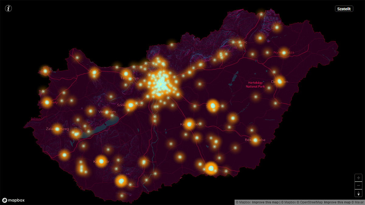
Rise and Fall of COVID-19 Billionaires
The COVID-19 pandemic brought significant changes to our life and work patterns, which opened a number of niches subsequently filled by certain companies. As a result, the net worth of some people soared. But now they are quickly losing those gains.
Bloomberg’s journalists delved into the rise and fall of COVID billionaires by analyzing the Bloomberg Billionaires Index. They found that the wealth of 189 people on the list at least had doubled at some point since December 31, 2019, and the growth (and then the shrinking) of their fortunes could be directly attributed to the pandemic. The shifts by individual are greatly visualized using bubbles, which you see above.
Take a close look at this and other visuals — made by Yasufumi Saito, Adrian Leung, and Jane Pong — on Bloomberg.
All U.S. Midterm Elections Where You Live
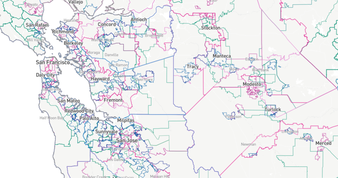
The November midterms in the United States will comprise many different elections. And the ballots will greatly vary based on where exactly the voters live.
USAFacts represented the boundaries of all voting communities, statewide and local, in a single map of the 2022 U.S. midterm elections. If you vote, enter your location and see which races will be on your ballot. You can also explore the candidates and the data on key issues, which makes the entire project a unique, comprehensive guide to the upcoming midterms.
Check it out on USAFacts.
***
If you like good data visualizations and want to see what others create, stay tuned for DataViz Weekly.
- Categories: Data Visualization Weekly
- No Comments »