 We continue to curate roundups of our favorite data graphics we see each week. Keep reading this new DataViz Weekly to check out four recent stories with cool visualizations that are totally worth a look!
- European gas storage levels — Reuters
- EV charging along popular American roads — Bloomberg
- Serena Williams’s career in tennis — The New York Times
- Perilous heat waves in the U.S. by 2053 — The Washington Post
Data Visualization Weekly: August 12, 2022 — August 19, 2022
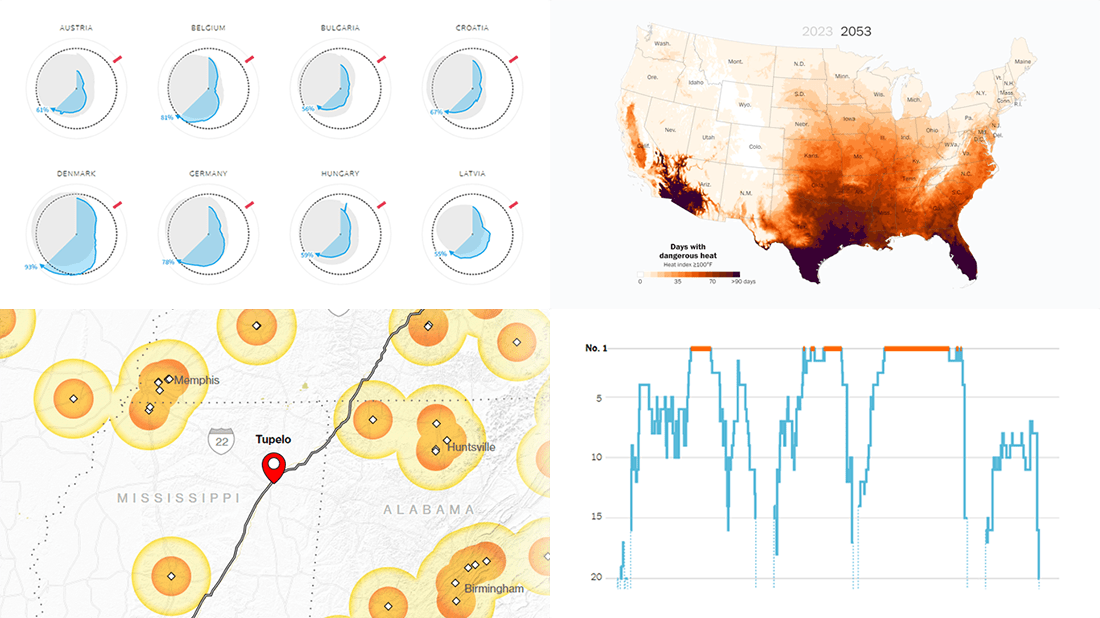
European Gas Storage Levels
Russia reduced its gas flows to Europe to just a fraction of what they had been in previous years. To mitigate the risks of an even more drastic fall or a complete cutoff and get ready for winter, the European Union is making effort to fill its gas storage sites to 80% capacity by November 1.
Polar charts on Reuters (made by Dea Bankova, Michael Ovaska, and Prasanta Kumar Dutta) nicely represent where European countries are and how they have progressed along the path to the target. The circular shape represents a one-year cycle. The blue area visualizes the percentage of gas filled in during this year. The gray one displays the average over the previous five years.
See the E.U. gas storage fill level tracker on Reuters.
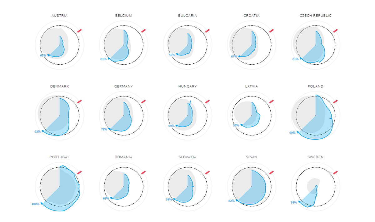
EV Charging Along Popular American Roads
Electric vehicles are in great demand in the United States. However, EV drivers still should be very careful when planning long-distance journeys. For example, many of the most popular summer road trip routes go across “electron deserts,” very long stretches without the appropriate charging stations.
Bloomberg’s Jeremy C.F. Lin made two cool maps for Kyle Stock’s article, which demonstrate the extent of the issue for non-Tesla EVs along the Natchez Trace Parkway and on the way from Sedona, AZ, to the Grand Canyon. Colored areas show the distance from charging stations. There is also a stacked bar chart at the end of the story that displays how North America compares to the rest of the world in EV charging infrastructure.
Check out the story about EV charging in America on Bloomberg.
Serena Williams’s Career in Tennis
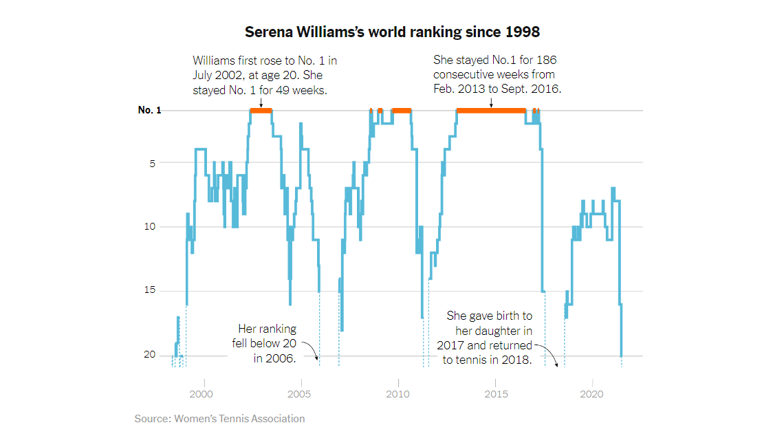
The U.S. Open Tennis Championships begins in ten days, and it is going to be the last professional tournament for Serena Williams.
The New York Times published an interesting article where Weiyi Cai, Lazaro Gamio, and Joe Ward are recalling her amazing career in women’s tennis with the help of great charts. The step line graph above, for example, represents the superstar’s world ranking over time. Further down the story, you’ll find visualizations for Serena Williams’s singles career, tournament by tournament, and performance at Grand Slam tournaments alone.
Look at Serena William’s career in charts on NYT.
Perilous Heat Waves in U.S. by 2053
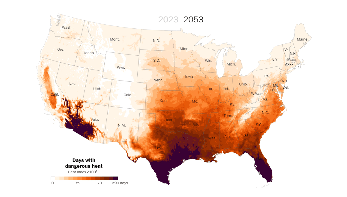
This summer has been hot. But it’s just the beginning as global warming is going to persist and worsen.
The Washington Post’s John Muyskens, Andrew Ba Tran, Anna Phillips, Simon Ducroquet, and Naema Ahmed analyzed new data from First Street Foundation and found that the percentage of Americans experiencing dangerous heat waves on a regular basis could be expected to grow from 46% now to 63% over the following thirty years. What’s more, some southern regions will see temperatures of 100+ degrees Fahrenheit (37+ degrees Celsius) for 70+ days in a row. An interactive map will let you take a look at how climate change will heat up your area.
Explore the heat wave map, see other data visuals, and learn more on The Post.
***
Hope you loved these visual representations of data too! Want to see more cool charts, maps, and infographics? Flash back to our previous Data Visualization Weekly roundups, and stay tuned!
- Categories: Data Visualization Weekly
- No Comments »