 Ready for a new selection of great charts and maps? Join us in checking out four awesome data visualization projects we have come across this week! Today on DataViz Weekly:
- Uninhabitable locations worldwide by 2100 — Berliner Morgenpost
- Sanctions against Russian oligarchs — Bloomberg
- Baby naming trends in Scotland — The Courier
- Milwaukee architectural home styles — The Milwaukee Journal Sentinel
Data Visualization Weekly: April 1, 2022 — April 8, 2022
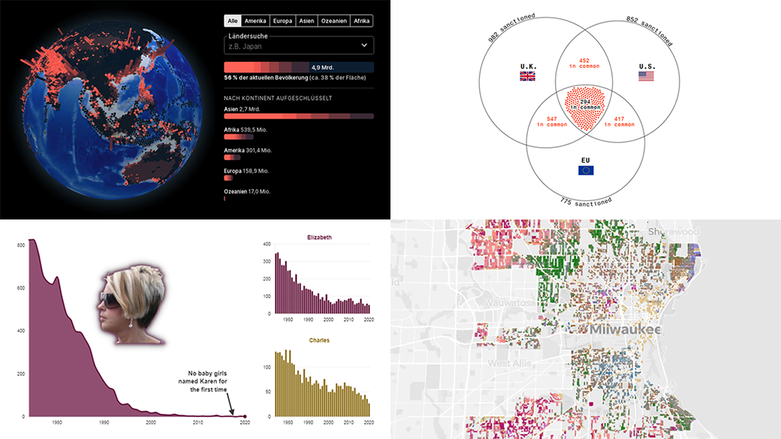
Uninhabitable Locations Worldwide by 2100
Extreme weather conditions caused by climate change may well make many places around the world inappropriate for normal human life by the end of the 21st century.
Berliner Morgenpost — namely Ida Flik, André Pätzold, and Benja Zehrsed — used a 3D globe to show the locations supposed to become uninhabitable within the next eight decades based on the likely most realistic scenarios that assume warming of 2.5-3°C by 2100. Those places are highlighted with red columns, with the height representing current populations in the corresponding area. When you scroll down the visual story, the globe will show you the impact of each of the four major factors one by one: excess heat, drought, sea level rise, and tropical cyclones.
Take a closer look and feel free to explore the globe for yourself using the interactive mode option.
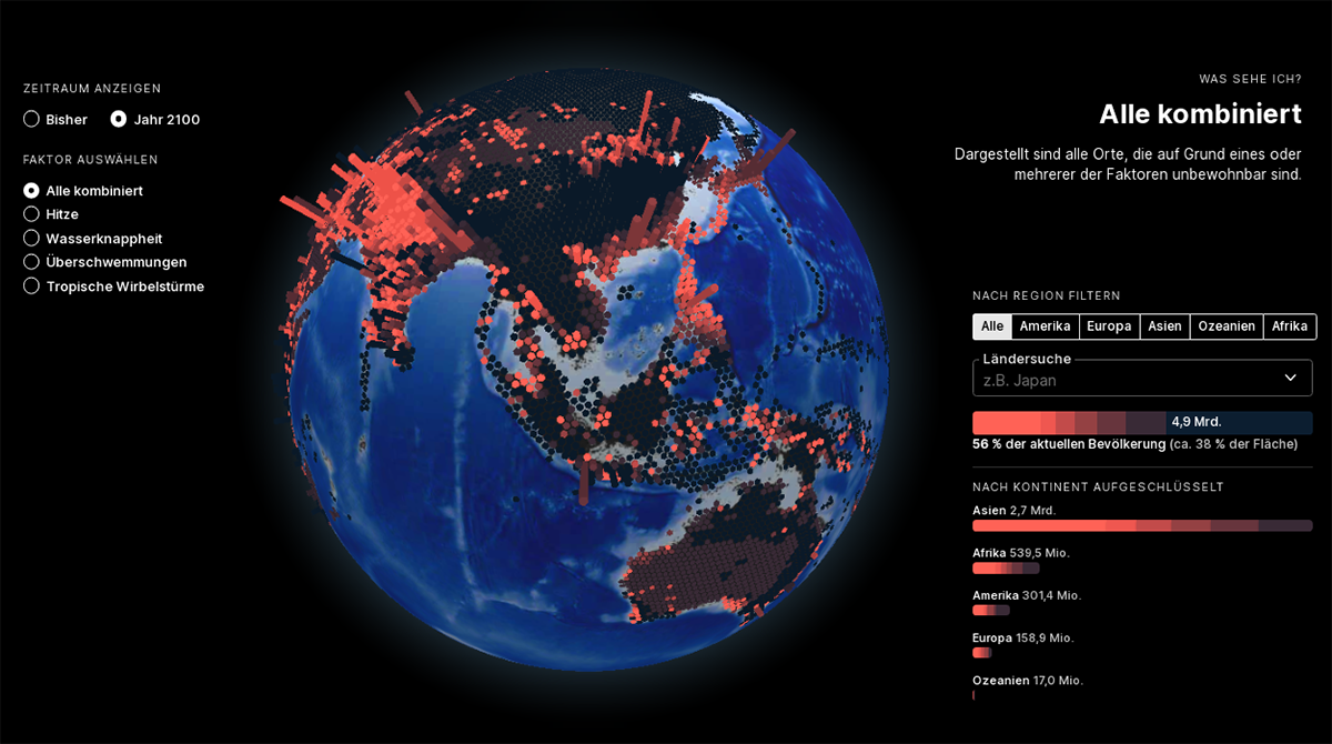
Sanctions Against Russian Oligarchs
The international community has made an attempt to isolate the Russian Federation from international finance, aiming to push its government to end the military operation in Ukraine. As a result of unprecedented measures, Russia is currently the most sanctioned country in the world. Nevertheless, the operation continues.
Bloomberg analyzed thousands of sanctions records and made several interesting revelations. For example, one month after February 24, half of the 20 richest people of Russia have not been sanctioned and are not legally restricted in operating their businesses around the world. There is also likely to be a lack of coordination between the United States, the United Kingdom, and the European Union as many of the personal sanctions do not overlap, which is greatly shown in a Venn diagram; experts say the divergences here may undermine the effectiveness of the global sanction actions.
Take a deep dive into the sanctions imposed on Russian oligarchs, with the help of data and graphics by Raeedah Wahid, Mira Rojanasakul, Marion Halftermeyer, and Alex McIntyre.
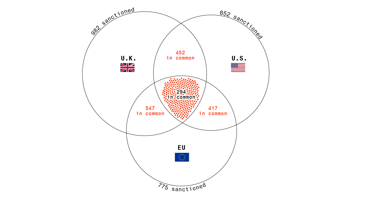
Baby Naming Trends in Scotland
Emma and David have been the most popular baby names in Scotland over the last almost five decades. And only a handful of baby girls are given the name Karen, which was so common in the 1970s.
The Courier published a wonderful piece providing an in-depth look at baby naming in Scotland based on data from National Records of Scotland going back to 1974. The article not only reveals general trends but also looks at the popularity of celebrity and royal names among others. Special attention is paid to the destiny of the name Karen in view of the Karen meme.
This is actually the first article in an amazing series. Make sure not to miss The Courier’s other fresh pieces about baby naming trends in Scotland and thank Lesley-Anne Kelly, Emma Morrice, and Joely Santa Cruz as their creators.
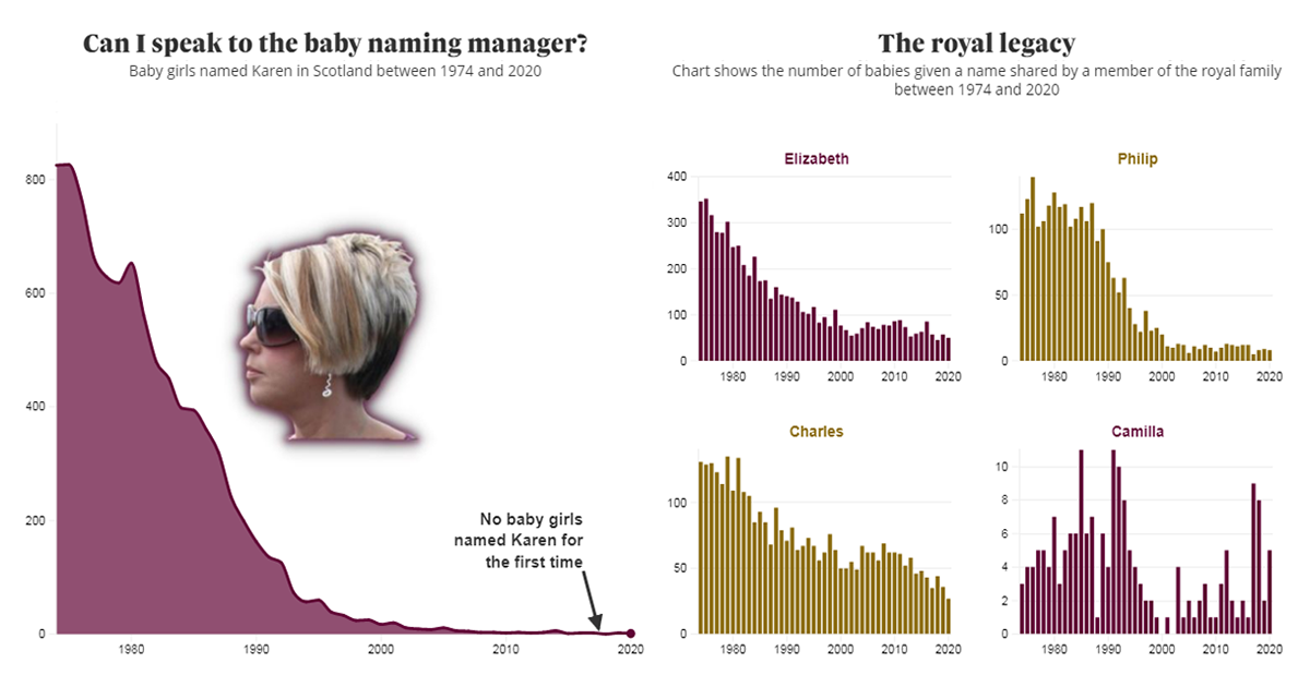
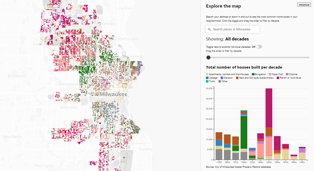
Milwaukee Architectural Home Styles
Housing patterns within a city often reflect not only aesthetic trends but also impacts of historical events. Look at Milwaukee, for example.
The Milwaukee Journal Sentinel offers a compelling visual story telling about the architectural styles of Milwaukee’s residential homes. With graphics by Erin Caughey and Yuriko Schumacher, it is based on data analysis carried out by John D. Johnson, a research fellow at Marquette University who dug into property records from the City Assessor’s Office. The piece is centered around a map that greatly helps communicate how architectural tastes have developed over time. At the end of the piece, you can explore the map for yourself — filter by decade, zoom in to a neighborhood, and so on.
Explore the urban history of Milwaukee through its many home styles.
***
These are lovely visualizations, aren’t they? Stay tuned for DataViz Weekly and get ready for even more great charts and maps from around the web!
- Categories: Data Visualization Weekly
- No Comments »