 DataViz Weekly is here with an overview of the top data graphics recently published around the internet! Today we are pleased to tell you about the following visualizations:
- Electric car models in comparison — Bloomberg Green
- Australia as 100 people (according to the 2021 census) — ABC News
- Human-caused wildfires in the U.S. around Independence Day — CNN
- 2022 Tour de France route — Reuters
Data Visualization Weekly: July 1, 2022 — July 8, 2022
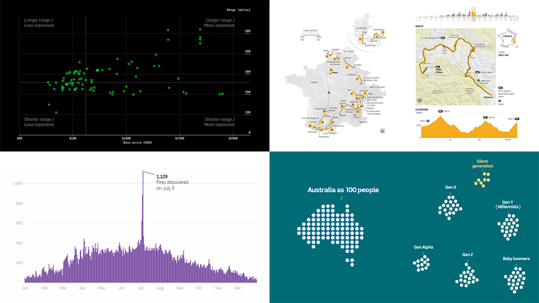
Electric Car Models in Comparison
There are dozens of electric car models already available on the market in the United States. So, which one is the best for both you and the planet?
Bloomberg’s journalists crunched various data on all models and build a dashboard that makes it easy to compare them. It all starts with a sortable table representing vehicle specifications along with climate friendliness ratings. Then comes an interactive scatter charting tool that plots some metrics against others to provide insight into whether the car’s weight affects the range, if greener EVs are necessarily more expensive, and so on.
See how the existing electric cars compare, in this interactive dashboard on Bloomberg Green designed and developed by Christopher Cannon, Luis Daniel, Julian Burgess, and Brittany Harris.
Australia as 100 People (2021 Census)
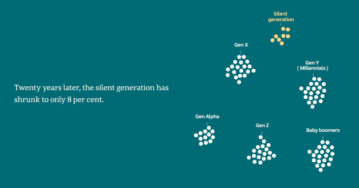
Census data can say a whole lot about a country and its people. Let’s look at Australia, for example. The Australian census is held every five years, and the results of the latest one taken in 2021 were published last week.
We have seen quite a few charts, maps, and infographics bringing to light the key points. You can easily find them out there as now you know what to look for. Just don’t miss out on how ABC News represented Australia as 100 people in a stunning scrollytelling piece, a fascinating way to help make sense of such complex data.
Find out what the 2021 data can tell us about the large and diverse country of Australia and how it is changing, on ABC News.
Human-Caused Wildfires in U.S. Around Independence Day
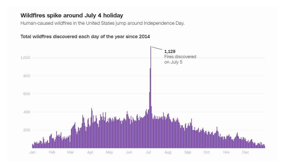
Simple charts may well be no less telling than complex visualizations. Look at that one.
CNN’s John Keefe visualized the U.S. National Interagency Fire Center’s data to show the daily number of human-caused fires since 2014. As you can see, there is a huge spike around the Fourth of July holiday. That’s why some cities even made tough decisions about their traditional firework shows on Independence Day around the United States.
Take a closer look at the graph and learn more on CNN.
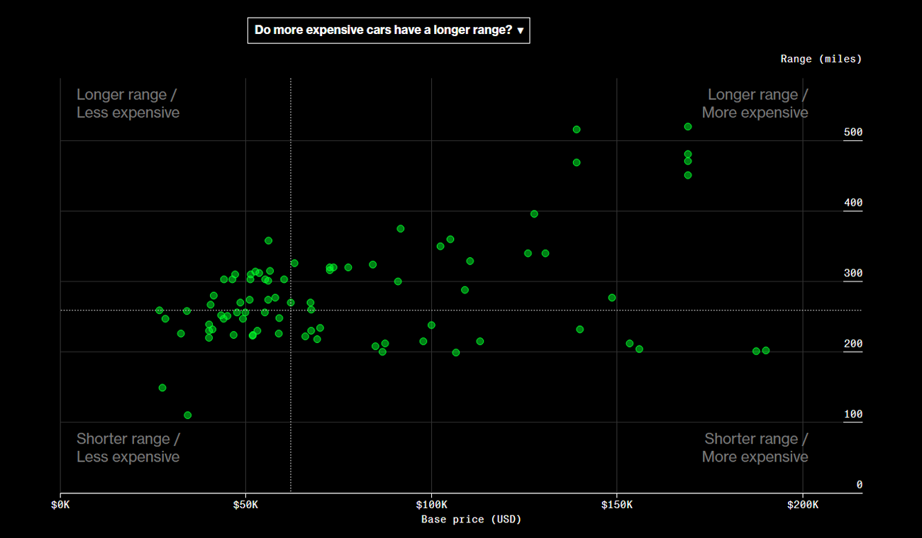
2022 Tour de France Route
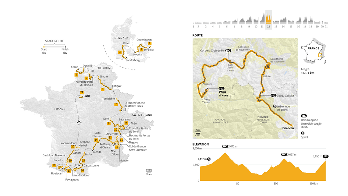
The 2022 Tour de France kicked off last Friday in Copenhagen, Denmark. The routes of some stages are set to take cyclists through Switzerland and Belgium. But for the most part, the race is primarily held in France, of course.
Reuters, namely Prasanta Kumar Dutta and Aditi Bhandari, delightfully mapped the entire route of this 109th edition of the Tour de France and the routes of all the 21 stages. Each stage is also provided with elevation profile charts that show at a glance how difficult individual parts of this one of the world’s most prestigious races are.
Check out the 2022 Tour de France route on Reuters. (By the way, last year’s route was nicely visualized along the awesome connector map tutorial on our blog.)
***
When you notice or create some amazing data visualization, drop us a line, and we’ll be more than happy to spread the word about it! Plus, that project may make it to a new DataViz Weekly roundup!
Meanwhile, just have a great time and stay tuned!
- Categories: Data Visualization Weekly
- No Comments »