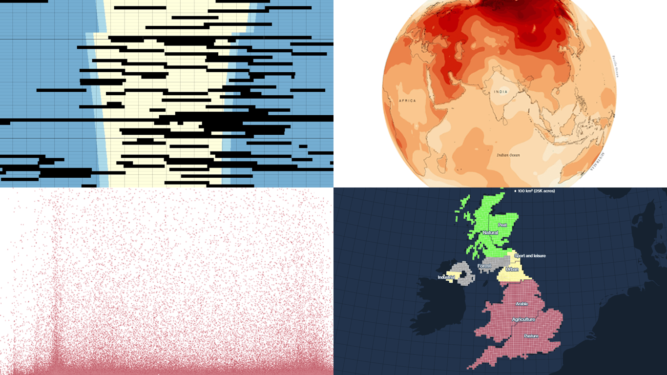
 It’s easier to analyze data when it is visualized in the form of a chart or a map. On DataViz Weekly, we share with you some vivid examples we have recently seen out there. Here’s our newest collection!
- Blackouts in Kyiv — Volodymyr Agafonkin
- Earth’s slowest-warming parts — The Washington Post
- Twitter Blue subscribers — The New York Times
- Land use in the United Kingdom — Bloomberg
Data Visualization Weekly: December 9, 2022 — December 16, 2022
Blackouts in Kyiv
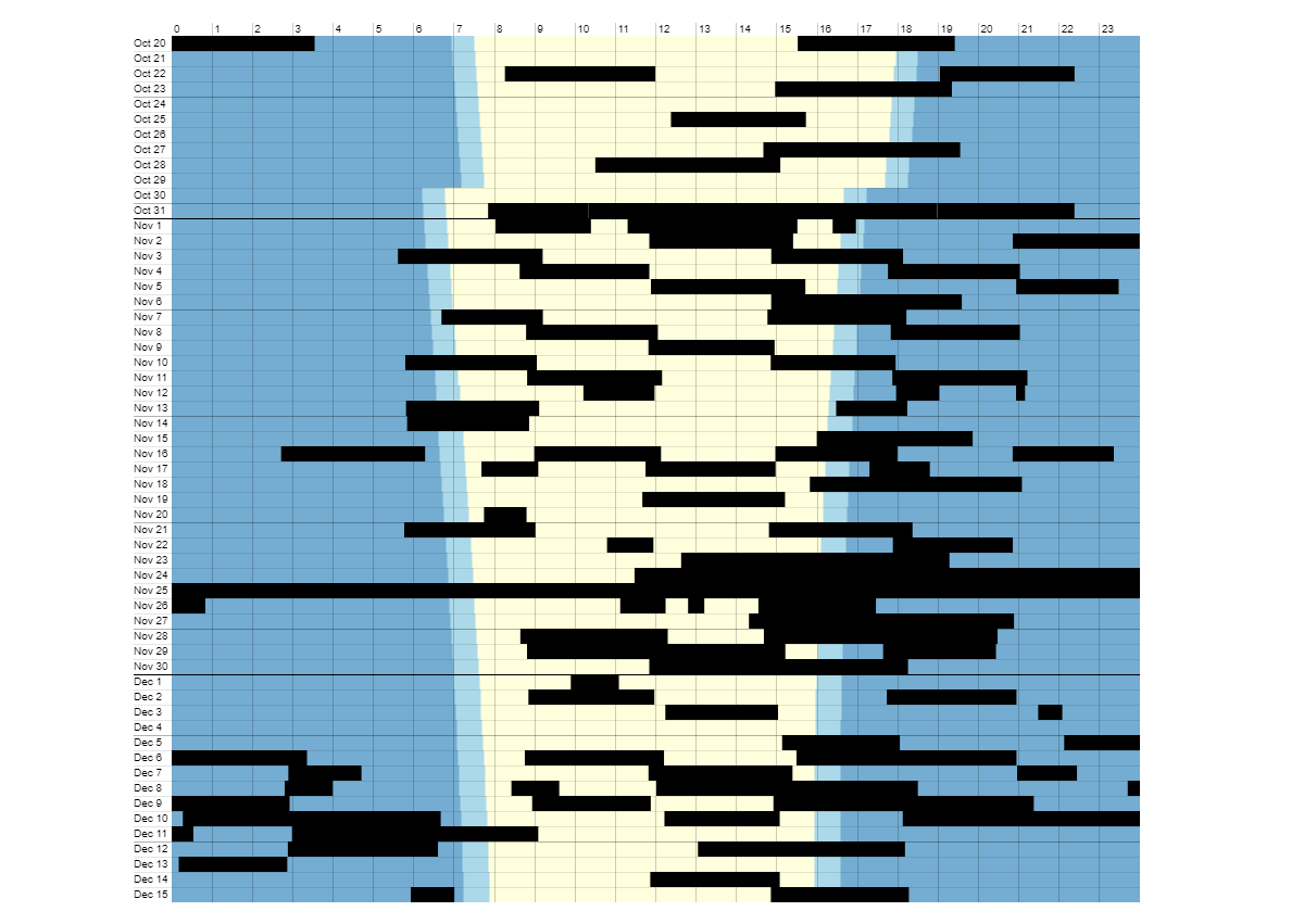
Russia continues massive strikes on Ukraine’s energy infrastructure. As a result, power outages are now part of Ukrainians’ daily life.
Volodymyr Agafonkin, living with his family in Kyiv, showed the scale of blackouts in the capital of Ukraine in the same graphical form as in his visualization of air raid alerts featured on DataViz Weekly in April. To represent power outages over the last two months, he used data from his own home security camera system’s logs. Rows are days, columns are hours during the day, and the background coloring provides the day-night context.
Explore the chart and find out how some patterns are explained, on Observable.
Slowest-Warming Parts of Earth
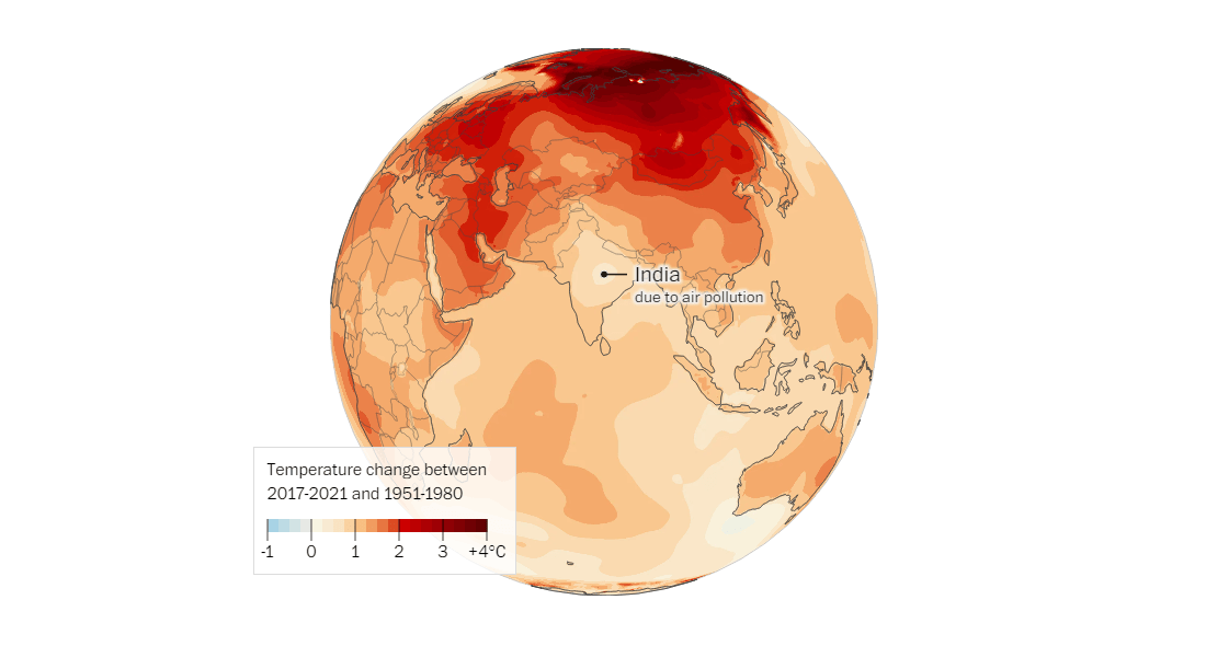
Some parts of our planet are warming more slowly than others. The reasons are surprising.
The Washington Post’s Niko Kommenda and Simon Ducroquet made several visualizations that show three areas that are weakly affected by climate change: East Antarctica, North Atlantic, and India. Those also represent why. According to scientists, wind circulation changes caused by the ozone hole above East Antarctica do not let cold polar air escape so easily as without them. Greenland’s melting ice cools down the North Atlantic waters. And intense air pollution in India blocks sunlight.
Check out the maps on The Post.
Twitter Blue Subscribers
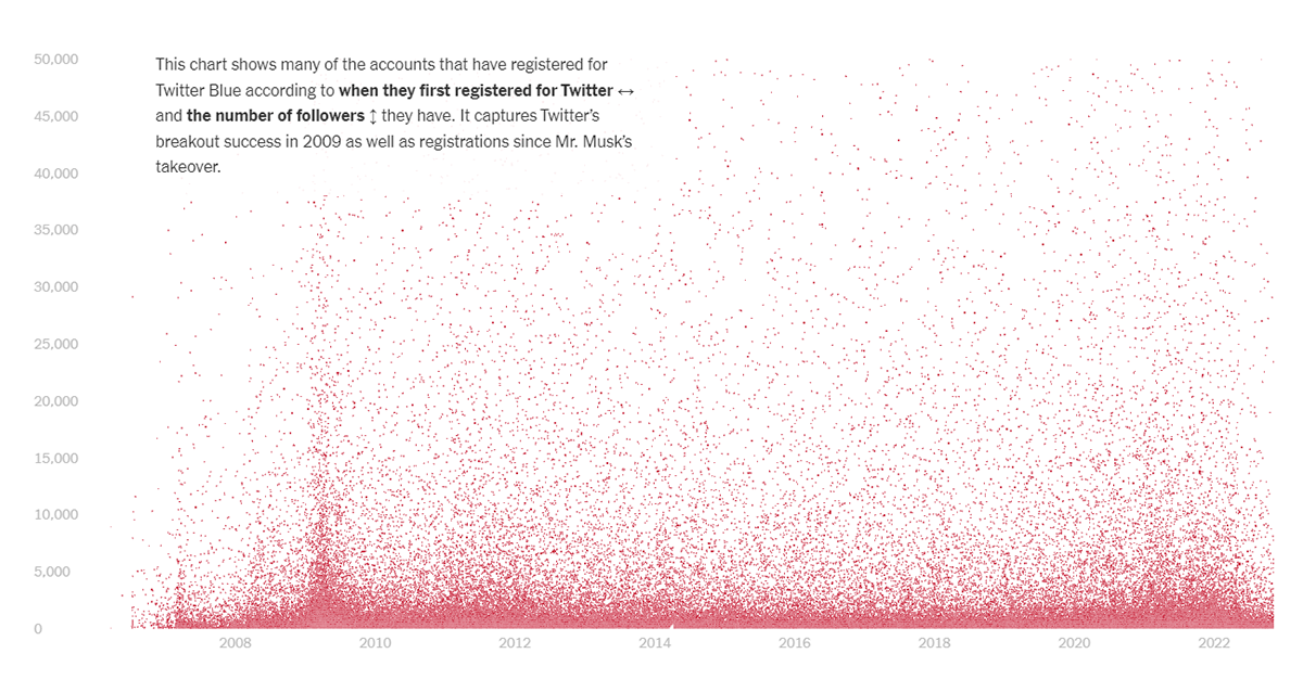
Previously, Twitter’s blue check mark was reserved for verified accounts of notable personalities. Recently, it has been added to the Twitter Blue subscription service as a premium feature.
The New York Times published a visual story where Stuart A. Thompson is looking into who is now paying for Twitter. The article centers around a scatter chart visualizing data from Berlin-based developer Travis Brown. The dots are paid accounts plotted according to their registration date (the X axis) and follower counts (the Y axis). As you scroll, the chart gets zoomed in and out to let you learn about patterns and some individual Twitter Blue subscribers.
See the piece on the NYT.
Land Use in United Kingdom
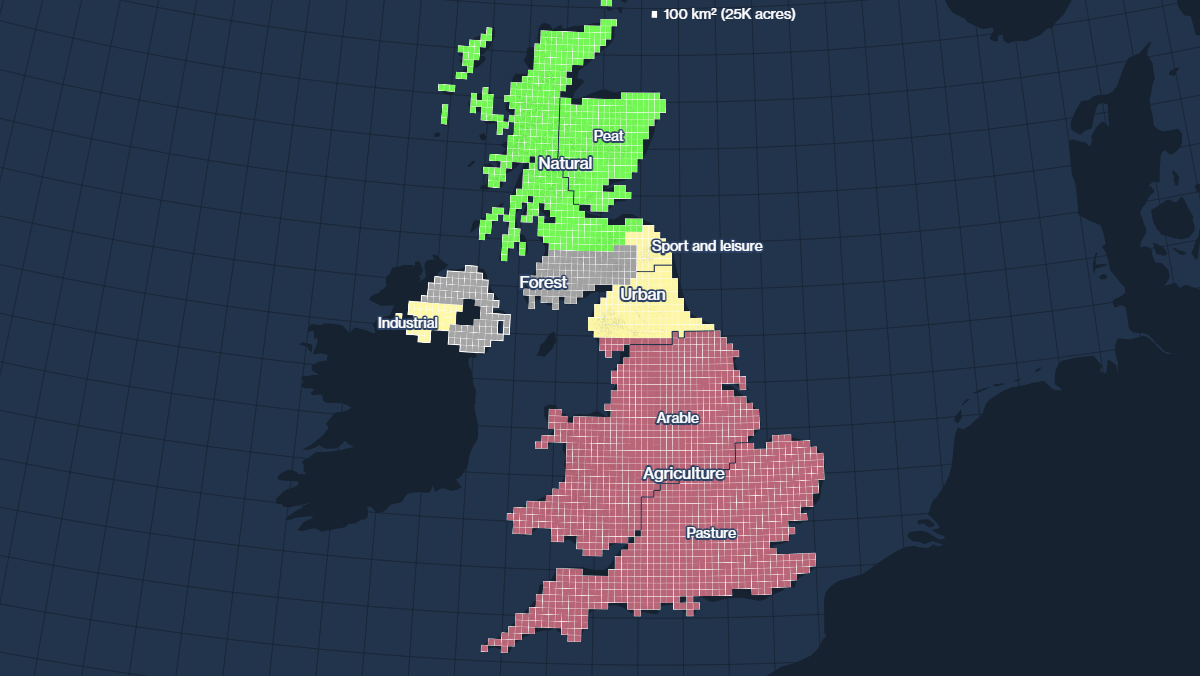
The United Kingdom does not have much land. But it is the sixth-largest economy in the world.
Bloomberg’s Nicholas Larkin, Hayley Warren, and Tim Coulter delved into how the U.K. uses its land. Their interactive begins with a general view (you can see the initial map above). Scrolling takes you to the details, including ownership and income.
Look at this map-based story on Bloomberg.
***
Check out previous editions of Data Visualization Weekly to see even more examples of charting and mapping in action. And Stay tuned!
- Categories: Data Visualization Weekly
- No Comments »