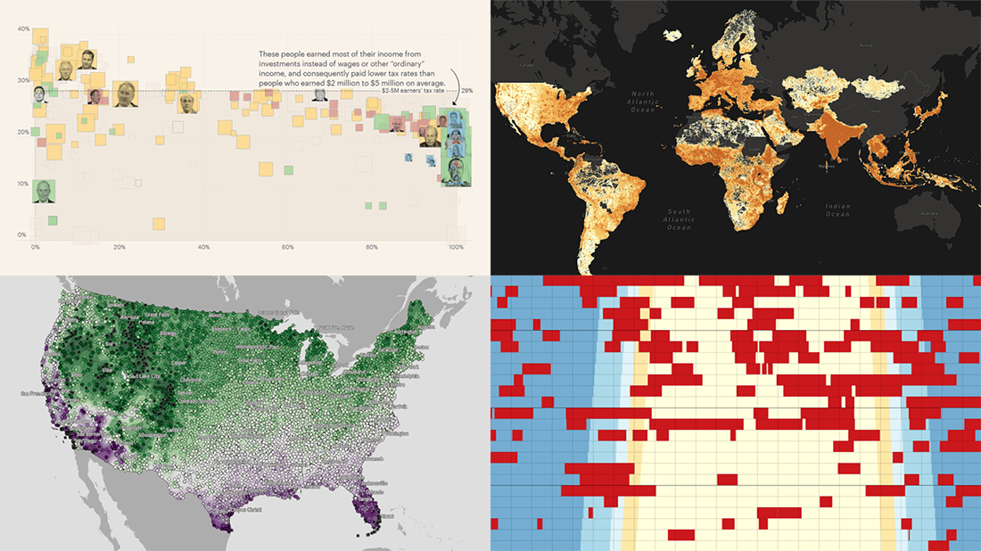
 Every day, a number of cool visualizations on various topics come out here and there. DataViz Weekly is designed to tell you about those that have caught our special attention most recently. This Friday, we invite you to take a close look at the following:
- Air raid sirens across Ukraine — Volodymyr Agafonkin
- Population density around the globe at a 30-meter resolution — Stamen
- America’s wealthiest people and their taxes — ProPublica
- Average date of the last spring freeze across the U.S. — Climate.gov
Data Visualization Weekly: April 8, 2022 — April 15, 2022
Air Raid Sirens Across Ukraine
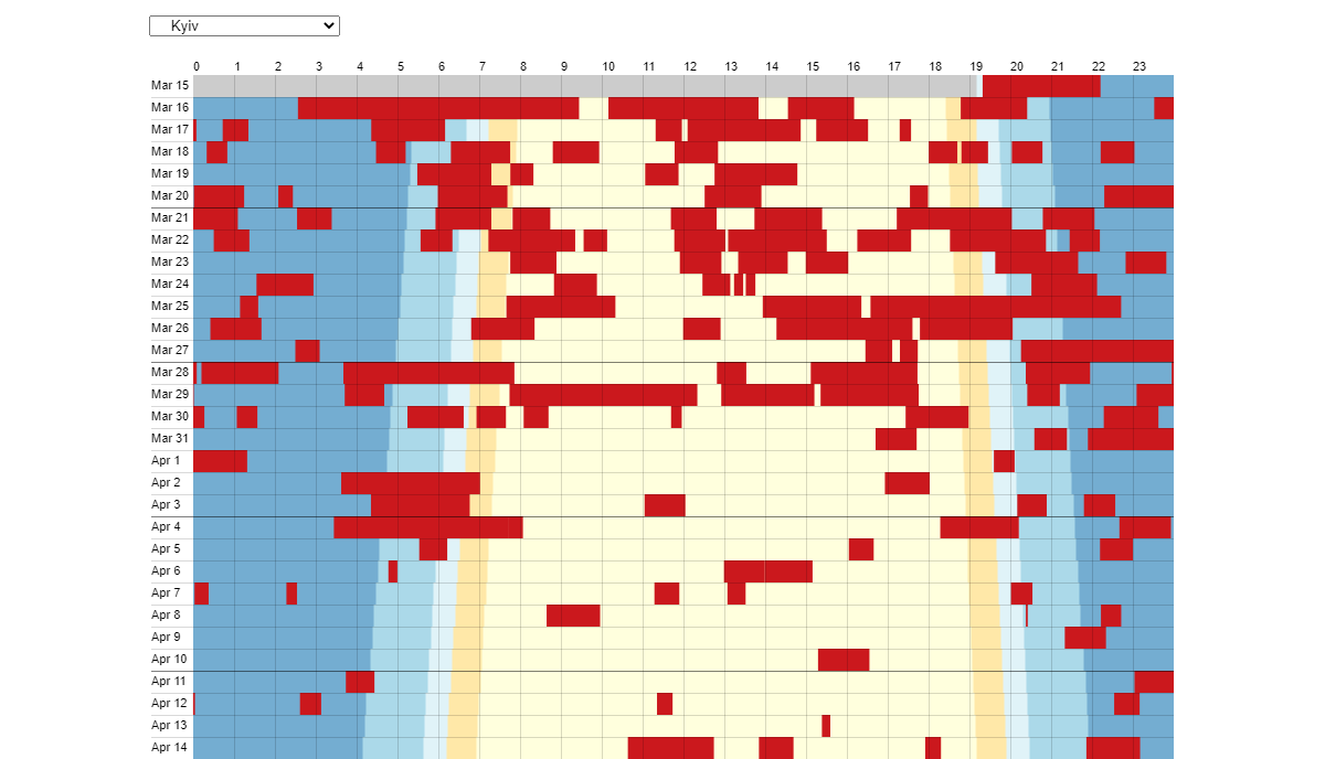
The frightening sound of air raid sirens, warning of possible imminent attacks from the air, has become a daily norm for Ukrainians.
Volodymyr Agafonkin decided to explore alert patterns across the country’s regions by the time of the day. So he scraped data about the sirens from the Air Alert (“Повітряна тривога” in Ukrainian) channel on Telegram and represented it graphically in a schedule-like timeline visualization displaying days as rows and hours as columns. The ongoing air raid sirens are shown as red blocks. The background color adds the day-night context.
The visualization is available on Observable and updated on a regular basis. Select a region or a city and look at the timeline of the air raid sirens in it.
World Population Density
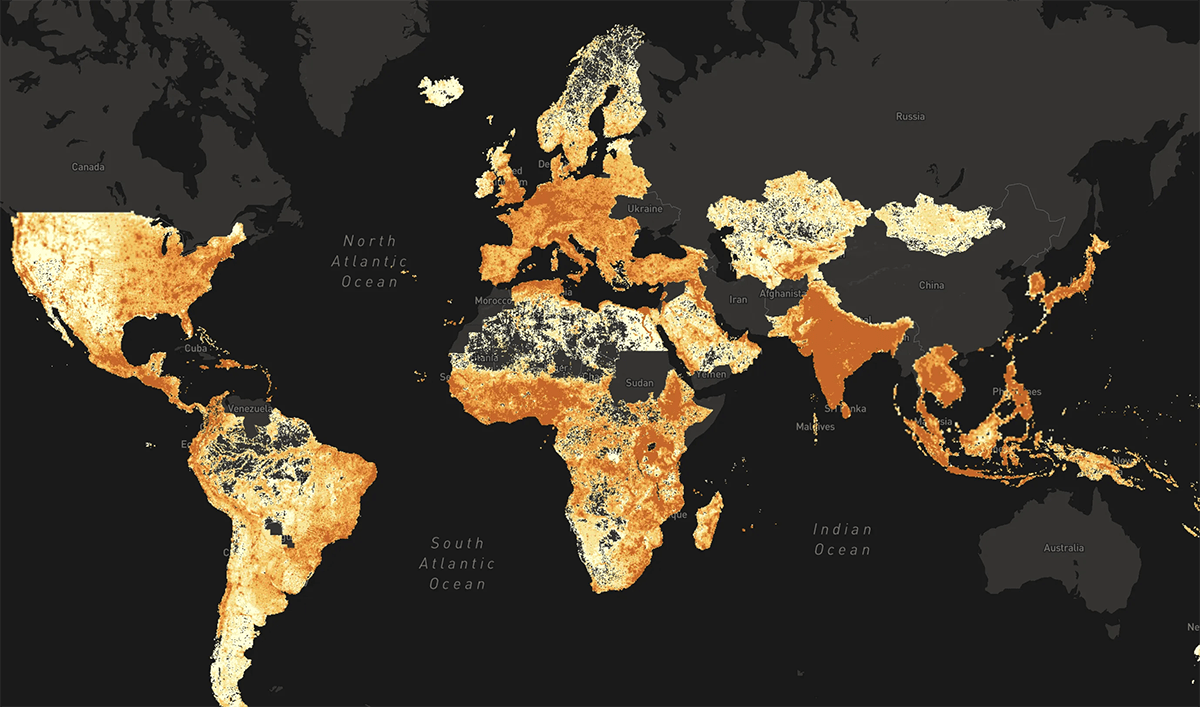
Data for Good at Meta got a new interactive mapping tool for its High Resolution Settlement Layer (HRSL) dataset, which provides a stunning way to explore global population density in very detail.
Called Population Density Explorer and developed by Stamen, the visualization makes it easy to see where people live and are concentrated and to view summary stats on basic demographics like age and gender for one territory or another. The underlying data covers over 160 countries and comprises not precise population counts but estimates calculated using satellite imagery and AI algorithms.
Check out the resulting map showing population density around the world at a 30-meter resolution.
America’s Wealthiest People and Their Taxes
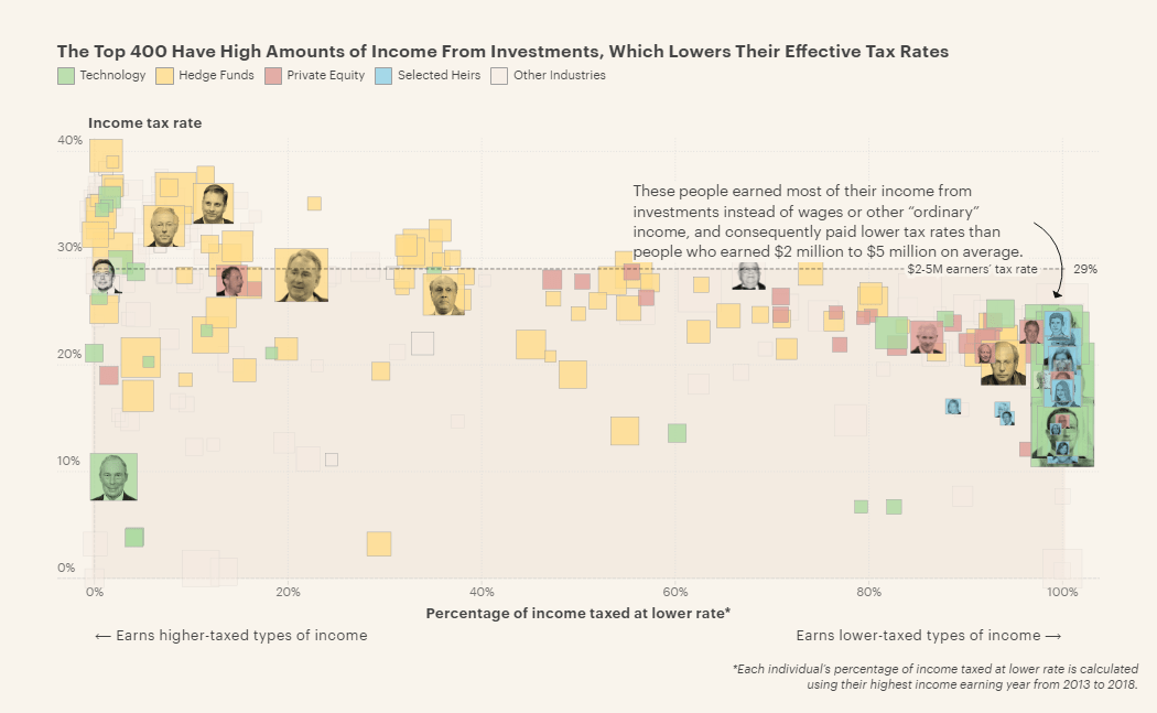
Last year, ProPublica managed to obtain a vast trove of Internal Revenue Service (IRS) information on the taxes and income of the 400 richest Americans. That data reveals, for example, that although the U.S. tax system is designed to make the highest earners pay higher tax rates than all the rest, it does not always work just like that.
A few days ago, ProPublica posted a remarkable visual story based on that dataset, which offers an interactive tour of the earnings and taxes of the wealthiest people in America from 2013 to 2018. It also looks at the factors driving lower tax rates for those with the highest incomes.
Compare how much the rich earned and paid in taxes, and note how (and why) that varies.
Average Date of Last Spring Freeze Across U.S.
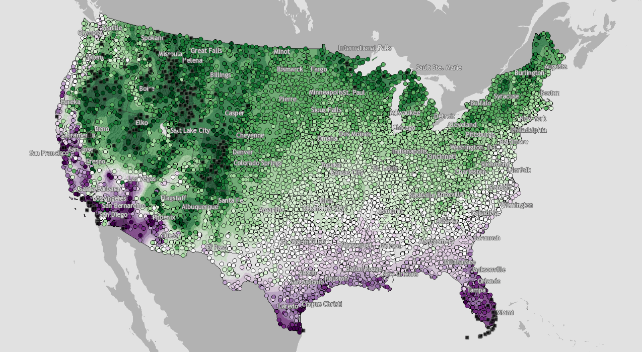
The calendar spring began on March 1. Many places around the United States, however, are still experiencing freezing air temperatures.
Climate.gov shared a cool interactive map that shows when spring could be expected to come in reality. Based on data from the 1991–2020 U.S. Climate Normals from the NOAA’s National Centers for Environmental Information (NCEI), the visualization shows the average date when the chances of freezing air temperatures drop below 50%. Each colored dot is a weather station. Click on one to see the exact date.
Find out what the historical temperature data says on when the last freeze occurs and real spring begins across the U.S.
***
Don’t miss a cool chart or map — stay tuned for Data Visualization Weekly.
- Categories: Data Visualization Weekly
- No Comments »