November 5th, 2021 by AnyChart Team
 Ready for a new portion of amazing charts and maps for inspiration? We’ve got it for you right here! Join us today on DataViz Weekly as we look at four new visualizations that definitely deserve your attention.
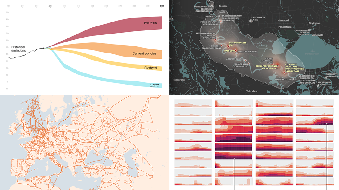
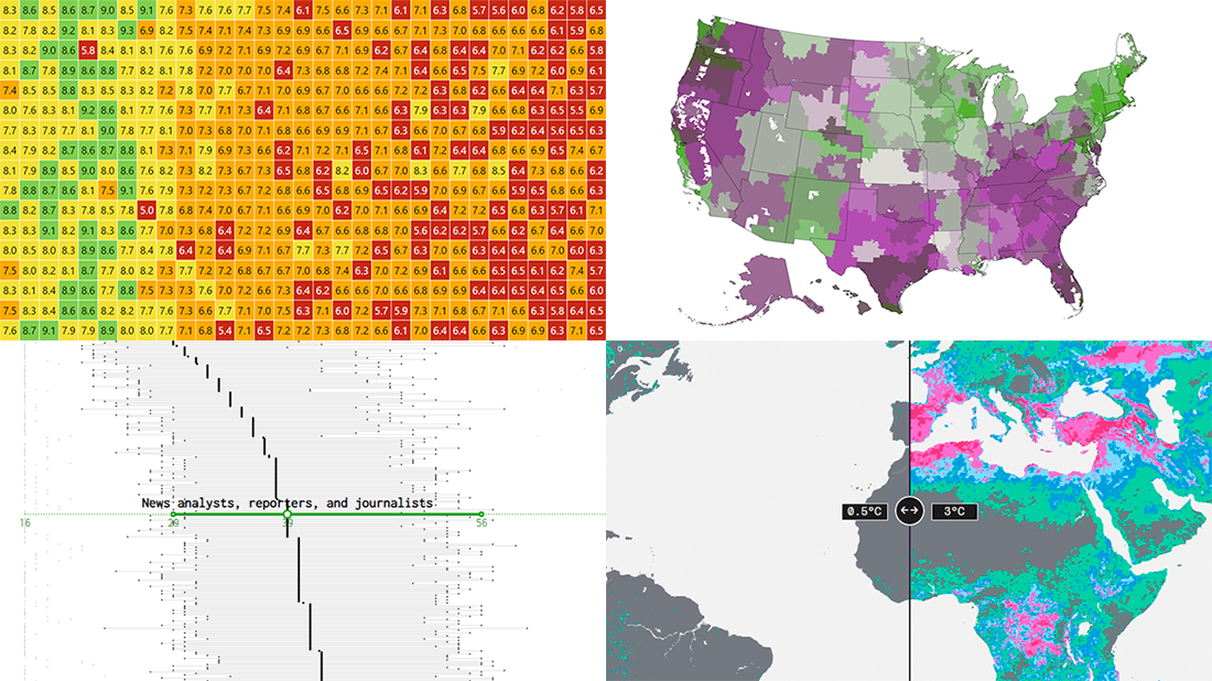
- Greenhouse gas emission pathways and climate goals — The New York Times
- U.S. drought extent patterns by region since 2000 — Scientific American
- Cancer-causing industrial air pollution across the United States — ProPublica
- European natural gas pipeline infrastructure — The Financial Times
Read more »
October 29th, 2021 by AnyChart Team
 Welcome back to DataViz Weekly, a regular series of posts on AnyChart Blog putting a spotlight on the coolest data visualization works we have come across over the last few days! Today, we’re glad to feature and tell you about the following projects:
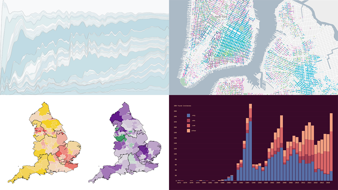
- Mapping historical New York City — Columbia University
- Tracking the Lenna image — The Pudding
- Analyzing the number of doctors in England — Sky News
- Charting TV genres over time — Nathan Yau
Read more »
October 22nd, 2021 by AnyChart Team
 It’s time for DataViz Weekly! Check out the most interesting data visualizations that have recently come to our attention!
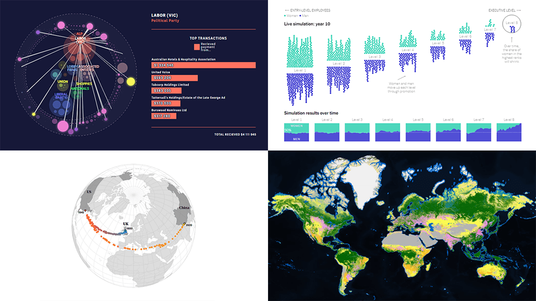
- Political donations from the gambling industry in Australia — ABC News
- Land cover worldwide — ESA
- Gender bias in the workplace — NYT Opinion
- World’s carbon “center of gravity” from 1800 through 2020 — The Guardian
Read more »
October 20th, 2021 by Shachee Swadia
 This article presents an easy-to-follow guide for building an interactive linear gauge chart in JavaScript.
We’ll show how to quickly create a cool and interactive linear gauge chart that highlights Covid-19 vaccination data around the world. Our chart will allow us to visualize the status of Covid-19 vaccination at the time of writing, and will display two types of data — showing how far away we are from the halfway target of both partially and fully vaccinating the global population.
Read the JS charting tutorial »
October 15th, 2021 by AnyChart Team
 When properly visualized, data can truly speak and tell stories allowing us to quickly decode what raw numbers hide. Would you like to see some clever examples? Look at the awesome new charts and maps that made it to this Friday’s DataViz Weekly!
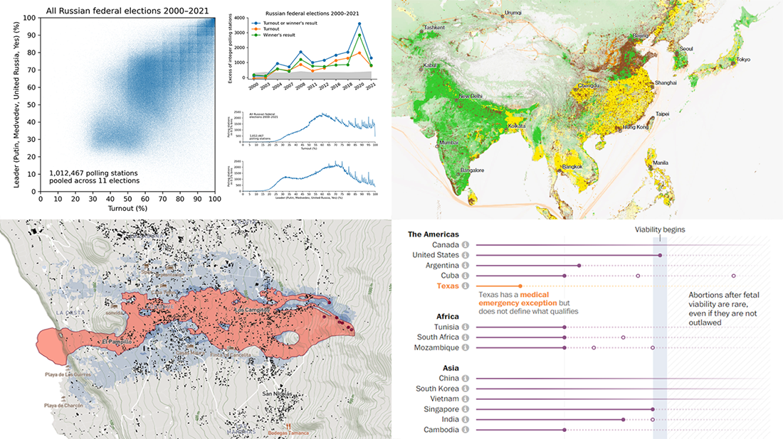
- All Russian federal elections since 2000 — Dmitry Kobak and Sergey Shpilkin
- Advance of the lava in La Palma — El País
- Abortion laws worldwide — The Washington Post
- Global methane emissions — Bloomberg Green
Read more »
October 8th, 2021 by AnyChart Team
 For all who already have an eye for data visualization or only want to get it, DataViz Weekly is here with an overview of four new interesting projects curated from around the web!
- U.S. jobs by age of workers — Nathan Yau
- Probable climate futures based on different scenarios — Probable Futures
- Average IMDb scores of all TV series by episode — Jim Vallandingham
- Vaccination vs hospitalization rates across the United States — The Washington Post
Read on to learn more about each and check them out!
Read more »
October 4th, 2021 by Shachee Swadia
 Data visualization is not only useful for communicating insights but also helpful for data exploration. There are a whole lot of different chart types that are widely used for identifying patterns in data. One of the lesser-used chart types is Word Tree. It is a very interesting visualization form, quite effective in analyzing texts. And right now, I will teach you how to quickly create nice interactive word tree charts using JavaScript.
Word trees display how a set of selected words are connected to other words in text data with a branching layout. These charts are similar to word clouds where words that occur more frequently are shown bigger. But they are different in the sense that word trees also show the connection between the words, which adds context and helps find patterns.
In this tutorial, I will create a lovely word tree from the text of the very famous book The Little Prince by French aviator and writer Antoine de Saint-Exupéry. Check out a demonstration of the final chart below and keep reading to learn how this and any other interactive JS word tree can be built with ease.
Read the JS charting tutorial »
October 1st, 2021 by AnyChart Team
 Looking for awesome examples of visual data stories? You’re in the right place at the right time! In this edition of DataViz Weekly, we feature four impressive new ones we’ve come across these days:
- Sexual violence crisis in Singapore — Kontinentalist
- Climate change in the Arctic and beyond — Woodwell Climate Research Center
- Melting glaciers as vanishing climate archives — Reuters
- All 12+ million buildings in Spain by height — elDiario.es
Read more »
September 29th, 2021 by AnyChart Team
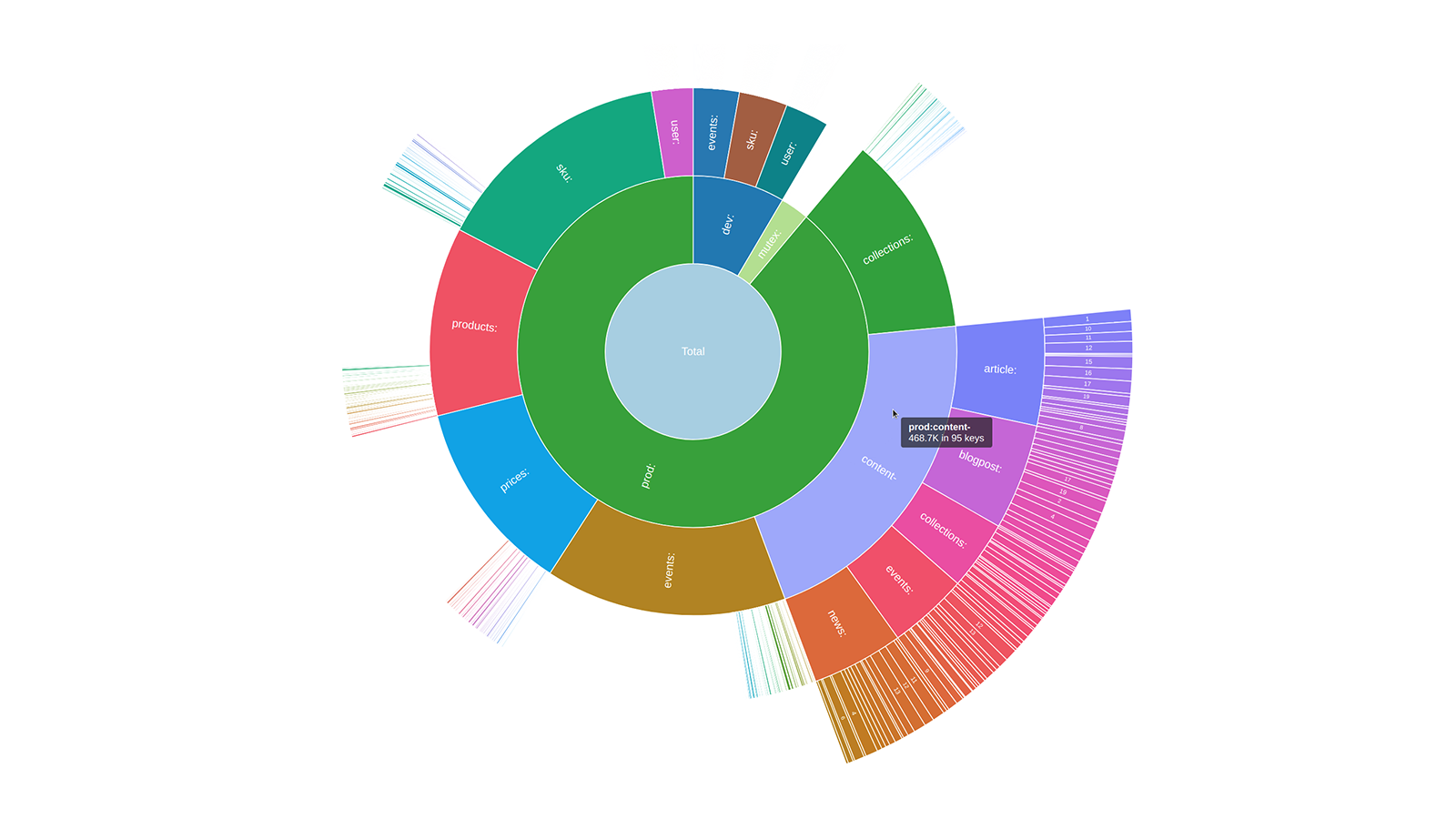 Sunburst charts are known to be greatly useful for visualizing hierarchical data structures. So it is no surprise that this chart type became a big hit among our users immediately after we added it to the AnyChart JavaScript library. Because the core of our global customer base is enterprise clients, most of the real-world use cases for our JS sunburst chart are hidden in internal corporate apps. But AnyChart is often picked for data visualization in open projects as well, and we invite you to see a super cool example we have recently found out about — Redis Inventory. It is an open-source tool that makes it easy to view Redis memory usage by key patterns in a hierarchical way, with an interactive sunburst chart in action.
Learn more about Redis Inventory and how AnyChart is used there from our quick interview with its creator Aleksandr Obukhov. (Stack: Go/Cobra/Redis.)
Read more »
September 24th, 2021 by AnyChart Team
 Hey everyone! It is Friday, and we are here to put a spotlight on the most compelling examples of sensible data visualization we have recently seen around the internet. As always, let’s start with a quick list and then look at each project. All aboard for DataViz Weekly!
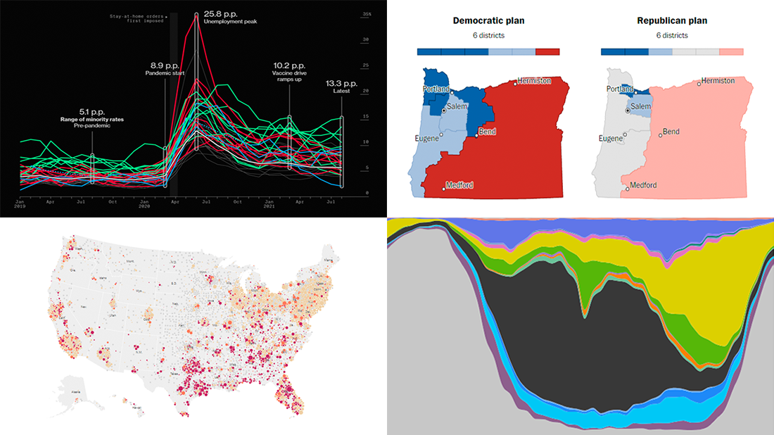
- Intensive care unit occupancy rates in the United States — The New York Times
- Minority unemployment rates in 15 large U.S. cities. — Bloomberg
- Early proposals for congressional redistricting in Oregon, Indiana, and Colorado — The Washington Post
- Time use of American men and women by employment status — Nathan Yau
Read more »