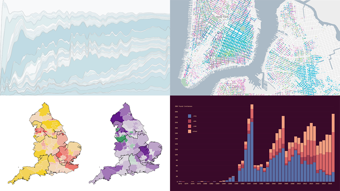
 Welcome back to DataViz Weekly, a regular series of posts on AnyChart Blog putting a spotlight on the coolest data visualization works we have come across over the last few days! Today, we’re glad to feature and tell you about the following projects:
- Mapping historical New York City — Columbia University
- Tracking the Lenna image — The Pudding
- Analyzing the number of doctors in England — Sky News
- Charting TV genres over time — Nathan Yau
Data Visualization Weekly: October 22, 2021 — October 29, 2021
Historical New York City
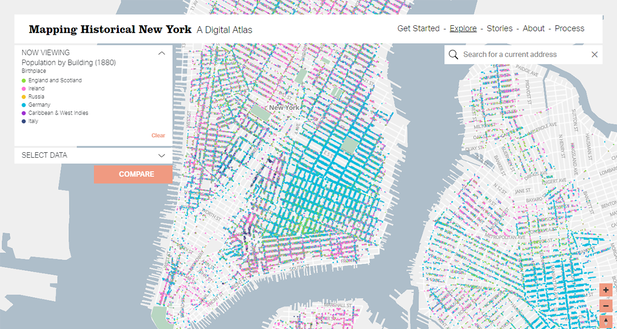
Affected by mass immigration and industrialization, New York City greatly changed between the mid-19th and early 20th centuries. A new awesome historical map built within the framework of a multi-year project carried out at Columbia University provides an at-a-glance view of the shifts.
Visualizing data from 1950, 1880, and 1910 census records, the map represents each counted person at their home location. In this way, it gives a unique opportunity to explore the population and residential landscape of the city by age, gender, race, job, and even country of birth. In addition, the project features several case studies that greatly demonstrate how selected demographic data can be shown to tell stories about different aspects of the history of New York.
Titled Mapping Historical New York: A Digital Atlas, the project was created by Columbia University’s History Department and the Center for Spatial Research at the Graduate School of Architecture Planning and Preservation (GSAPP). The authors are going to expand it by adding the 1940 census data in the near future.
Lenna Image
![]()
Everyone who has studied image processing is very likely to have encountered Lenna. This picture from Playboy’s November 1972 issue has actually become sort of an icon in the engineering world, living on without its subject’s consent and despite copyright claims.
Jennifer Ding, with Michelle McGhee and Jan Diehm, created an amazing essay that digs into the story of this phenomenon with the help of data. In the article, a stacked bar chart is used to visualize the number of instances of Lenna on the internet over time from a special dataset obtained for this project by scraping Google Scholar, search, and reverse image search results.
Without more ado, go ahead and check out this new excellent piece of visual data storytelling on The Pudding.
Number of Doctors in England
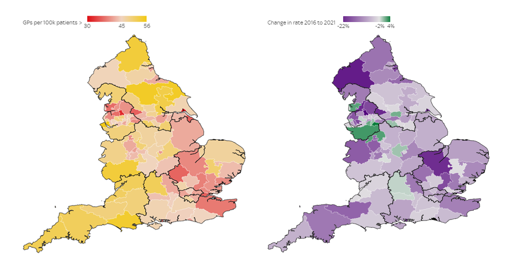
In England, there are fewer family doctors now than five years ago. At the same time, the current demand is quite above pre-pandemic levels. These are the key findings of a recent analysis carried out by Carmen Aguilar Garcia and Ganesh Rao, data journalists at Sky News.
The results of the analysis are presented in an impressive story narrated with the help of a number of interesting data visualizations. First, interactive maps make it easy to explore the situation across the country and spot areas with the biggest drops in the number of GPs, both in absolute values and per 100,000 population. Then, there are other graphics displaying what else was revealed by the study, including the gap between the most and least deprived regions, changes in face-to-face appointment rates, and more.
See the piece on Sky News.
TV Genres Over Time
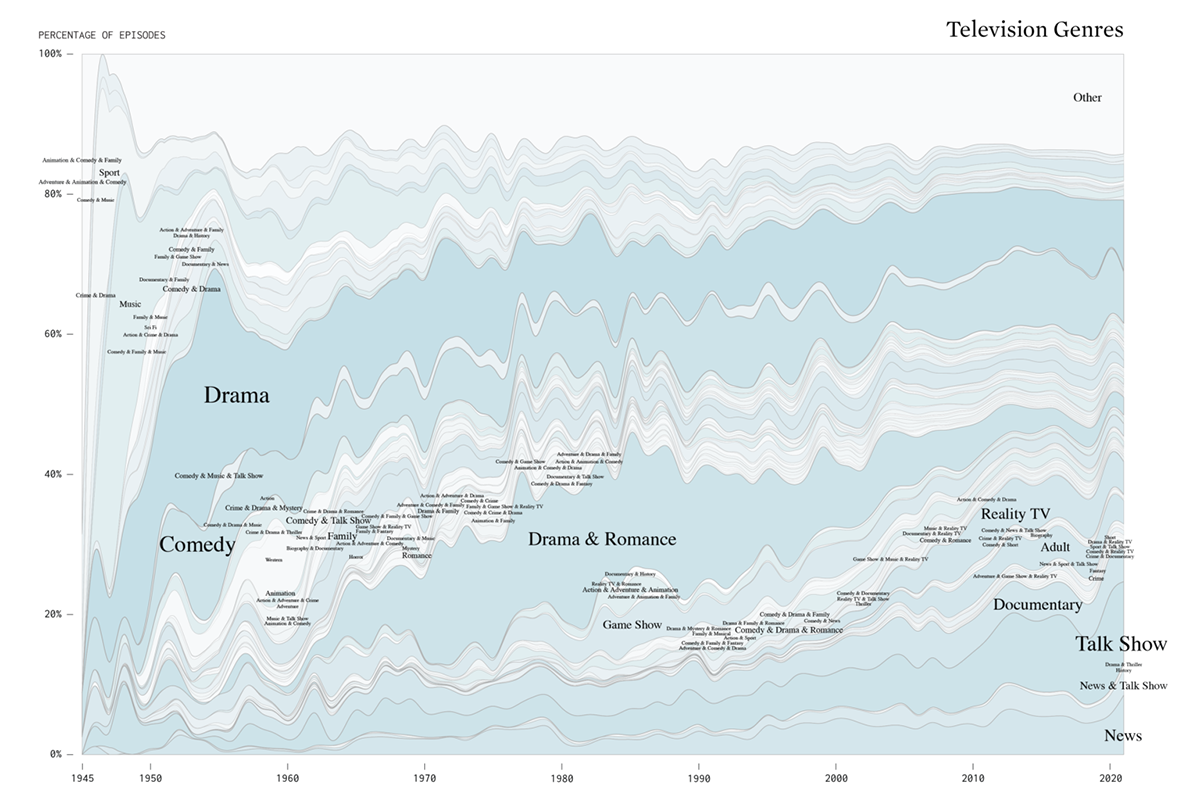
Before you head into the weekend time, here is one more thing we would like to show you.
Using data from IMDb, Nathan Yau charted the distribution of genres across all TV show episodes since 1945. His 100% stacked area graph shared this week greatly displays how the percentage of comedy, drama, sport, science fiction, biography, and others has been changing over time, for the last more than 70 years. Below the aggregate chart, you will find individual visualizations for each genre to be able to better identify up and down movements.
Check this out on FlowingData.
***
Your time is priceless and we are more than happy you’ve spent a small part of it with us on our blog. Hope to see you back soon!
- Categories: Data Visualization Weekly
- No Comments »