September 5th, 2023 by Shachee Swadia
 Chances are, you’ve come across various stock charts, whether you’re a seasoned trader or not. If crafting your data graphics piques your interest, you’re in the right place. Welcome to this user-friendly tutorial on building an interactive stock chart using JavaScript!
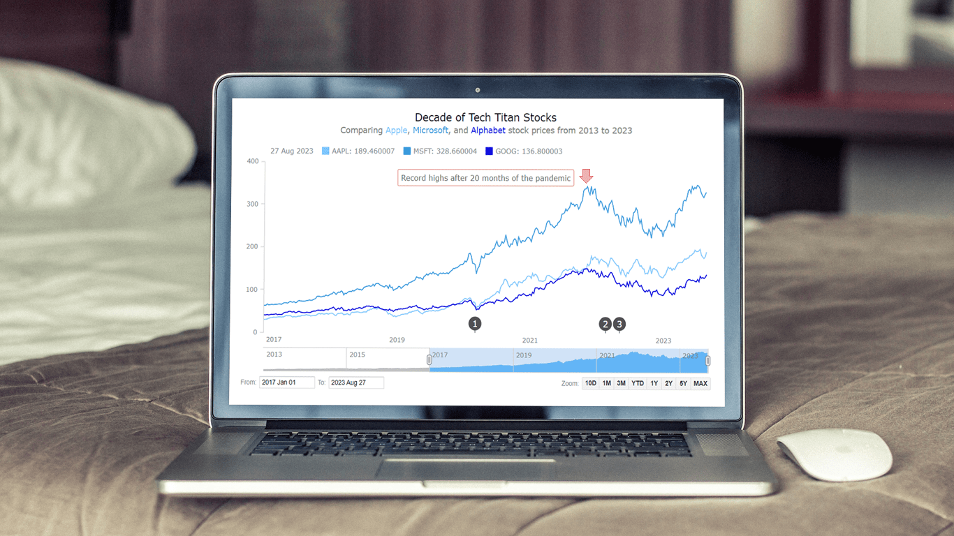
The JS stock chart we’ll create by the end of this guide will visually compare stock prices for three tech giants — Apple, Microsoft, and Google (Alphabet) — over the past decade. It’s a robust example to illustrate the stock charting process and the power of market data visualization.
So, hop on board as we explore the world of stock charts and learn how to create one from scratch.
Read the JS charting tutorial »
August 22nd, 2023 by AnyChart Team
 We’re thrilled to introduce YODA — Your Own Documents Assistant! It’s our brand new, AI-driven extension for Qlik Sense designed to augment your data journey when using Qlik. And we invite you to join its public debut at QlikWorld Tour 2023!
With YODA, you can seamlessly extract insights from various documents like contracts, corporate policies, and meeting notes directly within your Qlik reports, using natural language interactions.
Read more at qlik.anychart.com »
August 17th, 2023 by Nick Gogin
 From clocks to weight scales, speedometers to thermostats, and even the battery charge icon on your phone, Gauge Charts are widely used to represent a value on a scale or range, providing a clear visual indication of the represented measurement. Gauges can be circular or linear, and in this article, our focus will be on the latter style. I will guide you on how to create a cool linear gauge using JavaScript.
Specifically, we will explore the demonstration of linear gauges using an example of a real-time typing speed test. Throughout the article, we will delve into the structure of linear gauges, discuss styling options, explore how they can be connected to data, and show how you can easily build your Linear Gauges using JavaScript in just a matter of minutes. By the end of the tutorial, you’ll have an awesome example of a linear gauge used to dynamically illustrate typing speed test results or whichever data you want.
So, let’s dive in and elevate your web-based interactive data visualization game!
Read the JS charting tutorial »
August 14th, 2023 by AnyChart Team
 The world’s leader in data visualization, AnyChart has a proven track record of empowering enterprises with robust charting solutions. However, the true essence of AnyChart lies in its versatility — it extends beyond corporate analytics, to making data meaningful in our everyday lives.
For example, meet William Dibbern, an Engineering Manager based in Chicago, who ingeniously applied our JavaScript charting library to his upcoming wedding plans, turning them into a heartfelt blend of technology and emotion.
Join us for an insightful interview with Will as we delve into his journey, exploring how he harnessed the power of AnyChart JS Charts to craft a delightful experience that celebrates love and data in a refreshingly personal way.
Read more »
August 10th, 2023 by AnyChart Team
 Get ready to dive into an exceptional data experience at QlikWorld Tour 2023! We at AnyChart are super stoked to be part of this epic roadshow as proud sponsors and warmly invite you to join us in one of the participating U.S. cities:
- Dallas (The Star in Frisco) — August 10
- San Francisco (Oracle Park) — August 24
- New York (Pier60 at Chelsea Pier) — September 18
- Atlanta (College Football Hall of Fame) — September 20
Spoiler alert: The star of the show will be our first-ever presentation of YODA — Your Own Documents Assistant, the newest, groundbreaking, AI-driven extension for Qlik Sense. Be among the first to witness its power!
Read more at qlik.anychart.com »
August 1st, 2023 by Awan Shrestha
 Do you want to turn that data chaos into a comprehensible data show? Look no further than data visualization! And let me tell you, one chart to rule them all is the bubble chart. It's like blowing bubbles at your data and watching them pop into understanding! And the best part? With JavaScript, you can easily create an interactive bubble chart, and I will show you how!
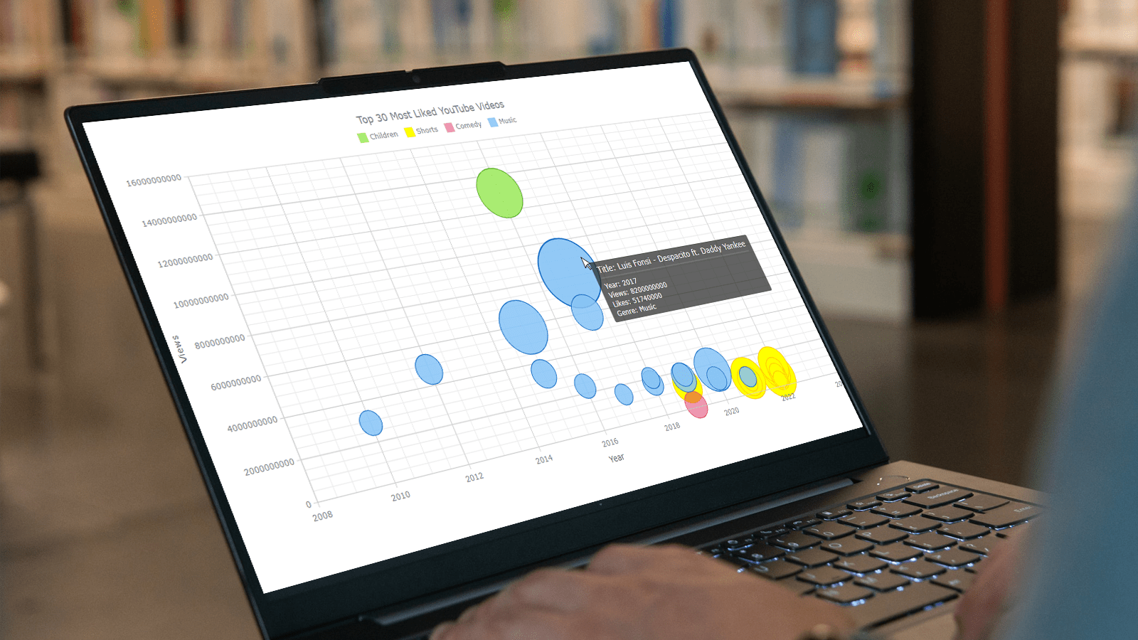
Bubble charts are versatile data visualizations that display data points in the form of bubbles, where the bubbles' size, color, and position represent different variables. In this tutorial, I'll walk you through building these graphics step by step, making the process a breeze. For illustration, we'll take data on the popularity of various YouTube videos and use JavaScript to create an interactive bubble chart showcasing the top 30 most-liked videos of all time, categorized by year of release, views, and likes.
By the end of this tutorial, you'll be able to create visually-stunning JS-based bubble charts without any hassle. So let's dive into the world of data bubbles and turn numbers into a visual feast for the eyes!
Read the JS charting tutorial »
July 11th, 2023 by Shachee Swadia
 Welcome to this step-by-step tutorial that will empower you to create an interactive Pareto chart using JavaScript that will look nice on any device and in any browser!
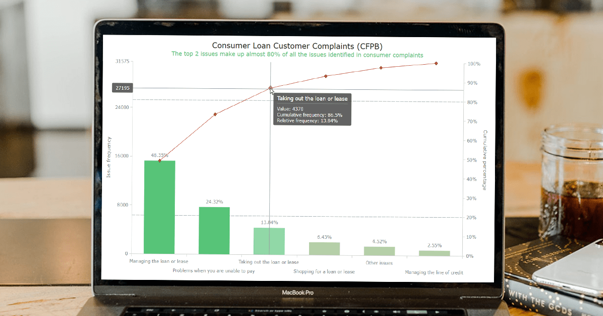
A Pareto chart is a captivating graphical combo representation that showcases individual values through descending bars, while a line graph illustrates the cumulative total. It is a powerful tool highlighting the relative importance of different categories within a dataset. Named after the visionary economist Vilfredo Pareto, the Pareto chart embodies the Pareto principle, also known as the 80/20 rule. This principle reveals that approximately 80% of effects stem from a mere 20% of causes. With their ability to pinpoint the most significant elements driving a specific scenario, Pareto charts have become indispensable in certain areas of data analysis.
Every chart needs data, and for this tutorial, I have chosen a dataset to serve as an example for illustration. Together, we will embark on a journey to visualize the major customer complaints for consumer loans in a Pareto chart, demonstrating how easily you can achieve it at every step. So get ready, and let’s dive into the world of Pareto charts and create our own interactive masterpiece!
Read the JS charting tutorial »
July 5th, 2023 by AnyChart Team
 Data visualization is a game-changer when it comes to exploring and making sense of data. And here at AnyChart, we’re passionate about making the development of interactive charts a breeze. Our award-winning JavaScript charting library is not only trusted by the big players in enterprise data intelligence systems, with over 75% of Fortune 500 companies relying on it. It is a go-to choice for thousands of developers worldwide who want to easily create awesome visualizations for their – and their clients’ – websites and apps.
Recently, we discovered a stunning sunburst chart powered by AnyChart on the website of the Berlin University Alliance. This diagram effectively organizes the ideas submitted by Berliners within the framework of the #Berlinforschtmit project, which calls upon the local community to tip scientists regarding new research topics. These collective efforts aim to make significant contributions toward enhancing the quality of life in the city.
We’ve had the pleasure of having a quick conversation with Björn Knetter from Freiheit Gruppe, the team responsible for the design and technical implementation of #Berlinforschtmit. He told us more about this innovative initiative and how they leverage AnyChart for impactful data visualization. All aboard for our quick interview!
Read more »
June 27th, 2023 by Alejandro Wassermann
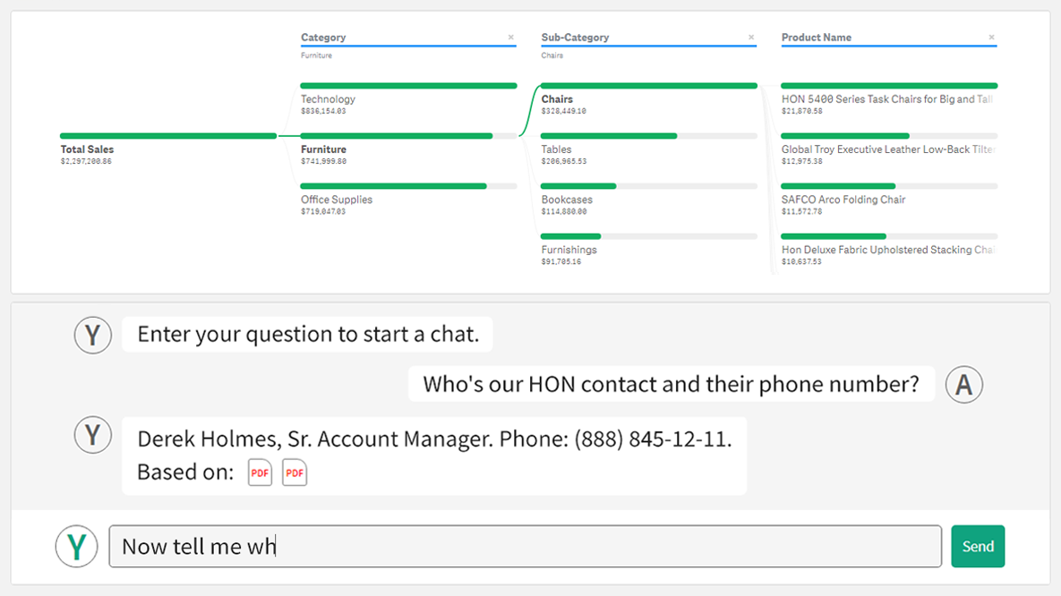
 Hey Qlikkies, are you itching to explore your data ad-hoc across multiple dimensions and conduct root cause analysis like a boss? Look no further than the Decomposition Tree visualization! I first stumbled upon this gem in Power BI, but guess what? Now you can harness its power within the realms of the Qlik Analytics Platform. In this tutorial, I’ll demonstrate how you can easily create amazing decomposition trees for your BI dashboards and apps in Qlik Sense.
A decomposition tree is a type of chart that uses a tree-like structure to represent how a whole metric or outcome can be broken down into its constituent parts or factors. It provides a hierarchical view of the relationships between different dimensions or variables and their contributions to the overall metric. By visually displaying the decomposition of a measure, such as sales or revenue, into various components, such as product categories, regions, or time periods, the decomposition tree helps identify the key drivers and understand the underlying factors influencing the metric. And I’ll use the tech layoffs data to show you how this can look and work in reality.
Let’s dive in and unleash the decomposition tree power in Qlik Sense!
Read more at qlik.anychart.com »
June 19th, 2023 by Awan Shrestha
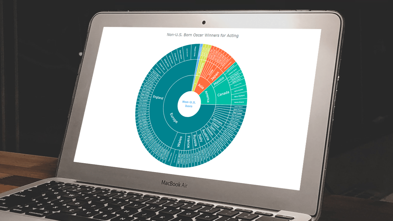 In the world of data all around us, charts play a crucial role in helping us explore and understand data more effectively. One powerful visualization technique is the sunburst chart, which allows us to represent hierarchical datasets, providing insights into complex compositions visually. In this tutorial, I’ll show you how to create your own stunning interactive sunburst charts using JavaScript effortlessly.
We’ll embark on an exciting journey using data about Oscar-winning actors and actresses from countries around the world as an example. Our JS-based sunburst chart will shine a spotlight on the achievements of those born outside the United States, representing the rich diversity of their origins.
Get ready to unlock the secrets of JavaScript sunburst chart development as I’ll guide you step-by-step. Together, we’ll learn how to effortlessly bring data to life, creating this mesmerizing visualization that engages and informs. Let’s dive in and discover the fascinating world of the sunburst chart!
Read the JS charting tutorial »