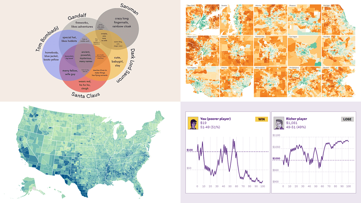
 While the Christmas spirit is already in the air, join us for a quick look at some amazing new data graphics that really caught our attention these days. And you’ll even know what Santa Claus has in common with Gandolf, Dark Lord Sauron, and Tom Bombadil. So, here’re the data visualizations featured in this DataViz Weekly:
- Inevitability of the super rich — The Pudding
- Adult illiteracy across the United States — ProPublica
- Carbon emissions footprint per household across the United States — The New York Times
- Intersections between Santa Claus and Tolkien’s characters — Tea with Tolkien
Data Visualization Weekly: December 16, 2022 — December 23, 2022
Inevitability of Super Rich

Economic mobility is frequently seen as affected by disparities in access to education and jobs. But the truth is, even if everyone gets equal opportunities, someone will anyway become way richer than others.
The Pudding published a visual story where Alvin Chang shows how this distortion in wealth distribution happens. The piece is based on an explanation of the Yard-sale model. Awesome interactives provide a clear idea of how it works in reality and therefore why the super rich are inevitable.
See the story on The Pudding.
Adult Illiteracy Across United States
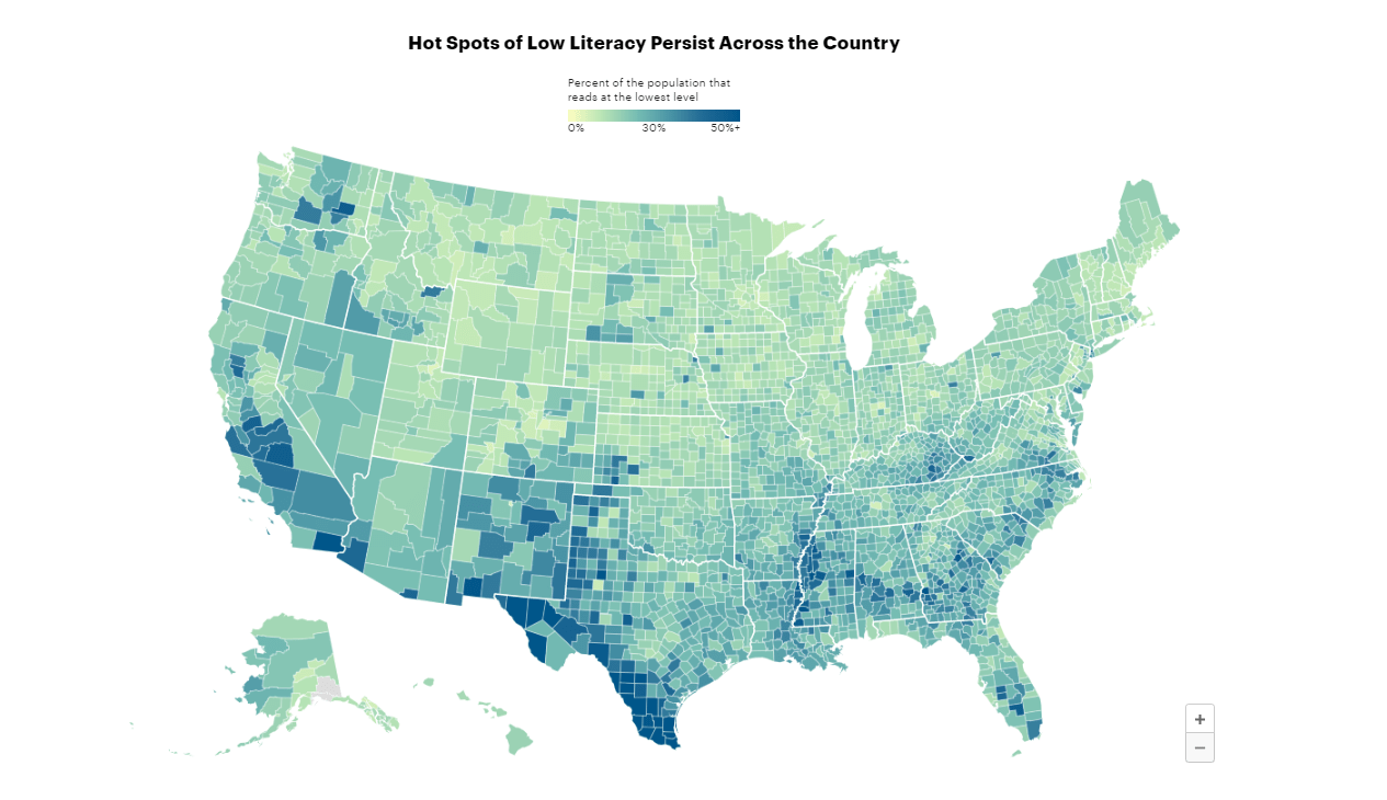
48 million American adults, or 23% of the entire U.S. adult population, struggle to read. Across the country, there are even areas where more than half of all adult residents read at the lowest level.
While discussing the situation and why this problem persists, ProPublica shared an interactive choropleth map that represents the percentage of adults struggling to read at the county level. At a glance, the visualization lets you see hot spots of low adult literacy across the United States and discover geographic patterns.
Explore the map in the article by Annie Waldman, Aliyya Swaby, and Anna Clark on ProPublica.
Carbon Emissions Footprint per Household Across United States
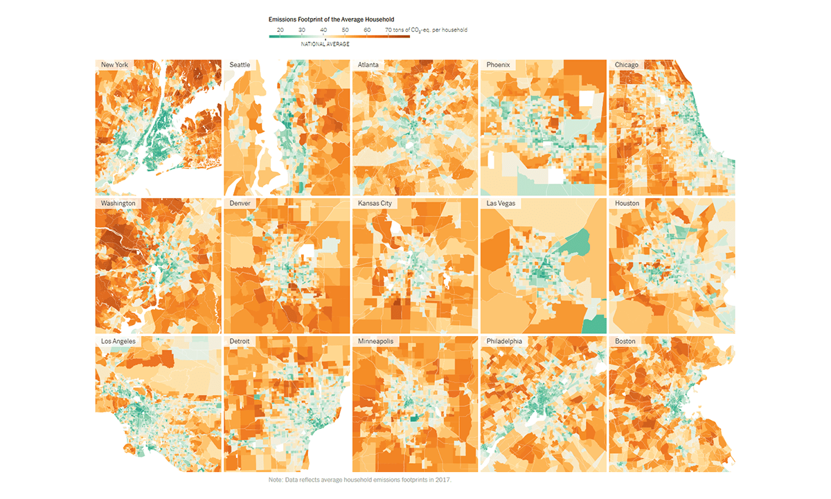
We are used to thinking that big city centers are heavy air polluters. While that is actually so in absolute figures, everything changes when you switch to a view per household.
For The New York Times, Nadja Popovich, Mira Rojanasakul, and Brad Plumer looked into how the U.S. households’ impact on climate change varies. Visualizing consumption-based data produced by EcoDataLab and the University of California, Berkeley, the article’s maps draw a clear picture. Away from big city centers, average household carbon emissions are higher.
Check out the maps and learn more on the NYT.
Intersections Between Santa Claus and Tolkien’s characters
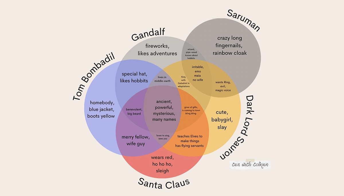
Christmas is just around the corner. And what a Christmas without Santa Claus.
Kaitlyn Facista, the creator of Tea with Tolkien, made a Venn diagram displaying how much Santa Claus and John Ronald Reuel Tolkien’s Gandolf, Tom Bombadil, and Dark Lord Sauron have in common. Then she also added Saruman to the comparison. A very pretty fun visualization!
Look at both on Twitter.
***
We all at AnyChart wish you a merry Christmas and a happy new year ahead!
- Categories: Data Visualization Weekly
- No Comments »