 There are various data visualization techniques designed to reveal insights that numbers alone just can’t. In this tutorial, we will see how to easily create a radar chart using JavaScript. It is an effective way to graphically represent multivariate data of several quantitative variables.
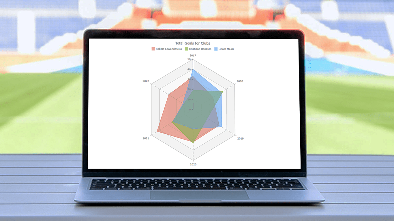
Writing the tutorial during the FIFA World Cup 2022, I could not resist taking some football data for a practical illustration. The JS radar chart examples built and customized here step by step will plot the number of goals three top players have scored for their clubs over the last six years: Lionel Messi, Cristiano Ronaldo, and Robert Lewandowski.
The whistle for kickoff is blown, and it all begins!
Building JS Radar Chart
After reading this tutorial, you will be able to build your own interactive, JavaScript-based radar charts suitable for any web page or application without hassle. Basically, there are just four fundamental steps along the way:
- Create an HTML container
- Include the necessary JavaScript files
- Load the data
- Write some JS code to draw the radar chart
1. Create an HTML container
Сreate a basic HTML page or use your existing one. Add an HTML block element, <div> which will contain the chart you will be making, and don’t forget to provide it with a unique ID attribute so that it could be referenced in the upcoming JS charting code.
Adding a few CSS rules in the <style> block allows you to control how your radar chart will be displayed. For example, if you set the width and height properties as 100% and the margin and padding as 0, it will take the entire page.
<!DOCTYPE html>
<html lang="en">
  <head>
    <meta charset="utf-8">
    <title>Radar Chart in JavaScript</title>
    <style type="text/css">
      html, body, #container {
        width: 100%; height: 100%; margin: 0; padding: 0;
      }
    </style>
  </head>
  <body>
    <div id="container"></div>
  </body>
</html>
2. Include the necessary JavaScript files
In the <head> section, include the JS scripts which will be used for building the radar chart, which is done using the <script> tags in the <head> section.
In this tutorial, we will use AnyChart JS Charts, a robust, award-winning JavaScript charting library. It supports radar plots among many chart types, providing pre-built features to create them with ease and no limits in customization. What’s important, AnyChart has detailed charting documentation and ready-to-use chart examples.
Let’s obtain AnyChart’s JS files from the CDN. (Alternatively, you can download them.) Building a radar chart requires the Core and Radar modules of the library. The JavaScript code is to be placed using the <script> tag in the <body> section.
<!DOCTYPE html>
<html lang="en">
  <head>
    <meta charset="utf-8">
    <title>Radar Chart in JavaScript</title>
    <script src="https://cdn.anychart.com/releases/8.11.0/js/anychart-core.min.js"></script>
    <script src="https://cdn.anychart.com/releases/8.11.0/js/anychart-radar.min.js"></script>
    <style type="text/css">
      html, body, #container {
        width: 100%; height: 100%; margin: 0; padding: 0;
      }
    </style>
  </head>
  <body>
    <div id="container"></div>
    <script>
      // Put your JS column charting code here.
    </script>
    </body>
</html>
3. Set the data
Now it’s time to prepare data. As I mentioned earlier, we will be visualizing the total goals of Lewandowski, Ronaldo, and Messi for their clubs from 2017 to 2022.
I have taken goalscorer statistics from Transfermarkt, and now we can set the data for our radar chart (look at all available data formats to see what’s best in your situation):
var chartData = {
  header: ['#', 'Robert Lewandowski', 'Cristiano Ronaldo', 'Lionel Messi'],
  rows: [
    ['2017', 33, 19, 40],
    ['2018', 24, 36, 34],
    ['2019', 31, 17, 34],
    ['2020', 32, 33, 19],
    ['2021', 43, 25, 24],
    ['2022', 29, 11, 12]
  ]
};
Here, the data is set as an object with two properties. The first one is the header, which is an array of the players’ names. The second one is rows, with each item including the year and the number of total goals scored by each player (in the same order their names appear in the header). For example, the last row specifies that in 2022, Robert Lewandowski scored 29 goals, Cristiano Ronaldo scored 11, and Lionel Messi scored 12.
4. Write some JS code to draw the radar chart
Now that the web page is ready, the scripts are included, and the data is prepared, let’s get our hands dirty with some JS coding for the radar graphic visualization.
First, add the anychart.onDocumentReady() function to wrap the entire JavaScript code for the chart inside.
<script>
  anychart.onDocumentReady(function () {
    // The following JS radar chart code will be here.
  }
</script>
Second, add the data (from the previous step).
var chartData = {
  header: ['#', 'Robert Lewandowski', 'Cristiano Ronaldo', 'Lionel Messi'],
    rows: [
      ['2017', 33, 19, 40],
      ['2018', 24, 36, 34],
      ['2019', 31, 17, 34],
      ['2020', 32, 33, 19],
      ['2021', 43, 25, 24],
      ['2022', 29, 11, 12]
  ]
};
Third, use the anychart.radar() function to create a radar chart instance.
var chart = anychart.radar();Fourth, load the data to the radar chart.
chart.data(chartData);Fifth, add a title, as appropriate chart captions are a must.
chart.title("Total Goals for Clubs");Finally, place the chart in the container by referring to the ID given to the HTML element <div> in step 1, and draw the chart using the draw() function.
chart.container('container');
chart.draw();
Halftime whistle! A basic JS-based radar chart is ready!
You can find the interactive version of this basic radar chart on AnyChart Playground. For your convenience, the entire code is put below:
<!DOCTYPE html>
<html lang="en">
  <head>
    <meta charset="utf-8">
    <title>Radar Chart in JavaScript</title>
<script src="https://cdn.anychart.com/releases/8.11.0/js/anychart-core.min.js"></script>
<script src="https://cdn.anychart.com/releases/8.11.0/js/anychart-radar.min.js"></script>
    <style type="text/css">
      html, body, #container {
        width: 100%;
        height: 100%;
        margin: 0;
        padding: 0;
      }
    </style>
  </head>
  <body>
    <div id="container"></div>
    <script>

      anychart.onDocumentReady(function () {

        // create a data set
        var chartData = {
        header: ['#', 'Robert Lewandowski', 'Cristiano Ronaldo', 'Lionel Messi'],
          rows: [
            ['2017', 33, 19, 40],
            ['2018', 24, 36, 34],
            ['2019', 31, 17, 34],
            ['2020', 32, 33, 19],
            ['2021', 43, 25, 24],
            ['2022', 29, 11, 12]
          ]
        };

        // create a radar chart
        var chart = anychart.radar();

        // set the chart data
        chart.data(chartData);

        // set the chart title
        chart.title("Total Goals for Clubs");

        // set the container id
        chart.container('container');

        // display the radar chart
        chart.draw();

      });

    </script>
  </body>
</html>
Customizing JS Radar Chart
The basic JavaScript-based radar chart looks great. But, let me continue with how you can make it even better. Adjusting various aspects of radar charts can be done easily. I will demonstrate a few effective tweaks right now.
A. Change the series type
I believe that with this data, the radar plot will look better with the area series. The change can be done with the help of the defaultSeriesType() function.
chart.defaultSeriesType('area’);
B. Personalize the colors
Let’s now personalize the colors of the series. The quickest way is to introduce a custom color palette by passing a list of colors to the palette() function. Feel free to be creative with your own color choices.
chart.palette(['#E5593499', '#9BC53DE6', '#64B5F6BF']);
C. Customize the appearance of the axes and grids
The appearance of the axes and grids of a JavaScript radar diagram can be configured in a few more lines of code.
First, let’s enhance the look of the Y-axis and ticks on it by changing the color of the stroke.
chart.yAxis().stroke('#545f69');
chart.yAxis().ticks().stroke('#545f69');
Second, the ticks are placed along the Y-axis with an interval of 8, but why don’t we make it 10?
chart.yScale().ticks().interval(10);Third, let’s configure the appearance of the Y-grid using a custom color palette.
chart.yGrid().palette(['gray 0.05', 'gray 0.025']);Fourth, look at how to easily change the color, thickness, and texture of the X-grid lines’ stroke.
chart.xGrid().stroke({
  color: "#545f69",
  thickness: 0.5,
  dash: "10 5"
});
D. Modify the hover state
When a data point is hovered over, it gets highlighted with a marker. At the same time, the tooltip shows up with the number of goals the respective player scored in the respective year.
To improve the legibility of the radar chart, it looks like a good idea to highlight all three data points for the same year when any of them is hovered over…
chart.interactivity().hoverMode('by-x');… and to make the tooltip display the goal statistics for all the players at once (let’s also customize the font color according to the series color using HTML).
chart.tooltip()
  .displayMode('union')
  .useHtml(true)
  .format(function(e){
    console.log(this);
    return '<span style="color:' + this.series.color() + '">' +
      this.seriesName + ": " + this.value + "</span>"
  });
In addition, it will be great to unify the marker shape. Let it be a star as we are talking about football stars.
chart.markerPalette(['star5']);
E. Add the legend
Finally, let’s add the chart legend to make it absolutely clear at a glance which series is where. All it takes is one line of code.
chart.legend().enabled(true);The final whistle blows! Here is our final JavaScript radar chart totally ready to be embedded on any site or app!
Check out the complete source code of this customized JS radar chart below and feel free to play with it further on AnyChart Playground.
<!DOCTYPE html>
<html lang="en">
  <head>
    <meta charset="utf-8">
    <title>Radar Chart in JavaScript</title>
    <script src="https://cdn.anychart.com/releases/8.11.0/js/anychart-core.min.js"></script>
    <script src="https://cdn.anychart.com/releases/8.11.0/js/anychart-radar.min.js"></script>
    <style type="text/css">
      html, body, #container {
        width: 100%;
        height: 100%;
        margin: 0;
        padding: 0;
      }
    </style>
  </head>
  <body>
    <div id="container"></div>
    <script>

      anychart.onDocumentReady(function () {

        // create a data set
        var chartData = {
          header: ['#', 'Robert Lewandowski', 'Cristiano Ronaldo', 'Lionel Messi'],
          rows: [
            ['2017', 33, 19, 40],
            ['2018', 24, 36, 34],
            ['2019', 31, 17, 34],
            ['2020', 32, 33, 19],
            ['2021', 43, 25, 24],
            ['2022', 29, 11, 12]
          ]
        };

        // create a radar chart
        var chart = anychart.radar();

        // set the series type
        chart.defaultSeriesType('area');

        // set the chart data
        chart.data(chartData);

        // set the color palette
        chart.palette(['#E5593499', '#9BC53DE6', '#64B5F6BF']);

        // configure the appearance of the y-axis
        chart.yAxis().stroke('#545f69');
        chart.yAxis().ticks().stroke('#545f69');

        // configure the stroke of the x-grid
        chart.xGrid().stroke({
          color: "#545f69",
          thickness: 0.5,
          dash: "10 5"
        });

        // configure the appearance of the y-grid
        chart.yGrid().palette(['gray 0.05', 'gray 0.025']);

        // begin the y-scale at 0
        chart.yScale().minimum(0);

        // set the y-scale ticks interval
        chart.yScale().ticks().interval(10);

        // set the hover mode
        chart.interactivity().hoverMode('by-x');

        //  set the marker type
        chart.markerPalette(['star5']);

        // improve the tooltip
        chart.tooltip()
          .displayMode('union')
          .useHtml(true)
          .format(function(e){
            console.log(this);
            return '<span style="color:' + this.series.color() + '">' +
              this.seriesName + ": " + this.value + "</span>"
          });

        // set chart legend settings
        chart.legend()
          .align('center')
          .position('center-bottom')
          .enabled(true);

        // set the chart title
        chart.title("Total Goals for Clubs");

        // set container id for the chart
        chart.container('container');

        // initiate chart drawing
        chart.draw();

      });

    </script>
  </body>
</html>
Conclusion
Congratulations! You have made it. We are at the end of this stepwise tutorial for making a radar chart with JavaScript. I had a fun time guiding you through the different stages. I hope I have been successful in teaching you the development of a web radar chart in easy steps.
Now, I am sure you can build your own radar plot and give your personal touch to it. Also, there are many other interesting chart types available. Try them and see what you can visualize next.
In case of any confusion and queries, you can reach out to me, I would be glad if I could help you out. Keep learning, and keep exploring!
AnyChart thanks Awan Shrestha for this wonderful Radar Chart tutorial!
Don’t miss more JavaScript charting tutorials on our blog!
Do you have an idea for a cool guest post? Drop us a line and let’s see!
- Categories: AnyChart Charting Component, HTML5, JavaScript, JavaScript Chart Tutorials, Tips and Tricks
- No Comments »