 We continue the DataViz Weekly series with a new collection of interesting charts and maps curated from around the internet. Today, we want to put a spotlight on the following impressive visualizations that truly let data speak:
- Winter death toll in Europe — The Economist
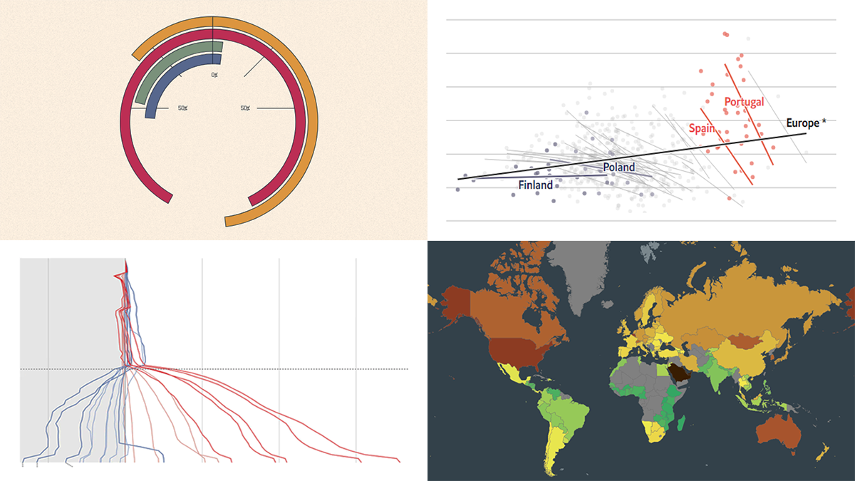
- Upward mobility from personal experience — The Pudding
- Shifts in Democrat and Republican follower counts on Twitter under Elon Musk — The Washington Post
- Carbon footprint by country — Electricity Maps
Data Visualization Weekly: November 25, 2022 — December 2, 2022
Winter Death Toll in Europe
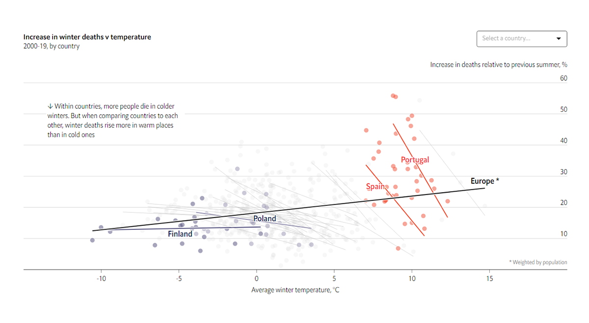
In Europe, over 20% more people die every week in winter months than in summer. This winter, due to the energy crisis fueled by the Russia–Ukraine conflict, the death toll may well surge.
For The Economist’s Graphic Detail feature, Ainslie Johnstone worked with data and built several impressive graphics revealing normal trends over the last two decades and those expected for the coming colder months given the changes in electricity prices. In particular, she visualized the relationship between average winter air temperatures and the increase in winter deaths in 2000-2019 by country, which is a nice example of Simpson’s paradox. You can see at a glance that generally, the warmer the country, the larger the gap in seasonal death rates.
Look at the charts on The Economist.
Upward Mobility From Personal Experience
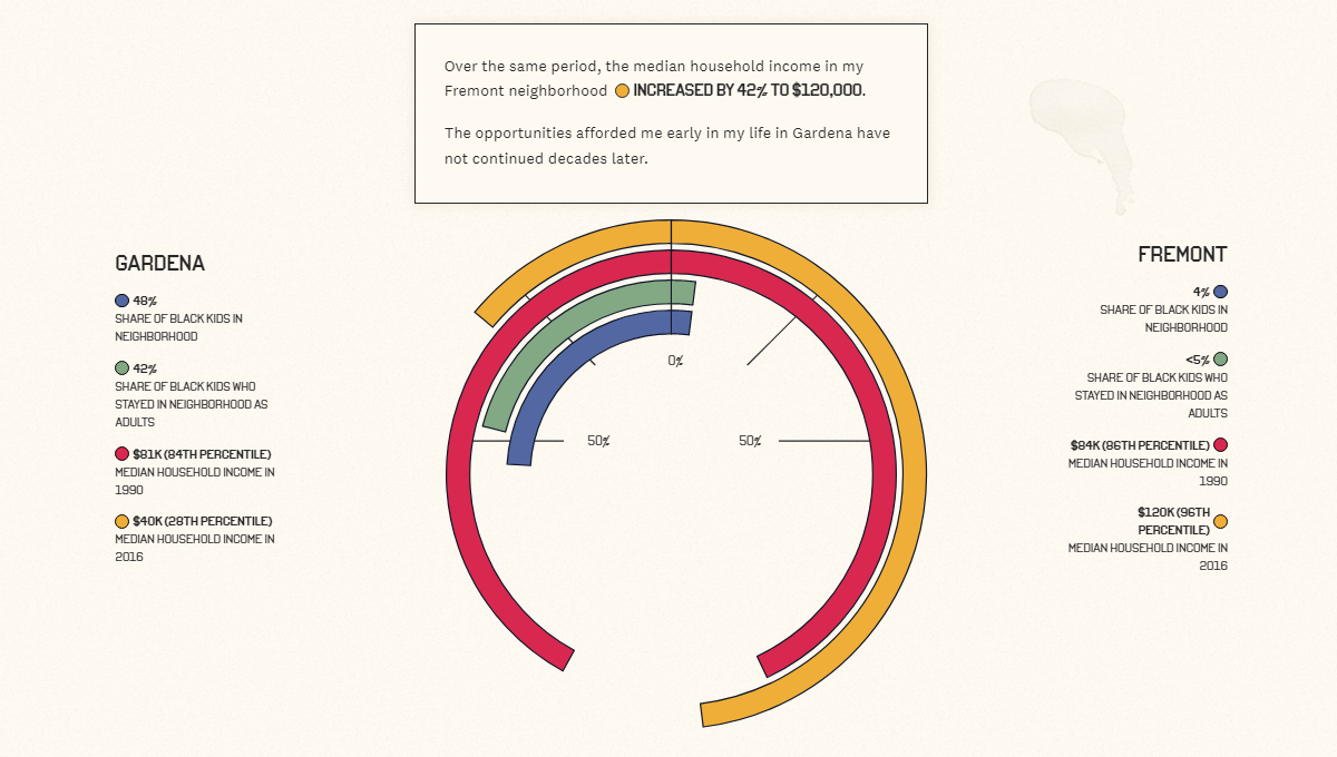
Researchers say the neighborhood where you grow up has an impact on your future success. But how big is the role of geographical location in shaping economic opportunities?
Aaron Williams of Netflix’s Data Science and Engineering group used data from the U.S. Census and Opportunity Insights to look into upward mobility through the lens of his personal life experiences. When he was a child, his family moved from Gardena to Fremont, both in California. Some socioeconomic differences between those two places are clearly represented with radial bars revealed and commented on as you scroll.
Check out the story on The Pudding.
Shifts in Democrat and Republican Follower Counts on Twitter Under Elon Musk
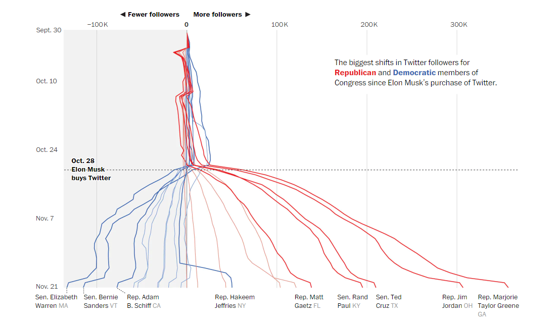
Twitter began to experience what can be called political ideology shifts in less than a month of Elon Musk’s reign.
The Washington Post’s Gerrit De Vynck, Jeremy B. Merrill, and Luis Melgar analyzed changes in Twitter follower counts for top-profile Democrats and Republicans. And they found out that over the period between October 27 and November 21, the former lost and the latter gained tens of thousands of followers. These shifts are striking when you look at the neat visualization displayed above (taken from the article).
Take a closer look at this chart and learn more on The Post.
Carbon Footprint by Country
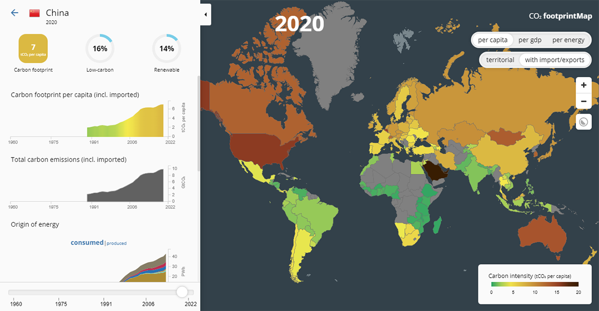
As is known, some countries contribute to climate change significantly more than others.
The Electricity Maps team mapped the carbon footprint of countries per capita, per GDP, and per energy. This project is an interactive visualization of data from the Global Carbon Budget 2022, bp’s Statistical Review of World Energy 2022, and the World Bank’s GDP and population statistics. On the left side, the represented countries are ranked based on the selected parameter.
Explore the countries’ impact on climate at footprintmap.org.
***
Stay tuned and keep us posted on your own cool data visualizations!
- Categories: Data Visualization Weekly
- No Comments »