Data Visualization for COVID-19 Dashboard Tracker Using AnyChart JS Charts
April 12th, 2021 by AnyChart Team![]() Data visualization has played an important role during the COVID-19 pandemic, allowing governments, scientists, healthcare professionals, and the general public to better understand different aspects of the crisis. There are many illuminating projects all over the web that leverage charts and maps to effectively communicate what the coronavirus statistics have to say. Some of them are using our data visualization tools under a free license provided as part of the special initiative we announced last spring to support the global COVID-19 data analysis effort.
Data visualization has played an important role during the COVID-19 pandemic, allowing governments, scientists, healthcare professionals, and the general public to better understand different aspects of the crisis. There are many illuminating projects all over the web that leverage charts and maps to effectively communicate what the coronavirus statistics have to say. Some of them are using our data visualization tools under a free license provided as part of the special initiative we announced last spring to support the global COVID-19 data analysis effort.
We told you about two examples of such projects earlier: StopCorona and iConcepts SARS-CoV-2 Stats. Now let us introduce you to another interesting resource — COVID-19 Dashboard Tracker by Maxime des Touches. Launched more than a year ago, while Maxime was yet a computer science student, it has turned from a simple online data table into a complex interactive data visualization project offering up-to-date insight into how the pandemic unfolds in France and worldwide.
Maxime kindly agreed to talk to us about his COVID-19 tracker, experience using AnyChart, and the pandemic in general. Check out our quick interview, glance at a few screenshots, and try his open-source dashboard by yourself. (Stack: HTML/jQuery/JSON.)
- Categories: AnyChart Charting Component, AnyStock, Big Data, Dashboards, HTML5, JavaScript, Stock Charts, Success Stories
- No Comments »
Visualizing Reddit Data Using AnyChart JS Charting Library
November 25th, 2020 by AnyChart Team Leading the data visualization market with the best-in-class solutions, we are always excited to see how not only companies but also individuals from all over the world use them to produce interactive charts in their projects. Here’s one new interesting example we’ve recently learned about. A developer created “Cloud a Subreddit,” a web project that generates a beautiful interactive Word Cloud chart out of any given Reddit’s subreddit with the help of the AnyChart JS library.
[Editor’s note: The interviewee’s personal details have been removed following a GDPR request.]
We had a quick interview with the creator to learn more about the work and experience of using AnyChart. Check it out.
- Categories: AnyChart Charting Component, Big Data, HTML5, JavaScript, Success Stories
- No Comments »
Flippity Uses AnyChart in Word Cloud Visualization Tool
October 26th, 2020 by AnyChart Team
While thousands of companies choose AnyChart to operate interactive data visualization in commercial projects, we are especially proud our charting solutions have been put for good use in education. Here’s a great new case, for example.
Have you heard about Flippity? It is a fascinating free web project providing teachers (and students) with an extremely straightforward way to turn Google Sheets’ spreadsheets into something cool and useful in the education process — flashcards, quizzes, games, timelines, leaderboards, random name pickers, progress indicators, and many other online things. Earlier this year, Flippity added a dedicated tool to create a Word Cloud from a Google spreadsheet, and we are excited it is powered by our JavaScript charting library!
To learn and tell you more about Flippity and their experience using AnyChart JS for data visualization, we had a quick talk with Steve Fortna, a school teacher from Massachusetts and the creator of Flippity. Check out the interview! (Stack: HTML/Google Sheets.)
- Categories: AnyChart Charting Component, HTML5, JavaScript, Success Stories
- No Comments »
Visualizing COVID-19 Pandemic Data for Austria Using AnyChart JS Charts
June 25th, 2020 by AnyChart Team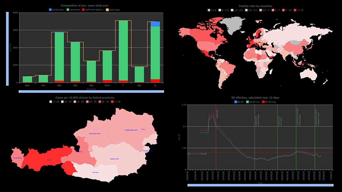 The COVID-19 pandemic persists as a global emergency, and we continue to support initiatives that contribute to tackling the coronavirus crisis. Specifically, we allow COVID-19 analytics projects to use our data visualization tools for free under a non-profit license.
You already know about StopCorona, a COVID tracker by Diffco, which is one such resource. Today, we want to meet you with another noteworthy project using AnyChart to visualize the pandemic statistics — iConcepts SARS-CoV-2 Stats. Created by Austrian part-time web developer Juergen Hoefer and featured on the official Open Data Austria portal, it shows the COVID-19 statistics for Austria (and worldwide) from different perspectives, in countless interactive charts powered by our JavaScript (HTML5) charting library.
We asked Juergen a few questions to learn more about this project and his experience visualizing COVID-19 pandemic data with the help of AnyChart. Read the answers and take a glance at several quick chart examples from his website. (Stack: HTML/CSV.)
- Categories: AnyChart Charting Component, AnyMap, Big Data, HTML5, Success Stories
- 1 Comment »
StopCorona Creator Shares How They Visualize COVID-19 Data Using AnyChart
May 21st, 2020 by AnyChart Team![]() Earlier, we introduced you to a new, ever-updating COVID tracker that uses AnyChart to visualize the latest pandemic data in insightful charts, StopCorona.info. To let you know more, we also talked to Vadim Peskov, CEO at Diffco, the app development company behind StopCorona, and asked him a few questions.
Earlier, we introduced you to a new, ever-updating COVID tracker that uses AnyChart to visualize the latest pandemic data in insightful charts, StopCorona.info. To let you know more, we also talked to Vadim Peskov, CEO at Diffco, the app development company behind StopCorona, and asked him a few questions.
Read our quick interview to learn more about StopCorona and their experience using our JavaScript charting library for interactive data visualization. (Stack: MySQL/Symfony/Angular.)
- Categories: AnyChart Charting Component, Big Data, Charts and Art, HTML5, JavaScript, Success Stories
- 3 Comments »
COVID Tracker StopCorona.info Adds AnyChart JS Charts to Visualize Coronavirus Statistics
May 18th, 2020 by AnyChart Team![]() COVID tracker StopCorona.info is using our JavaScript data visualization library to display up-to-date coronavirus statistics in compelling and insightful charts. (Read our interview with its creator to learn how.)
COVID tracker StopCorona.info is using our JavaScript data visualization library to display up-to-date coronavirus statistics in compelling and insightful charts. (Read our interview with its creator to learn how.)
COVID-19 is a global emergency and the fight against it requires a joint effort. We at AnyChart cannot stay aside, too. With a lot of pandemic data out there, from numerous sources and with constant updates, it’s difficult to keep up with how the situation unfolds, let alone making sense of all relevant information in due course. But this is exactly where we can help, with our established charting solutions that can visualize any data on the fly.
We thought you should know we’re ready to give a full-featured non-profit license to all initiatives aiming to tackle the novel coronavirus outbreak. Moreover, we’ve already allowed one project – StopCorona.info – to use our JavaScript charting library for free.
Developed as a not-for-profit initiative by Diffco, a top Silicon Valley app development company, StopCorona is designed to bring transparency to the pandemic situation worldwide. To achieve that, it collects COVID-19 statistics from more than 20 reliable public open data sources, including WHO, CDC, ECDC, CCDC, and NHC to name a few. Now this enormous (and ever-expanding) set of coronavirus data is graphically represented in an analyst-friendly interface powered by AnyChart JS Charts.
As a global leader of data visualization and reporting tools, we at AnyChart were more than happy to support StopCorona by letting them use our award-winning JS charting library absolutely free, under a full-featured non-profit license.
If you guys are building a useful resource for COVID-19 data analytics, try AnyChart and apply for a free license, too. We will gladly provide you with complimentary access to our flexible data visualization solutions. In this way you will get the industry’s best charts for the web or mobile fully at your service, empowering your website visitors or app users to make sense of the myriad COVID numbers at a glance, with great ease.
- Categories: AnyChart Charting Component, AnyStock, Big Data, Business Intelligence, Dashboards, HTML5, JavaScript, Success Stories
- 5 Comments »
Mills College Uses AnyChart JS Charts for Student Success Data Visualization
April 29th, 2020 by AnyChart Team Myriads of enterprise-level software developers rely on our award-winning JavaScript data visualization library to build comprehensive reporting and analytics applications. However, AnyChart is also widely chosen to operate basic charts. One example of such a use case is a visualization of student success metrics at Mills College, a famous American higher education institution attended at different times by filmmaker Sofia Coppola, musician Dave Brubeck, and Congresswoman Barbara Lee among other great people.
We interviewed Angelique Felgentreff from Mills College to get you first-hand information about their experience using charts powered by AnyChart. (Stack: OmniUpdate OU Campus/PHP.)
- Categories: AnyChart Charting Component, HTML5, JavaScript, Success Stories
- No Comments »
AnyChart Recognized in Top 10 Business Intelligence and Analytics Companies of 2019
November 19th, 2019 by AnyChart Team We are excited to announce that Analytics Insight, a magazine that covers big data and business intelligence developments, included AnyChart in The 10 Next Generation BI and Analytics Companies of 2019 — “for providing the most advanced solutions and playing a significant role in shaping the future of these disruptive technologies.”
The list has been made public in the just-released November issue of the magazine and is accompanied by the stories about each featured company. With permission of Analytics Insight, today we are republishing the magazine’s story about us on our blog — “AnyChart: Turning Data into Actionable Insights with Award-Winning Data Visualization Solutions.”
Read the story of AnyChart as it appeared on Analytics Insight »
- Categories: AnyChart Charting Component, AnyGantt, AnyMap, AnyStock, Big Data, Business Intelligence, Charts and Art, Dashboards, Financial Charts, Flash Platform, Gantt Chart, GraphicsJS, HTML5, Interesting Facts, JavaScript, News, Success Stories
- No Comments »
Devon County Council Uses AnyChart JS Charts for Health Data Visualization
August 29th, 2019 by AnyChart Team As a globally leading, award-winning data visualization solution, our JavaScript charting library is used not only in commercial apps but also by governments of all levels worldwide. Devon County Council, a UK local authority administering the English county of Devon, is one such customer.
In particular, Mark Painter from Devon County Council’s Community and Public Health Intelligence Team told us they use AnyChart to generate all the charts in their Health and Wellbeing Profiles. We’ve interviewed him to learn more. (Stack: WordPress/CSV.)
- Categories: AnyChart Charting Component, Success Stories
- No Comments »
AnyChart CEO Anton Baranchuk Named One of Most Promising CEOs of 2019
August 13th, 2019 by AnyChart Team Insights Success magazine has named Anton Baranchuk, CEO and Co-founder of AnyChart, one of The Most Promising CEOs of 2019. Celebrating this exciting recognition, we are pleased to share with you a special article about him and our company. Published in the latest issue of Insights Success, the story is based on Anton’s recent interview with the magazine. Take a read.
- Categories: AnyChart Charting Component, News, Success Stories
- No Comments »