 As a globally leading, award-winning data visualization solution, our JavaScript charting library is used not only in commercial apps but also by governments of all levels worldwide. Devon County Council, a UK local authority administering the English county of Devon, is one such customer.
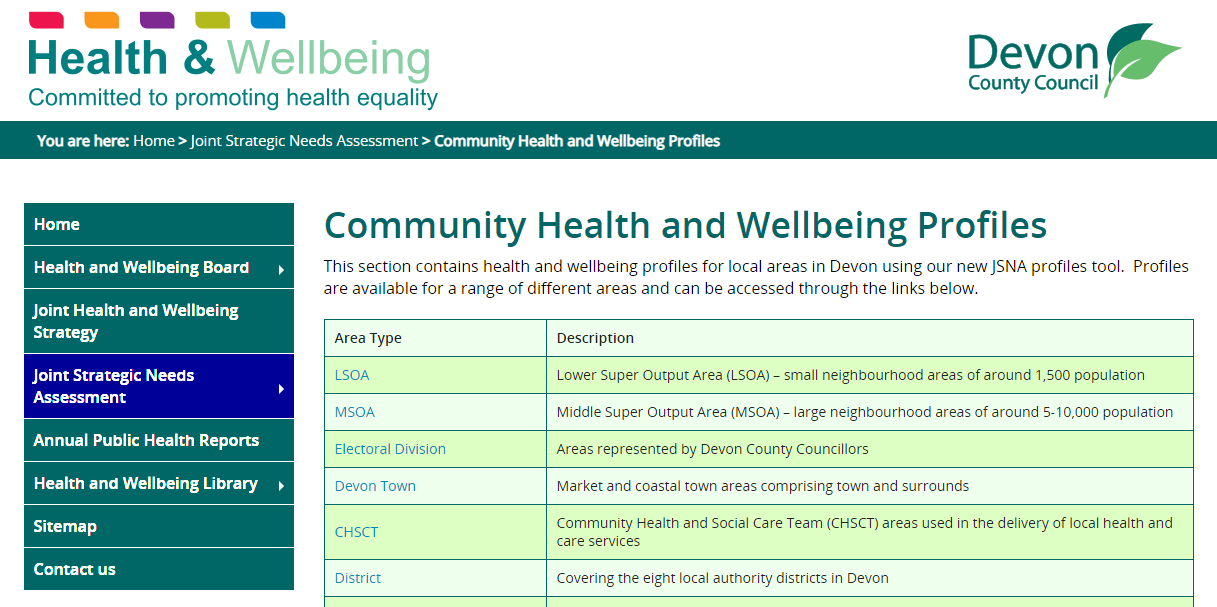
In particular, Mark Painter from Devon County Council’s Community and Public Health Intelligence Team told us they use AnyChart to generate all the charts in their Health and Wellbeing Profiles. We’ve interviewed him to learn more. (Stack: WordPress/CSV.)
AnyChart: To start with, what do you and your team do? What is the purpose and scope of your work?
Mark Painter: The Public Health service of Devon County Council focuses on reducing health inequalities, trying to reduce the gap between the most and least deprived within the population. The aim is for people to live longer in better health.
There are three main areas of public health:
- Health improvement — commissioning of services including Public Health Nursing, sexual health, substance misuse, healthy lifestyle, NHS Health Checks, public mental health and oral health promotion; work closely with DCC colleagues and partners such as the district and borough councils, police, fire and rescue, NHS, education and environmental health.
- Health care public health — Public health provides clinical effectiveness advice and provides Clinical Commissioning Groups (CCGs) with important information and data to aid them in their decision.
- Health protection — the main functions of health protection are now the responsibility of Public Health England but there remains a local authority role in overseeing the health protection function to ensure it meets the needs of the local population; also contribute to emergency preparedness including inclement weather, flooding or pandemics.
The Community and Public Health Intelligence Team provide data and analysis to support the work of the Public Health service and the County Council more widely.
A: What role does data visualization play in your work? Why do you need it and how is it helpful?
MP: Generally, data is difficult. Providing someone with a table of numbers, or a paragraph of text often doesn’t get the message across. Maps and charts can be easier to understand, although it’s important to ensure that they are properly formed and aren’t misleading, for example by shortening the axes to emphasize a change.
A: Please describe a project in which you are making use of AnyChart: What is the purpose of the project, who uses it, why, and what technology is it built on?
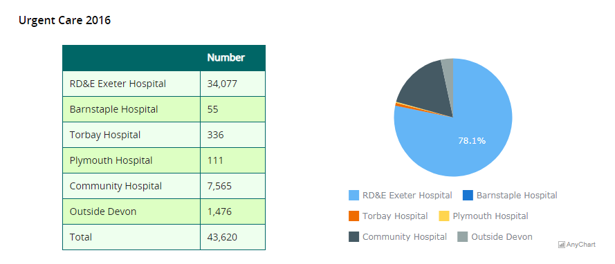
MP: The County Council produces analysis of the health and well-being of the population in its area — there are about 50 indicators used. The profiles also need to be produced for a range of geographic levels (ranging from around 100 people to over 750,000). In total there are around a thousand areas. With so many combinations we needed a way to generate the charts dynamically.
The data are stored on GitHub as CSV files, and the pages served by WordPress using custom built templates.
The site is used by elected officials to get a sense of the people they represent, members of the public and a range of partner organisations — local councils, community and voluntary groups, the police etc.
A: How do you use AnyChart in that project? What kind of data does AnyChart visualize, and what chart types and features are most helpful?
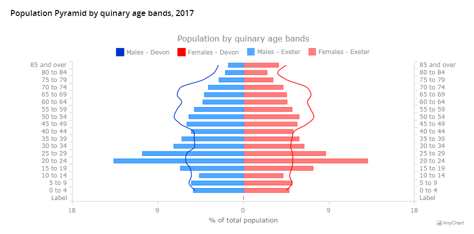
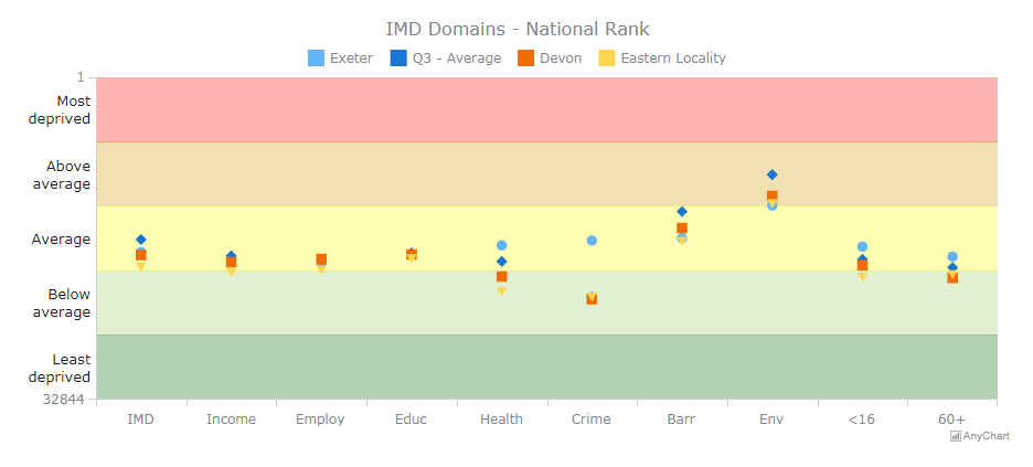
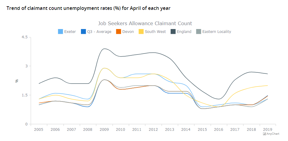
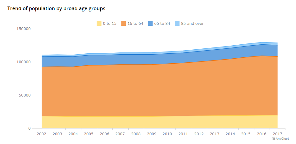
MP: The datasets we use cover topics such as demographics (age of population, births, deaths), deprivation, social security benefit claimants, academic attainment, ill-health estimates and use of health services.
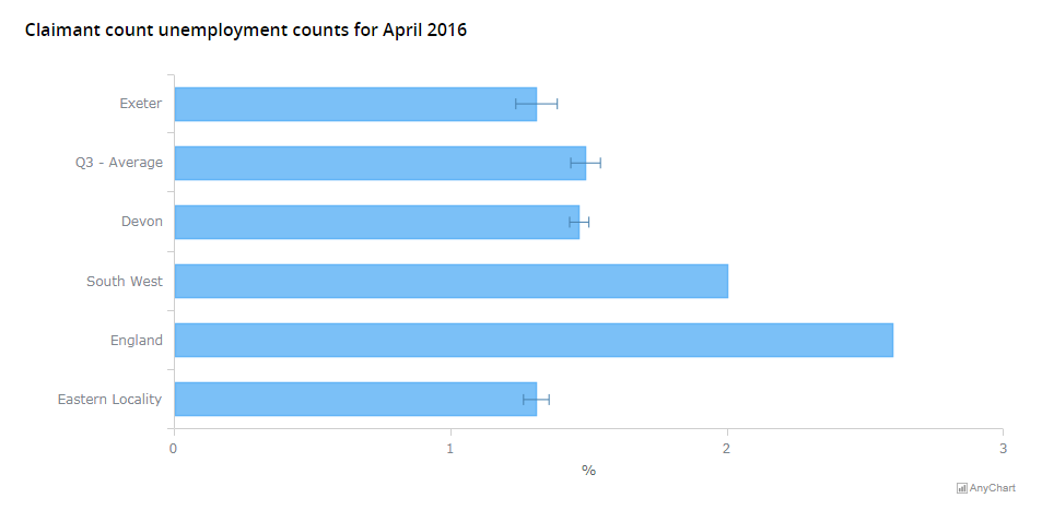
We use stacked area charts, line charts (some with reversed scales and coloured backgrounds), bar charts (with error bars which is essential and not something all packages offer), stacked bar charts, dot plots (again with background colours), and pie charts.
A: Why did you choose AnyChart? What do you like most about our JS library?
MP: The range of charts available and the amount of customization is impressive.
Also, the ability to add error bars was essential for us.
A: Please tell us how we can further improve AnyChart: What do you think it lacks and what would you like to see in the future versions?
MP: Some of the documentation is quite detailed and technical. Not being a JS developer I sometimes had trouble getting the correct syntax, but usually got there in the end.
A: The documentation indeed is written for programmers. But we are so glad even non-programmers can figure out how to create charts using our solution! We’ll definitely keep on making our docs even easier to grasp.
Thanks for your answers! Just one more question: When asked by a friend which JS charting library to use for data visualization, how would you recommend AnyChart in one or two phrases?
MP: Being a public authority there’s a limit to what I can say in regard to recommending one product over another. What I can say is that AnyChart offered us exactly what we needed — a wide range of charting options in one, (relatively) simple to use package.
Check out the Devon County Council case study we’ve just published as well and see other selected case studies.
Don’t miss out on more customer stories in our blog.
If you want to share your AnyChart story, please let us know.
- Categories: AnyChart Charting Component, Success Stories
- No Comments »