How to Create Sparklines with JavaScript
January 13th, 2022 by Shachee Swadia Sparklines are elegant microcharts introduced by Edward Tufte, a renowned statistician and data visualization pioneer. Drawn without any axis and occupying minimal space, these tiny graphs are designed to represent the big picture displaying trends in line with text and within table cells. If you want to learn about an easy way of building a sparkline chart, it is the right place!
In this article, I will show you how to quickly create cool sparkline charts using JavaScript. With OTT content ruling the world of entertainment these days, let’s have fun learning and look at the IMDb ratings of one of the most popular shows nowadays — Money Heist (La Casa de Papel in its original Spanish).
Without more ado, come along on this journey of knowledge heist!
Read the JS charting tutorial »
- Categories: AnyChart Charting Component, Big Data, HTML5, JavaScript, JavaScript Chart Tutorials, Tips and Tricks
- No Comments »
How to Build Surface Chart Using JavaScript
December 15th, 2021 by Shachee Swadia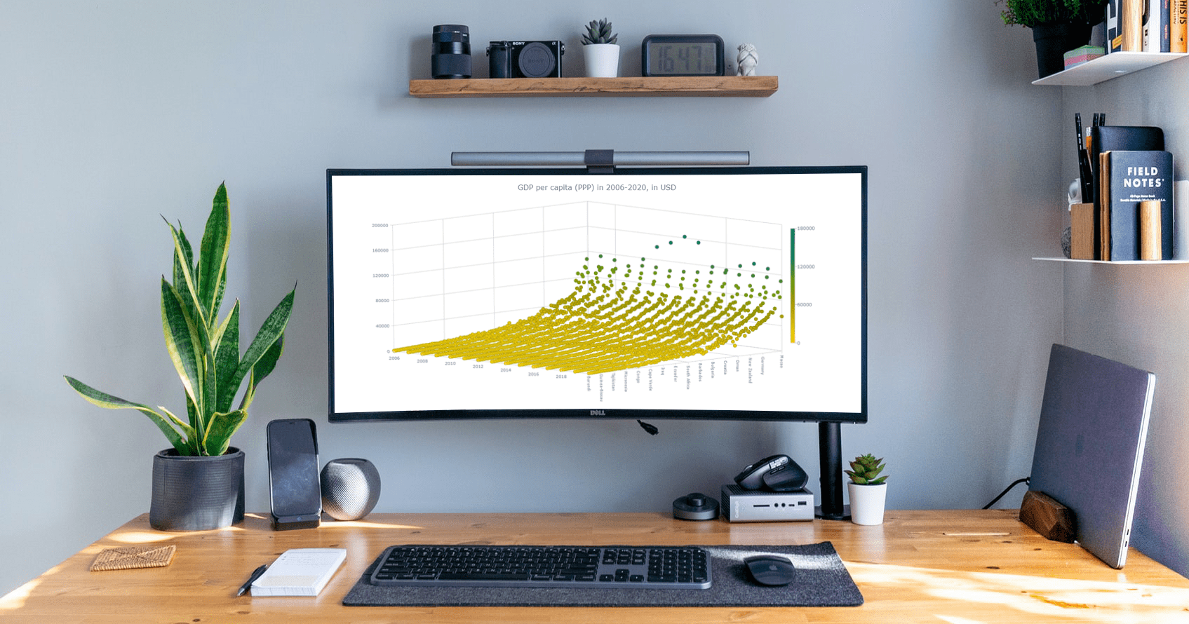 Data visualization is a must-have skill today with ever-growing data and the need to analyze as well as present that data. You will definitely come across data charts whether you are in the technology industry or not and therefore, it is a good idea to learn how to build visualizations.
I will show you here that building charts is not very tough and with the right tools, you can start creating interactive, interesting visualizations in little time and effort!
In this step-by-step tutorial, I will demonstrate how to represent GDP values of various countries for the past 15 years on a beautiful interactive 3D surface chart using a JavaScript library for data visualization.
The surface plot looks quite complex, but I will show you how straightforward it is to make a compelling and fully functional one.
Read the JS charting tutorial »
- Categories: AnyChart Charting Component, Big Data, HTML5, JavaScript, JavaScript Chart Tutorials, Tips and Tricks
- No Comments »
How to Build Interactive Connector Map with JavaScript
September 21st, 2021 by Shachee Swadia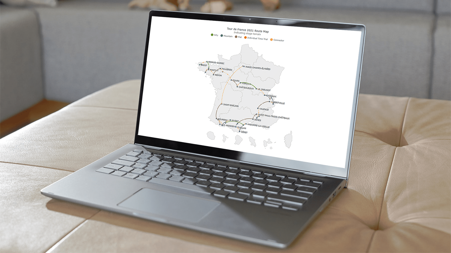 A connector map is a set of straight or curved lines that link points on a geographical map. It is commonly used to graphically represent routes or any other connections between locations. Would you like to learn how to build an attractive data visualization like that for a web page or app?
Actually, it is easy to create an interactive connector map using JavaScript. And I am ready to show you how right now! Follow along with this tutorial as I depict the cycling path of the 2021 Tour de France in the form of a JS connector map and thoroughly explain all steps.
Read the JS charting tutorial »
- Categories: AnyChart Charting Component, AnyMap, HTML5, JavaScript, JavaScript Chart Tutorials, Tips and Tricks
- 2 Comments »
How to Create Financial Open-High-Low-Close (OHLC) Chart Using JavaScript
September 7th, 2021 by Shachee Swadia A stepwise guide on how to create interactive financial charts in the form of an OHLC chart. Visualizing the stock prices of Amazon over the course of Jeff Bezos’s tenure as the CEO.
Financial charts are especially useful to represent large amounts of data and identify trends. Would like to learn one such cool financial chart called the OHLC chart that visualizes stock price movement?
Read the JS charting tutorial »
- Categories: AnyChart Charting Component, AnyStock, Big Data, Financial Charts, HTML5, JavaScript, JavaScript Chart Tutorials, Stock Charts, Tips and Tricks
- No Comments »
Building JS Resource Gantt Chart to Visualize Tokyo 2020 Paralympic Schedule
August 17th, 2021 by Shachee Swadia Smart resource allocation is a must to achieve a high level of operational efficiency. Aiming to ensure it, project management professionals commonly rely on a special form of data visualization called a Resource Gantt chart. Creating graphics like this may seem daunting at first sight. But I am here to show you an easy way to build Resource Gantt charts with JS using a compelling, topical example.
Resource Gantt charts, also known as simply Resource charts, consist of bars oriented along the horizontal axis. Each bar visualizes a resource used by an activity, with the length representing the duration while that resource is occupied by that activity. The left and right edges of the bars display the start and end times. The resources, or event labels, are listed on the left. The dates and times are shown in the header.
Tokyo 2020 Paralympic Games are just around the corner. So, I decided to visualize their sports program by venue. Follow along with this stepwise tutorial and you will learn how to create a cool JavaScript Resource Gantt chart visualizing the Tokyo 2020 Paralympic schedule!
Read the JS charting tutorial »
- Categories: AnyChart Charting Component, AnyGantt, Big Data, Business Intelligence, Gantt Chart, HTML5, JavaScript, JavaScript Chart Tutorials, Tips and Tricks
- No Comments »
Creating JS Flow Map in Four Steps
July 13th, 2021 by Shachee Swadia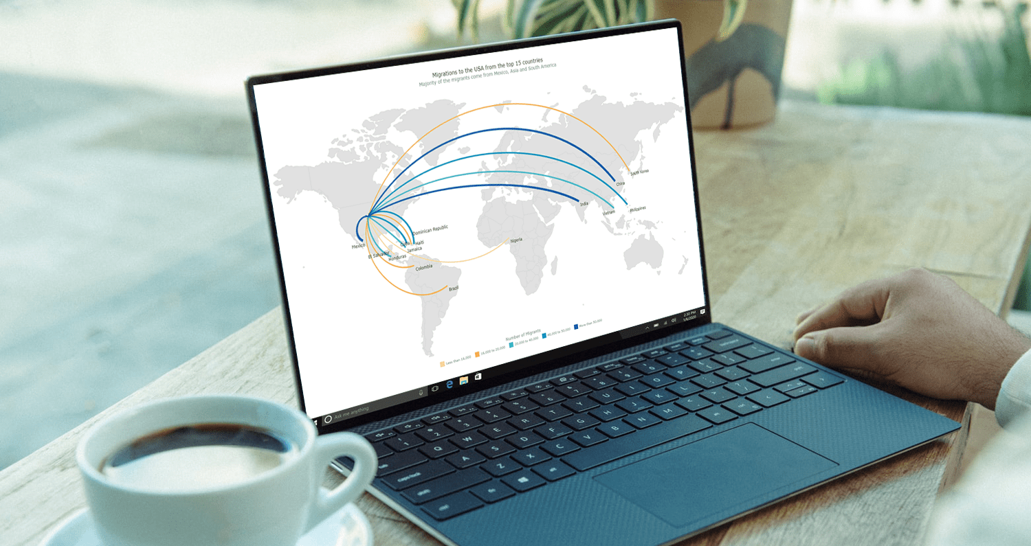 A step-by-step tutorial showing how to create an interactive JS Flow Map. Illustrated by visualizing data on migration to the US.
It may seem to be complicated to create an interactive Flow Map for the Web using JavaScript. But it’s not! This easy-to-follow tutorial will show you how to build beautiful JS flow maps without too much effort.
In these difficult times of the pandemic, there is a lot of confusion and concern about the immigration status of people around the globe. I decided to take a look at the immigration data of the US which has more migrants than any other country in the world. Here, I explore where these immigrants come from and represent the top 15 countries that contributed the highest number of migrants to the US in the year 2019.
A flow map seems the perfect way to showcase the inflow of migrants into the United States from various countries. Before going further, let me give you a brief idea about a flow map and its uses.
Read the JS charting tutorial »
- Categories: AnyChart Charting Component, AnyMap, Big Data, Business Intelligence, HTML5, JavaScript, JavaScript Chart Tutorials, Tips and Tricks
- 2 Comments »
How to Create Interactive Timeline Chart with JavaScript
June 17th, 2021 by Shachee Swadia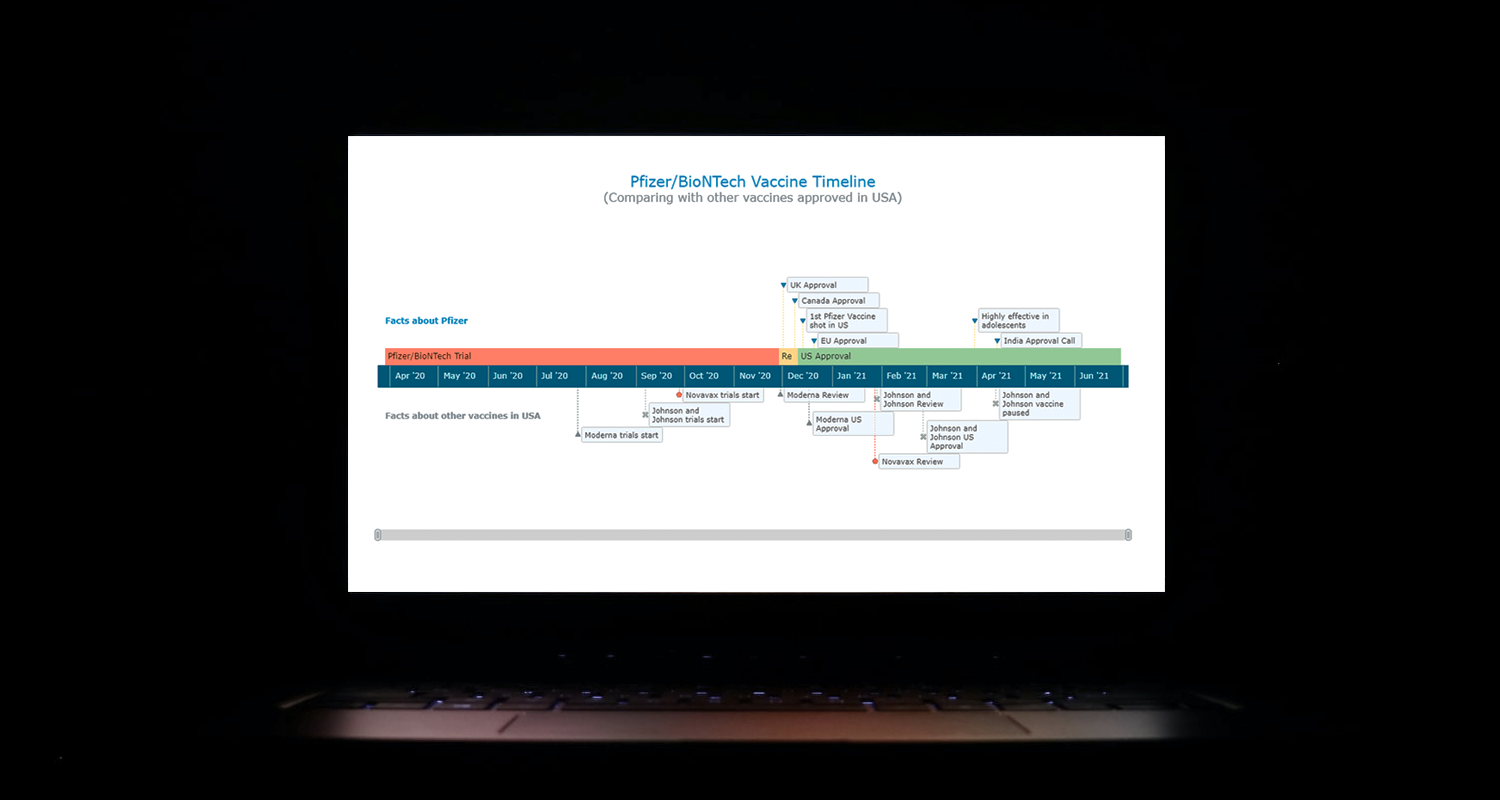 I think all of us have come across timelines somewhere or the other; as a means of conveying chronological information, the classic timeline is unmatched, both in the depth of information conveyed and the “cool” factor, when done with a deft creative touch. So, with that said, would you like to learn how to build a timeline chart using JavaScript that both looks great and is simple to create? (Of course, you do!) Follow along with me as I take you through the step-by-step breakdown for developing your own JS timeline with a practical example.
As the world continues to battle with COVID-19, the long-awaited good news is the development of vaccines across the globe. Here, I decided to build an interactive timeline that showcases the phases of Pfizer-BioNTech vaccine development in the United States. To add more contextual information, I also wanted to show approvals from other countries and some related facts, including the dates for the development of the 3 other vaccines approved for usage in the US.
Read the JS charting tutorial »
- Categories: AnyChart Charting Component, Big Data, Charts and Art, HTML5, JavaScript, JavaScript Chart Tutorials, Tips and Tricks
- No Comments »
Making JS Dot Density Map to Visualize Shipping Ports Across Globe
April 20th, 2021 by Shachee Swadia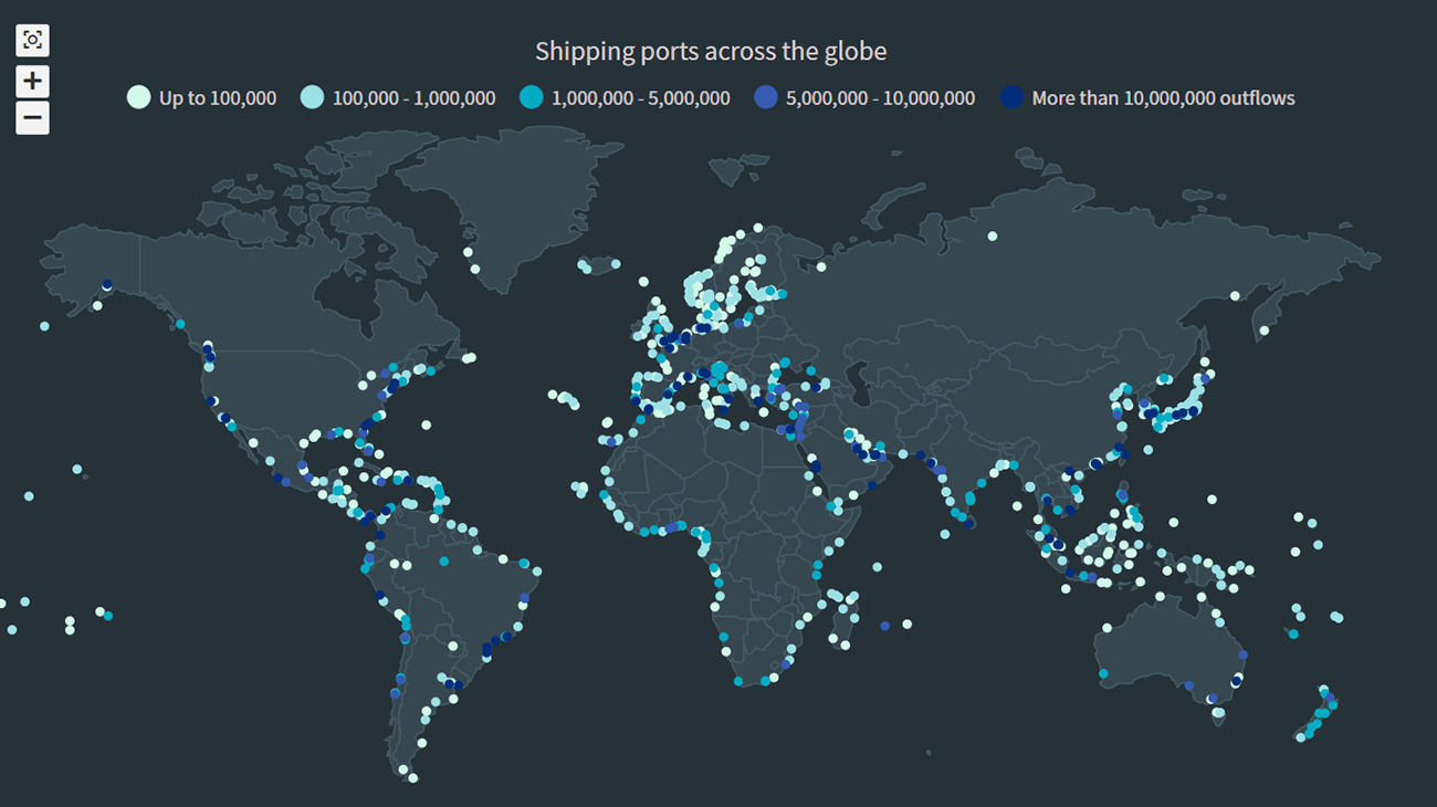 The recent incident of the Suez Canal blockage caught my interest in shipping and prompted me to explore the various shipping ports around the globe. There are more than 850 ports in the world and to get an overall view of where these are located, I decided to plot them on a dot map, or dot density map, using JavaScript.
Building an interactive JS dot density map can seem like a daunting task. But let me assure you that it can be pretty straightforward. Right now, I will show how to make a fully functional dot map chart using a JavaScript library for data visualization.
Read the JS charting tutorial »
- Categories: AnyChart Charting Component, AnyMap, Big Data, HTML5, JavaScript, JavaScript Chart Tutorials, Tips and Tricks
- No Comments »
Data Visualization for COVID-19 Dashboard Tracker Using AnyChart JS Charts
April 12th, 2021 by AnyChart Team![]() Data visualization has played an important role during the COVID-19 pandemic, allowing governments, scientists, healthcare professionals, and the general public to better understand different aspects of the crisis. There are many illuminating projects all over the web that leverage charts and maps to effectively communicate what the coronavirus statistics have to say. Some of them are using our data visualization tools under a free license provided as part of the special initiative we announced last spring to support the global COVID-19 data analysis effort.
Data visualization has played an important role during the COVID-19 pandemic, allowing governments, scientists, healthcare professionals, and the general public to better understand different aspects of the crisis. There are many illuminating projects all over the web that leverage charts and maps to effectively communicate what the coronavirus statistics have to say. Some of them are using our data visualization tools under a free license provided as part of the special initiative we announced last spring to support the global COVID-19 data analysis effort.
We told you about two examples of such projects earlier: StopCorona and iConcepts SARS-CoV-2 Stats. Now let us introduce you to another interesting resource — COVID-19 Dashboard Tracker by Maxime des Touches. Launched more than a year ago, while Maxime was yet a computer science student, it has turned from a simple online data table into a complex interactive data visualization project offering up-to-date insight into how the pandemic unfolds in France and worldwide.
Maxime kindly agreed to talk to us about his COVID-19 tracker, experience using AnyChart, and the pandemic in general. Check out our quick interview, glance at a few screenshots, and try his open-source dashboard by yourself. (Stack: HTML/jQuery/JSON.)
- Categories: AnyChart Charting Component, AnyStock, Big Data, Dashboards, HTML5, JavaScript, Stock Charts, Success Stories
- No Comments »
How to Create Bubble Map with JavaScript to Visualize Election Results
January 25th, 2021 by Shachee Swadia In these times of exponentially growing data, visualization is a necessary skillset to have in your tool box. Popular techniques include bar charts, line graphs, pie charts, and bubble maps among others.
Building interactive charts from scratch with JavaScript can be a difficult endeavor for any developer, especially someone starting out new. That is exactly why we have JS charting libraries which make it much easier and quicker to conjure up insightful visualizations!
Read on to see how I create a JavaScript Bubble Map with one of these libraries.
Read the JS charting tutorial »
- Categories: AnyChart Charting Component, AnyMap, Big Data, Charts and Art, HTML5, JavaScript, JavaScript Chart Tutorials, Tips and Tricks
- No Comments »