 The recent incident of the Suez Canal blockage caught my interest in shipping and prompted me to explore the various shipping ports around the globe. There are more than 850 ports in the world and to get an overall view of where these are located, I decided to plot them on a dot map, or dot density map, using JavaScript.
Building an interactive JS dot density map can seem like a daunting task. But let me assure you that it can be pretty straightforward. Right now, I will show how to make a fully functional dot map chart using a JavaScript library for data visualization.
JavaScript Charting Libraries
There are some great JavaScript charting libraries available to use with each one of them having its advantages and disadvantages. The good part with using JS libraries is that the logic of the chart creation process with all of them is quite similar. So, you can learn the basics with one and then extrapolate your learnings to use the library that suits your project’s requirements.
For this tutorial, I have decided to use AnyChart JS Charts library to create the dot density map. I think it is a great choice for beginners because AnyChart is easy to use yet flexible with extensive documentation and loads of examples.
Building Dot Density Map with JavaScript
Whether it’s a dot density map or any other map or chart, when it comes to JavaScript charting there are four basic steps that are generally needed to make a data visualization of almost any type:
- Create the HTML page where the chart will be displayed.
- Include all necessary JavaScript files.
- Prepare the data you want to visualize.
- Write the JS code for the chart.
1. Create a basic HTML page
The first step is to create a blank HTML page to hold the dot map chart. I add a div element with a unique id that I will use to reference it later.
Note that you can specify the width and height parameters inside the <style> block to modify the space that your visualization will occupy. I have put 100% in both parameters so my dot density map will fill the whole page.
<html>
  <head>
    <title>JavaScript Dot Map</title>
    <style type="text/css">
      html, body, #container {
        width: 100%;
        height: 100%;
        margin: 0;
        padding: 0;
      }
    </style>
  </head>
  <body>
    <div id="container"></div>
  </body>
</html>
2. Include the required scripts
The next step is to link the appropriate JS scripts that will be used to create the dot map. Since I am using the AnyChart library, I will reference the corresponding files. For my map, I need to add AnyChart’s Core and Geo Maps modules. I also need to include the file that has the geodata for the world map which is also available in the library’s CDN.
All these script files need to be included in the <head> section of the HTML page.
<html>
  <head>
    <title>JavaScript Dot Map</title>
    <script src="https://cdn.anychart.com/releases/8.9.0/js/anychart-core.min.js"></script>
    <script src="https://cdn.anychart.com/releases/8.9.0/js/anychart-map.min.js"></script>
    <script src="https://cdn.anychart.com/geodata/latest/custom/world/world.js"></script>

    <style type="text/css">
      html, body, #container {
        width: 100%;
        height: 100%;
        margin: 0;
        padding: 0;
      }
    </style>
  </head>
  <body>
    <div id="container"></div>
    <script>
      // All the code for the JS dot density map will come here.
    </script>
  </body>
</html>
3. Connect the data
I downloaded the shipping port data from The World Bank Data Catalog.
The AnyChart library supports many data formats, including CSV, JSON, and XML. My file is JSON which you can download here.
Before we start using the data, I include two more script files on the HTML page. To handle the loading of the data file, I add the Data Adapter module. Since I am creating a map, I will make use of another JavaScript library — Proj4js — which transforms point coordinates from one coordinate system to another. In simple terms, it will take care of plotting the dots over the respective geographical areas.
I then use the loadJsonFile method inside the <script> tag in the body of the HTML page to load the JSON file.
<html>
  <head>
    <title>JavaScript Dot Map</title>
    <script src="https://cdn.anychart.com/releases/8.9.0/js/anychart-base.min.js"></script>
    <script src="https://cdn.anychart.com/releases/8.9.0/js/anychart-map.min.js"></script>
    <script src="https://cdn.anychart.com/geodata/latest/custom/world/world.js"></script>

    <script src="https://cdn.anychart.com/releases/8.9.0/js/anychart-data-adapter.min.js"></script>
    <script src="https://cdnjs.cloudflare.com/ajax/libs/proj4js/2.3.15/proj4.js"></script>

    <style type="text/css">
      html, body, #container {
        width: 100%;
        height: 100%;
        margin: 0;
        padding: 0;
      }
    </style>
  </head>
  <body>
    <div id="container"></div>
    <script>
      anychart.data.loadJsonFile('https://gist.githubusercontent.com/shacheeswadia/47b28a4d061e415555f01f5ce48e9ae3/raw/0f7592a8048872db7b77ccd2df8907e61952a806/shippingDataInverted.json', function (data) {})
    </script>
  </body>
</html>
So, now that the package is all ready, it is time to ship it!
4. Add the code to draw the dot density map
The best part of using JS charting libraries is that the amount of code to write is really limited. I am not exaggerating when I say that the dot density map will be built in just 10 lines of code.
Firstly, I will make sure that all the code for creating the chart is inside the anychart.onDocumentReady() function. This is to have the page fully loaded before anything else is executed. After the data is loaded, as we saw in the earlier step, I create the map and set the geodata. I also add a title to the map.
<script>
  anychart.onDocumentReady(function() {
    anychart.data.loadJsonFile('https://gist.githubusercontent.com/shacheeswadia/47b28a4d061e415555f01f5ce48e9ae3/raw/0f7592a8048872db7b77ccd2df8907e61952a806/shippingDataInverted.json',
    function (data) {

      // set the map chart
      var map = anychart.map();

      // set the global geodata
      map.geoData('anychart.maps.world');

      // set the map title
      map.title( 'Shipping ports across the globe');

    });
  });
</script>
Next, I create a series that will mark the seaports on the map as dots. Each point displays a latitude and longitude label by default which I don’t want so I disable the labels for the series.
// set the marker series
var series = map.marker(anychart.data.set(data));

// disable labels to not show latitude and longitude for each point
series.labels(false);
The final two lines of code are setting the container to reference the previously added HTML block element and drawing the map.
// set the containter
map.container('container');

// draw the map
map.draw();
That’s it — a fully functional interactive dot density map is delivered!
You can check out this initial version with the code here, or on CodePen, or on AnyChart Playground.
<html>
  <head>
    <title>JavaScript Dot Map</title>
    <script src="https://cdn.anychart.com/releases/8.9.0/js/anychart-base.min.js"></script>
    <script src="https://cdn.anychart.com/releases/8.9.0/js/anychart-map.min.js"></script>
    <script src="https://cdn.anychart.com/geodata/latest/custom/world/world.js"></script>

    <script src="https://cdn.anychart.com/releases/8.9.0/js/anychart-data-adapter.min.js"></script>
    <script src="https://cdnjs.cloudflare.com/ajax/libs/proj4js/2.3.15/proj4.js"></script>

    <style type="text/css">
      html, body, #container {
        width: 100%;
        height: 100%;
        margin: 0;
        padding: 0;
      }
    </style>
  </head>
  <body>
    <div id="container"></div>
    <script>
    anychart.onDocumentReady(function() {
      anychart.data.loadJsonFile('https://gist.githubusercontent.com/shacheeswadia/47b28a4d061e415555f01f5ce48e9ae3/raw/0f7592a8048872db7b77ccd2df8907e61952a806/shippingDataInverted.json',
      function (data) {

        // set the map chart
        var map = anychart.map();

        // set the global geodata
        map.geoData('anychart.maps.world');

        // set the chart title
        map.title( 'Shipping ports across the globe');

        // set the marker series
        var series = map.marker(anychart.data.set(data));

        // disable labels to not show latitude and longitude for each point
        series.labels(false);

        // set the container
        map.container('container');

        // draw the chart
        map.draw();

      });
    });
    </script>
  </body>
</html>
Customizing JS Dot Map
We have a basic dot map built in JavaScript here, with predefined styles and features. However, there are numerous ways you can easily tweak the map to make it more engaging. You may want to make your graphic aesthetically better, to highlight a particularly interesting aspect of the data visualization, or to add some functionality to improve the information being shown.
I will show you how to customize the JS dot density map in the following ways:
- Indicate the number of outflows at each shipping port with a color scale.
- Enhance the tooltip.
- Add zoom functionality for the map.
- Change the overall color theme.
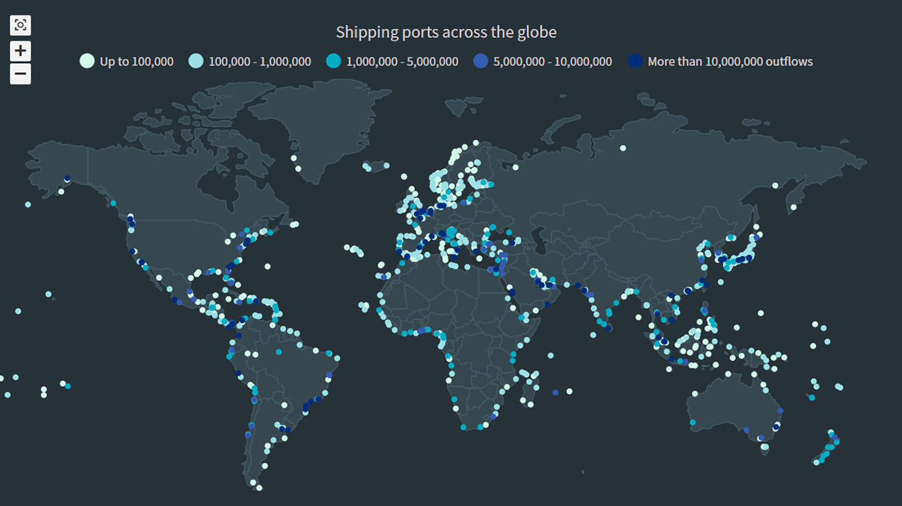
1. Indicate the number of outflows at each port with a color scale
I wanted to show more information in the visualization without adding too much complexity. So, I add an extra dimension to the dot map by using colors to represent the number of outflows from each shipping port. This requires a bit of coding so follow along as I explain how I do this.
Firstly, I define the dataset that I will map to multiple series with different colors based on the outflow numbers.
var portsDataSet = anychart.data.set(data).mapAs();Next, I create a function that defines how I want to represent the series and also the legend for this representation. Now, using this function, I create five different series, each with a name, minimum/maximum number of outflows, and color.
// helper function to create several series
var createSeries = function (name, data, color) {

  // set the marker series
  var series = map.marker(data);

  // configure the series settings
  series
    .name(name)
    .fill(color)
    .stroke('2 #E1E1E1')
    .type('circle')
    .size(5)
    .labels(false)
    .selectionMode('none');

  series
    .legendItem()
    .iconType('circle')
    .iconFill(color)
    .iconStroke('2 #E1E1E1');
  };

// create 5 series, filtering the data by the outflows at each port
createSeries(
  'Up to 100,000',
  portsDataSet.filter('outflows', filterFunction(0, 100000)),
  '#D1FAE9'
);
createSeries(
  '100,000 - 1,000,000',
  portsDataSet.filter('outflows', filterFunction(100000, 1000000)),
  '#9CE0E5'
);
createSeries(
  '1,000,000 - 5,000,000',
  portsDataSet.filter('outflows', filterFunction(1000000, 5000000)),
  '#00ACC3'
);
createSeries(
  '5,000,000 - 10,000,000',
  portsDataSet.filter('outflows', filterFunction(5000000, 10000000)),
  '#355CB1'
);
createSeries(
  'More than 10,000,000 outflows',
  portsDataSet.filter('outflows', filterFunction(10000000, 0)),
  '#002D79'
);
You will see that a filter function is used to segregate data in each series. This filter function is defined right at the end of the code.
// helper filter function
function filterFunction(val1, val2) {
  if (val2) {
    return function (fieldVal) {
      return val1 <= fieldVal && fieldVal < val2;
    };
  }
  return function (fieldVal) {
    return val1 <= fieldVal;
  };
}
I enable the legend for the map and voila, you can see the dots colored in 5 different shades according to the outflow numbers.
map.legend(true);
Don’t worry if all this feels a bit overwhelming. It is a bit beyond the beginner level but not too complicated if you follow the steps. You can play with the code of this customized dot density map on CodePen, or on AnyChart Playground.
2. Enhance the map tooltip
The default tooltip of the dot map just shows the latitude and longitude of each point so I customize the tooltip to display some more meaningful information.
For each point, I show the name of the shipping port as the title of the tooltip and the country as well as the number of outflows in the body of the tooltip. Since I want to show multiple fields, I enable HTML for the tooltip that would allow me to format the text. I then add all the information in HTML format.
map
  .tooltip()
  .useHtml(true)
  .padding([8, 13, 10, 13])
  .width(350)
  .fontSize(12)
  .fontColor('#e6e6e6')
  .titleFormat(function () {
    return this.getData('Name');
  })
  .format(function () {
    return (
      '<span style="color: #bfbfbf;">Country: </span>'+
      this.getData('Country') +
      '<br/>' +
      '<span style="color: #bfbfbf;">Outflows: </span>' +
      this.getData('outflows').toFixed(0)
    );
  });
Doesn’t the tooltip now feel like a useful additive to the dot density map?
3. Add zoom functionality for the map
In the dot map, I noticed that there are clusters indicating a lot of shipping ports in certain areas. To enable a viewer to have a closer view of those areas, I add the zoom functionality.
For this, I first need to include some scripts and CSS links. I add all those in the <head> section. Then, I just add two lines to enable zoom UI controls for the map. This again shows how easy and convenient it is to add such features when using an appropriate data visualization library like AnyChart.
<script src="https://cdn.anychart.com/releases/8.9.0/js/anychart-exports.min.js"></script>
<script src="https://cdn.anychart.com/releases/8.9.0/js/anychart-ui.min.js"></script>

<link rel="stylesheet" type="text/css" href="https://cdn.anychart.com/releases/8.9.0/css/anychart-ui.min.css">
<link rel="stylesheet" type="text/css" href="https://cdn.anychart.com/releases/8.9.0/fonts/css/anychart-font.min.css">
// add zoom ui controls
var zoomController = anychart.ui.zoom();
zoomController.render(map);Check out the Move and Zoom API documentation if you want to set up any other interactive behavior to let the viewer dig into the data displayed on the map.
4. Change the overall theme and some appearance tweaks
To polish the dot density map just, I make some simple modifications. I decide to change the background of the map to a darker shade which would highlight the dots. For this, I use one of AnyChart’s inbuilt themes — Dark Glamour — that includes predefined settings like the dark background color. For this, I include the theme script and add a line of code to set the theme for the map.
<script src="https://cdn.anychart.com/releases/8.9.0/themes/dark_glamour.min.js"></script>// set the color theme
anychart.theme('darkGlamour');
One last thing I do is reduce the size of the markers and remove the stroke for the series.
series
.name(name)
.fill(color)
.stroke('none')
.type('circle')
.size(3)
.labels(false)
.selectionMode('none');There you have it! A really cool and beautiful dot map that intuitively showcases the different shipping ports around the globe.
Have a look at the code on CodePen, or on AnyChart Playground, or right here below.
<html>
<head>
<title>JavaScript Dot Map</title>
<script src="https://cdn.anychart.com/releases/8.9.0/js/anychart-base.min.js"></script>
<script src="https://cdn.anychart.com/releases/8.9.0/js/anychart-map.min.js"></script>
<script src="https://cdn.anychart.com/geodata/latest/custom/world/world.js"></script>
<script src="https://cdn.anychart.com/releases/8.9.0/js/anychart-data-adapter.min.js"></script>
<script src="https://cdnjs.cloudflare.com/ajax/libs/proj4js/2.3.15/proj4.js"></script>
<script src="https://cdn.anychart.com/releases/8.9.0/js/anychart-exports.min.js"></script>
<script src="https://cdn.anychart.com/releases/8.9.0/js/anychart-ui.min.js"></script>
<script src="https://cdn.anychart.com/releases/8.9.0/themes/dark_glamour.min.js"></script>
<link rel="stylesheet" type="text/css" href="https://cdn.anychart.com/releases/8.9.0/css/anychart-ui.min.css">
<link rel="stylesheet" type="text/css" href="https://cdn.anychart.com/releases/8.9.0/fonts/css/anychart-font.min.css">
<style type="text/css">
html, body, #container {
width: 100%;
height: 100%;
margin: 0;
padding: 0;
}
</style>
</head>
<body>
<div id="container"></div>
<script>
anychart.onDocumentReady(function() {
anychart.data.loadJsonFile('https://gist.githubusercontent.com/shacheeswadia/47b28a4d061e415555f01f5ce48e9ae3/raw/0f7592a8048872db7b77ccd2df8907e61952a806/shippingDataInverted.json',
function (data) {
// set the color theme
anychart.theme('darkGlamour');
// set the map chart
var map = anychart.map();
// set the global geodata
map.geoData('anychart.maps.world');
// set the chart title
map.title( 'Shipping ports across the globe');
// create a dataset from data
var portsDataSet = anychart.data.set(data).mapAs();
// helper function to create several series
var createSeries = function (name, data, color) {
// set the marker series
var series = map.marker(data);
// configure the series settings
series
.name(name)
.fill(color)
.stroke('none')
.type('circle')
.size(3)
.labels(false)
.selectionMode('none');
series
.legendItem()
.iconType('circle')
.iconFill(color);
};
// create 5 series, filtering the data by the outflows at each port
createSeries(
'Up to 100,000',
portsDataSet.filter('outflows', filterFunction(0, 100000)),
'#D1FAE9'
);
createSeries(
'100,000 - 1,000,000',
portsDataSet.filter('outflows', filterFunction(100000, 1000000)),
'#9CE0E5'
);
createSeries(
'1,000,000 - 5,000,000',
portsDataSet.filter('outflows', filterFunction(1000000, 5000000)),
'#00ACC3'
);
createSeries(
'5,000,000 - 10,000,000',
portsDataSet.filter('outflows', filterFunction(5000000, 10000000)),
'#355CB1'
);
createSeries(
'More than 10,000,000 outflows',
portsDataSet.filter('outflows', filterFunction(10000000, 0)),
'#002D79'
);
// enable and configure the map tooltip
map
.tooltip()
.useHtml(true)
.padding([8, 13, 10, 13])
.width(350)
.fontSize(12)
.fontColor('#e6e6e6')
.titleFormat(function () {
return this.getData('Name');
})
.format(function () {
return (
'<span style="color: #bfbfbf">Country: </span>'+
this.getData('Country') +
'<br/>' +
'<span style="color: #bfbfbf">Outflows: </span>' +
this.getData('outflows').toFixed(0)
);
});
// turn on the map legend
map.legend(true);
// add zoom ui controls
var zoomController = anychart.ui.zoom();
zoomController.render(map);
// set the container
map.container('container');
// draw the map
map.draw();
});
});
// helper filter function
function filterFunction(val1, val2) {
if (val2) {
return function (fieldVal) {
return val1 <= fieldVal && fieldVal < val2;
};
}
return function (fieldVal) {
return val1 <= fieldVal;
};
}
</script>
</body>
</html>
Conclusion
As you see, it is quite simple and exciting to create interactive data visualizations like dot density maps using a JavaScript library. There are many different types of charts and maps available with AnyChart so check out the various options here.
I hope this tutorial has piqued your interest in dot maps and JavaScript charts in general. Please feel free to ask any questions, offer suggestions, or drop a comment. Go on, explore the seas and let your data visualization ship sail!
We at AnyChart are glad to thank Shachee Swadia for creating this amazing JS Dot Map tutorial.
If you want to write an interesting guest post for our blog, please contact us.
Check out other JavaScript charting tutorials.
- Categories: AnyChart Charting Component, AnyMap, Big Data, HTML5, JavaScript, JavaScript Chart Tutorials, Tips and Tricks
- No Comments »