 Sparklines are elegant microcharts introduced by Edward Tufte, a renowned statistician and data visualization pioneer. Drawn without any axis and occupying minimal space, these tiny graphs are designed to represent the big picture displaying trends in line with text and within table cells. If you want to learn about an easy way of building a sparkline chart, it is the right place!
In this article, I will show you how to quickly create cool sparkline charts using JavaScript. With OTT content ruling the world of entertainment these days, let’s have fun learning and look at the IMDb ratings of one of the most popular shows nowadays — Money Heist (La Casa de Papel in its original Spanish).
Without more ado, come along on this journey of knowledge heist!
JS Sparkline Charts to Be Built
In the tutorial, we will be creating a total of two JavaScript-based sparkline charts with different series.
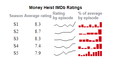
The line sparklines will display how the IMDb ratings of the episodes change over each of the five seasons of Money Heist.
The column sparklines will indicate how each episode’s rating stands compared to that season’s average, in percentages: The former will have a value of 100% if it equals the latter and a greater or smaller value for anything more or less than the average, respectively.
Check out how our JS sparkline charts will look and keep reading to delve into this data visualization development process step by step!
One may think there is a trick somewhere and you need to know a lot about coding but it is actually relatively easy and the final JavaScript code will be lean 40+ lines of Vanilla JS.
Creating JavaScript Sparkline Chart
A lovely JS sparkline chart can be created in just four simple steps. Isn’t that perfecto?
- Make an HTML page.
- Add the script files to be used.
- Connect the data.
- Write the JavaScript charting code.
1. Make an HTML page
To begin with, we need a basic HTML page with a <table> element that will hold all the data values along with the sparkline charts. To reference the table later in the code, we’ll provide it with an ID parameter. For example, “tb-seasons.”
Then, let’s add the table head to display the title of the whole table and the headings of each column. Long texts will be broken into two lines so the entire sparkline chart-based data visualization project looks neater.
Finally, of course, we also need to define the body of the table. It is where our data values and sparkline charts themselves will be rendered.
<html>

  <head>
    <title>JavaScript Sparkline Chart</title>
    <style type="text/css">
      html,
      body {
        width: 100%;
        margin:0;
        padding: 0;
      }
      tr {
        overflow: hidden;
        height: 14px;
        white-space: nowrap;
      }
      td {
        text-align: center;
        vertical-align: middle;
      }
      .chart {
        height: 20px;
        width: 80px;
      }
    </style>
  </head>
  <body>
    <table id="tb-seasons">
      <thead>
        <tr>
          <th id="tg-head" colspan="4">Money Heist IMDb Ratings</th>
        </tr>
        <tr>
          <th id="tg-head">Season</th>
          <th id="tg-head">Average rating</th>
          <th id="tg-head">Rating<br>by episode</th>
          <th id="tg-head">% of average<br>by episode</th>
        </tr>
      </thead>
      <tbody>
      </tbody>
    </table>
  </body>
</html>
As you see, in this first step, we have also specified the styles for the body, each row, and each cell of the table. In this example, the height of the chart is as small as 20 pixels, and the width of the chart is only 80 pixels. This is done to showcase that sparkline charts work without taking much space and to drive home the point that they are designed to serve as micrographs in tables.
2. Add the script files to be used
Next, we need to reference all the required scripts that will be used to create a sparkline chart visualization.
There are many JavaScript charting libraries out there. However, not all of them support sparkline charts. Here, we will be using one that does, AnyChart. It is lightweight, flexible, and a good choice for beginners because there are many examples and detailed documentation.
Let’s add the necessary script files from AnyChart CDN. To build sparkline charts using this JS library for data visualization, we need three specific scripts: the core module, the sparkline module, and the data adapter module. So, we’ll include them all in the <head> section of the HTML page created in the first step.
<html>
  <head>
    <title>JavaScript Sparkline Chart</title>
    <script src="https://cdn.anychart.com/releases/8.11.0/js/anychart-core.min.js"></script>
    <script src="https://cdn.anychart.com/releases/8.11.0/js/anychart-sparkline.min.js"></script>
    <script src="https://cdn.anychart.com/releases/8.11.0/js/anychart-data-adapter.min.js"></script>
    <style type="text/css">
      // The HTML body and table styles.
    </style>
  </head>
  <body>
    // The table to hold the data values and the charts.
    <script>
      // All the code for the JS sparkline chart will come here.
    </script>
  </body>
</html>
3. Connect the data
I have already taken the Money Heist ratings data from the IMDb website and created a JSON file in the format required for our sparklines. We will then connect that dataset using the data.loadJsonFile function.
Now the stage is all set, so let’s get to immediately making the forethought interactive sparkline graphics by writing a little bit of JavaScript charting code!
4. Write the JavaScript charting code
Sparkline charts are rendered within a table. Therefore, creating a table with sparkline charts involves adding data for each row of the table. It may not be as simple as making one single bar chart or a line chart. But we will go through each line of code, so do not worry as you’ll see creating an interactive JS sparkline chart is really far from rocket science.
Let’s start with adding a function that encloses the code to ensure that the page is fully loaded before executing any code. Then we will add the data file.
The first thing to do after adding the data is to create a function to iterate through data and call another function to create a row for each season.
function (data) {
  // go through the data and add each season's info and charts to the table
  Object.entries(data).forEach(([key, value]) => createSeason(key, data));
}
Next, let’s define the new function called just now.
First, let’s get a link for the table body where we want to add the rows using the ID assigned in the first step. Next, we will add a new row and set its height to 30px. In this row, we’ll insert cells to hold the season number, the average rating of that season, and the sparklines. The latter will be made using another function and based on the sparkline chart type, line or column.
function createSeason(season, data){

  // get a table link
  var tbodyRef = document.getElementById('tb-seasons').getElementsByTagName('tbody')[0];

  // insert a row at the end of the table
  var newRow = tbodyRef.insertRow();
  newRow.setAttribute('height', '30px');

  // append a season name text node to a cell
  newRow.insertCell().appendChild(document.createTextNode(season));

  // append a season rating cell
  newRow.insertCell().appendChild(document.createTextNode(data[season]
.avg));

  // create a line sparkline chart showing ratings
  var lineDiv = createSparkline(data[season], 'episodeRatings', 'line');

  // append it
  newRow.insertCell().appendChild(lineDiv);

  // create a column sparkline chart showing percentages
  var columnDiv = createSparkline(data[season], 'percentOfAvg', 'column');

  // append it
  newRow.insertCell().appendChild(columnDiv);

}
The last thing to do is define the function that will build the sparkline charts with the desired series type.
// create sparkline of a given type, color, and from a given field
function createSparkline(data, field, type){

  var sparkline = anychart.sparkline(data[field]);
  sparkline.seriesType(type);

  // create a div for the sparklines and assign a css class name
  var chartDiv = document.createElement('div');
  chartDiv.setAttribute('class', 'chart');

  sparkline.container(chartDiv);
  sparkline.draw();

  return chartDiv;

}
Tada — beautiful and functional interactive JS sparkline charts are made! Wasn’t it even easier than expected?
We can immediately notice the trend of growing ratings within each season of Money Heist and that the last episode is always the highest-rated. That’s one of the greatest advantages of sparkline charts.
The interactive version of this basic JavaScript sparkline chart-based data visualization with the full code can be found on AnyChart Playground. Next, we will customize the graphs to make them look even better.
Customizing Sparklines
A huge advantage of using a JavaScript charting library with the sparkline type of data visualization available out of the box, like the AnyChart JS library, is the ease of creating a basic version along with a plethora of options to customize the chart. We’ll improve the look of our sparklines right away.
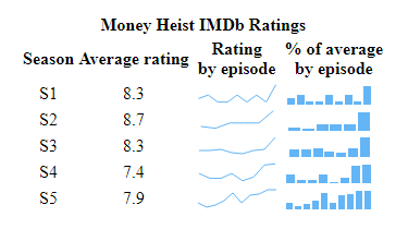
Modifying the color palette
A very easy and effective idea to uplift the chart is to use colors that match the data that we are representing. Since our data is about the TV series Money Heist, we can simply use the red and black colors predominantly seen in any Money Heist poster.
Let’s use the black color to depict the line sparklines and the red color for the column sparklines. It can be done by setting the stroke color for the former and the fill color for the latter.
We will simply add the color parameters to both sparkline building functions and pass the color values when calling them.
// create a line sparkline chart showing ratings
var lineDiv = createSparkline(data[season], 'episodeRatings', 'line', '#040102');

// create a column sparkline chart showing percentages
var columnDiv = createSparkline(data[season], 'percentOfAvg', 'column', '#cf0011');

…

sparkline.fill(color).stroke(color);
Improving the headings
To make our visual more attractive, we can push some style changes. Let’s start with the title. We’ll give a class to the top row and configure the style settings for that class.
<tr class="main-heading">
  <th id="tg-head" colspan="4">Money Heist IMDb Ratings</th>
</tr>

…

.main-heading {
  font-family: sans-serif;
  font-size: 14px;
}
Similarly, let’s add some custom styles for the headings of the columns.
<tr class="col-headings">
  <th id="tg-head">Season</th>
  <th id="tg-head">Average rating</th>
  <th id="tg-head">Rating<br>by episode</th>
  <th id="tg-head">% of average<br>by episode</th>
</tr>

…

.col-headings {
  font-family: sans-serif;
  font-size: 13px;
  color: #7c868e;
  font-weight: 300;
  text-align: left;
}
Here is a sneak peek at how stunning the sparklines look with just these easy modifications. You can take a look at the interactive version with the code here.
Changing the tooltip
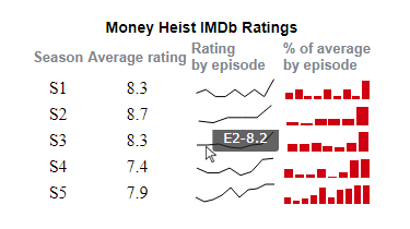
A tooltip should always add some value and help in showing more information when it’s needed. In our sparkline charts, the default tooltip shows X and Y values, which is not very insightful. Let’s make it display the episode number and the value for each data point — episode rating in the line sparkling charts and percentage in the column chart.
Just like we did for colors, we’ll add the tooltip parameters to the functions and pass the custom tooltip text according to the type of sparkline series.
sparkline.tooltip().format(function() {
  var x = (this.x) + 1;
  return "E" + x + "-" + this.value + tooltipPostfix;
});
That’s it! Visually appealing and informative sparklines are ready!
Check out the final interactive JS sparkline chart on AnyChart Playground where you can also continue improving it, add some other data, and so on. The full code is also below just in case.
<html>

<head>
  <title>JavaScript Sparkline Chart</title>
  <script src="https://cdn.anychart.com/releases/8.11.0/js/anychart-core.min.js"></script>
  <script src="https://cdn.anychart.com/releases/8.11.0/js/anychart-sparkline.min.js"></script>
  <script src="https://cdn.anychart.com/releases/8.11.0/js/anychart-data-adapter.min.js"></script>

  <table id="tb-seasons">
    <thead>
      <tr class="main-heading">
        <th id="tg-head" colspan="4">Money Heist IMDb Ratings</th>
      </tr>
      <tr class="col-headings">
        <th id="tg-head">Season</th>
        <th id="tg-head">Average rating</th>
        <th id="tg-head">Rating<br>by episode</th>
        <th id="tg-head">% of average<br>by episode</th>
      </tr>
    </thead>
    <tbody>
    </tbody>
  </table>

  <style type="text/css">
    html,
    body {
      width: 100%;
      margin: 0;
      padding: 0;
    }

    tr {
      overflow: hidden;
      height: 14px;
      white-space: nowrap;
    }

    td {
      text-align: center;
      vertical-align: middle;
    }

    .chart {
      height: 20px;
      width: 80px;
    }

    .main-heading {
      font-family: sans-serif;
      font-size: 14px;
    }

    .col-headings {
      font-family: sans-serif;
      font-size: 13px;
      color: #7c868e;
      font-weight: 300;
      text-align: left;
    }
  </style>
</head>

<body>

  <div id="container"></div>

  <script>
    anychart.onDocumentReady(function () {
      anychart.data.loadJsonFile('https://gist.githubusercontent.com/shacheeswadia/21ddfa122938e676bf9e7911e1417d9a/raw/d28d7a22b968bb39d755285d28ce949b31276628/sparklineChartData.json',
        function (data) {
          // go through the data and add each season's info and charts to the table
          Object.entries(data).forEach(([key, value]) => createSeason(key, data));
        }
      );
    });

    function createSeason(season, data) {
      // get a table link
      var tbodyRef = document.getElementById('tb-seasons').getElementsByTagName('tbody')[0];
      // insert a row at the end of the table
      var newRow = tbodyRef.insertRow();
      newRow.setAttribute('height', '30px');
      // append a season name text node to a cell
      newRow.insertCell().appendChild(document.createTextNode(season));
      // append a season rating cell
      newRow.insertCell().appendChild(document.createTextNode(data[season].avg));
      // create a line sparkline chart showing ratings
      var lineDiv = createSparkline(data[season], 'episodeRatings', 'line', '#040102', 'Rating', '');
      // append it
      newRow.insertCell().appendChild(lineDiv);
      // create a column sparkline chart showing percentages
      var columnDiv = createSparkline(data[season], 'percentOfAvg', 'column', '#cf0011', 'Percent of average', '%');
      // append it
      newRow.insertCell().appendChild(columnDiv);
    }

    // create sparkline of a given type, color, and from a given field
    function createSparkline(data, field, type, color, tooltipText, tooltipPostfix) {
      var sparkline = anychart.sparkline(data[field]);
      sparkline.seriesType(type);
      sparkline.fill(color).stroke(color);
      sparkline.tooltip().format(function () {
        var x = (this.x) + 1;
        return "E" + x + "-" + this.value + tooltipPostfix;
      });
      // create a div for the sparklines and assign a css class name
      var chartDiv = document.createElement('div');
      chartDiv.setAttribute('class', 'chart');
      sparkline.container(chartDiv);
      sparkline.draw();
      return chartDiv;
    }
  </script>

</body>
</html>
Conclusion
You see it is really interesting and easy to build elegant sparklines with JavaScript. To see what else is possible, don’t hesitate to look at the sparkline charting docs and examples in the AnyChart gallery.
So then, let us all use our brains not for plotting a bank robbery but for creating some lovely visual charts of this and many other types!
We want to thank freelance data visualizer Shachee Swadia for creating this amazing JavaScript Sparkline Chart tutorial as a guest post.
To learn more about sparkline charts, visit Chartopedia.
We also have many other JS chart tutorials in case you are interested.
Got an idea of a no less awesome guest post? We are eager to hear from you!
- Categories: AnyChart Charting Component, Big Data, HTML5, JavaScript, JavaScript Chart Tutorials, Tips and Tricks
- No Comments »