Freshest Data Visualization Inspirations — DataViz Weekly
July 1st, 2022 by AnyChart Team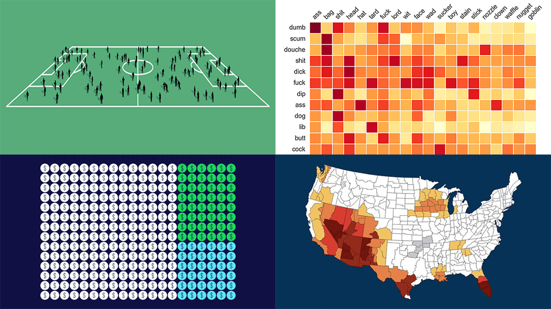 Need some inspiration for data visualization? Especially for you, on DataViz Weekly, we’ve selected four new online projects where charts and maps do a fascinating job to explain and let people explore a thing!
- Population of England and Wales, according to Census 2021 — ONS
- Daily estimates of climate change’s impact on temperatures across the U.S. — Climate Central
- Compound pejoratives on Reddit — Colin Morris
- Music streaming revenue distribution model — The Pudding
- Categories: Data Visualization Weekly
- No Comments »
Stunning Visualizations of Heat Records, Election Results, Time Splits, Air Pollution Data — DataViz Weekly
May 27th, 2022 by AnyChart Team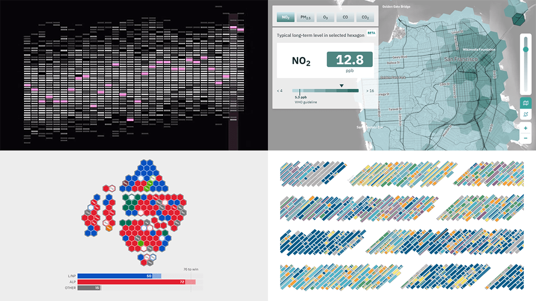 Ready for another serving of stunning data visualizations? Here you go with DataViz Weekly! Look at four projects that have caught our eyes most recently.
- Heat records in 400 U.S. cities — The Pudding
- 2022 Australian election’s unfolding and results — ABC News
- Air quality in the San Francisco Bay Area block by block — Aclima
- Data visualization project time splits by activity — Eli Holder on Nightingale
- Categories: Data Visualization Weekly
- No Comments »
Plotting Building Age, Electricity Price, Temperature Highs, Excess Mortality — DataViz Weekly
April 1st, 2022 by AnyChart Team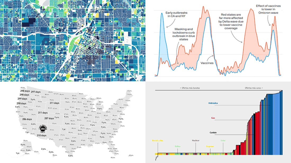 Visualized data is much easier for the human brain to process and understand than textual or tabular. On DataViz Weekly, we collect the most interesting examples of charts and maps demonstrating how that works in reality. Enjoy our new picks:
- Age of buildings in Las Vegas — Las Vegas Review-Journal
- Electricity market price determination in Spain — elDiario.es
- Time since a record temperature high across the United States — The Pudding
- Excess deaths in Republican-leaning and Democratic-leaning states — Axios
- Categories: Data Visualization Weekly
- No Comments »
Check Out These Great New Visual Data Stories — DataViz Weekly
February 18th, 2022 by AnyChart Team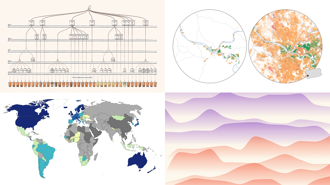 Eager to see some great visualizations? We’re here to tell you about four new data stories that are definitely worth checking out! See which projects made it to this DataViz Weekly and read on.
- Bubble tea versions in a visual breakdown — Taiwan Data Stories
- Age of democracies worldwide — Our World in Data
- Women in news headlines — The Pudding
- Redlining’s lasting legacy — FiveThirtyEight
- Categories: Data Visualization Weekly
- No Comments »
Coolest Latest Visualizations You Can’t Miss — DataViz Weekly
October 29th, 2021 by AnyChart Team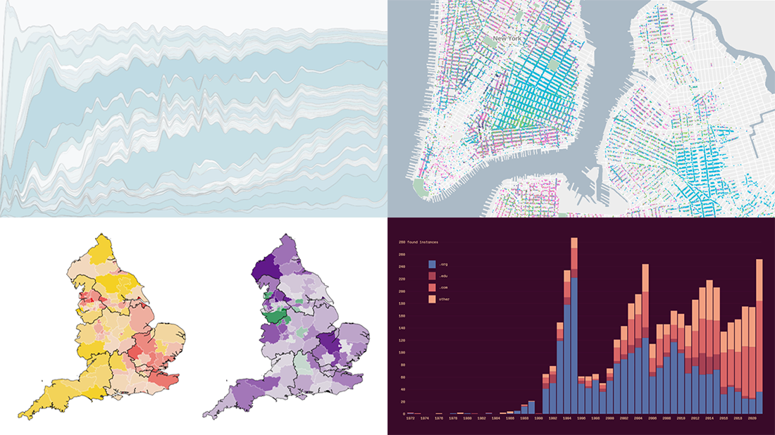 Welcome back to DataViz Weekly, a regular series of posts on AnyChart Blog putting a spotlight on the coolest data visualization works we have come across over the last few days! Today, we’re glad to feature and tell you about the following projects:
- Mapping historical New York City — Columbia University
- Tracking the Lenna image — The Pudding
- Analyzing the number of doctors in England — Sky News
- Charting TV genres over time — Nathan Yau
- Categories: Data Visualization Weekly
- No Comments »
New Impressive Visualizations Making Data Talk — DataViz Weekly
August 20th, 2021 by AnyChart Team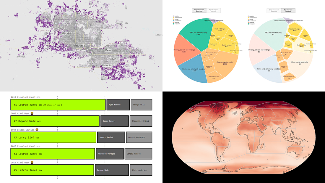 DataViz Weekly is here with an overview of new impressive visualizations that make data talk. These four projects grabbed our attention recently and we could not help telling you about them!
- The biggest carry jobs in NBA history — The Pudding
- Global and regional climate change effects — IPCC
- Presidential and bipartisan infrastructure plans in comparison — The Upshot
- Urban development and sprawl in America between 2001 and 2019 — The Washington Post
- Categories: Data Visualization Weekly
- No Comments »
Engaging Data Graphics on Hobbies, Protests, Commute, and Reddit — DataViz Weekly
April 23rd, 2021 by AnyChart Team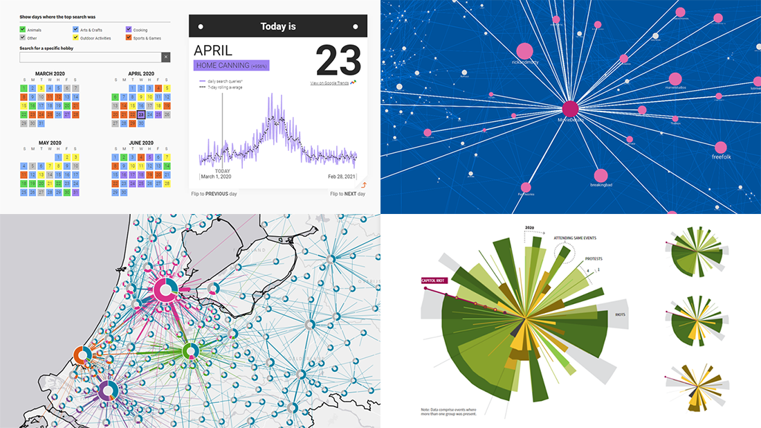 Can’t wait for a new portion of engaging data graphics? We’ve got it for you right here, right now! The following visualizations caught our eye this week, and DataViz Weekly is here to make sure you do not miss out on them:
- Top trending hobbies during the COVID-19 pandemic — Polygraph and Google Trends
- Right-wing protests in America in 2020-2021 — Reuters
- Commuting in the Netherlands — Statistics Netherlands
- Map of Reddit — Andrei Kashcha
- Categories: Data Visualization Weekly
- No Comments »
Visualizing Data on Poverty, Happiness, Music, and Retail — DataViz Weekly
April 9th, 2021 by AnyChart Team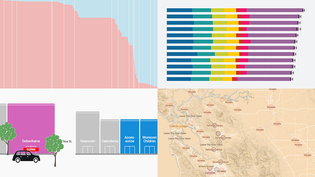 Look at these new exciting examples of data visualizations! We’ve stumbled upon these just recently and are more than happy to present them to you today on DataViz Weekly:
- Share of population with income below the poverty threshold — Our World in Data
- World Happiness Report 2021 — SDSN
- Most popular music in your city and worldwide — The Pudding
- COVID’s impact on retail stores on Oxford St, Rodeo Dr, and Russell St — Quartz
- Categories: Data Visualization Weekly
- No Comments »
Fresh Compelling Data Graphics Worth Seeing — DataViz Weekly
March 26th, 2021 by AnyChart Team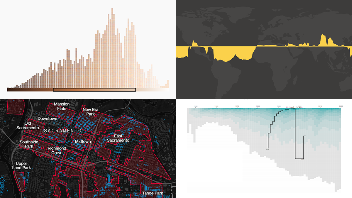 Get your weekly dose of cool data visualization stuff! We have come across these four new amazing projects just lately and are glad to tell you about them right now. Here are the graphics featured this time on DataViz Weekly:
- Career timelines for all NBA players since 1946 — Nathan Yau
- Bias and anti-blackness in the names of foundation shades — The Pudding
- Flood risk in historically redlined and non-redlined neighborhoods — Bloomberg CityLab
- Elevation and bathymetry worldwide along parallels — Nicolas Lambert
- Categories: Data Visualization Weekly
- No Comments »
Impressive Charts on Age, Energy, Climate, and Music — DataViz Weekly
August 7th, 2020 by AnyChart Team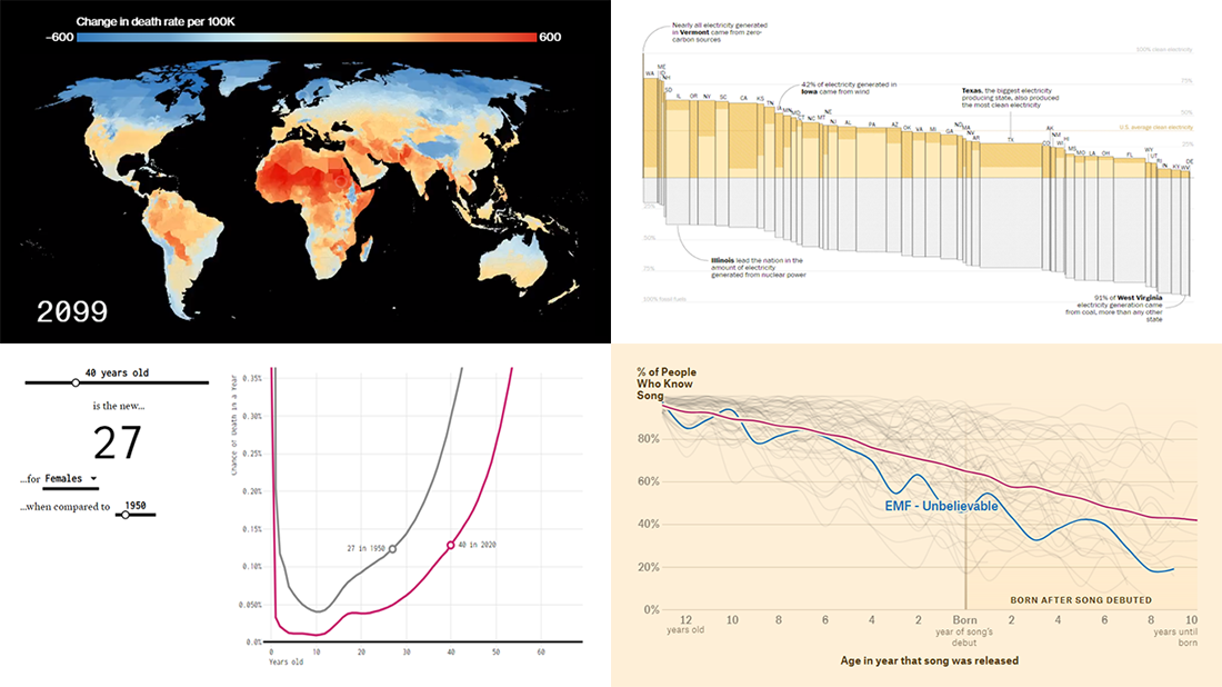 Lately, we’ve come across a lot of new impressive charts all over the internet. Here are some of the most interesting ones — check them out and you’ll see the real power of data visualization in action! Today in DataViz Weekly:
- New age for your age — FlowingData
- Electricity generation in the U.S. states by fuel source — The Washington Post
- Mortality consequences of climate change and income inequality — Bloomberg Green
- 1990s music recognition across generations — The Pudding
- Categories: Data Visualization Weekly
- No Comments »