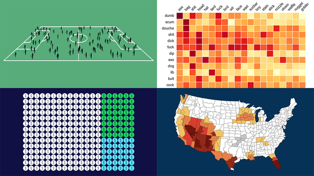
 Need some inspiration for data visualization? Especially for you, on DataViz Weekly, we’ve selected four new online projects where charts and maps do a fascinating job to explain and let people explore a thing!
- Population of England and Wales, according to Census 2021 — ONS
- Daily estimates of climate change’s impact on temperatures across the U.S. — Climate Central
- Compound pejoratives on Reddit — Colin Morris
- Music streaming revenue distribution model — The Pudding
Data Visualization Weekly: June 24, 2022 — July 1, 2022
Population of England and Wales, According to Census 2021
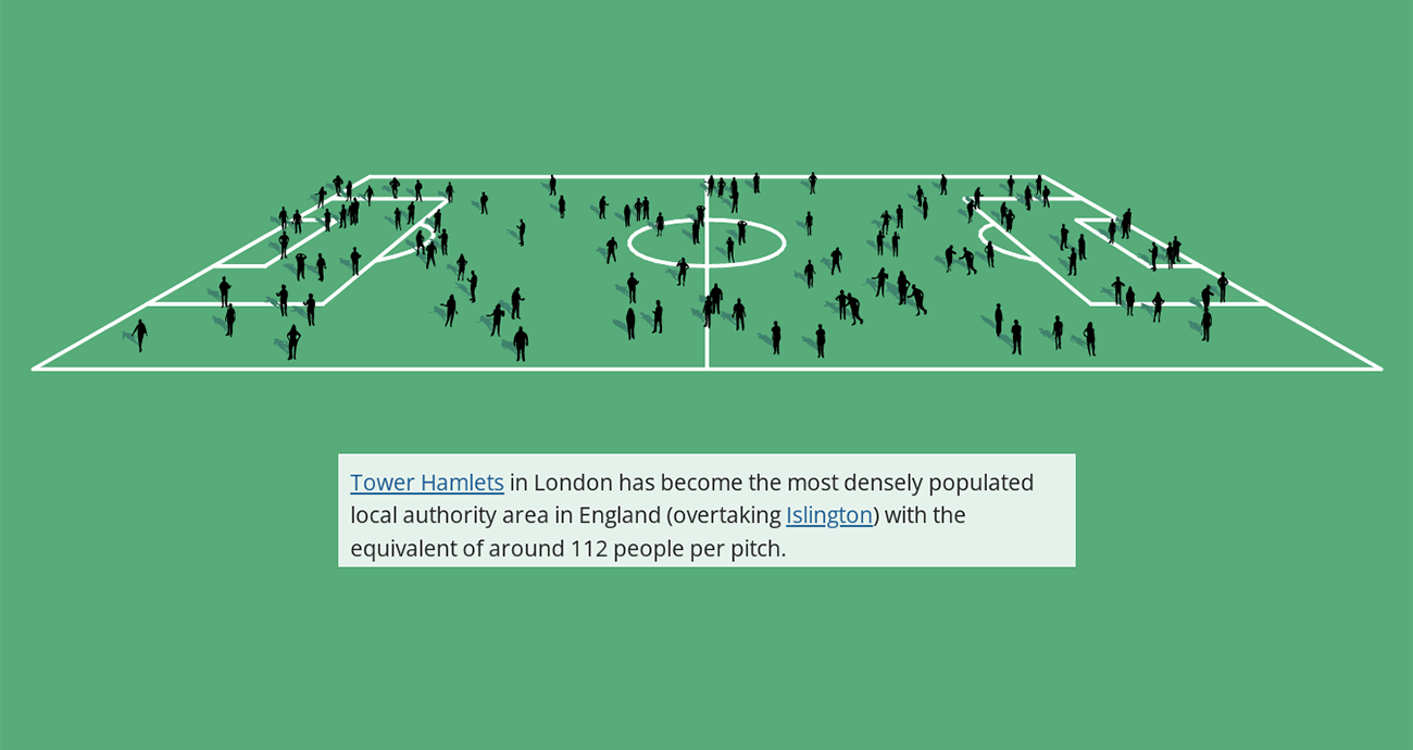
Providing a snapshot of a given population at a specific point in time, census data is not only important in public policy decision making and research but also always interesting to look at.
On Tuesday, the United Kingdom’s Office for National Statistics published the first results of the Census 2021 for England and Wales. The release was accompanied by an interactive story that greatly represents how the population has changed down to the local authority level. In addition to traditional visualizations, such as choropleth maps and histograms among others, the project features football (soccer) pitch graphics used to show population density.
See how the latest population data for England and Wales is visualized on the ONS website.
Daily Estimates of Climate Change’s Impact on Temperatures Across U.S.
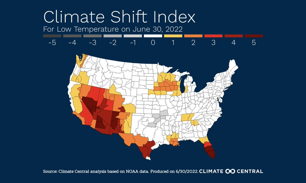
Air temperatures around the world are shifting due to climate change. If you’re wondering exactly how much it has influenced the current weather where you live (and if that’s somewhere in the U.S.), here’s a new smart tool.
Climate Central launched the Climate Shift Index project that estimates, based on data from NOAA, how likely today’s temperature would occur in the same location without (human-caused) climate change. The resulting CSI scores are represented in a colored map, which makes it easy to identify areas where the impact of climate change is the biggest. And you can see all that not only for today but also for yesterday, tomorrow, and the day after tomorrow. The project is updated on a daily basis.
Learn more about how it works and check out the mapping tool itself on the Climate Central website.
Compound Pejoratives on Reddit
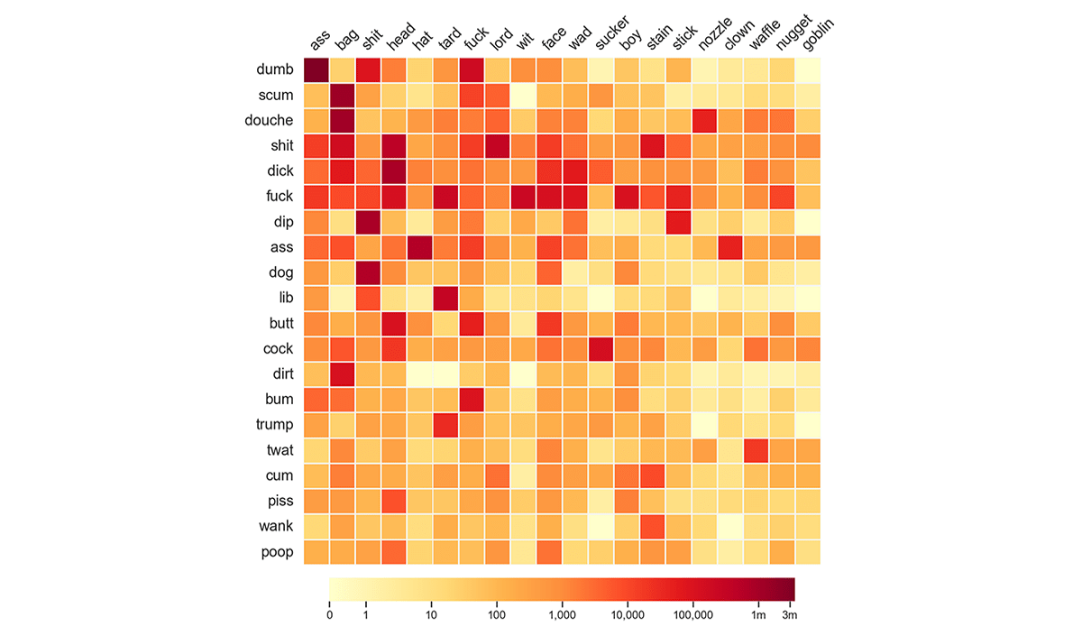
As we all know, dirty words are bad, but they can also be a lot of fun.
Colin Morris scraped fifteen years of Reddit comments — indeed all of them from 2006 through 2020 — and thoroughly analyzed the frequency of different compound pejoratives. The results are represented in a dedicated story with a lot of cool charts.
Why Reddit? Colin explains: “As a corpus, Reddit has the virtue of being uninhibited in its profanity, and on the cutting edge of new coinages. For example, Google Books Ngram Viewer, which indexes the majority of all books published in English up to 2019, gives no results for fuckwaffle, whereas the term has been used in 1,096 Reddit comments.”
Check out the study on Colin’s blog.
Music Streaming Revenue Distribution Model
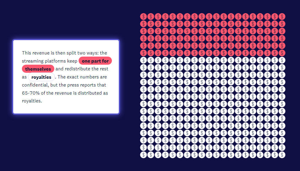
Have you ever wondered how artists get paid from streaming music on platforms such as Spotify, Apple Music, Amazon Music, and others?
The Pudding published a beautiful visual essay where Elio Quinton, Senior Director of Machine Learning and Audio R&D at Universal Music, delves into the mechanics of how streaming royalties work. The path those payments take is described in great detail. But the entire explanation is nonetheless very clear thanks to simple, yet smart visualizations.
Look at this story on the online music streaming revenue distribution on The Pudding.
***
These visualizations are just wow, aren’t they? Let’s see what you can do! Send us your data viz works and we will be pleased to consider them for inclusion in the nearest Data Visualization Weekly roundup!
- Categories: Data Visualization Weekly
- No Comments »