 Look at these new exciting examples of data visualizations! We’ve stumbled upon these just recently and are more than happy to present them to you today on DataViz Weekly:
- Share of population with income below the poverty threshold — Our World in Data
- World Happiness Report 2021 — SDSN
- Most popular music in your city and worldwide — The Pudding
- COVID’s impact on retail stores on Oxford St, Rodeo Dr, and Russell St — Quartz
Data Visualization Weekly: April 2, 2021 — April 9, 2021
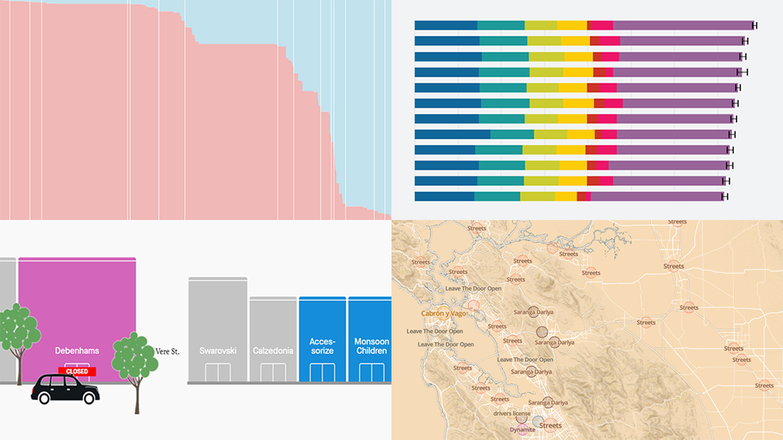
Share of Population with Income Below Poverty Threshold
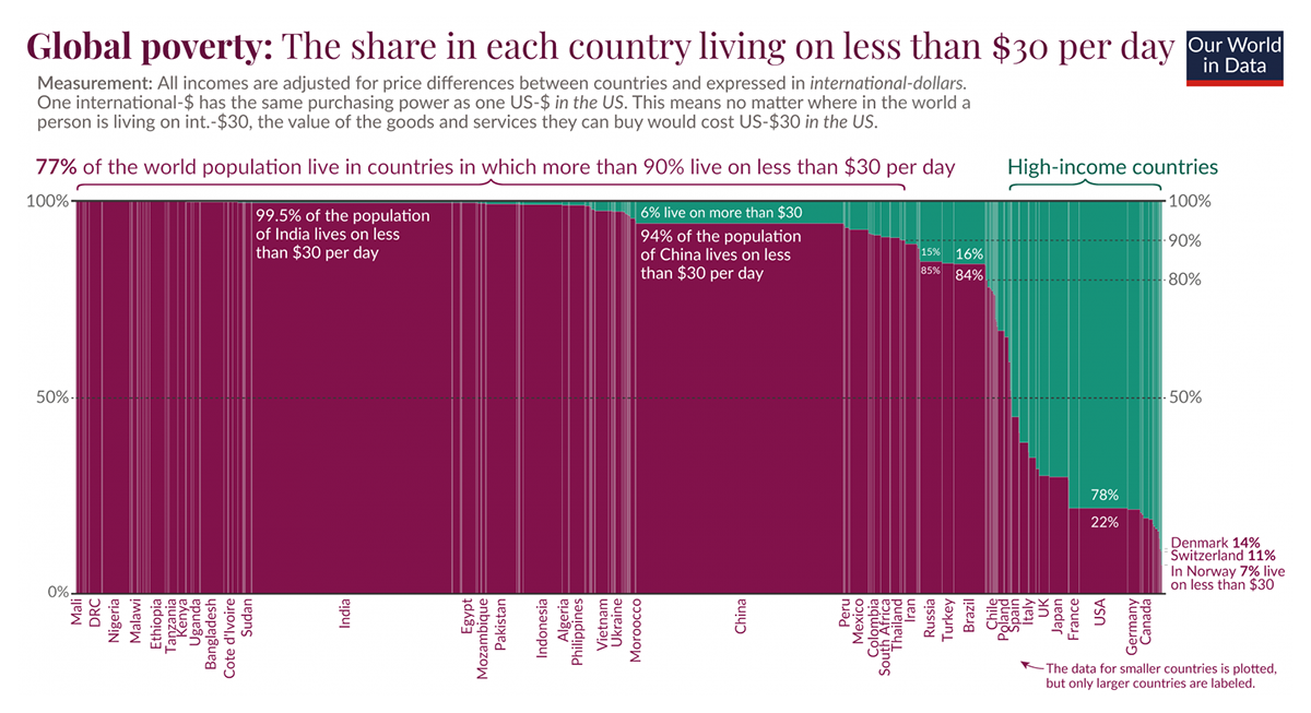
According to data from the World Bank’s PovcalNet project, the income of 85% of all people in the world is under $30 a day. That’s over 6 billion individuals around the globe. At the same time, 77% of the world population live in countries where more than 90% live on less than $30.
The situation is displayed country by country on this chart recently published by Max Roser, the editor and founder of Our World in Data. It consists of vertical bars representing the population of individual countries in such a way that the width is proportional to the population size and the height is 100%. The purple sub-bars within each bar encode the share of the population whose income is below $30 considered here as the average poverty threshold.
To take a closer look and zoom in to see certain countries, check out the interactive version created by Daniel Bachler, CTO at Edelweiss Connect, on Observable. There, you can not only hover over the bars to see the exact percentages but also set a different poverty threshold.
Then, return to Our World in Data not to miss out on the other impressive charts Max Roser built researching into how much economic growth is actually needed to reduce poverty globally.
World Happiness Report 2021
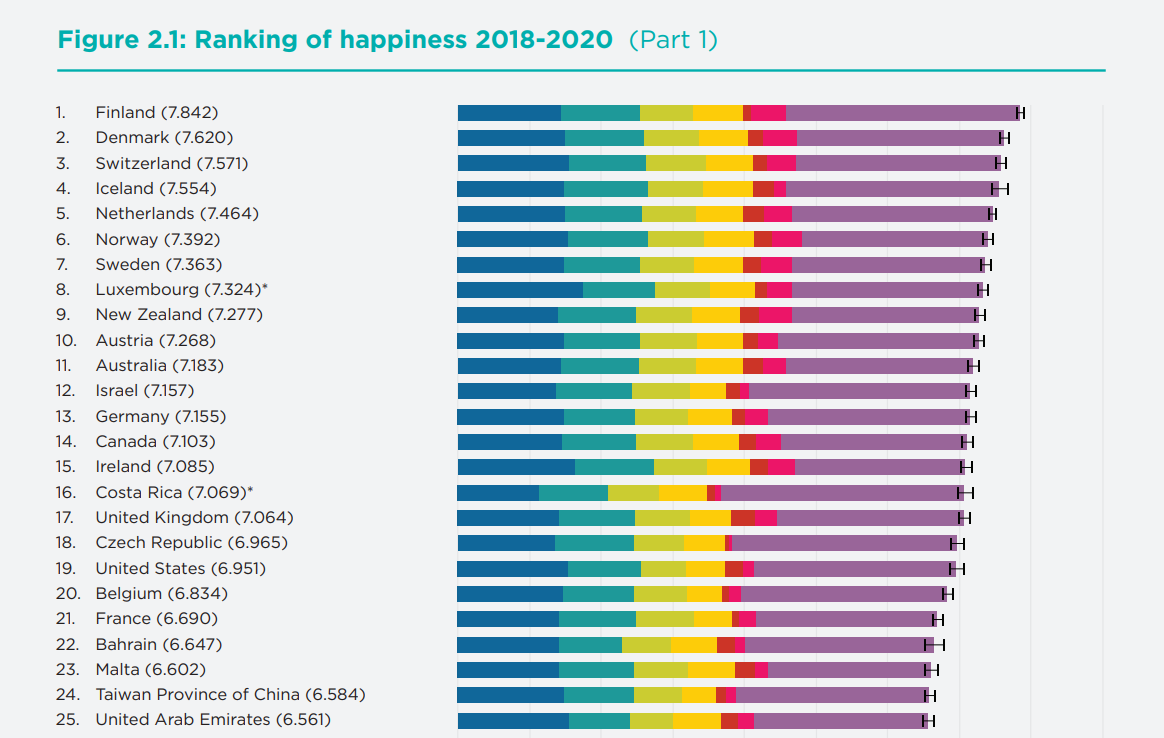
For more than a year now, we have been living through an exceptional, difficult time striving to cope with the awful global crisis. However, researchers assert that there’s surprising resilience in how we rate our lives and perceive our well-being overall.
The World Happiness Report 2021 recently published by the United Nations Sustainable Development Solutions Network (SDSN) shows happiness levels in 2020 stayed quite consistent with previous years’ data despite the effects of COVID-19. Out of 149 countries ranked by the index, Finland kept first place as the happiest country on Earth. Denmark, Switzerland, Iceland, and Netherlands also fared very well, in the top five. In case you are interested, Canada and the United States came in 14th and 19th, respectively.
The stacked bars you see on this chart provide insight into the composition of the overall happiness score for each country. The factors taken into account are (left to right) GDP per capita, social support, healthy life expectancy, freedom to make life choices, generosity, perceptions of corruption, and dystopia together with the residual error.
Check out the report itself, in PDF or on the website, to explore the final rankings and country-specific bars along with plenty of other visualizations, as well as to learn more about the findings and the model implemented in this research.
Most Popular Music in Your City and Worldwide
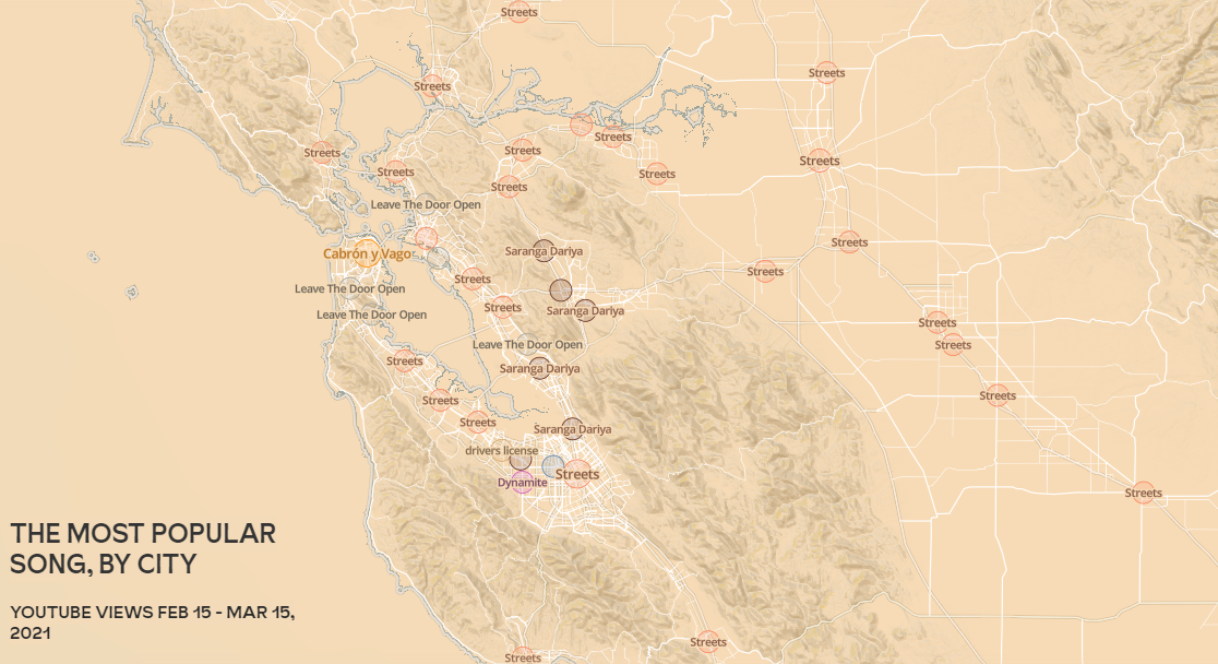
That is very likely that you’ve heard the song which is currently most popular in your city or town, but… Do you want to know which one it is? Maybe you are also wondering what kind of music is listened to in neighboring places? Or, where in the world people like the same songs that you do or, on the contrary, prefer something completely different?
Matt Daniels and The Pudding invite you to get out of your music bubble and look around to find the answers to these and other interesting questions! Just enter the name of your city and get to know ten facts based on the recent YouTube analytics. First, you’ll find out what’s the most popular song in your area. In San Francisco, for example, it’s Carbón y Vago by El Fantasma and Los Dos Carnales. Then, take a look farther away, discover thrilling patterns, and keep exploring popular music around the world.
Just keep scrolling and you’ll see! Pretty maps will help you navigate, and you can explore them all with ease as they are interactive.
COVID’s Impact on Retail Stores on Oxford St, Rodeo Dr, and Russell St
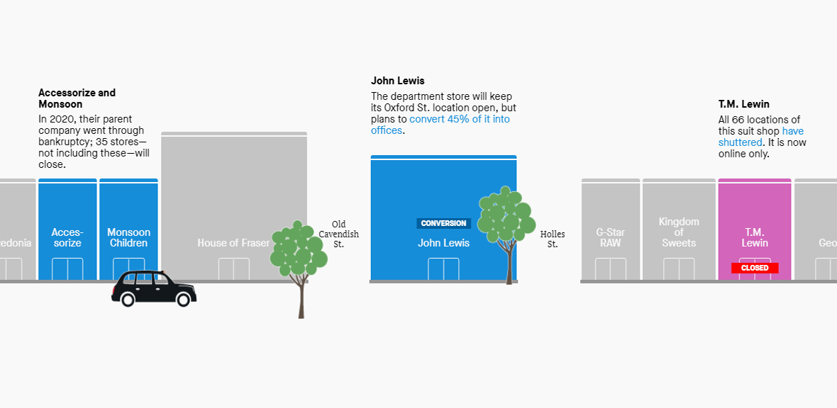
In the pandemic year of 2020, the retail industry was affected so badly that many shopping malls, streets, and districts will look quite different from how we remember them. Britain’s high streets alone lost an overwhelming total of 17,532 outlets.
For Quartz, Amanda Shendruk produced a fascinating visual story illustrating how three of the most famous streets in the world fared during the hard times. Again, just scroll and enjoy a safe drive along Oxford Street in London, Rodeo Drive in Beverly Hills, and Russell Street in Hong Kong in their current state. See what stores are closed, converted, still empty and available for lease, and so on. The cars correspond to the locations.
Just make sure to not scroll too fast as police don’t sleep even on the Quartz website.
***
We appreciate your attention to our blog! Stay tuned for the most interesting data visualizations of the week, each Friday on AnyChart Blog!
- Categories: Data Visualization Weekly
- No Comments »