 Ready for another serving of stunning data visualizations? Here you go with DataViz Weekly! Look at four projects that have caught our eyes most recently.
- Heat records in 400 U.S. cities — The Pudding
- 2022 Australian election’s unfolding and results — ABC News
- Air quality in the San Francisco Bay Area block by block — Aclima
- Data visualization project time splits by activity — Eli Holder on Nightingale
Data Visualization Weekly: May 20, 2022 — May 27, 2022
Heat Records in 400 U.S. Cities
New project! We’re tracking daily heat records for 400 U.S. cities. See where yesterday’s temperature ranked historically for your city and when the last record was set. https://t.co/iDPe1kqbDV pic.twitter.com/RJiZOLVld1
— The Pudding (@puddingviz) May 24, 2022
Heat waves are becoming increasingly common and intense across the United States, bringing record high temperatures here and there.
The Pudding released a cool heat record tracker built by Matt Daniels and Russell Goldenberg. The project provides insight into daily temperature records across about 400 U.S. cities whose climate data is available in the Applied Climate Information System (ACIS). To start with, you can quickly find out whether yesterday was a heat record for that location. Then, see how recent temperatures over there measure up against past record highs, and much more.
Check out this awesome new data visualization project on The Pudding.
2022 Australian Election’s Unfolding and Results
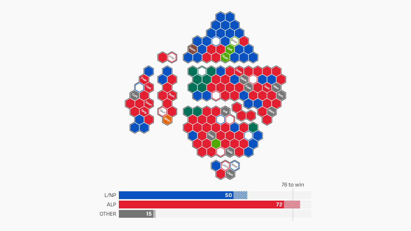
After almost nine years in power, the center-right Liberal-National coalition lost the 2022 Australian federal election held last Saturday. Now, the next government will be formed by the Labor Party led by Anthony Albanese.
ABC News made a brilliant visual explainer of the election results, showing how parliamentary seats were won and lost on Saturday night. The story centers around a cartogram depicting each seat as a colored hexagon. The use of this technique instead of a traditional choropleth map to communicate the results of the election is greatly explained in this article in case you are interested (certainly worth attending to if you ask us).
See how the Australian election night unfolded for everyone, on ABC News.
Air Quality in San Francisco Bay Area Block by Block
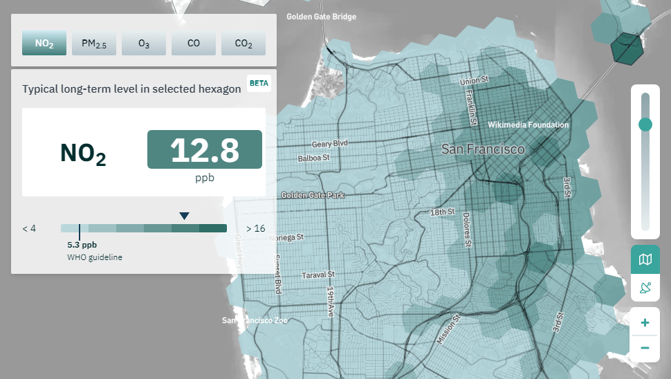
Now it is easy to identify typically the most polluted places all over the San Francisco Bay Area.
For over two years now, California-based technology company Aclima has been measuring air quality in the region using sensors installed on low-emission vehicles set to traverse neighborhoods. A few days ago, it launched the air.health project with an interactive map that represents the collected data at a very granular level. Search for an address and find out the typical (long-term) levels of air pollution across five types of pollutants: Carbon Monoxide (CO), Carbon Dioxide (CO2), Nitrogen Dioxide (NO2), Fine Particulate Matter (PM2.5), and Ozone (O3). Or, click a hexagon segment and then a road segment for a closer look at one area or another.
Explore long-term air pollution levels in the Bay Area at the block level, on the air.health website operated by Aclima.
Data Visualization Project Time Splits by Activity
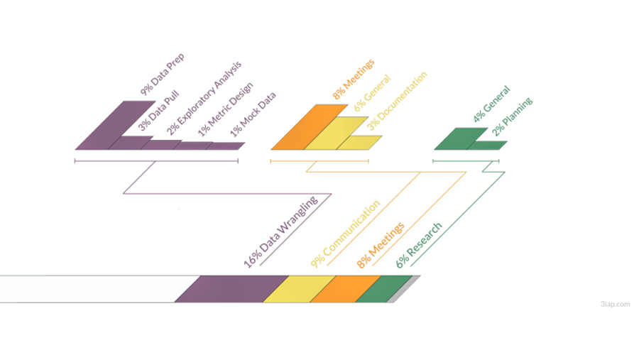
When you freelance in data visualizations, a significant portion of time is spent on non-dataviz things.
Eli Holder logged more than 1,500 hours of paid data visualization work on ten different projects. His analysis shows that about 60% of time was spent directly doing the design and engineering of graphics. The remaining roughly 40% was split between research, communications and meetings with clients, and data wrangling. The breakdown of time by category is greatly visualized in timelines for each project.
Look at how much time goes into exactly what kind of activity when you are a freelance data visualization professional, in a cool article by Eli Holder on Nightingale.
***
We hope it has been fun checking out these stunning data visualization projects. Thanks for your attention. Stay tuned for Data Visualization Weekly.
- Categories: Data Visualization Weekly
- No Comments »