 Visualized data is much easier for the human brain to process and understand than textual or tabular. On DataViz Weekly, we collect the most interesting examples of charts and maps demonstrating how that works in reality. Enjoy our new picks:
- Age of buildings in Las Vegas — Las Vegas Review-Journal
- Electricity market price determination in Spain — elDiario.es
- Time since a record temperature high across the United States — The Pudding
- Excess deaths in Republican-leaning and Democratic-leaning states — Axios
Data Visualization Weekly: March 25, 2022 — April 1, 2022
Age of Buildings in Las Vegas
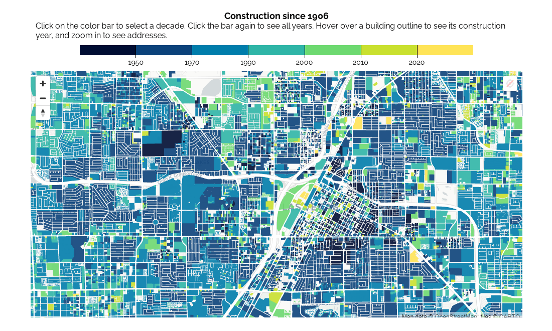
Founded in 1905, Las Vegas has become one of the major cities in the United States. Now anyone can take a deep dive into the history of its growth through the lens of construction using a very nice data visualization tool.
The Las Vegas Review-Journal created an interactive map displaying the age of every building in the Las Vegas Valley. Representing construction year data from the Clark County Assessor’s Office, the visualization provides a great view of the region’s growth over the decades. All the buildings are colored according to when they were developed.
Hover over a property to see its construction year in the tooltip. Use the color scale bar to highlight the buildings set up in a certain period.
Electricity Market Price Determination in Spain
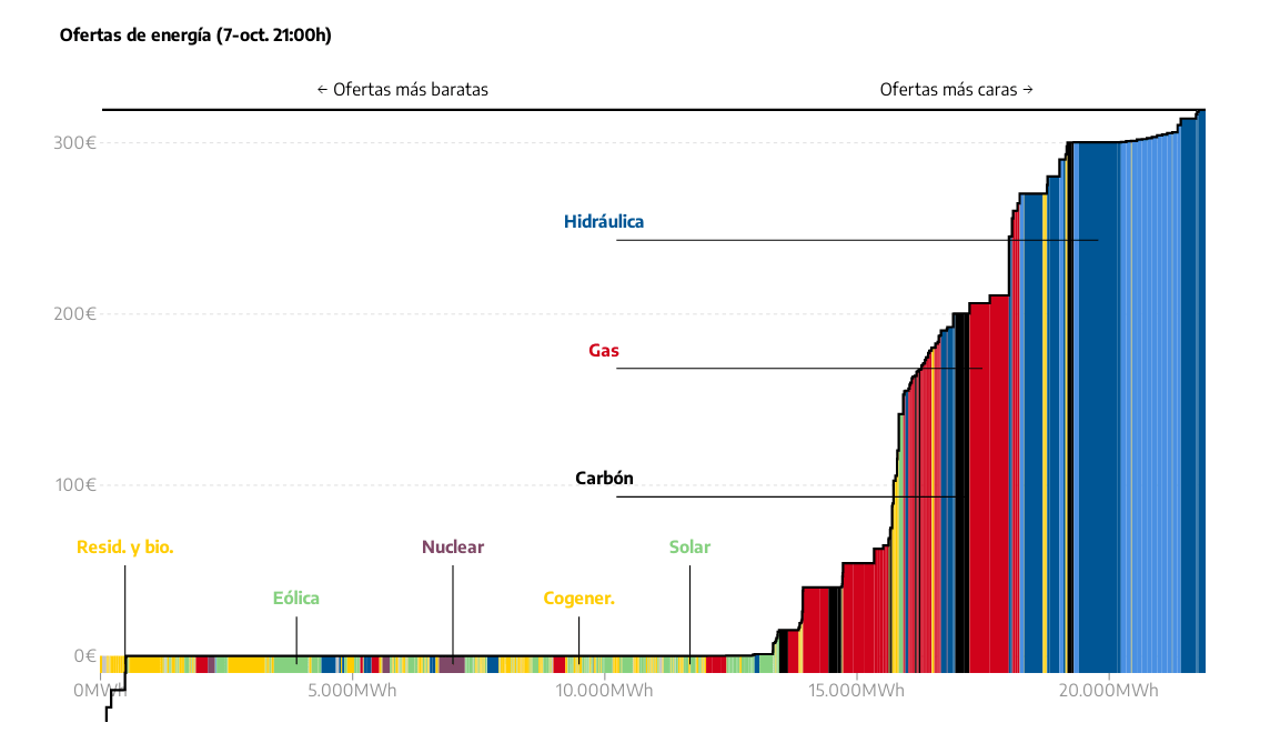
Electricity generated from wind and solar resources can cost the same as gas-powered. Can’t imagine how that is possible? Look at the electricity market in Spain.
Spanish news website elDiario.es analyzed over eight million offers from energy companies in 2021 to find out how the price of electricity is built. The process appears to be complex. Electricity prices in Spain are determined in daily auctions where energy-producing companies make bids for each hour of the following day based on demand estimates. But a marvelous visual story full of beautiful, telling data graphics does a great job to explain everything.
Check out how Spain’s electricity market works and determines the price.
Time Since Record Temperature High Across U.S.
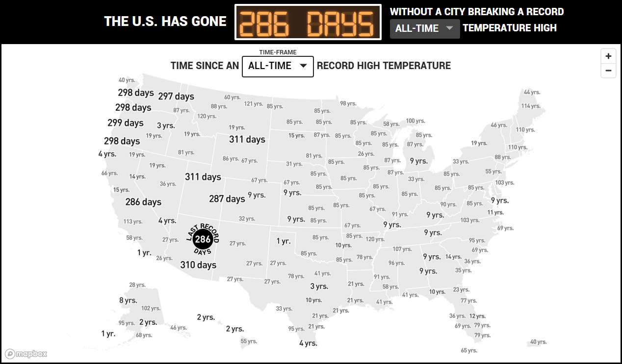
You know those accident safety signage scoreboards like “N days since last injury” often shown in factories. The Pudding made a similar thing for heat records in the form of an interactive map.
The project lets you see how much time has elapsed since a record-high air temperature was noticed in each of the 400 U.S. cities tracked by the Applied Climate Information System (ACIS). The map gets daily updates. Two views are available based on the timeframe you want to explore, daily and all-time.
See the number of days (or years) without a record daily (or all-time) temperature high here or there.
Excess Deaths in Republican and Democratic States
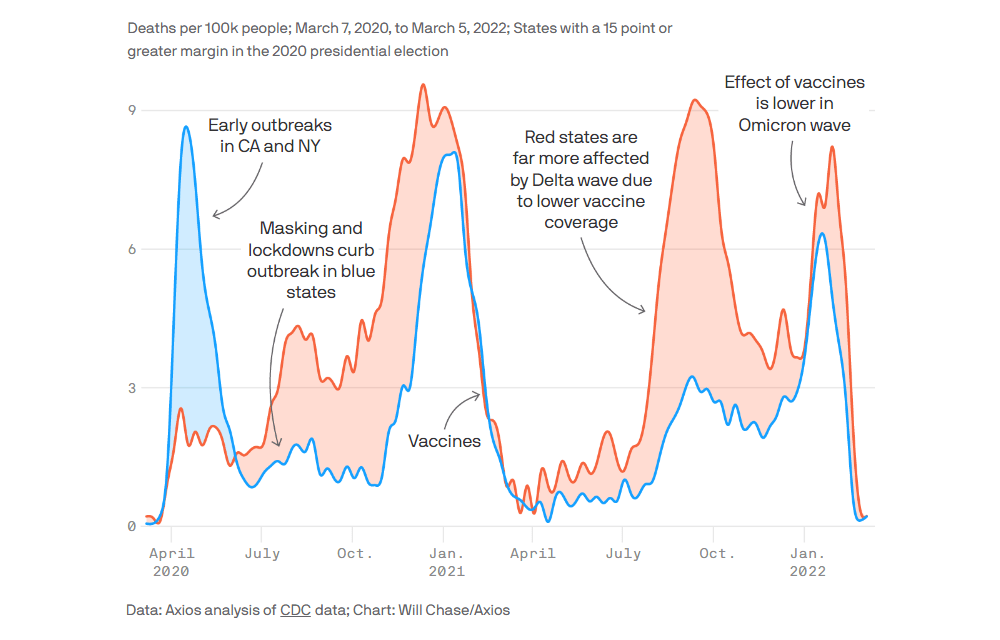
The COVID-19 pandemic has been deadlier in Republican-leaning states. The reasons are likely to be lower vaccination rates and higher resistance to other precautions such as wearing masks.
Excess mortality is often used as an estimate for COVID-19 mortality. Axios plotted it for blue and red states side by side. The resulting chart gives a clear picture of the existing difference, revealing more excess deaths per 100,000 people in the latter than in the former over the two-year period from March 7, 2020, to March 5, 2022.
Explore mortality rates through the lens of partisan divisions in the United States.
***
We appreciate your attention and interest in data viz. Stay tuned for Data Visualization Weekly and don’t hesitate to let us know once you’ve built or come across some really nice chart or map.
Have a great time!
- Categories: Data Visualization Weekly
- No Comments »