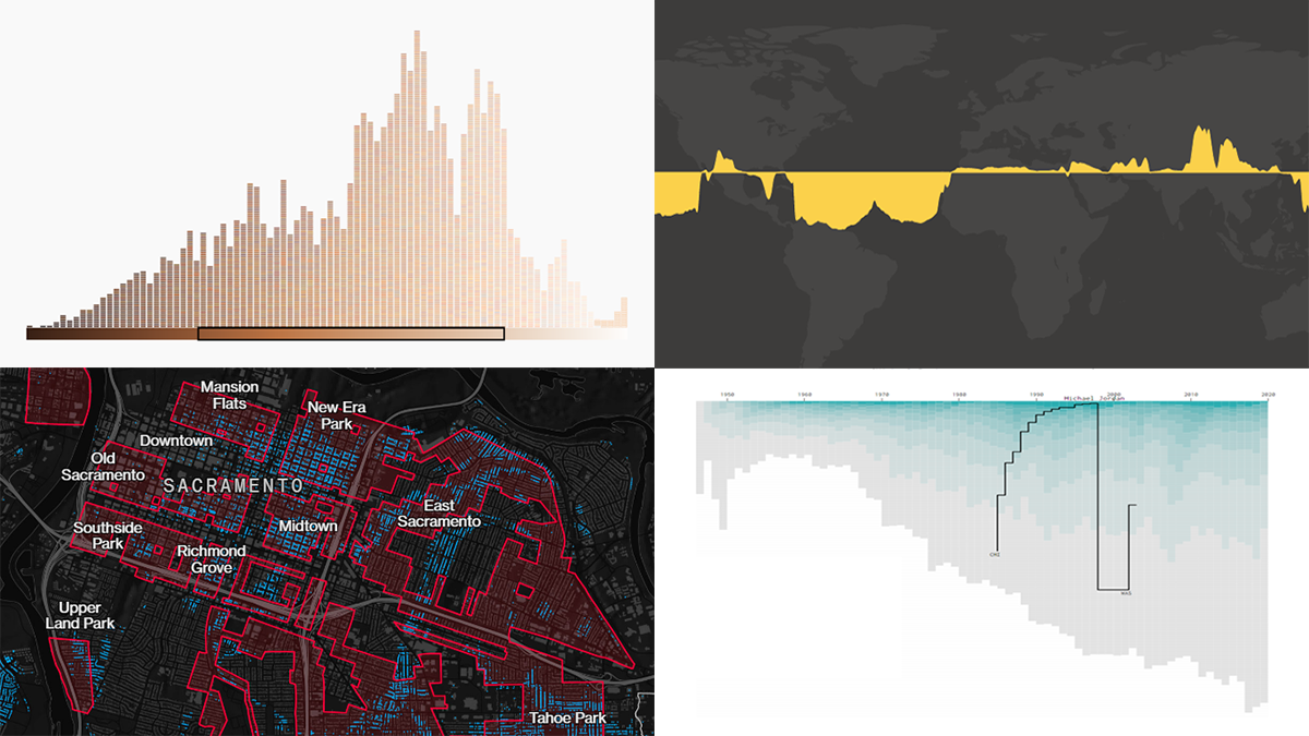
 Get your weekly dose of cool data visualization stuff! We have come across these four new amazing projects just lately and are glad to tell you about them right now. Here are the graphics featured this time on DataViz Weekly:
- Career timelines for all NBA players since 1946 — Nathan Yau
- Bias and anti-blackness in the names of foundation shades — The Pudding
- Flood risk in historically redlined and non-redlined neighborhoods — Bloomberg CityLab
- Elevation and bathymetry worldwide along parallels — Nicolas Lambert
Data Visualization Weekly: March 19, 2021 — March 26, 2021
Career Timelines for All NBA Players Since 1946
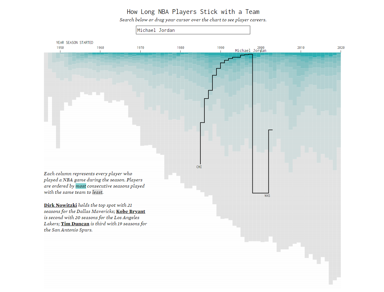
Few basketball players stay with the same NBA team for their entire career. Wondering who remained loyal to a single club, who switched teams too often, and how patterns changed over the decades after the league’s foundation, Nathan Yau turned to statistics.
For a convenient overview, he charted the career timelines of every NBA player, covering the 74 complete seasons from 1946 through 2020. For each season, the visualization shows all players who played at least one game in descending order of how many consecutive years they spent with the same team. The top spots overall are occupied by Dirk Nowitzki (twenty-one seasons with the Mavericks), Kobe Bryant (twenty seasons with the Lakers), and Tim Duncan (nineteen seasons with the Spurs).
To discover and observe individual paths, hover over the chart or search for a certain player whose career you want to look at.
Bias and Anti-Blackness in Names of Foundation Shades
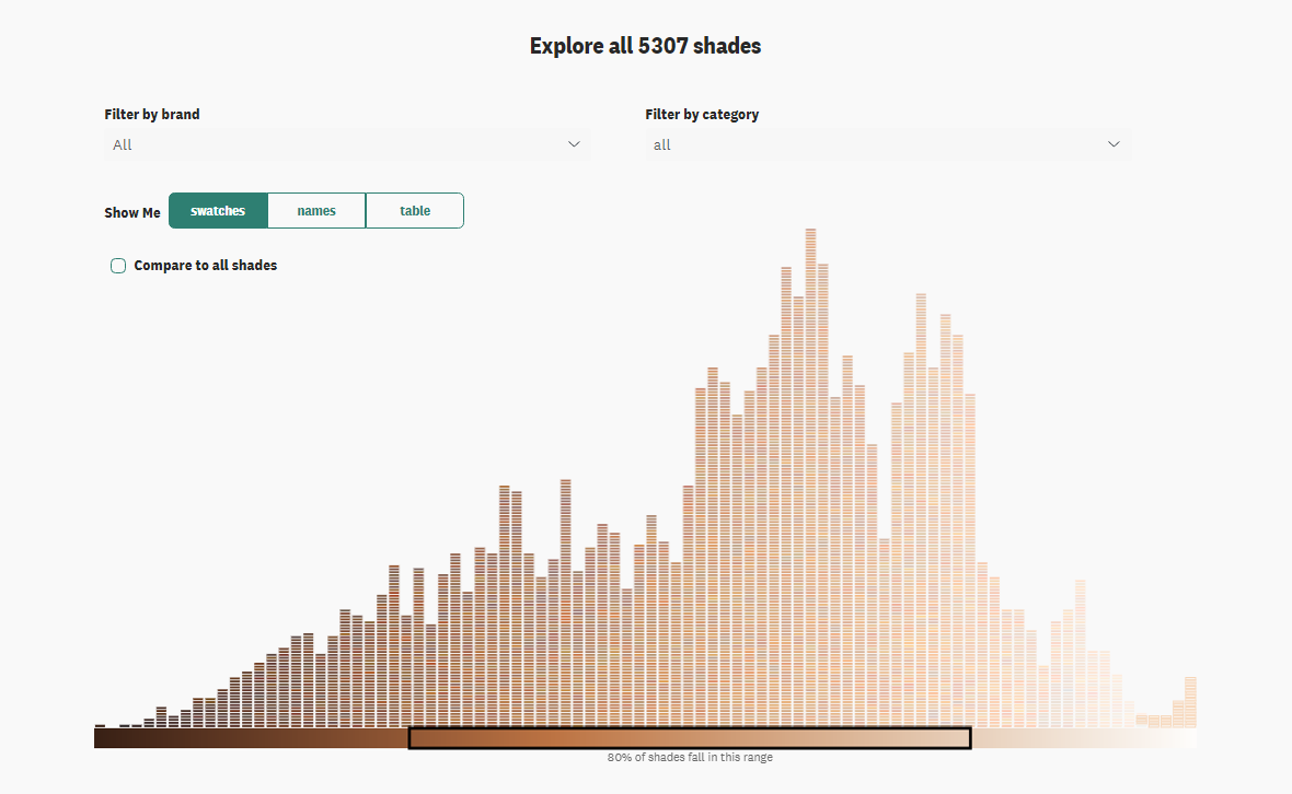
Last week, we told you about a Quartz analysis that revealed mainly slight (if any) increases in the skin tone diversity in the fashion and beauty brands’ Instagram imagery compared to before their decisive commitment to change voiced during the BLM protests last year. This week, The Pudding has published another impressive data story showing bias that’s still taking place in that industry.
Ofunne Amaka and Amber Thomas looked at the names of 6,816 foundation shades from 107 brands and 328 products on the websites of Ulta and Sephora. What was found during the research could hardly surprise anyone — the implicit light skin tone prioritization and anti-black microaggressions. For example, the overwhelming majority of shades with “nude” and “natural” in the name are attributed to light complexion beauty products. Darker shades appear to be named after other things such as food, drinks, etc.
The story features a lot of scroll-driven animated visualizations showing the data at a glance. At the beginning, however, there’s a toggle that allows you to view all graphics in the static form if you want. Scroll all the way down to explore all foundation shade names in one interactive chart where you can filter the points by category and by brand, for more insights.
Flood Risk in Historically Redlined and Non-Redlined Neighborhoods
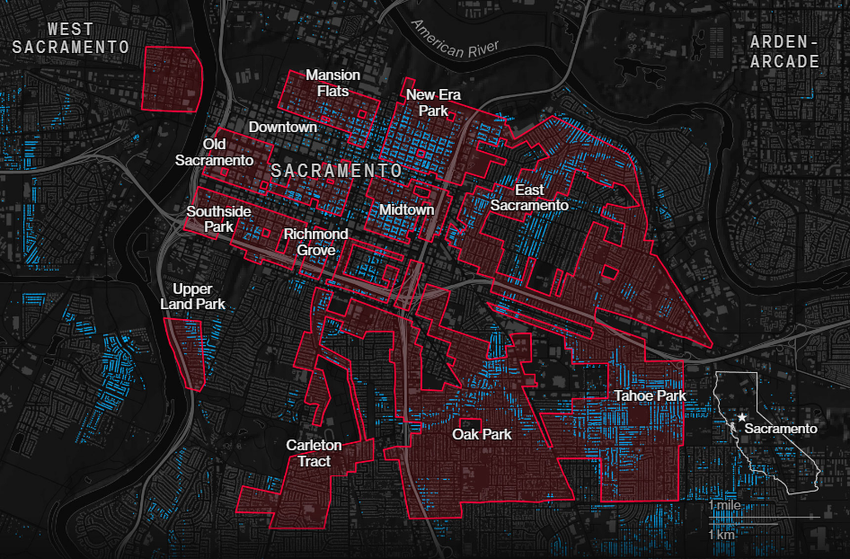
One of the consequences of the discriminatory housing policy of the 1930s, when Black and immigrant neighborhoods were designated undesirable for mortgage lending and redlined on the corresponding maps, is that these parts are now exposed to a greatly higher risk of flooding than non-redlined. Analysts from Redfin, a real estate brokerage firm, found this correlation when comparing flood risk data from First Street Foundation with redlining maps from the interuniversity Mapping Inequality project.
Learn more about the findings in a Bloomberg CityLab story by Kriston Capps and Christopher Cannon. There, you will find compelling maps displaying the racial disparity in flood risk for Sacramento, where it is the most alarming across the 38 major U.S. metro areas in the focus of this Redfin analysis, as well as for New York City and Chicago.
Don’t miss out on a dumbbell chart overviewing the cities with a greater share of high flood risk in formerly redlined areas, and maps for Miami and Detroit where the situations are quite specific.
Elevation and Bathymetry Worldwide Along Parallels
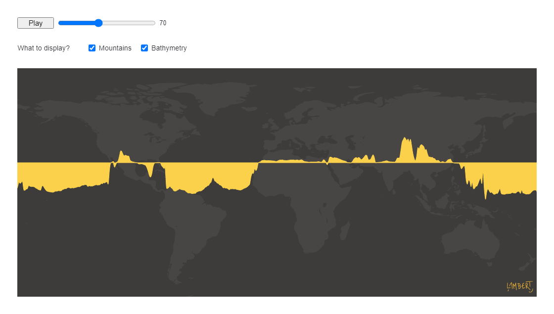
Last but not least, here’s a fun project you’ll fall in love with. Nicolas Lambert created an animated visualization representing the land elevation and ocean depth across the globe.
Just press the “Play” button and you will see a horizontal line moving from the top to the bottom (and then back to the top), featuring a graph that displays the height of mountains (above the line) with the bathymetry data (below the line) along the corresponding lines of latitude (parallels).
Press “Pause” and move the slider to explore the elevation and bathymetry manually. It’s an Observable notebook, so the full code is available right there.
***
We hope you liked these awesome visualizations. Whenever you meet or make a cool chart or map, let us know! We will be glad to consider it for the next Data Visualization Weekly roundup.
Many thanks for your attention! Stay tuned!
- Categories: Data Visualization Weekly
- No Comments »