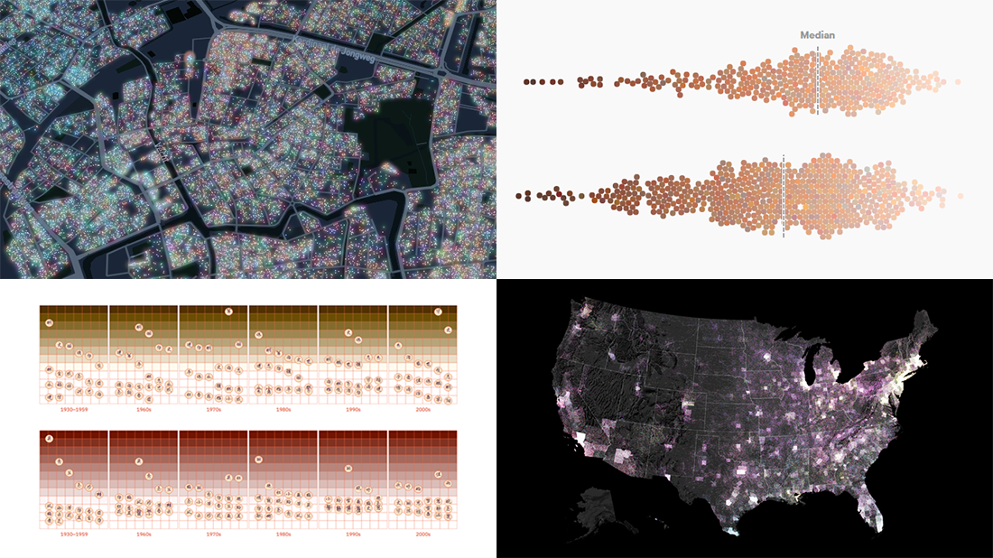
 Every day, a number of new data visualizations on various topics come out around the internet. We are keen to curate the most awesome graphics and share them with you on DataViz Weekly! Today in the spotlight:
- Skin tones on the Instagram feeds of fashion and beauty brands — Quartz
- Timeline of the pandemic year — WaPo
- Evolution of Chinese names — Kontinentalist
- Dutch election results in detail — NRC
Data Visualization Weekly: March 12, 2021 — March 19, 2021
Skin Tones on Beauty and Fashion Brands’ Instagram Feeds
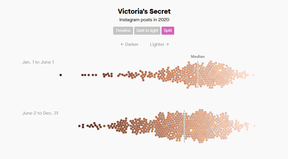
Following last year’s large-scale protests over police killings of Black Americans, many beauty and fashion brands expressed solidarity with the Black Lives Matter movement. They also admitted a need to improve diversity and promised to do better in that regard. Now, Quartz decided to find out whether anything changed.
Amanda Shendruk and Marc Bain took a look at 27,000 images from the Instagram feeds of 34 fashion (and beauty) companies and did an analysis of the skin tones showing up there before and after the day of June 2, Blackout Tuesday around which brands massively posted in support of BLM. Representing the skin tone of one person as one dot of the corresponding color, the journalists plotted the data for each brand over time as well as from darkest to lightest complexions.
The analysis revealed the ongoing domination of light skin even after the mid-year racial-justice protests in the U.S. However, some brands actually increased the representation of darker tones quite tangibly. Go ahead and explore the data in charts for yourself. Don’t miss out on the summary visualization of the median skin lightness change by brand.
Pandemic Year Timeline
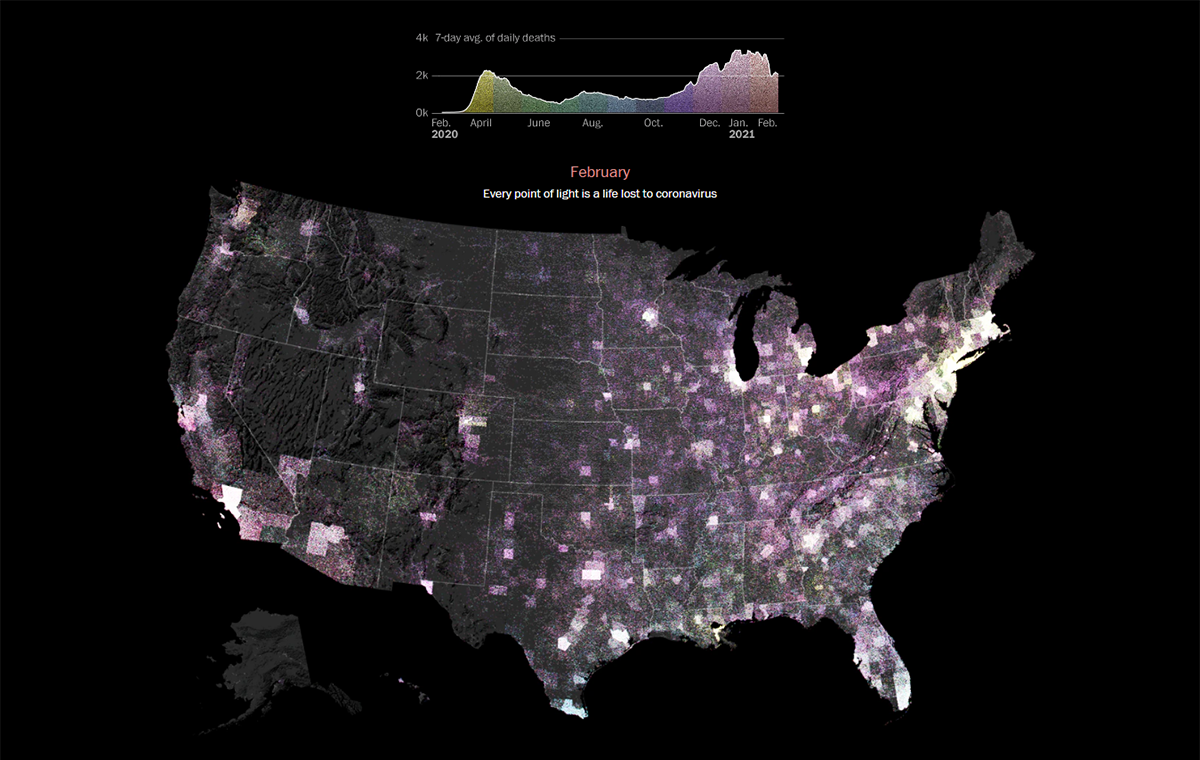
On March 11, 2020, the World Health Organization declared the rapidly spreading COVID-19 outbreak a pandemic. So, it has already been one year… In the United States alone, over 525,000 people lost their lives due to the coronavirus during those fifty-two weeks.
Taking a look back, The Washington Post — namely Reis Thebault, Tim Meko, and Junne Alcantara — made a special timeline feature telling the story of that extraordinary period based on hundreds of articles written and tons of data analyzed over the course of it. The piece starts with an animated dot density map visualization where each point of light stands for one lost American life. It is synchronized with the area graph above it which displays the seven-day average of daily deaths in the U.S.
Scroll down the article and you’ll be able to review the pandemic year in the U.S. in detail. The map will accompany you along the way revealing the horrible death toll growth day by day.
Evolution of Chinese Names
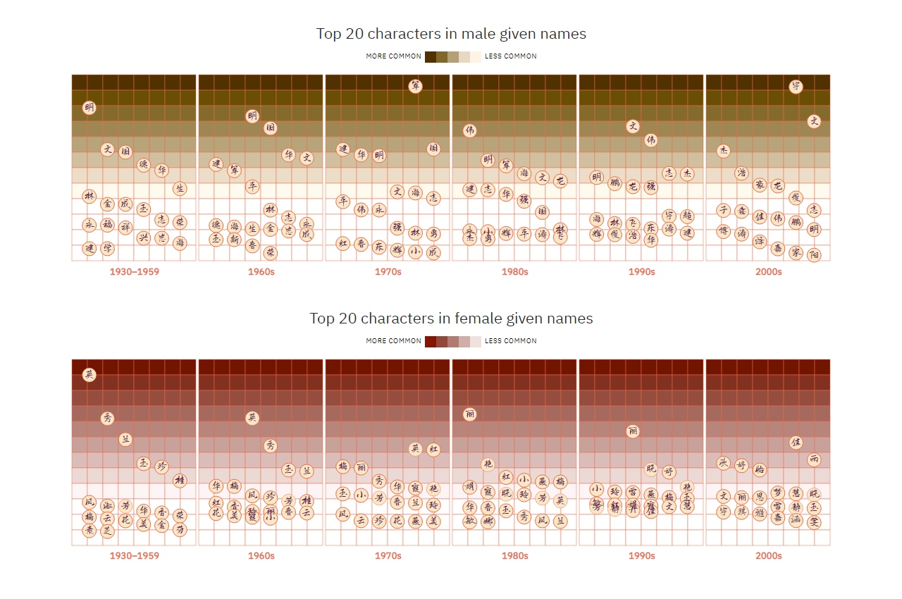
Whenever you hear a Chinese name, be aware that it was picked with the utmost care out of over 220 million unique options based on a total of 14,872 Chinese characters. Even in non-superstitious families in China, parents traditionally encode what they wish for a kid in the kid’s name. At the same time, names may well reflect current events and trends. That is why we should treat Chinese names as artefacts that can say a lot – just as we would generally expect from literature, art, music, and so on.
Kontinentalist published fascinating research into the evolution of Chinese names. To conduct it, Isabella Chua dived into a database of more than one billion Han Chinese people, China’s largest ethnic group, born from 1930 through 2008.
Check out a number of interesting charts revealing what Chinese names mean and tell us about the country’s history.
Dutch Election Results in Detail
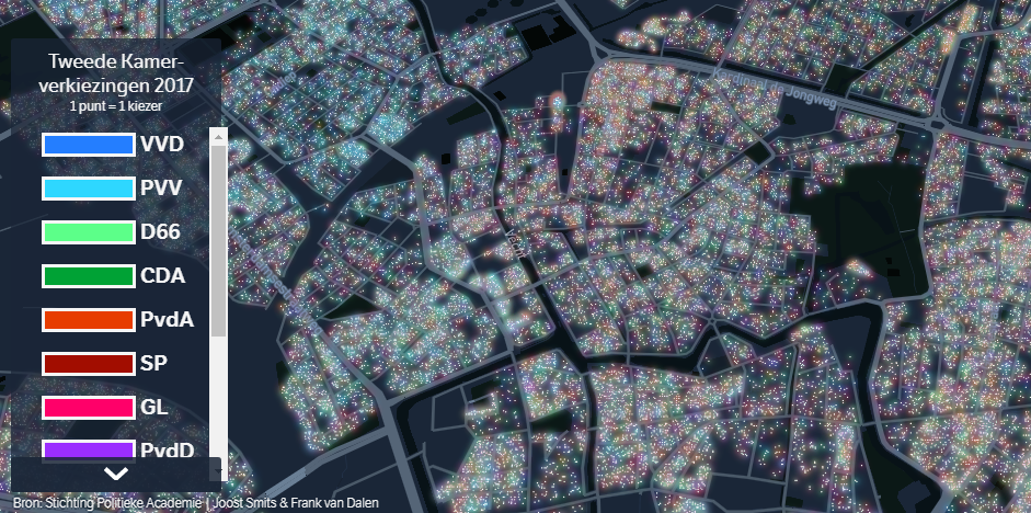
A few days before the 2021 general election in the Netherlands, Dutch newspaper NRC published a stunning map providing a detailed picture of how the country voted four years ago. Visualizing data collected by Frank van Dalen and Joost Smits from Stichting Politieke Academie, the map represents every single vote as a dot colored according to what party received it.
There are thirteen different colors appearing on the graphic, which is the number of parties that participated in the 2017 election of the House of Representatives. So, it may be not as easy to understand who won where and find patterns at a glance. However, the visualization is interactive, making it possible to choose what party votes to display right now.
Actually, the 2021 voting has already taken place, this week. If you are interested to look at the results, check out the election maps and other relevant visualizations on NRC, De Telegraaf, or de Volkskrant.
***
That’s all for now, folks. Stay tuned for more — Data Visualization Weekly is out every Friday!
- Categories: Data Visualization Weekly
- 1 Comment »