Visual Data Analytics on Protests, GDP, Opinions, and Weather — DataViz Weekly
December 20th, 2019 by AnyChart Team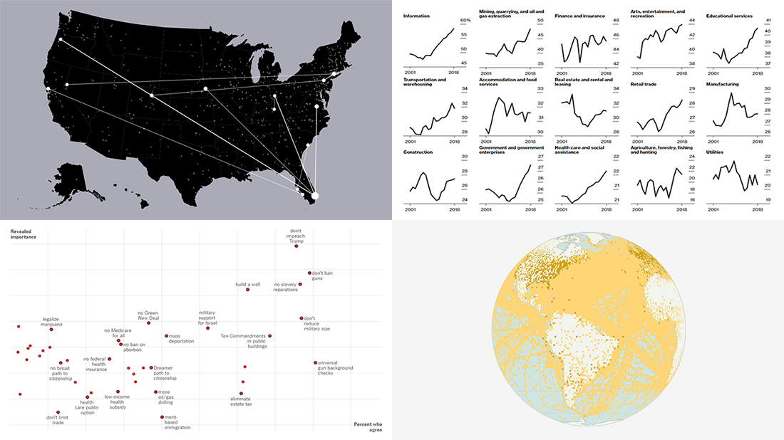 Visual data analytics with the help of charts and maps as efficient graphical presentation forms can quickly bring a lot of insight into mere numbers. We’ve curated some more examples from all over the web to illustrate this. See our new DataViz Weekly selection of great recently-published projects featuring data visualization in action:
- Street protests in the United States — Alyssa Fowers
- American GDP by county — Bloomberg
- Topical issues for U.S. voters — The Upshot, The New York Times
- Weather observations in old ship logbooks — Reuters
- Categories: Data Visualization Weekly
- No Comments »
Charting Data About Retirement Savings, Warren’s Plans, California Housing, and UK Election — DataViz Weekly
November 15th, 2019 by AnyChart Team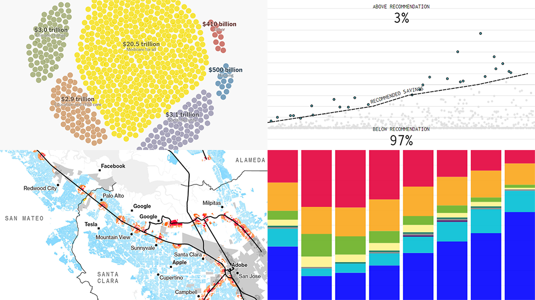 It’s Friday, which means we are ready to share with you new awesome examples of charting in action. Look how powerful the right visualization can be when one needs to explore or communicate various statistics. Here’s a quick list of the projects presented in this new DataViz Weekly post — we’ve found them out there these days:
- Saving for retirement in the United States — FlowingData
- Costs of Elizabeth Warren’s policy plans — The New York Times
- Housing crisis in California — Bloomberg
- Voting intentions before the 2019 United Kingdom general election — CNBC
- Categories: Data Visualization Weekly
- No Comments »
Compelling Data Visualizations to Check Out This Weekend — DataViz Weekly
October 25th, 2019 by AnyChart Team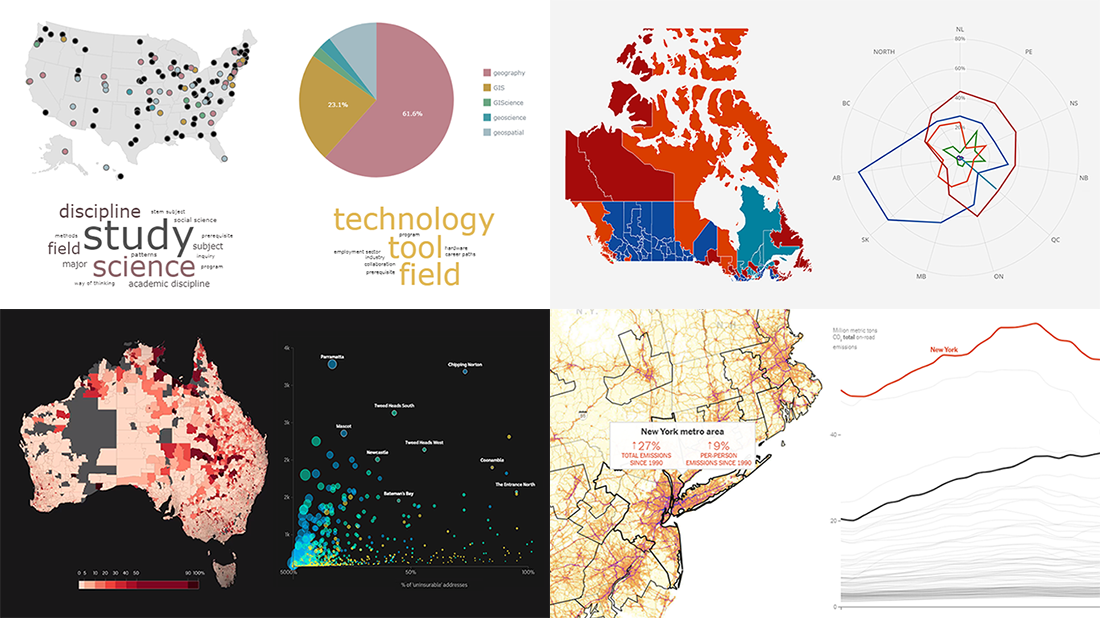 Continuing our regular DataViz Weekly feature, we invite you to check out several compelling data visualizations worth taking a look at, which we’ve noticed and enthusiastically explored these days. Here’s a quick list of the projects highlighted in the new roundup:
- Impact of climate change on the costs and availability of insurance in Australia — ABC News
- “Geography” and “GIS” in the U.S. higher education — Alicia Bradshaw, UW Tacoma
- Auto emissions in America — The New York Times
- Canadian federal election results — CBC/Radio-Canada
- Categories: Data Visualization Weekly
- No Comments »
Exploring Data on Drought, Impeachment, Opioids, and Tax — DataViz Weekly
October 11th, 2019 by AnyChart Team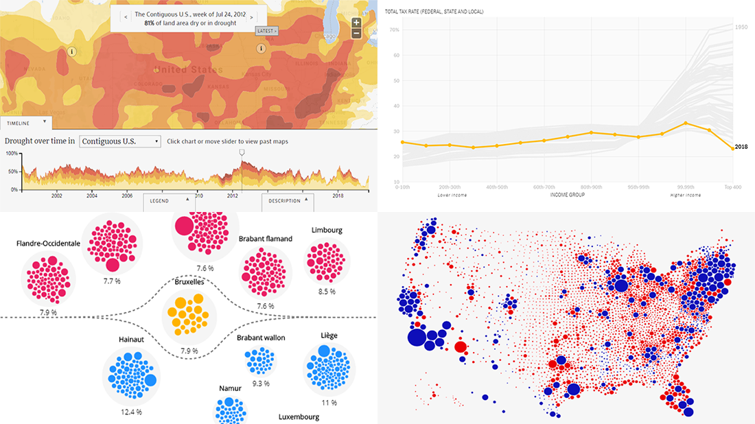 Exploring data visualized in cleverly made charts and maps not only provides quicker and better insight. It is also an aesthetically pleasing process. We’ve got examples to illustrate this point — check out our new DataViz Weekly post highlighting the following interesting projects we’ve recently come across:
- Weekly drought reports for the United States — EcoWest & Bill Lane Center for the American West at Stanford University
- Trump’s impeachment map vs cartogram — Karim Douïeb
- Opioid consumption in Belgium — Médor & Jetpack AI
- Total tax rate change in the United States in 1950-2018 — David Leonhardt for The New York Times
- Categories: Data Visualization Weekly
- No Comments »
Visualizing Diversity and Absence in Schools, Child Mortality, and Debate Topics — DataViz Weekly
September 20th, 2019 by AnyChart Team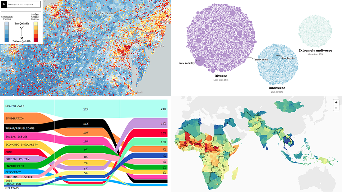 Enjoy new awesome chart examples! The following cool projects visualizing diversity and integration, presidential debate topics, and more have captured our attention this week, and we’re excited to feature them now within the framework of the DataViz Weekly series on AnyChart Blog:
- Chronic absence in U.S. schools
- Racial diversity across all America’s school districts
- Child mortality in low-to-middle-income countries
- Top issues discussed at the first three Democratic debates
- Categories: Data Visualization Weekly
- No Comments »
Visualizing Costs and Fires Data in Charts and Maps — DataViz Weekly
September 6th, 2019 by AnyChart Team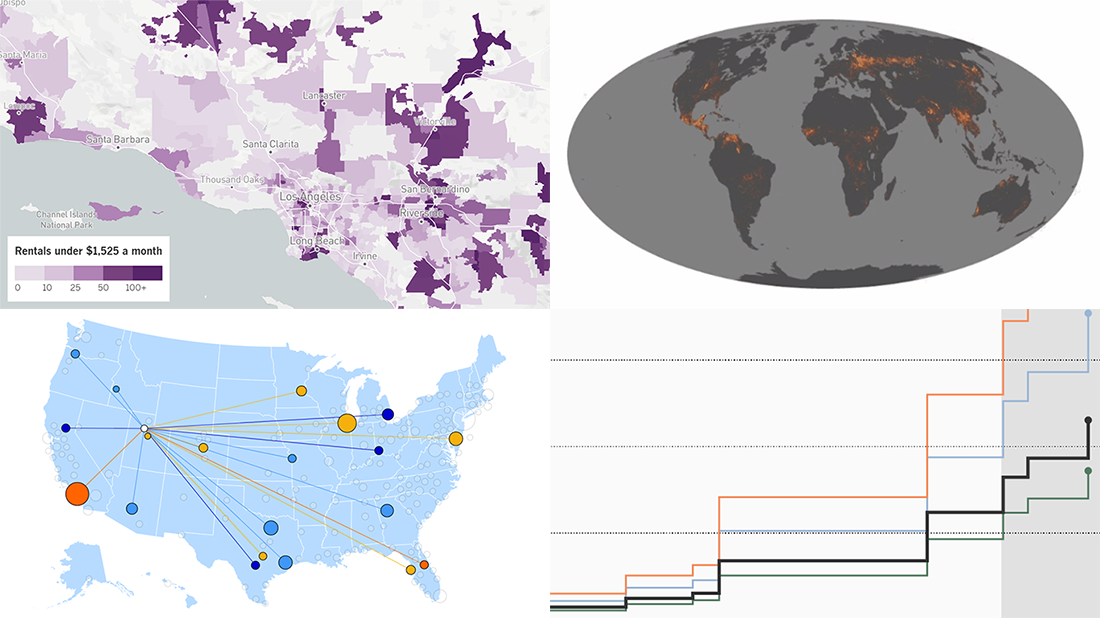 Hey, check out some more of the new awesome data projects we’ve come across this week! It’s a new DataViz Weekly article, and today we are glad to show you cool charts and maps visualizing costs and fires:
- Salaries adjusted for cost of living across the United States
- U.S.-China trade war costs for American families
- Affordable home rentals in California
- Long-term record of fires worldwide
- Categories: Data Visualization Weekly
- No Comments »
Stunning Data Visuals on Names, Slavery, Privacy, and Foliage — DataViz Weekly
August 30th, 2019 by AnyChart Team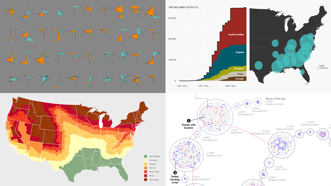 Are you ready for a new dose of stunning data visuals? Today is Friday, and DataViz Weekly is already here! Today we invite you to take a look at the following new interesting projects with charts and infographics:
- Gender-switched names in the United States
- Growth of slavery in America
- Website user data trackers
- Peak fall foliage color across the U.S.
- Categories: Data Visualization Weekly
- No Comments »
Visual Data Projects About National Parks, Drug Crime, Political Identity, and Top Websites — DataViz Weekly
August 16th, 2019 by AnyChart Team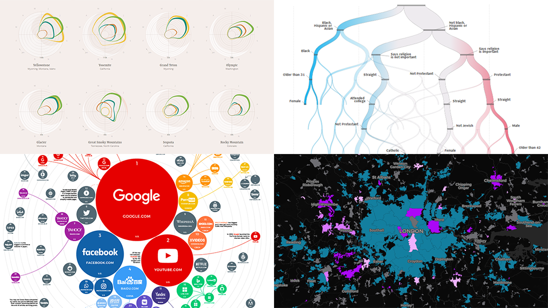 Check out some of the new exciting visual data projects that we’ve recently found around the web. Here’s a quick list of what’s featured today on DataViz Weekly:
- Discovering the best time to visit a national park in the United States
- Revealing drug crime trends in England and Wales
- Analyzing demographics to predict a preferred political party
- Ranking the top 100 websites
- Categories: Data Visualization Weekly
- No Comments »
Excellent Visualizations on Subway, Moons, Energy, and Sea Ice — DataViz Weekly
July 12th, 2019 by AnyChart Team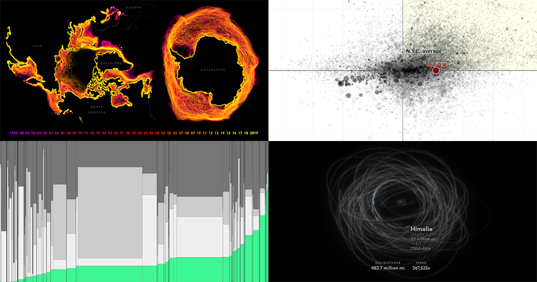 Many excellent visualizations have appeared this week around the web. Now it’s time to choose four and briefly introduce them to you — that’s what we’ve been doing for years within the framework of the special DataViz Weekly feature on our blog.
Alright. We invite you to take a look at the following new cool projects as another set of great data visualization examples, for your inspiration and fun:
- Variability in the New York subway commutes — The Upshot
- Moons in our solar system — National Geographic
- Energy consumption worldwide since 1980 — Bloomberg
- Sea ice extents since 1979 — ArcGIS Blog
- Categories: Data Visualization Weekly
- No Comments »
New Cool Diagrams, Graphs, and Maps Visualizing Interesting Data — DataViz Weekly
June 21st, 2019 by AnyChart Team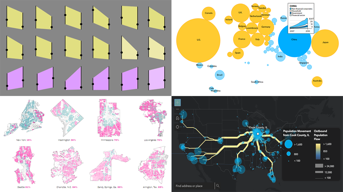 Generally, data becomes much easier to make sense of when it is visualized in diagrams, maps, or other forms of graphics. DataViz Weekly shows you examples of how this is true in reality. Today, we’ve put together another four of the latest data visualization projects discovered by our team around the internet. They bring insight into the following topics:
- Single-family home zoning in the United States of America
- Time use of parents vs people without kids
- Debt of emerging market countries
- U.S. internal migration
- Categories: Data Visualization Weekly
- 1 Comment »