 Are you ready for a new dose of stunning data visuals? Today is Friday, and DataViz Weekly is already here! Today we invite you to take a look at the following new interesting projects with charts and infographics:
- Gender-switched names in the United States
- Growth of slavery in America
- Website user data trackers
- Peak fall foliage color across the U.S.
Stunning Data Visuals in Data Visualization Weekly: August 23, 2019 — August 30, 2019
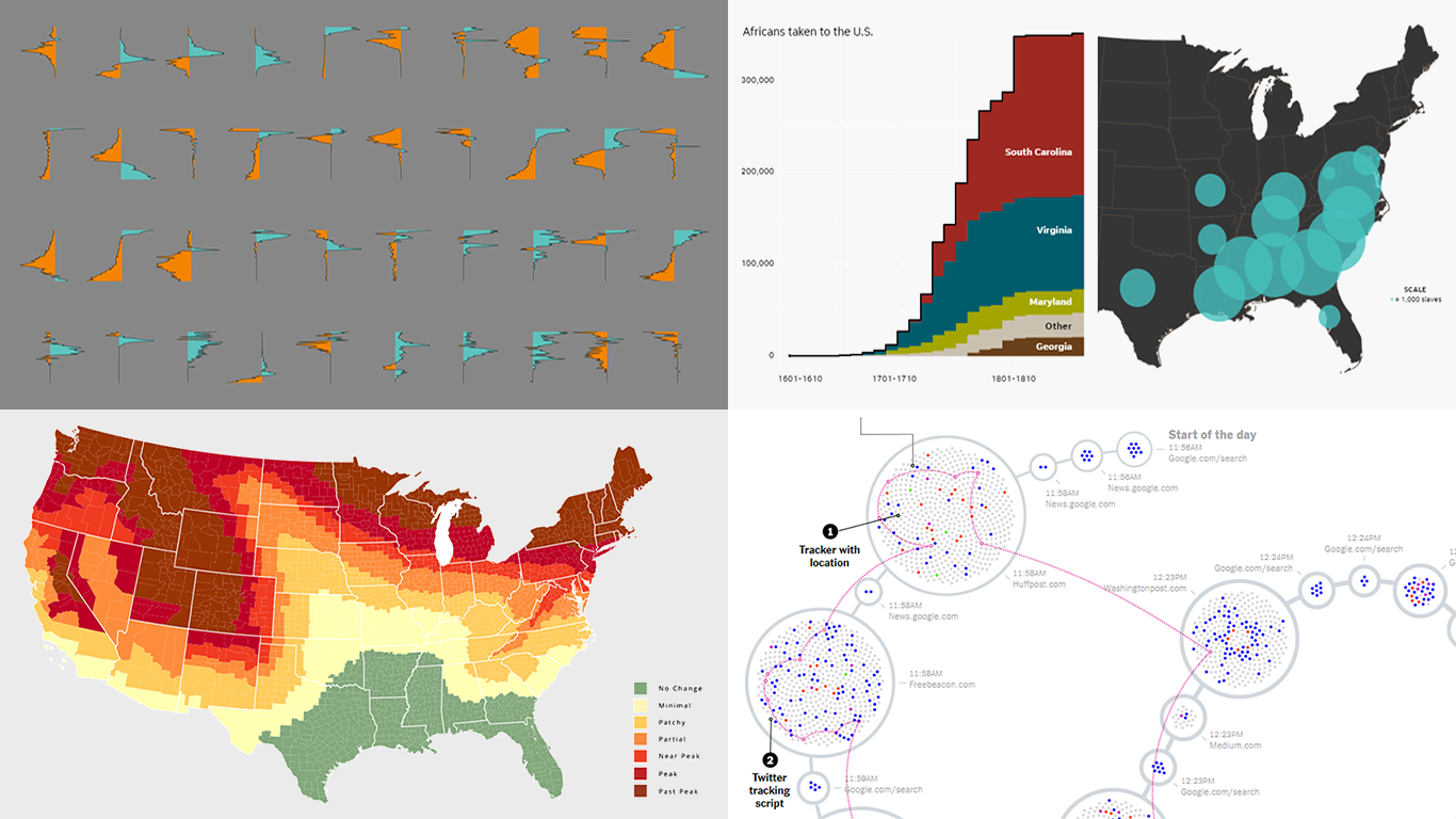
Most Gender-Switched Names in U.S. History
While some names are used mostly for girls and some mostly for boys, there are names that switched sexes. Data visualization expert Nathan Yau wondered which names in the United States made the biggest switch between 1930 and 2018. To find out, he looked into the U.S. Social Security Administration’s data set of baby names, identified almost 3,000 names (3%) that switched, and visualized the change in counts and rates for the most switched ones.
See his new Data Underload post on FlowingData to watch how he worked with data and to explore the charts and conclusions he made.
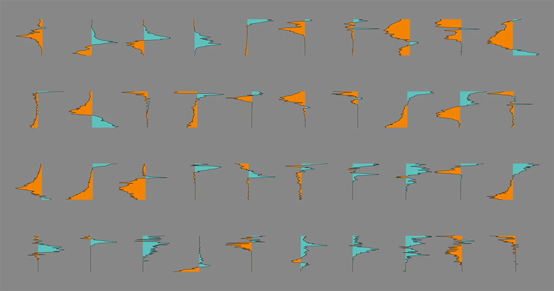
Growth of Slavery in U.S.
400 years ago, in August 1619, the first recorded Africans were brought to the English colonies in North America. which is considered to represent the origins of slavery on these territories. USA Today recalls that story in a stunning visual format, also offering charts and infographics to illustrate how slavery then grew in the United States over two centuries.
Check out the explosive growth of slavery in America in data visualizations on USA Today.
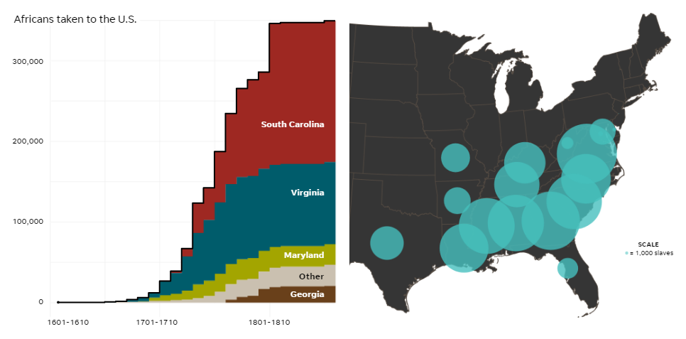
Tracking Website Users’ Data Across Internet
American journalist Farhad Manjoo installed OpenWPM, a web privacy measurement framework designed to monitor how websites track their visitors’ data. Then he surfed the internet in a habitual way during several days and sent the resulting data to his colleagues at The New York Times. Then Nadieh Bremer worked with them to create a fascinating visualization of that data.
Look how hundreds of trackers followed Farhad Manjoo while he was living his regular life on the web — reading news, watching videos, searching for stuff, and so on.
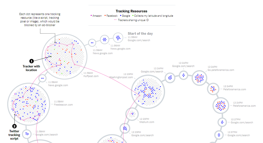
Peak Fall Foliage Color in U.S. in 2019
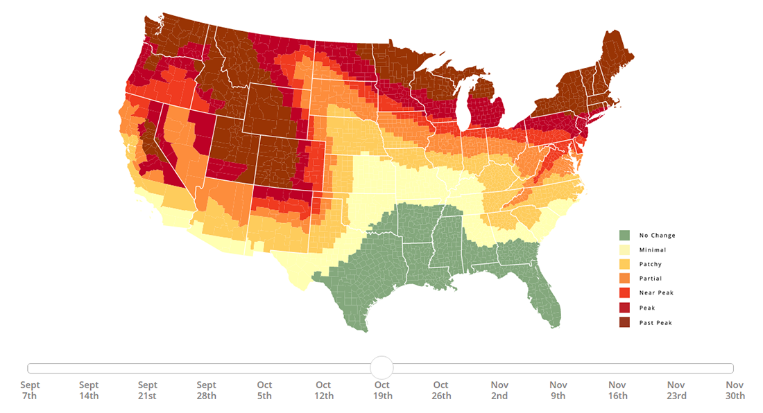
Within the framework of its annual initiative, SmokyMountains.com has just published a new fall foliage prediction map for the United States. The project is designed to display how tree leaves are expected to change their colors across the country this fall, week by week, helping travelers who seek to catch peak color to better plan their trips.
Move the time slider right under the map to play with this awesome visualization and watch the peak fall foliage colors spreading all over the United States this year.
***
Check out these stunning data visuals and stay tuned for DataViz Weekly!
- Categories: Data Visualization Weekly
- No Comments »