 Continuing our regular DataViz Weekly feature, we invite you to check out several compelling data visualizations worth taking a look at, which we’ve noticed and enthusiastically explored these days. Here’s a quick list of the projects highlighted in the new roundup:
- Impact of climate change on the costs and availability of insurance in Australia — ABC News
- “Geography” and “GIS” in the U.S. higher education — Alicia Bradshaw, UW Tacoma
- Auto emissions in America — The New York Times
- Canadian federal election results — CBC/Radio-Canada
New Compelling Data Visualizations: October 18, 2019 — October 25, 2019
Climate Change’s Impact on Insurance Costs in Australia
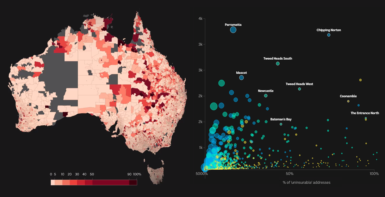
One of the tangible consequences of climate change consists in the establishment of extreme weather conditions and natural disasters that are uncustomary for certain local areas. Resulting in a sharp increase in insurance premiums, such a risk is already clearly seen to affect the cost of home insurance and even its overall availability in particular places.
Australia is a striking example. A new analysis, conducted by Dr Karl Mallon’s Climate Risk firm exclusively for ABC News, provides data-based insight into what is going on and expected to happen with insurance around the country over the 21st century.
Check out an impressive visual story on ABC News, which tells more of the expansion of insurance “red zones” across Australia, communicating calculations and their interpretation with the help of various great-looking charts and maps.
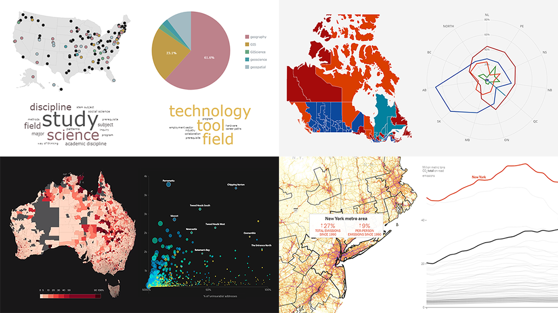
“Geography” and “GIS” in U.S. Higher Education
For her capstone paper at the University of Washington Tacoma, Alicia Bradshaw, now MS Geospatial Technologies, made an interesting research into how geography departments in the U.S. higher education institutes describe their core discipline. To find out what kind of language they use in public and how they differ and parallel in those terms in a spatial perspective, she analyzed texts on their official websites.
Look at the charts (and maps) Alicia made to reveal how 122 such departments use the terms “geography,” “GIS,” “geoscience,” “geospatial,” and “GIScience.” On a web page that she calls an interactive companion to her paper, you can find cool interactive word clouds, pie charts, a dot map, and more graphics.
We are especially excited that our JavaScript charting library was utilized for data visualization in this awesome project. Great use of AnyChart, indeed!
Auto Emissions in America
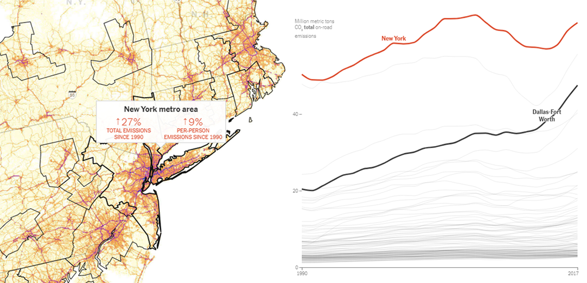
Nowadays, the biggest share of greenhouse gas emissions in the United States comes from transportation. To see how this changed, the New York Times analyzed new data recently published in the Database of Road Transportation Emissions (DARTE) maintained by Boston University researchers, which supplies detailed estimates of annual on-road emissions of carbon dioxide over the past few decades.
In support of the exploration goals, Nadja Popovich and Denise Lu created a beautiful interactive map visualizing a year’s worth of CO2 from freight and passenger traffic on rural and urban roads, claimed to be the most detailed map of auto emissions in America. Check it out and read more in their article on NYT. Don’t miss out on another cool and interesting interactive visualization, which is a chart of total and per-person on-road emissions in the 100 U.S. metro areas with the highest emissions from driving.
Canada Election Results
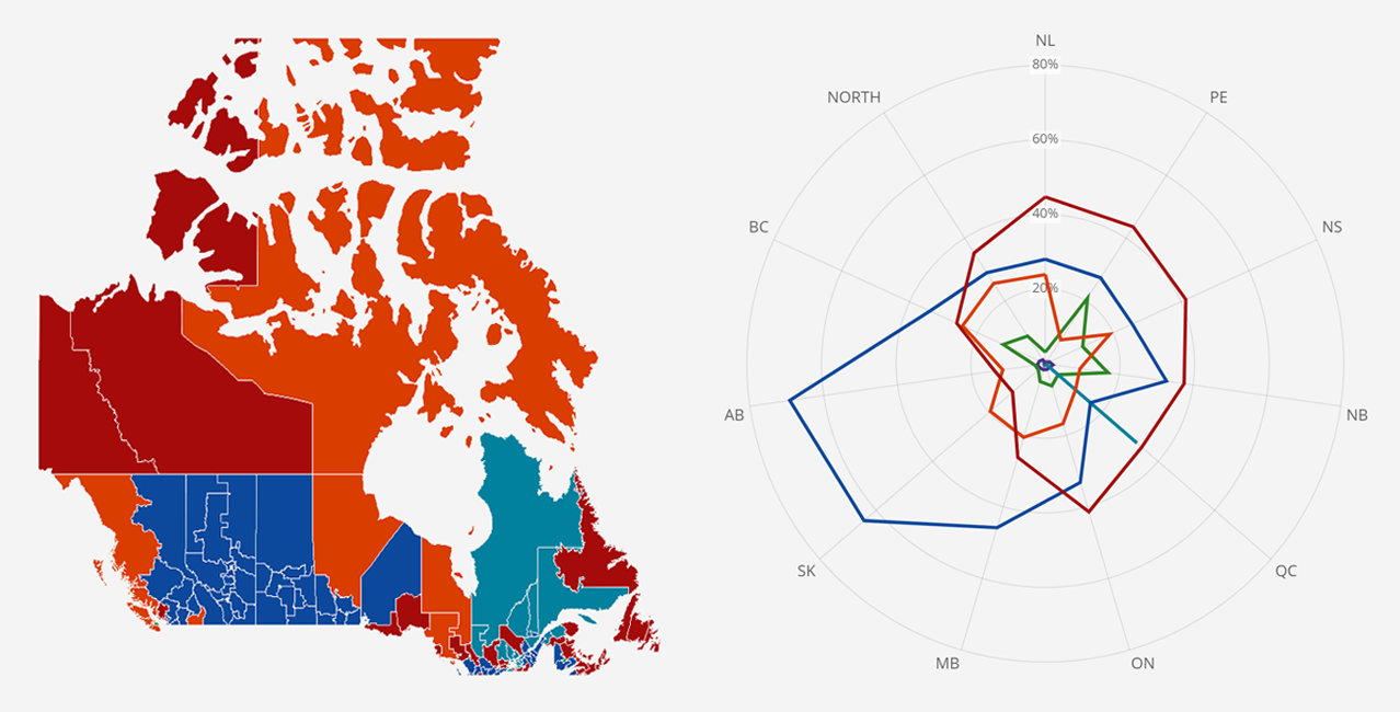
The 2019 federal election held in Canada earlier this week ended with an ambiguous victory of the Liberal party. The Liberals succeeded to retain power but at the same time lost a majority as their representation in the House of Commons of Canada decreased from 177 seats to 157 (out of 338).
To find out the details about the general election’s outcome, you are welcome to visit CBC/Radio-Canada’s Canada Votes 2019 page. There, you’ll find all the most important counts represented, in figures and visualizations. In particular, take a quick play with the polar chart to compare the popular vote breakdown by region in 2019 against 2015.
***
Found some fresh compelling data visualizations out there? Let us know by pinging us here in the comments, or in the online chat, or via our social media channels — on Twitter, Facebook, LinkedIn, Medium, or Pinterest.
Stay tuned for Data Visualization Weekly.
- Categories: Data Visualization Weekly
- No Comments »