 Check out some of the new exciting visual data projects that we’ve recently found around the web. Here’s a quick list of what’s featured today on DataViz Weekly:
- Discovering the best time to visit a national park in the United States
- Revealing drug crime trends in England and Wales
- Analyzing demographics to predict a preferred political party
- Ranking the top 100 websites
New Cool Visual Data Projects in Data Visualization Weekly: August 9, 2019 — August 16, 2019
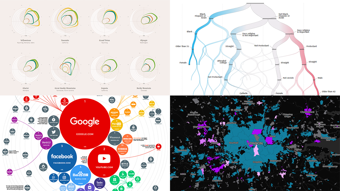
Discovering Best Time to Visit Each U.S. National Park
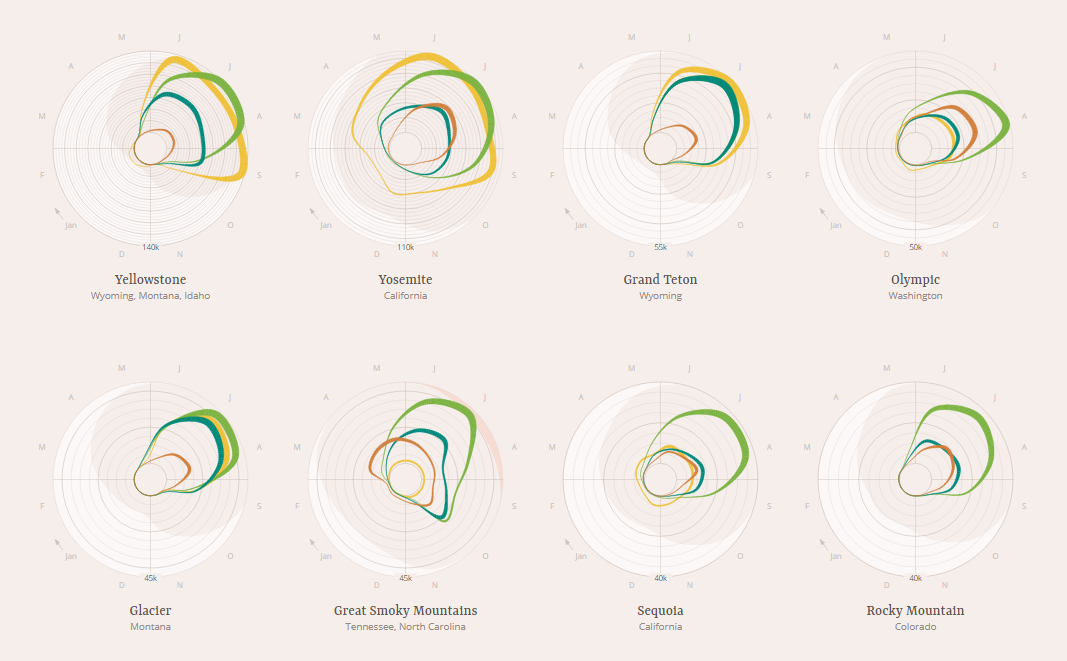
Jordan Vincent, a UX designer and software engineer, made a set of creative visualizations to find out when is the best time to visit one or another U.S. national park for an overnight stay. “When should you pitch your tent? Or when is it better to opt for lodging? When should you visit to avoid the crowds?” — to make his project give answers to these types of questions, he plotted the overnight stays statistics from the U.S. National Park Service by time of year and type of lodging, along with climate data from NOAA’s National Centers for Environmental Information (NCEI) to take average temperatures into account.
Check out the charts for each of the 54 national parks covered in this Jordan Vincent’s visual data project, including Yosemite, Yellowstone, Grand Canyon, Glacier, and many others whose data was found available.
Revealing Drug Crime Trends in England and Wales
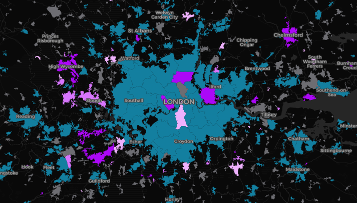
Will Dahlgreen, a BBC data journalist, visualized police data to look into drug crime trends for England and Wales. While the number of drug crimes have noticeably decreased there in the past few years, an interactive map he made helps reveal a shift in where they take place. According to what we see on the visualization, drug crime is moving from cities and especially city centers to the outskirts and smaller towns and villages.
Explore the map to see the changes by yourself and don’t miss out on several zoomed parts with striking examples further down the article.
Analyzing Demographics to Predict Preferred Political Party
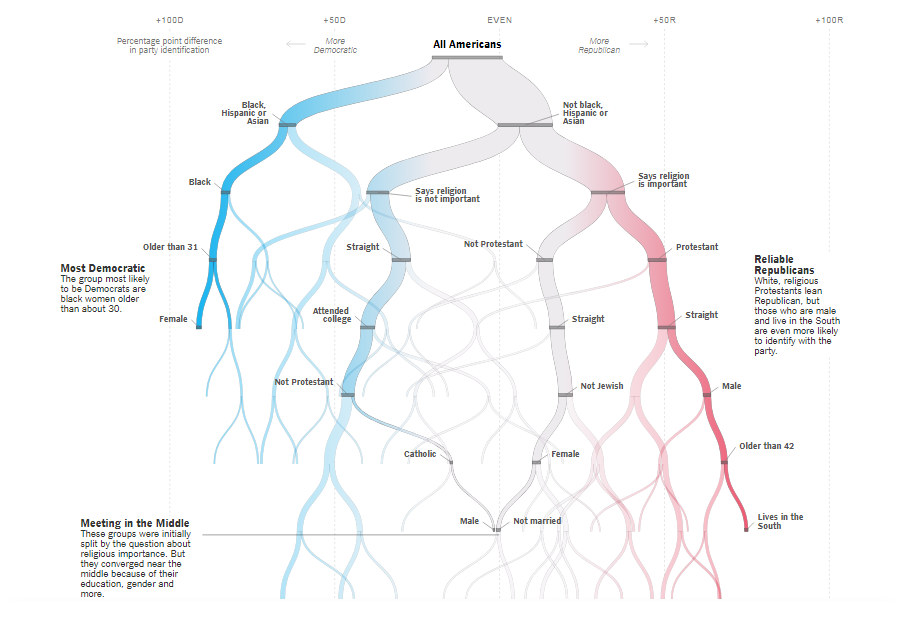
In his last project as a graphics editor at The New York Times, Sahil Chinoy, now an economics PhD student at Harvard, looked into how demographics can predict whether an American is more likely to identify as a Republican or a Democrat. Using data from recent surveys along with assistance of many political scientists, he made up a methodology allowing to determine how you vote based on your answers to several simple questions.
Complete a quiz to see what the algorithm says about your party preferences and explore a decision tree that updates as you go. Scroll further down the article to learn more about the relationships between certain demographics and political views in the contemporary United States of America.
Ranking Top 100 Websites
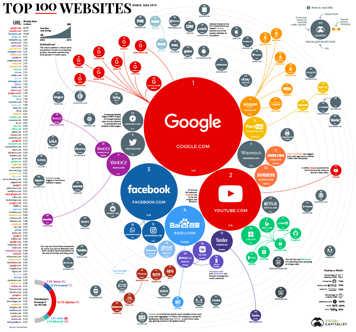
Visual Capitalist published an interesting infographic visually representing SimilarWeb’s traffic statistics for the top 100 websites globally. By the way, here’s an interesting fact: To make it at least to the 100th line on the list, a website needs about 350 million visits per month.
Explore this visualization of the ranking on Visual Capitalist. Don’t miss out on some entertaining facts based on an analysis of what data shows, below the main infographic.
***
All the best! Stay tuned for cool visual data projects!
- Categories: Data Visualization Weekly
- No Comments »