 Enjoy new awesome chart examples! The following cool projects visualizing diversity and integration, presidential debate topics, and more have captured our attention this week, and we’re excited to feature them now within the framework of the DataViz Weekly series on AnyChart Blog:
- Chronic absence in U.S. schools
- Racial diversity across all America’s school districts
- Child mortality in low-to-middle-income countries
- Top issues discussed at the first three Democratic debates
Visualizing Diversity and More in Data Visualization Weekly: September 13, 2019 — September 20, 2019
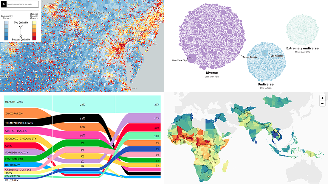
Chronic Absence in U.S. Schools
Delving into the factors that affect learning at school, the Hamilton Project at the Brookings Institution created an interactive map that shows so-called ‘chronic absence’ rates for every elementary, middle, and high school in the United States. Attendance is considered critical for academic progress of a student, and chronic absence is recognized as a situation when they’ve missed at least 10% of all school lessons regardless of reason. Together with the chronic absence data, the map also visualizes the magnitude of school and community factors.
Use this map to explore the rates of chronic absence as well as school and community factors across the U.S. There, you can also look up a certain school or school area by name or address. Hover over places and click on dots to see more information about the corresponding territories and schools.
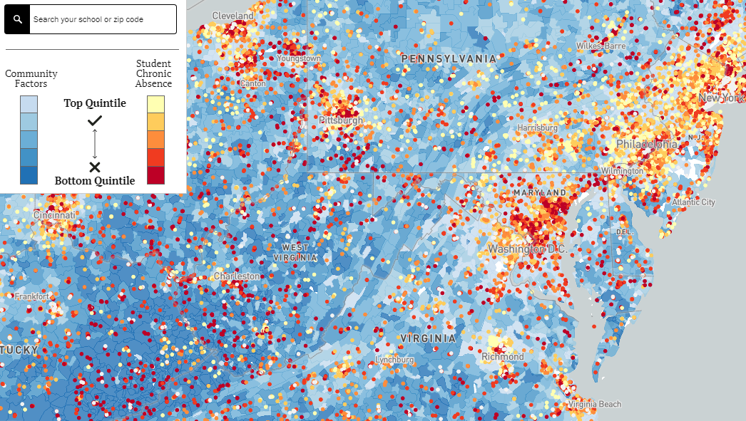
Racial Diversity and Integration Across All America’s School Districts
The U.S. Census Bureau expects that as soon as next year, America will reach a demographic tipping point, seeing the number of white children surpassed by that of children of color. The Washington Post looked into the matter of how school is changing in response to the country’s growing racial diversity. As the newspaper’s analysts found out, it is a fact that nowadays more children go to schools with students of different races than ever before. However, there are still places with quite deeply segregated communities and schools, especially in big cities and across the U.S. South.
Explore the diversity and integration of school districts all over the United States of America using a dedicated interactive map published on The Post. On your way to the map along the article, you will find cool bubble-based visualizations providing insight into the racial makeup of the nation’s school districts in 2017 and in 1995, to compare and see what’s changing.
Child Mortality Rates in Low-to-Middle-Income Countries in 2000-2017
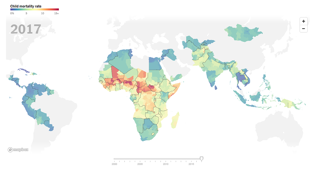
According to the ‘Examining Inequality 2019′ report published this week by the Bill and Melinda Gates Foundation and created in collaboration with researchers from the University of Washington’s Institute for Health Metrics and Evaluation (IHME), child mortality rates declined in 2000-2017 in 96 of the 97 low-to-middle-income countries accounting for the vast majority of young children’s deaths. At the same time, the results are greatly imbalanced and kids’ chance of survival remains linked with exactly where in the world (or where across a country) they are born and raised.
The New York Times‘ The Upshot mapped the new data about child mortality rates, showing what they currently are and how they changed in 2000-2017. Check out two interactive global maps and take a zoomed-in look at India, Nigeria, Thailand, Southern Africa, and Haiti further down the article.
Top Issues Discussed at Democratic Debates
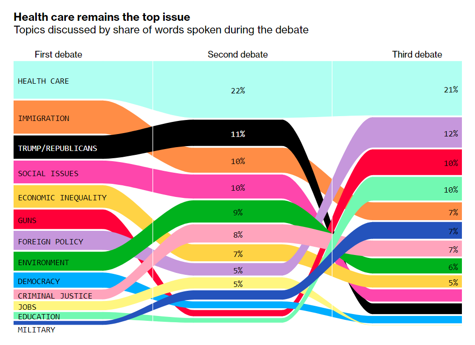
More than one year before the next United States presidential election scheduled for November 3, 2020, the race for the Democratic party’s nomination is in full swing. To understand what’s at the top of the agenda, Bloomberg scrutinized the transcripts of the first three debates, highlighted the topics discussed at each moment (one color for each topic), and charted them based on their frequency in candidates’ speeches.
Health care appeared to be the hottest issue during all the three debates, accounting for about one-fifth of all words spoken by Joe Biden, Cory Booker, Elizabeth Warren, Julián Castro, Kamala Harris, Amy Klobuchar, and other participating candidates. Find out how other topical issues performed, in a dedicated article with interesting graphics on Bloomberg.
***
We hope you liked these projects visualizing diversity in U.S. school districts, Democratic debate topics, and others. Stay tuned for DataViz Weekly.
Have a fascinating weekend time everyone!
- Categories: Data Visualization Weekly
- No Comments »