 Visual data analytics with the help of charts and maps as efficient graphical presentation forms can quickly bring a lot of insight into mere numbers. We’ve curated some more examples from all over the web to illustrate this. See our new DataViz Weekly selection of great recently-published projects featuring data visualization in action:
- Street protests in the United States — Alyssa Fowers
- American GDP by county — Bloomberg
- Topical issues for U.S. voters — The Upshot, The New York Times
- Weather observations in old ship logbooks — Reuters
Visual Data Analytics Projects in Data Visualization Weekly: December 13, 2019 — December 20, 2019
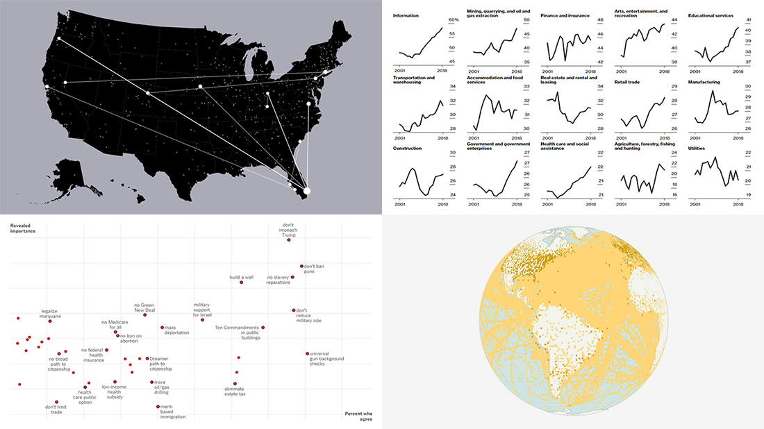
Street Protests in America
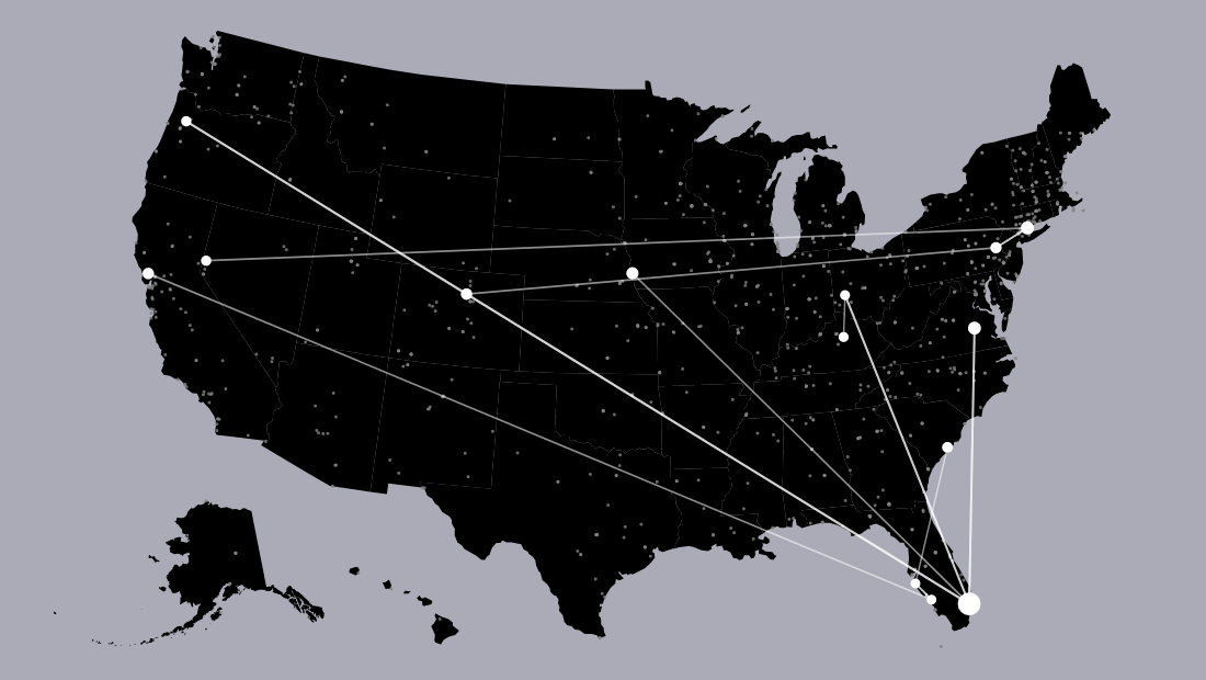
Alyssa Fowers, a graduate student at the University of Miami, created a data visualization project offering a great way to explore nearly three years of street protests in the United States at a glance. There you will find multiple impressive charts and maps. For example, you can watch the protest spread week by week starting with Donald Trump’s inauguration, find out exactly where Americans protested about a certain topic (guns, immigraion, education, and so on), and understand even more.
Check out the Points of Light project, with many interesting data visualizations, static and interactive.
County-Level U.S. GDP
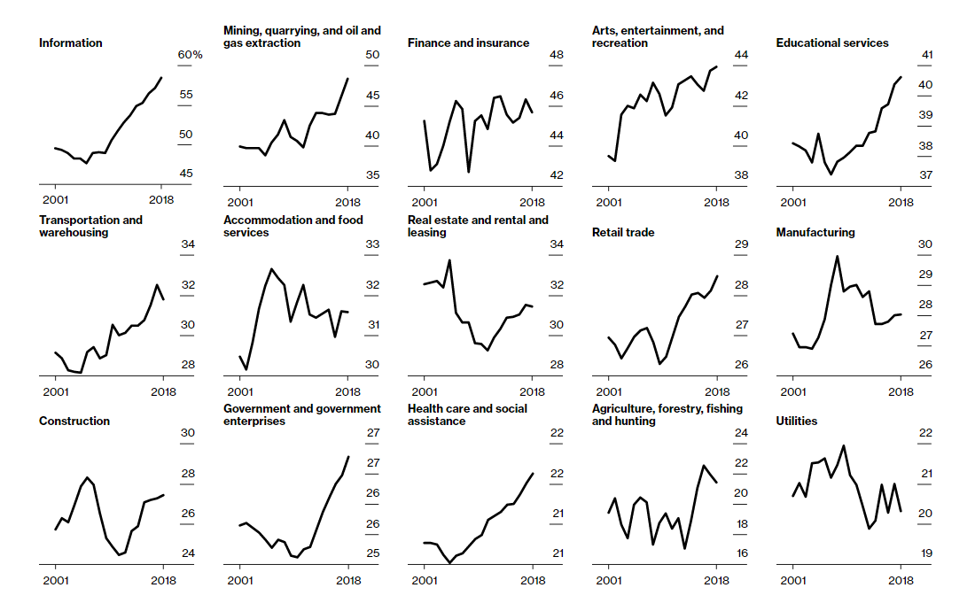
Last week, the U.S. Bureau of Economic Analysis released county-level GDP data for 2001-2018. Among many interesting findings, the statistics show that the growth of the American economy is increasingly concentrated in about 1% of all counties. As a matter of fact, 31 counties made almost one-third of the entire nation’s GDP in 2018. For a more in-depth look at the growing concentration of the U.S. economic activity, Bloomberg made a series of interesting visualizations in a special piece.
To start with, you can use a map to locate those 31 counties and see how big their GDP is. Then, there is a chart showing the growth of their cumulative share of the U.S. GDP, employment, and population. Finally, check out 15 sparkline charts revealing the change in the concentration of industries by visualizing the share of each industry’s output from their respective 1% of counties.
If you are interested to see more visualizations of the newly released county-level U.S. GDP data, we recommend checking out another article on Bloomberg dedicated to identifying the geographical center of the nation’s economy as of 2018 and how it changed since 2001, also detailed by industry.
U.S. Voters’ Burning Issues
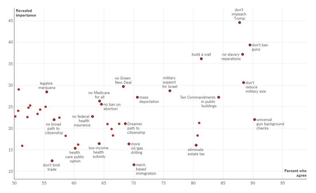
In July 2019, the University of California, Los Angeles (UCLA), in collaboration with the Democracy Fund, launched Nationscape. Surveying over 6,000 people weekly and fielded by market research company Lucid, it is reported to be one of the largest public opinion surveys ever conducted. The Upshot decided to use the data collected within the framework of this project to present a picture of the voters’ priorities and see how they differ depending on party preferences.
See the two charts to understand what is most important to Republicans and Democrats. Read an analysis for some quick conclusions. In addition, do not miss out on checking out the independents’ concerns in a separate article.
Weather Observations from Old Ship Logs
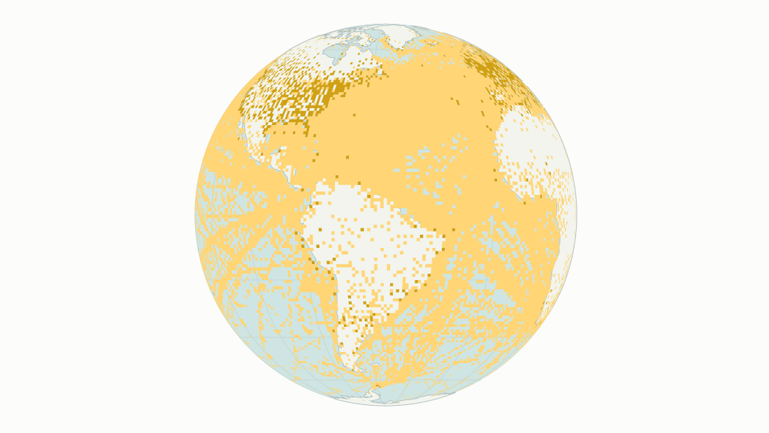
Tons of tons of weather observations are thoroughly described in the logs of ships sailing in the 19th and early 20th centuries. These records are transcribed by volunteers from the Old Weather project and then fed into the corresponding National Oceanic and Atmospheric Administration’s data set. Such a “weather time machine” can show what the weather was in a certain place on every single day, now back to 1836, fueling new insights into the past and future of the changing climate conditions around the globe.
Join Reuters as they explain more details and provide great examples of how this work goes and why it is important.
***
We appreciate your attention and hope you like what we’ve highlighted in today’s Data Visualization Weekly. Expect a new dose of cool visual data analytics project examples in another roundup on our blog next Friday. All the best.
- Categories: Data Visualization Weekly
- No Comments »