 Exploring data visualized in cleverly made charts and maps not only provides quicker and better insight. It is also an aesthetically pleasing process. We’ve got examples to illustrate this point — check out our new DataViz Weekly post highlighting the following interesting projects we’ve recently come across:
- Weekly drought reports for the United States — EcoWest & Bill Lane Center for the American West at Stanford University
- Trump’s impeachment map vs cartogram — Karim Douïeb
- Opioid consumption in Belgium — Médor & Jetpack AI
- Total tax rate change in the United States in 1950-2018 — David Leonhardt for The New York Times
Charts for Exploring Data, in Data Visualization Weekly: October 4, 2019 — October 11, 2019
Weekly Drought Reports for U.S.
![]()
Mitch Tobin from The Water Desk, an initiative of the University of Colorado Boulder’s Center for Environmental Journalism, in collaboration with the Stanford University’s Bill Lane Center for the American West launched an interactive dashboard on the EcoWest website, which visualizes data from weekly drought reports of the U.S. Drought Monitor jointly produced by the National Oceanic and Atmospheric Administration (NOAA), the University of Nebraska-Lincoln’s National Drought Mitigation Center, and the U.S. Department of Agriculture.
The new tool provides a convenient display of drought levels across the country, allowing analysts to monitor not only the current ones but also view weekly data going back to January 2000.
Check out this interactive visualization and explore the drought in the United States over time.
Trump’s Impeachment Map vs Cartogram
Challenge accepted! Here is a transition between surface area of US counties and their associated population. This arguably provides a much more accurate reading of the situation. @observablehq notebook: https://t.co/wdfMeV5hO4 #HowChartsLie #DataViz #d3js https://t.co/lStHeeuMUw pic.twitter.com/MpYiXtsHmu
— Karim Douïeb (@karim_douieb) October 8, 2019
The “Try to impeach this” map tweeted in late September by Lara Trump, U.S. President Donald Trump’s daughter-in-law, sparked a lot of interest and discussions all over the internet. Data scientists and visualization experts, in particular, gladly took it as an example of misleading or at least dubious graphics. For instance, Alberto Cairo even made it the first case demonstrated in his new book “How Charts Lie” which is about to come out.
Karim Douïeb for his part visualized the same data in the form of a cartogram. Shifting the focus from territories to people, it greatly represents a different, more accurate reading of the same situation.
Look at the animated GIF to watch a transition between the surface area of the U.S. counties and their associated population to compare the two visualizations and see again how different approaches to graphical representation can lead to different perceptions and conclusions when exploring data.
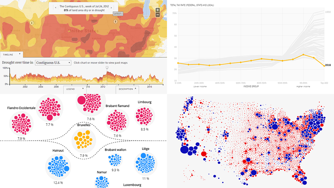
Opioid Consumption in Belgium
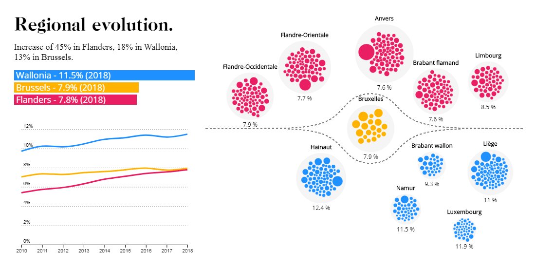
Lately, Karim Douïeb has also put his hand to another awesome data visualization project. Médor, a Belgian magazine mostly working in the investigative report style, delved into the issue of opioid consumption with the focus on the situation in Belgium, and on behalf of operational analytics company Jetpack AI he helped them with data visualization.
As a result of these combined efforts, Médor published an awesome visual story with a lot of interesting and indeed great-looking charts and maps. Revealing the horrifying statistics that more than 1.1 million people in Belgium have been prescribed opioids — one in ten Belgians! — the project goes into an analysis of the details.
Check out “The pain of the Belgians” to see this impressive storytelling and learn about the problem.
Total Tax Rate Change in U.S. in 1950-2018
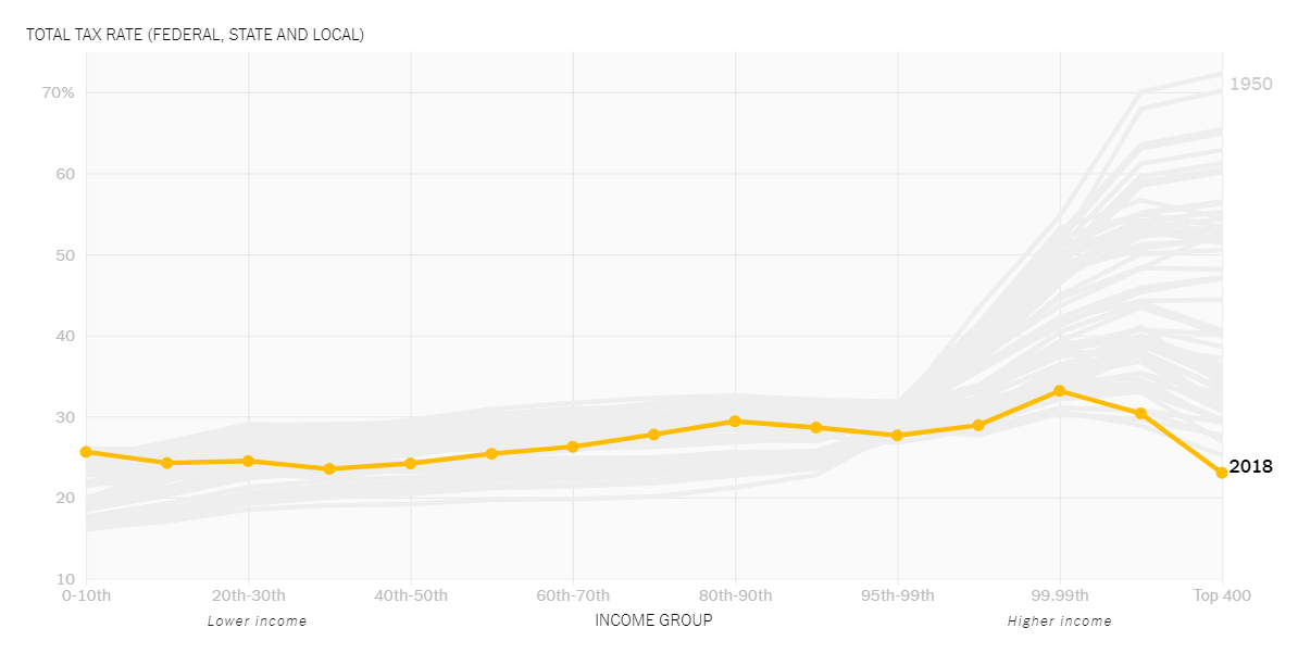
In a new book titled “The Triumph of Injustice” released just about now, UC Berkeley’s professors of economics Gabriel Zucman and Emmanuel Saez present a look into the tax system of the United States and how it has changed. One of their conclusions is that now, for the first time in over a hundred years on record, American billionaires pay lower tax rates than other people such as, for instance, their secretaries.
In reality, after the tax cuts introduced in 2017 by Donald Trump, the overall tax rate on the 400 richest U.S. households went lower than a quarter of their income, down to 23% from 47% in 1980 and 70% in 1950.
In his column for The New York Times, famous journalist David Leonhardt delves into more details about the new data and the book itself and shows a cool chart that visualizes how the total tax rate in the U.S. have changed since 1950 across all income groups. Take a look.
***
Data Visualization Weekly will return to our blog next Friday with new examples of information graphics and charts that greatly assist in exploring data on various topics. Stay tuned!
- Categories: Data Visualization Weekly
- No Comments »