4 Great Examples of Data Visualization in Action — DataViz Weekly
August 28th, 2020 by AnyChart Team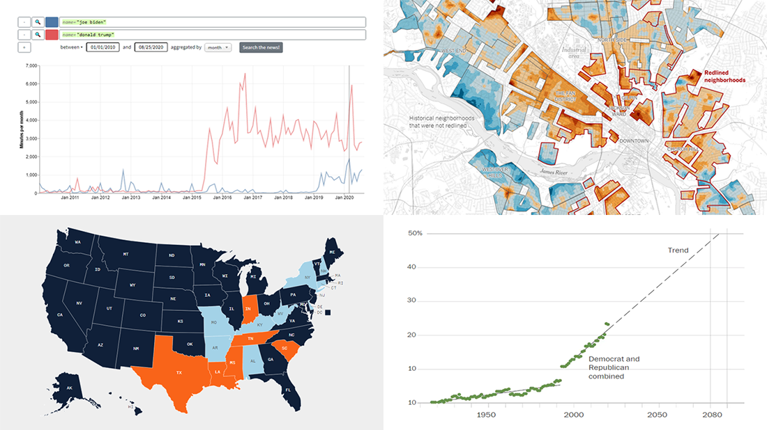 We’ve curated another four great examples of data visualization in action. Would you like to learn about them and check them out right now? Wait no longer! Below is a list of the projects highlighted in the new DataViz Weekly — just give it a glance and go ahead!
- Exploring a link between racism in the housing policy and hotter neighborhoods — The New York Times
- Analyzing the content of cable TV news — Stanford University
- Tracking gender inequality in American politics — The Washington Post
- Summarizing voting rules for the 2020 U.S. election by state — NBC News
- Categories: Data Visualization Weekly
- No Comments »
New Great Charts and Maps for Data Visualization Addicts — DataViz Weekly
August 21st, 2020 by AnyChart Team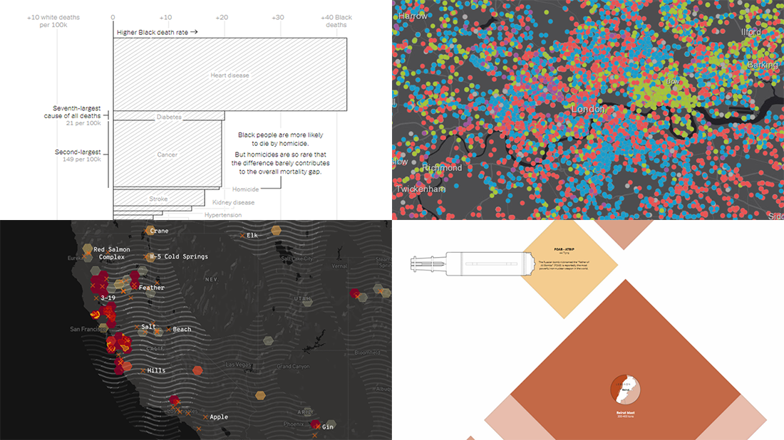 DataViz Weekly is here with a new dose of awesome charts and maps for all data visualization addicts! Today, we are putting a spotlight on the following projects where data is allowed to speak with the help of graphics:
- Stop and search incidents in London — Esri UK Education
- California wildfires — Los Angeles Times
- Scale of the Beirut explosion — Reuters
- Mortality rates for Black and White Americans — New York Times Opinion
- Categories: Data Visualization Weekly
- No Comments »
New Information Visualization Projects Not to Be Missed — DataViz Weekly
August 14th, 2020 by AnyChart Team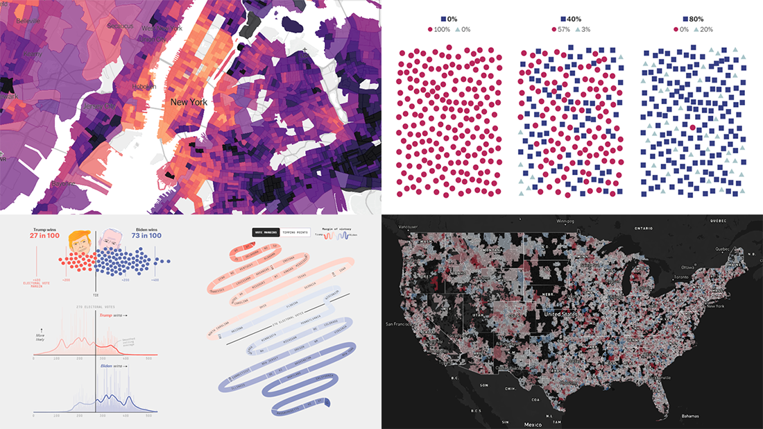 Look at these new cool information visualization projects and notice how different techniques help explore and communicate data, in practice.
Today in DataViz Weekly:
- FiveThirtyEight’s 2020 U.S. presidential election model — FiveThirtyEight
- Herd immunity simulations — The Washington Post
- Unemployment in the United States at the census tract level — The Upshot
- Home prices in America — Realbloc
- Categories: Data Visualization Weekly
- No Comments »
Plotting Data on Park Soundscapes, $600 Unemployment, COVID-19 Deaths, and Game of Thrones Battles — DataViz Weekly
July 31st, 2020 by AnyChart Team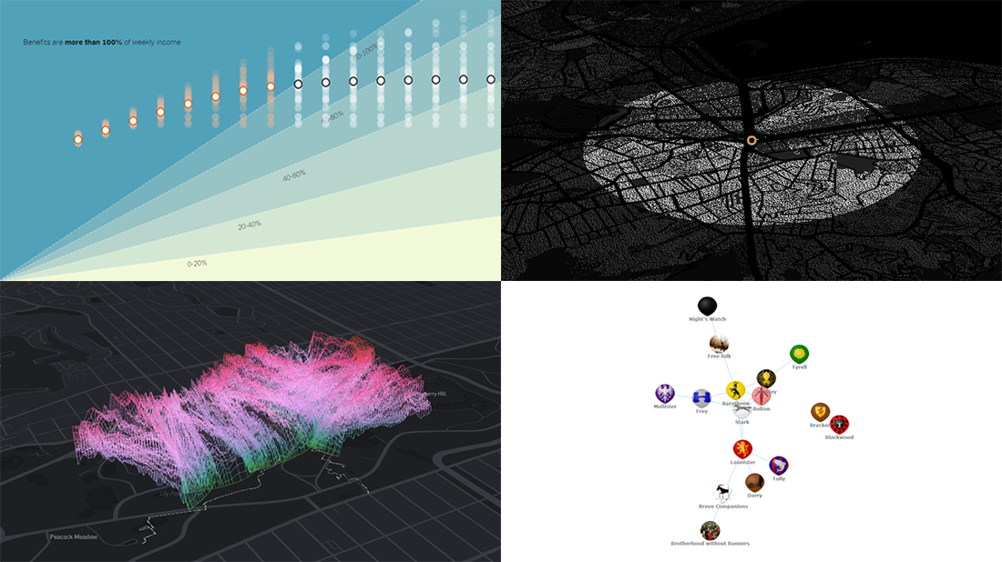 There are many ways of plotting data. Which one to choose in your case? The answer depends, of course, on what kind of data you need to analyze and what questions you want it to answer. In DataViz Weekly, we meet you with some of the best practices on a regular basis. The only thing that unites them is, all the highlighted projects have been launched in public just about now. So here are the new great examples and inspirations:
- Changing soundscapes of urban parks worldwide — MIT Senseable City Lab
- Extra $600 unemployment benefits in America — The New York Times
- COVID-19 deaths in Brazil (as if all of them happened in one neighborhood) — Agência Lupa & Google News Initiative
- Game of Thrones battles in a network graph — Wayde Herman
- Categories: Data Visualization Weekly
- No Comments »
COVID-19 Vaccine, Future, Impact, and Non-COVID Wiki Atlas Visualizations — DataViz Weekly
May 8th, 2020 by AnyChart Team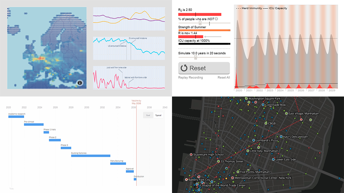 Without any exaggeration, the vast majority of data visualizations made public these weeks (and already months) are about the novel coronavirus pandemic. In compliance with the general trend, three of the four projects presented in the new DataViz Weekly article shed light on issues related to COVID-19. Take a glance at a quick list of the featured data visualization works and read more to meet them.
- COVID-19 vaccine development timeframe and how to reduce it – NYT
- COVID-19 future, in playable simulators – M. Salathé & N. Case
- COVID-19 impact on traffic and air pollution in Europe – European Data Portal
- Atlas of places featured in Wikipedia – T. Noulas, R. Schifanella, D. Sáez-Trumper & J. Tan
- Categories: Data Visualization Weekly
- No Comments »
New COVID-19 Data Visualizations — DataViz Weekly
May 1st, 2020 by AnyChart Team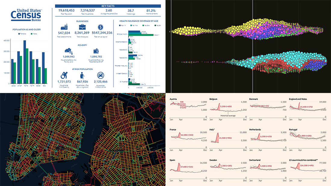 It’s Friday, May 1, and we invite you to take a quick look at the fresh DataViz Weekly selection of cool charts and maps. This article presents the following new COVID-19 data visualizations we have come across this week:
- Discovering excess deaths from COVID-19 — FT
- Exploring NYC sidewalk widths through the prism of social distancing — Meli Harvey
- Analyzing coronavirus search trends — Schema Design, Google News Initiative and Axios
- Visualizing demographic and economic data for COVID-19 impact planning reports — U.S. Census Bureau
- Categories: Data Visualization Weekly
- No Comments »
Social Distancing in Data Visualizations — DataViz Weekly
April 3rd, 2020 by AnyChart Team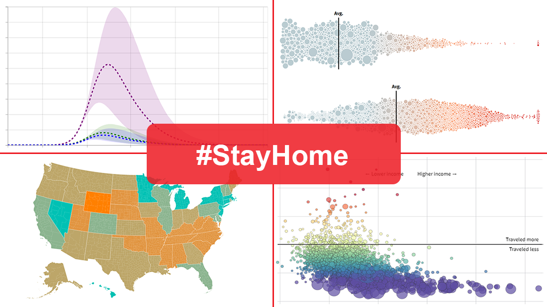 Many health and epidemiology experts consider social distancing to be the most effective way to slow the spread of COVID-19 at the current stage. But does it really work and help?
In today’s DataViz Weekly, we put a focus on data visualizations — charts and maps — on where we, in the United States, have been on social distancing. The following projects deserved to get featured in this special “#StayHome” edition:
- “The Social Distancing of America” — Reuters
- “Where America Didn’t Stay Home Even as the Virus Spread” — NYT
- “Social Distancing Scoreboard” — Unacast
- “COVID-19 Projections Assuming Full Social Distancing Through May 2020” — IHME, UW Medicine
- Categories: Data Visualization Weekly
- 1 Comment »
Creative Visualizations on Climate, Protests, Jobs, and Wildlife — DataViz Weekly
March 27th, 2020 by AnyChart Team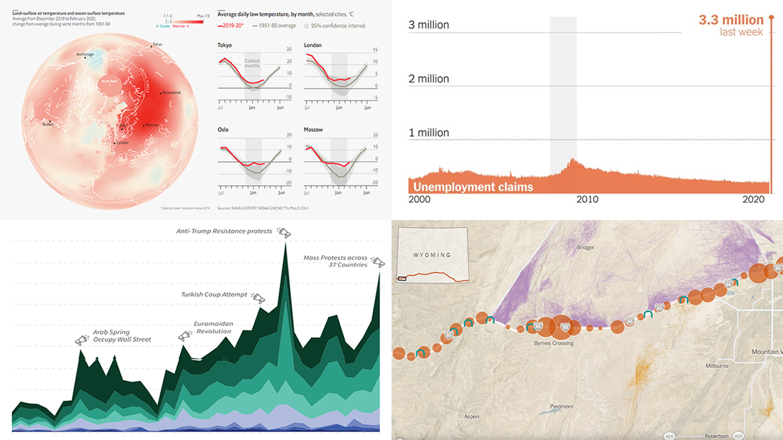 The new issue of DataViz Weekly puts a spotlight on some of the most interesting new creative visualizations from around the Web. Last week, we made a focus on COVID-19 charts. This time, we get along without the coronavirus subject. Well, mostly.
Here is what’s on DataViz Weekly this Friday:
- Winter temperatures in the northern hemisphere — The Economist
- Mass political protests worldwide — Center for Strategic and International Studies
- Spike in joblessness in the United States of America — The New York Times
- Wyoming wildlife corridors — The Washington Post
- Categories: Data Visualization Weekly
- No Comments »
Coronavirus in US in Charts and Maps — DataViz Weekly
March 20th, 2020 by AnyChart Team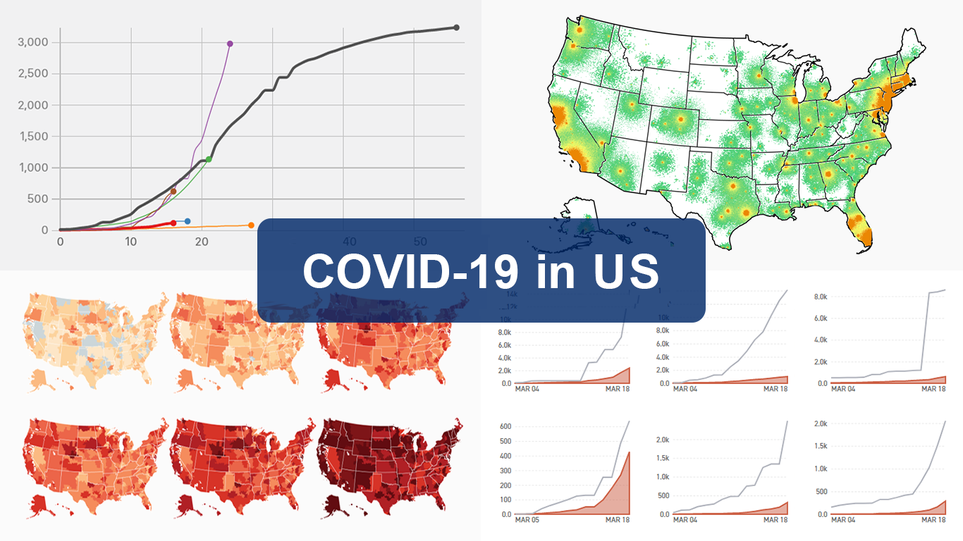 As the novel coronavirus pandemic is in full swing, COVID-19 is now by far the most topical issue on the global agenda. So it’s no surprise that the vast majority of the data visualization projects we’ve come across this week are about the outbreak. That’s why the new DataViz Weekly article is entirely devoted to the same subject — the coronavirus.
We are quite sure many of you have already seen some if not all of the best dashboards, charts, and trackers of the global COVID-19 outbreak from Johns Hopkins University, The New York Times, Financial Times, Business Insider, The Guardian, Bloomberg, and others. Awesome animated simulations from The Washington Post’s Harry Stevens, showing why epidemics like this spread exponentially and how social distancing could help to flatten the curve of COVID-19 cases, have almost certainly came to your attention and does not need to be presented additionally.
Headquartered in the United States, we decided to find out more about what has been going on about COVID-19 in America. Join us on a review of four interesting (though sometimes a bit frightening) data graphics features created by top media outlets, which provide insight into where the U.S. stands — from the perspective of cases and tests (Politico), scenarios (TIME), and hospital bed capacity (The Upshot by NYT), as well as compared to the rest of the world (BuzzFeed News). Check out the special “COVID-19 in US” edition of DataViz Weekly on the AnyChart blog.
- Categories: Data Visualization Weekly
- 2 Comments »
Fresh Visualization Projects on Super Tuesday, Cost of Living in Germany, London Cycling, and NO2 in China — DataViz Weekly
March 6th, 2020 by AnyChart Team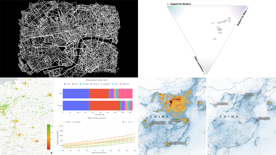 Today is Friday. We have already chosen four new stunning visualization examples and are excited to show you them! Look how powerful the right charts and maps can be when you need to explore and communicate data. Here’s a quick list of the fresh visualization projects this new DataViz Weekly blog post puts a spotlight on:
- Takeaways from Super Tuesday — The New York Times
- Cost of living in German cities — Fabian Nobis
- Cycling all streets in central London — Davis Vilums
- Nitrogen dioxide over China and Wuhan — NASA Earth Observatory
- Categories: Data Visualization Weekly
- No Comments »