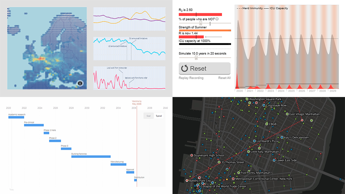
 Without any exaggeration, the vast majority of data visualizations made public these weeks (and already months) are about the novel coronavirus pandemic. In compliance with the general trend, three of the four projects presented in the new DataViz Weekly article shed light on issues related to COVID-19. Take a glance at a quick list of the featured data visualization works and read more to meet them.
- COVID-19 vaccine development timeframe and how to reduce it – NYT
- COVID-19 future, in playable simulators – M. Salathé & N. Case
- COVID-19 impact on traffic and air pollution in Europe – European Data Portal
- Atlas of places featured in Wikipedia – T. Noulas, R. Schifanella, D. Sáez-Trumper & J. Tan
Data Visualization Weekly: May 1, 2020 — May 8, 2020
COVID-19 Vaccine Development Timeline
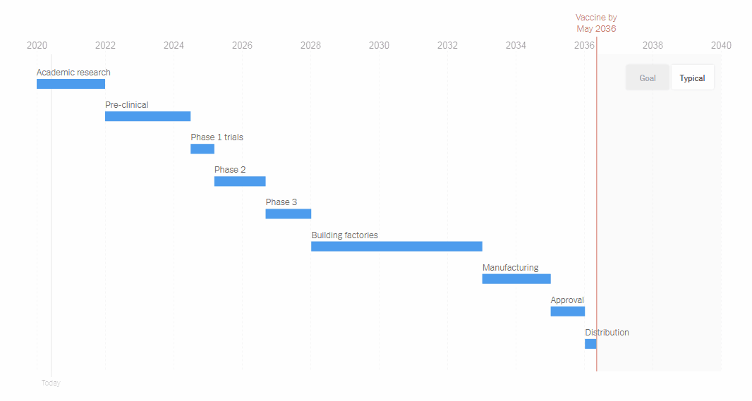
A vaccine can be expected to become the ultimate weapon against the novel coronavirus. But how long will it take for the world to develop it? Generally, many years are needed before a vaccine can be released to distribution. A COVID-19 vaccine would take 16 years to come into being officially ready for public use. The New York Times asked multiple vaccine experts to understand how we can accelerate the preparations.
Check out this story on NYT where a number of charts visualize at a glance how each possible option could condense the normal timeframe.
COVID-19 Future Simulators
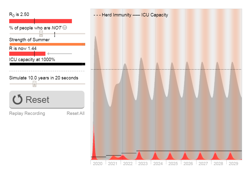
Epidemiologist Marcel Salathé and graphics developer Nicky Case created a bunch of playable simulators to demonstrate what could happen next with COVID-19 and our lives. First, they explain the basics of the epidemiology and what has happened so far. Then, you can watch diverse scenarios of the next months, depending on measures taken, such as wearing masks, physical distancing, lockdowns, and so on. Finally, more graphics show what can be expected in the matter of years in one or another model.
Take a look at this impressive project and it will channel your fears into understanding. Really, human life on Earth perseveres even under the worst scenario.
COVID-19 Impact on Traffic and Pollution in Europe
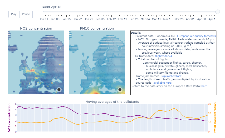
The European Data Portal for COVID-19 editorial team made an interactive dashboard that visualizes open data on air pollution and traffic across Europe over time since the beginning of 2020. Precisely, the graphics display the concentration of nitrogen dioxide (NO2) and particular matter (PM10) with the pollutants’ moving averages, as well as global air traffic and traffic jam burden in the Netherlands.
Explore the dashboard and note lower traffic and clearer air. If you are interested to look into a link between them and see more data and graphics on this topic, check a dedicated overview of different projects as curated by the European Data Portal.
Atlas of Places Featured on Wikipedia
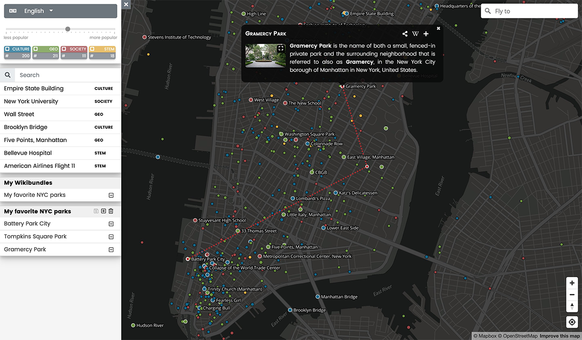
When the situation is normalized and we can travel again, you may well find this cool resource helpful in getting around new (to you) cities and regions. Wiki Atlas – it’s an initiative of Tassos Noulas, Jimin Tan (both New York University), Rossano Schifanella (University of Turin) and Diego Sáez-Trumper (Wikimedia Foundation) – has just received a major redesign and now features a brand new interactive map which neatly displays all real-world sites featured on Wikipedia with links to the respective articles.
See Wiki Atlas and bookmark it for post-outbreak tourism. While on a lockdown, however, you can still make good use of this data visualization tool. For instance, it proves to be helpful in conveniently navigating through Wikipedia articles about places of interest and learning.
***
We hope you enjoyed these new cool projects about COVID-19 vaccine timeline, future in simulations, impact on air pollution and traffic, and – not related to COVID-19 – Wiki Atlas. Stay tuned as we’ll keep sharing the most interesting charts from around the web, in Data Visualization Weekly on AnyChart Blog.
- Categories: Data Visualization Weekly
- No Comments »