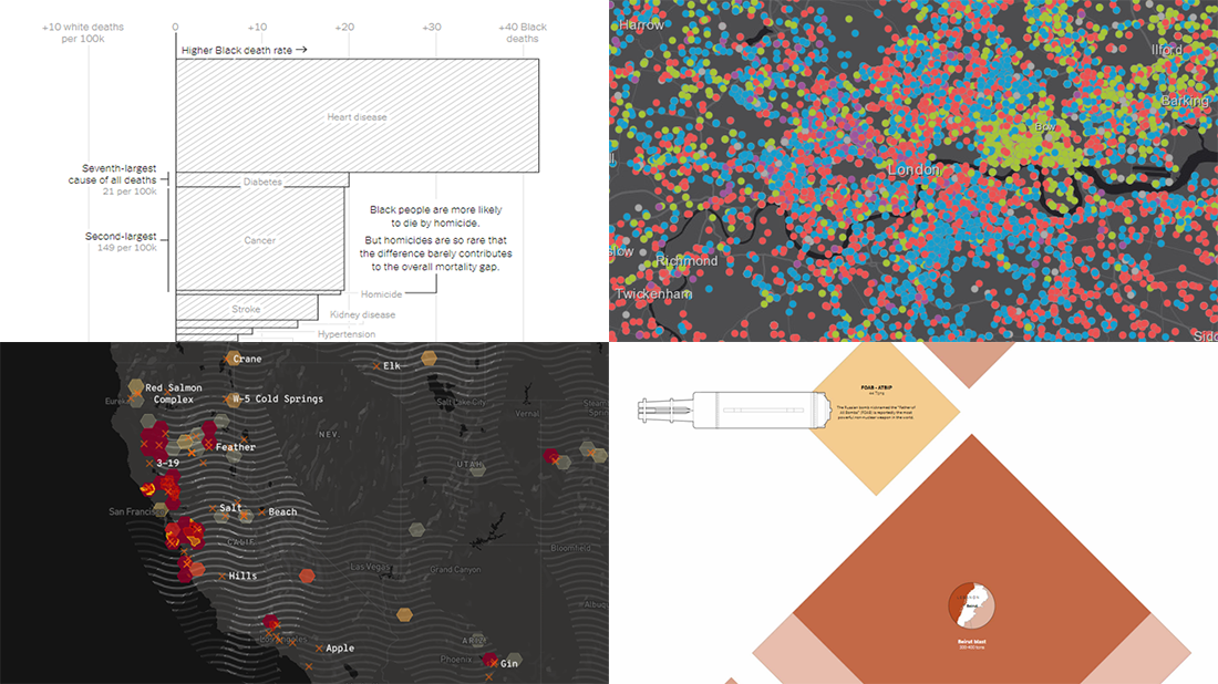
 DataViz Weekly is here with a new dose of awesome charts and maps for all data visualization addicts! Today, we are putting a spotlight on the following projects where data is allowed to speak with the help of graphics:
- Stop and search incidents in London — Esri UK Education
- California wildfires — Los Angeles Times
- Scale of the Beirut explosion — Reuters
- Mortality rates for Black and White Americans — New York Times Opinion
Data Visualization Weekly: August 14, 2020 — August 21, 2020
Stop and Search Incidents in London
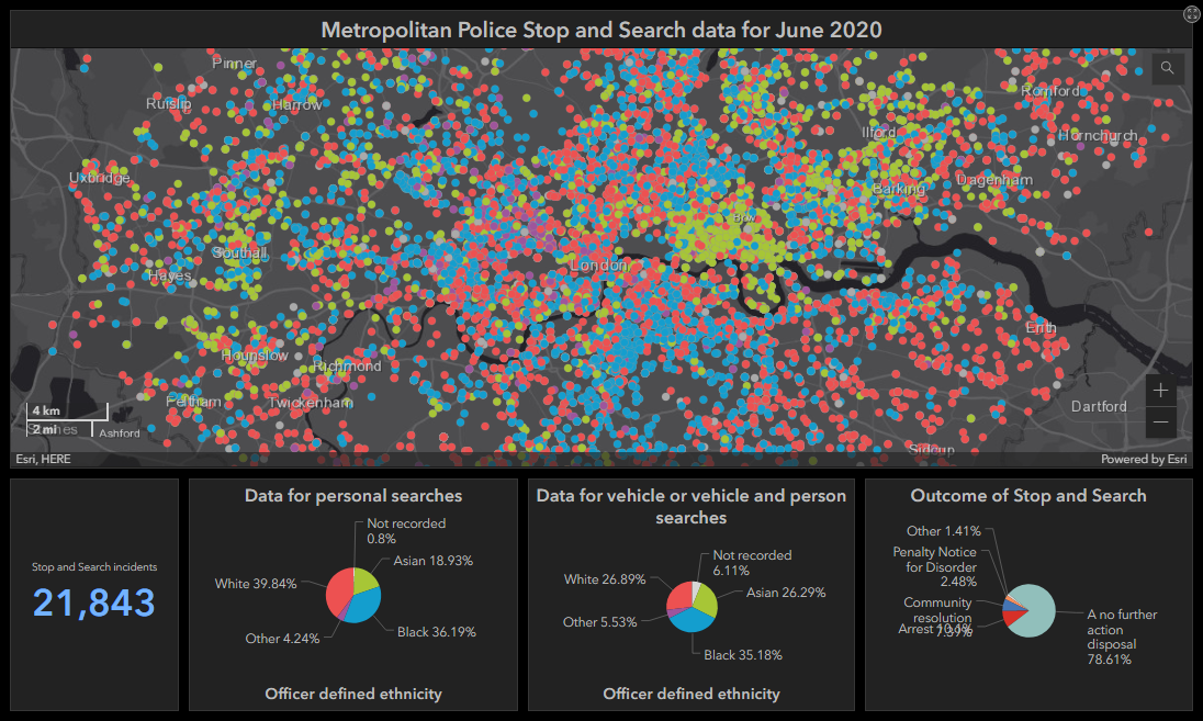
The Esri UK Education portal added an interactive dashboard representing all the 26,626 stop and search incidents with a recorded location that had taken place in June 2020 in London, according to the official data published by the Metropolitan Police. The focal point of the dashboard is a dot map which shows the location of each event and the ethnicity of the person involved. Click on the dot and you’ll see various details about the respective incident, including but not limited to the object of search and the outcome.
The dashboard also features small pie charts for additional insights. They are synchronized with the map, so it is possible to click the slices in order to filter the map view. Also, you can move around and zoom in and out on the map and the pie charts will change accordingly.
California Wildfires
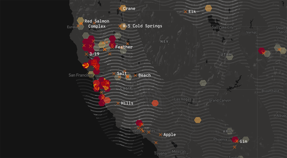
The California Fire Map on the Los Angeles Times website is not new. But it’s again that time of the year when this project is especially relevant and important. In addition, we have never put a spotlight on it within the framework of DataViz Weekly, nor it existed yet when we made the special California Wildfire in Maps and Charts issue in August 2018.
So, built and further maintained by Casey Miller, a data journalist at the LA Times, the map does a great job visualizing the most up-to-date information about the California wildfires. In particular, it is helpful in making sense of the following data: fire origins, perimeters, and hotspots; mandatory evacuation and evacuation warning zones; air pollution. Click on a fire or a fire perimeter and you’ll see the details about the respective fire such as for how long it’s been active, how many acres it has burned so far, and the percentage of its containment. Data is taken from a number of sources, and the map automatically updates as new data arrives, which currently happens every few minutes.
At the moment of writing, there are 37 active California fires, and the map also shows 25 other fires taking place right now in other Western states. Please stay safe, everyone.
Scale of Beirut Explosion
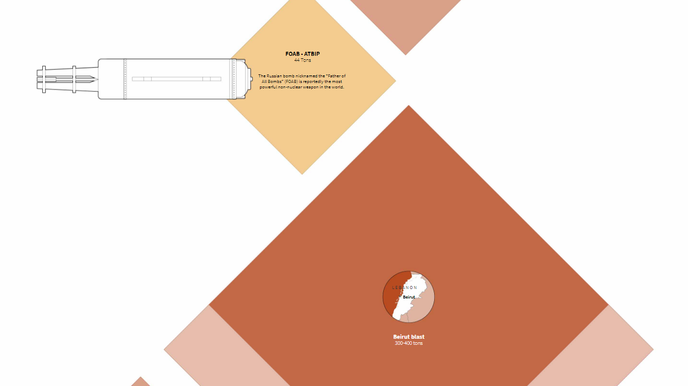
A few hundred tons of TNT equivalent, the recent explosion at the port of Beirut is one of the biggest non-nuclear explosions the world has ever seen. To let us sense the scale, Simon Scarr and Marco Hernandez from Reuters created a special visual piece depicting the power of some other known explosions and conventional weapons for intuitive comparisons.
It all begins with a Hellfire missile of 0.01 tons of TNT equivalent and goes all the way to Little Boy of 15,000 tons, the American nuclear bomb that destroyed Japan’s Hiroshima in August 1945. So where is the Beirut blast? An expert is quoted by Reuters as saying that, “on a scale, this explosion is scaled down from a nuclear bomb rather than up from a conventional bomb.” You won’t miss its huge representation in the piece.
Black and White Mortality Rates in America
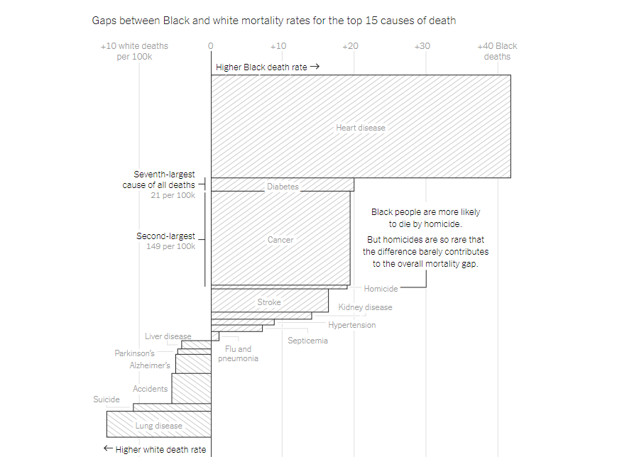
Data revealed an alarming mortality gap between Black and White Americans. During the pandemic, Black people were found to be twice as likely to die from COVID-19 than White people. However, the gap in death rates has been there at least since 1900. Gus Wezerek from the New York Times Opinion Graphics team looked into the available numbers and visualized them for better understanding.
The first charts in the article show the death rates for White and Black Americans over time highlighting the everlasting difference. Then comes a bar mekko chart with variable width bars displaying the gaps for the top causes of death in detail. Finally, stacked column charts visualize excess deaths of Black people — the number of deaths that would have been avoided if death rates of Black and White Americans had been the same. Check out this article in the NYT Opinion section to take a closer look and learn much more.
***
Thanks for your attention. We’ll share more cool stuff for data visualization addicts next Friday. Stay tuned.
- Categories: Data Visualization Weekly
- No Comments »