 A new record-breaking wildfire season in California is in full swing, occupying the headlines of many national and even world media outlets. To better analyze and present what’s going on, data and graphics experts created various maps and charts. Today’s issue of Data Visualization Weekly features some interesting ones of them, and in fact, is fully dedicated to the topical California wildfire problem.
California Wildfire on Data Visualization Weekly
Record-Breaking Fire Season in California
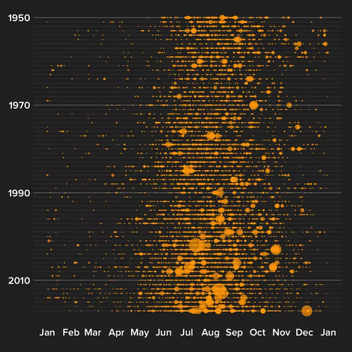
With more than 800,000 acres across California already burned as of August 10, this wildfire season is another record-breaking one. Moreover, three of the thirty largest fires in California since 2000 are taking place right now. One of them, the Mendocino Complex Fire has even become the worst in the state’s history and still keeps growing. The New York Times pieced together the footprints of the biggest California wildfires for the last 18 years for comparison and shared charts proving the reported worsening trend.
Causes of Calfornia Wildfire Getting Worse
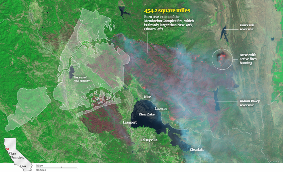
BuzzFeed News went deeper into what is making California fires worse over time and shares a number of interesting data visualizations. Indeed, the chart above, displaying the area and timing of the wildfires since 1950, shows big ones have become more common. Check out the article to learn about the findings. In particular, there you’ll be able to compare the patterns for natural and human-caused fires and look at multiple other charts. By the way, both data and code are available.
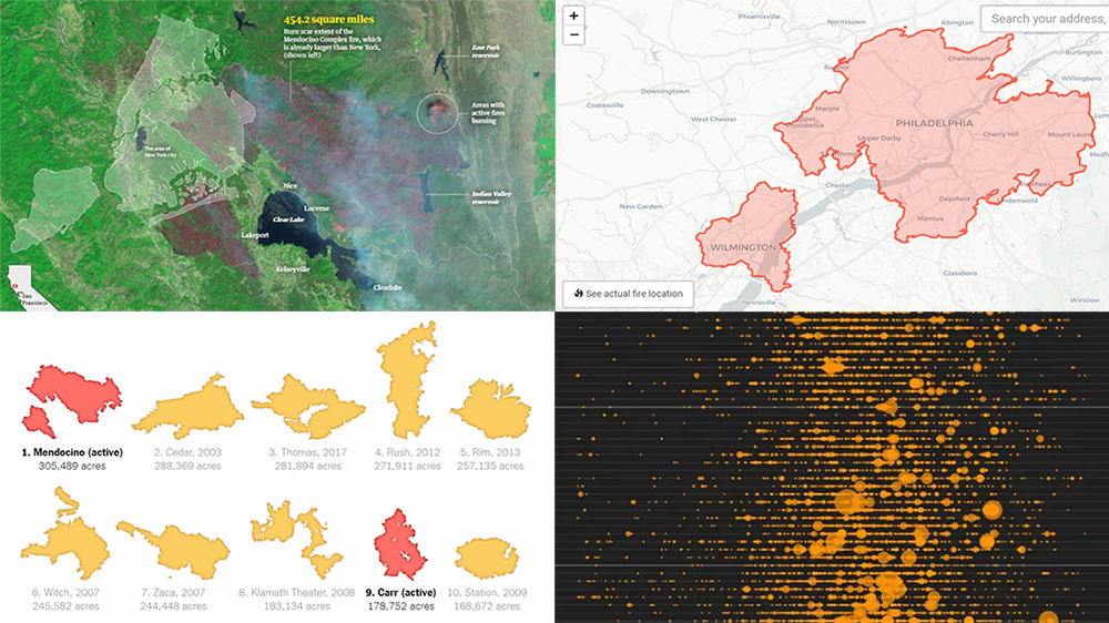
Mendocino Complex Fire in Visualizations
The Guardian put a focus on the scale of the Mendocino Complex Fire and how it became the largest-ever in California. To start with, here you can visually explore the territory of this wildfire and compare its area with one of the New York City. Don’t miss out on an animated graphic displaying how exactly it was growing day by day.
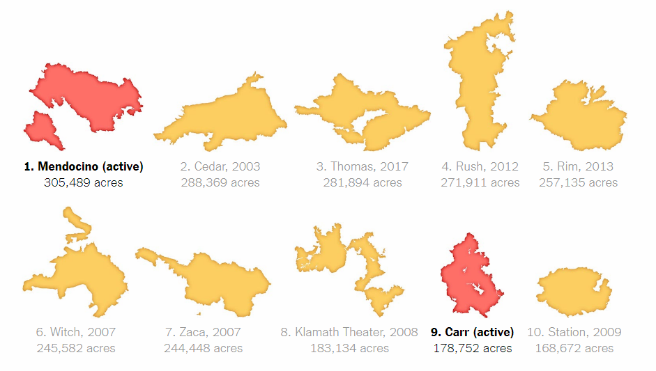
Wildfire Area in Comparison with Any Area You Know Well
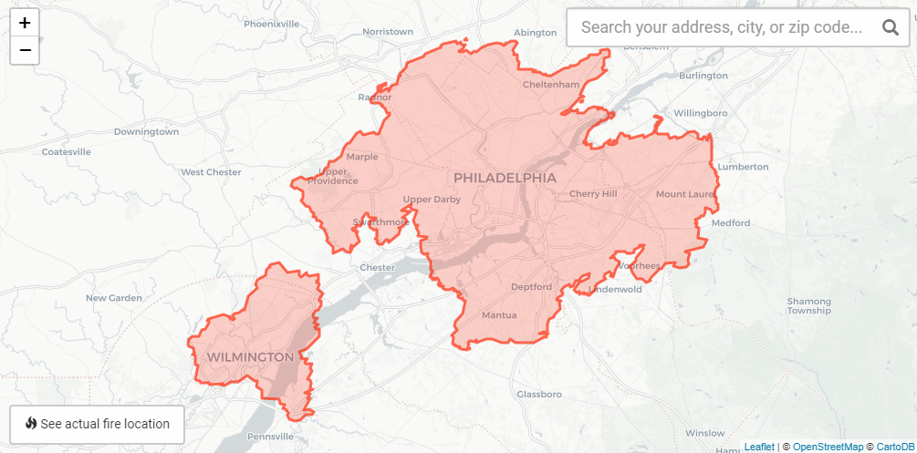
NBC Philadelphia published an interactive visualization going even further into communicating how big the territory on fire is. It’s a map with the pre-drawn Mendocino Complex Fire’s area that you can lay on any territory — your hometown, for example — for an even deeper understanding of the size of California’s largest wildfire. To look at the state’s other big active fires from a similar perspective — Carr, Ferguson, and Donnell — play with the corresponding maps on The Sacramento Bee.
***
If you are somewhere in or close to a fire area, we hope you are safe.
Take care at all times.
- Categories: Data Visualization Weekly
- 1 Comment »