 It’s Friday, May 1, and we invite you to take a quick look at the fresh DataViz Weekly selection of cool charts and maps. This article presents the following new COVID-19 data visualizations we have come across this week:
- Discovering excess deaths from COVID-19 — FT
- Exploring NYC sidewalk widths through the prism of social distancing — Meli Harvey
- Analyzing coronavirus search trends — Schema Design, Google News Initiative and Axios
- Visualizing demographic and economic data for COVID-19 impact planning reports — U.S. Census Bureau
Interesting New COVID-19 Data Charts and Maps: April 24, 2020 — May 1, 2020
Excess Deaths from COVID-19
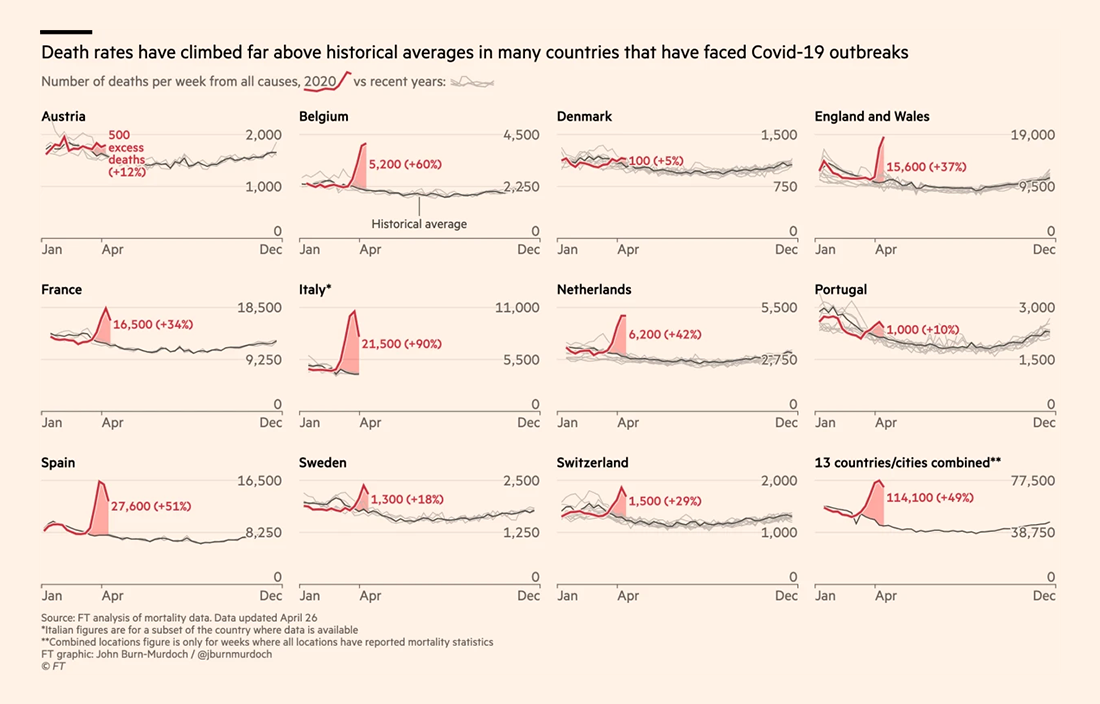
The Financial Times analyzed mortality statistics in 14 countries. Journalists compared the number of deaths from all causes during the weeks of a country’s outbreak to the historical average for the same period in 2015-2019 and calculated excess deaths. According to their findings, the global death toll from COVID-19 could be up to 60% higher than reported officially. This is 122,000 fatalities in excess of normal levels, significantly more than 77,000 in official COVID-19 counts of deaths for the same periods and places.
Look at the charts. They show the number of deaths per week from all causes over the course of the year, during 2020 and recent years along with the historical average — in Austria, Belgium, Denmark, England and Wales, France, Italy, Netherlands, Portugal, Spain, Sweden, and Switzerland. The article on FT also includes similar charts for some urban areas all over the world: Guayas (Ecuador), Jakarta (Indonesia), Madrid (Spain), New York City (United States), London (United Kingdom), Bergamo province (Italy), Ile-de-France (France), and Stockholm (Sweden).
Around the web, there are already quite a few charts and researches on the topic of excess deaths. For example, we can also highlight here a New York Times analysis and The Economist‘s project. For a closer look at the situation in the United States, check the results of a study that a team of researchers, led by the Yale School of Public Health, made for The Washington Post.
NYC Sidewalk Widths
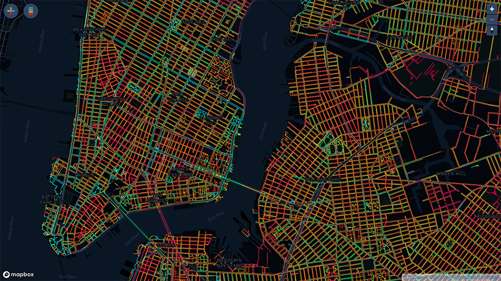
Urban planner Meli Harvey made a cool map visualization of sidewalk widths in New York City from the perspective of social distancing. Colors nicely show how easy each path is for a pedestrian to maintain the required distance while on it. The map is based on data from the Sidewalk dataset from the NYC Open Data portal.
This visualization can be helpful if you are planning a walk in NYC. However, keep in mind that width is the only variable represented. In reality, there might be obstructions or other factors that can greatly impact whether or not it is difficult to stay away from everyone else as you go.
COVID-19 Search Trends
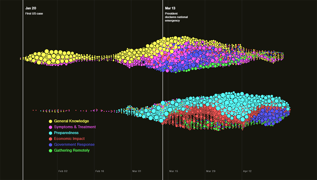
Schema Design in collaboration with Google News Initiative and Axios created an exciting data visualization story about coronavirus-related search trends. By looking at this project, we can reveal and explore some of the top ones for the United States of America. The authors, directed by famous data visualization expert Alberto Cairo, promise to update this piece regularly as well as to add global data within the following weeks.
Look at waves of interest during the pandemic, reflecting its progression and our understanding of it. Cool bubbles.
Census Bureau COVID-19 Website
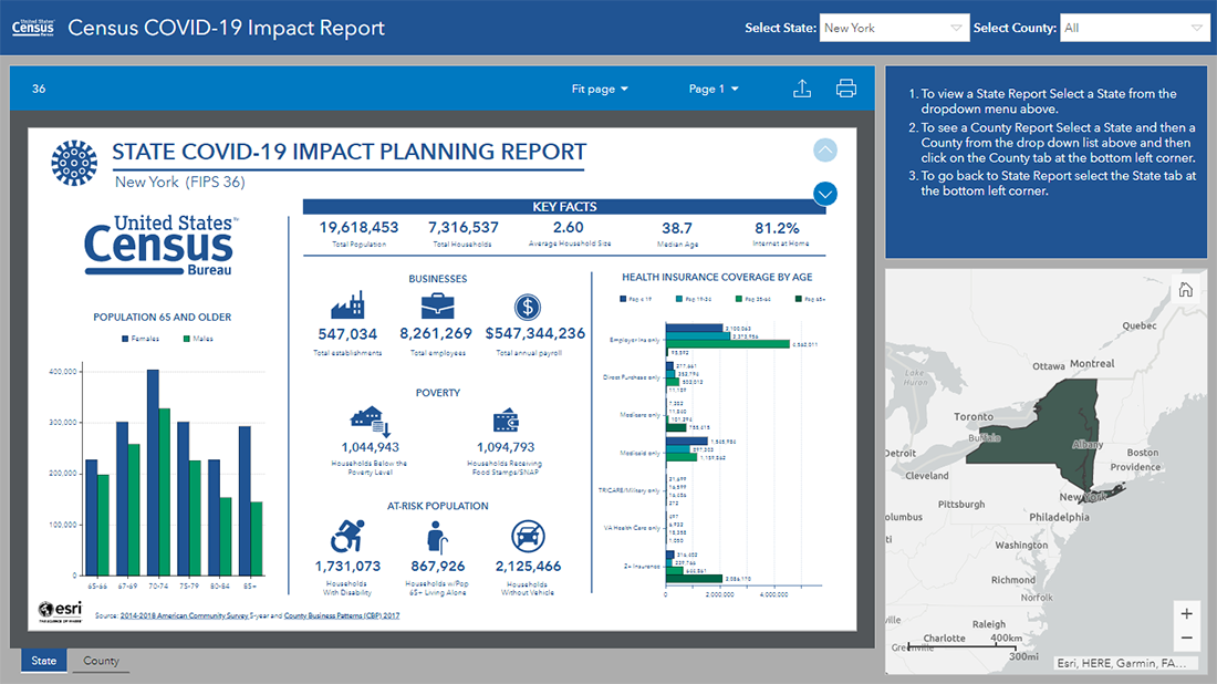
The United States Census Bureau launched its own COVID-19 website. Featuring a data hub built in collaboration with the Environmental Systems Research Institute (Esri), the project allows everyone to explore the U.S. demographic and economic data in interactive visualizations. The data is taken from the American Community Survey and the County Business Patterns program.
Check out the two core visualizations published there as of now. The first one is a dashboard that represents a COVID-19 impact planning report for each state and county. The other is a map visualizing selected statistics. The Census Bureau says the website is periodically updated.
***
These new COVID-19 data visualizations are worth seeing in case watching how the novel coronavirus pandemic unfolds is of interest to you.
Stay tuned.
- Categories: Data Visualization Weekly
- No Comments »