Great Visualizations Not to Miss — DataViz Weekly
January 22nd, 2021 by AnyChart Team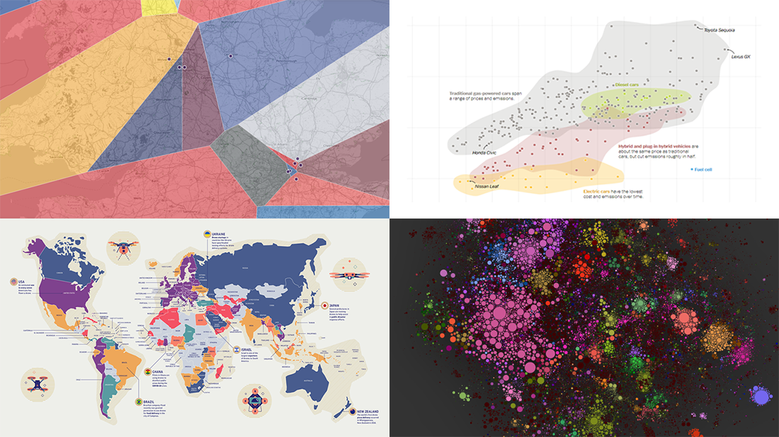 For those unfamiliar with DataViz Weekly, each Friday we select the most interesting data visualization projects from all we’ve discovered these days around the internet. Then we present them in a dedicated summary post. Look at our new picks!
- Electric, hybrid, and gas car costs vs emissions — NYT
- Nearest English football team — Automatic Knowledge
- Map of 100,000 books — David Manzanares
- Drone privacy legislation worldwide — Surfshark
- Categories: Data Visualization Weekly
- No Comments »
New Graphics That Make Data Talk — DataViz Weekly
December 18th, 2020 by AnyChart Team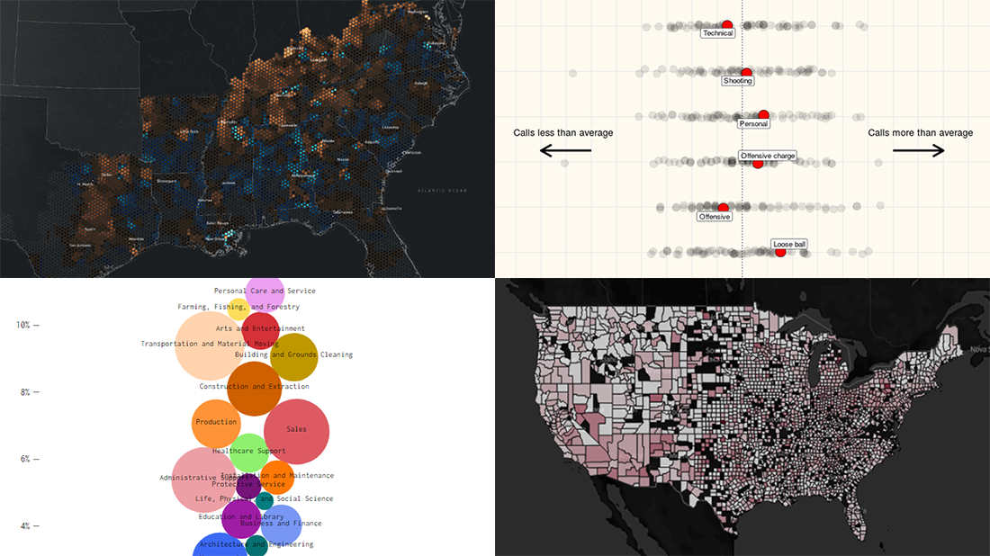 Get ready for another dose of amazing charts and maps! DataViz Weekly‘s here to show you a set of new projects featuring graphics that make data talk — excellent examples of data visualization in action!
Here are this week’s picks:
- Over 200 years of migrations in the American South — Edward Ayers, Nathaniel Ayers & Justin Madron
- NBA fouls and violations, by referee — Owen Phillips
- U.S. unemployment change, by occupation — Nathan Yau
- U.S. hospital COVID-19 bed occupancy — Carlson School of Management at UMN
- Categories: Data Visualization Weekly
- No Comments »
Best New Data Visualizations in Overview — DataViz Weekly
December 11th, 2020 by AnyChart Team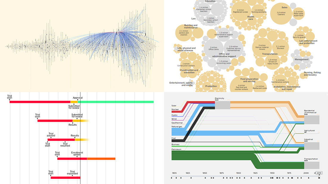 Welcome back to DataViz Weekly, where we overview the best new data visualizations created by professionals. As always, let’s begin with a list of the projects we’re excited to put a spotlight on, and then take a closer look at each:
- Exploring letter communication networks of the Tudor government in the 16th century — Kim Albrecht, Ruth Ahnert & Sebastian Ahnert
- Tracking the most promising coronavirus vaccines — Bloomberg
- Defining “essential” and “frontline” workers for vaccination — NYT
- Understanding the U.S. energy use evolution since 1800 — RDCEP, UChicago
- Categories: Data Visualization Weekly
- No Comments »
Visualizing Data About Energy Mix, Subreddit Posts, Hate Crimes, and McDonald’s Ice Cream Availability — DataViz Weekly
November 13th, 2020 by AnyChart Team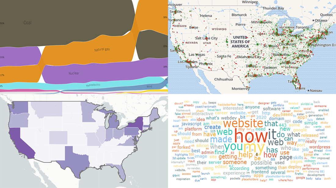 DataViz Weekly is back — check out some of the most interesting third-party data visualization projects we have recently come across! Let’s start with a quick list and then take a closer look at each:
- Electricity generation in America since 2001 — NYT
- Subreddits in word clouds — Cloud a Subreddit
- Hate crimes in the United States — UCLA
- McDonald’s ice cream machine status — Rashiq Zahid
- Categories: Data Visualization Weekly
- No Comments »
20+ Electoral Maps Visualizing 2020 U.S. Presidential Election Results — DataViz Weekly Special Edition
November 6th, 2020 by AnyChart Team All eyes on election maps! Yes, they could be misleading. And even widely misleading. But it can be at least so fascinating to look at them, especially at times like this! So, we have curated a list of over twenty reputable resources — as of now, to be precise, 24 and counting! — where you can watch the live results of the 2020 United States Presidential election in compelling data visualizations. At the same time, it is a great chance for you to investigate and understand how election maps (and some other graphics) can look and work in practice.
? See also: 2024 U.S. Election Maps (November 2024).
Vote counts may be different on different platforms and update as more data becomes available out there — it’s absolutely okay. The election results are still partial. Over the coming days, all numbers will be adjusted to match the real, final vote count. Just in case: We’ve added only reliable sources — notable, reputable media outlets.
Without further ado, check out maybe the most important data visualizations these days! (Electoral vote count numbers in the text last updated on November 9th, 2020, for each source.)
- Categories: Data Visualization Weekly, News, Third-Party Developers
- 3 Comments »
Pre-Election Data in Charts and Analysis — DataViz Weekly
October 30th, 2020 by AnyChart Team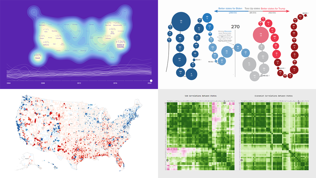 With November 3rd just around the corner, we could not resist the temptation to devote an entire Friday article to the 2020 U.S. election. Indeed, there are many great new data visualization projects on this topic that are worth featuring. Check out some of the most interesting ones in the special pre-election edition of DataViz Weekly:
- Visualizing data about donations to Biden’s and Trump’s campaigns — The New York Times
- Charting the latest Electoral College ratings — The Cook Political Report
- Exploring election forecast correlations — Adam Pearce
- Analyzing search interest in the U.S. election years since 2004 — Truth & Beauty
- Categories: Data Visualization Weekly
- No Comments »
New Stunning Data Graphics Projects Not to Miss — DataViz Weekly
October 16th, 2020 by AnyChart Team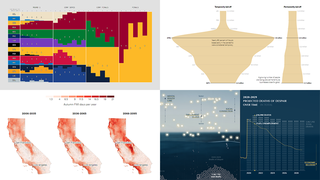 We know DataViz Weekly is read on a regular basis by data visualization practitioners from many countries, and we are happy you guys find it interesting and helpful. Are you ready for another bunch of new great data graphics projects worth looking at? There you go:
- NBA playoff win probabilities — Adam Pearce
- Fall fire weather days in California by the century’s end — ProPublica
- U.S. unemployment crisis shapes — NYT
- Deaths of despair in America — Periscopic
- Categories: Data Visualization Weekly
- No Comments »
Feel Power of Data Visualization in Four New Examples — DataViz Weekly
October 2nd, 2020 by AnyChart Team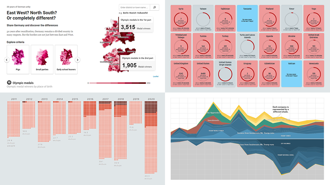 We’ve curated another four new wonderful examples from around the web that greatly illustrate the power of data visualization in action. Meet them straight away, on DataViz Weekly!
- COVID-19 spreading rates by country — Jan Willem Tulp
- Two decades of Trump’s finances — The New York Times
- Dangerous air pollution in the record wildfire season in the Western U.S. — NPR
- Germany divided — Berliner Morgenpost
- Categories: Data Visualization Weekly
- No Comments »
Visualizing Noise, Census, COVID-19, and Happiness Data — DataViz Weekly
September 25th, 2020 by AnyChart Team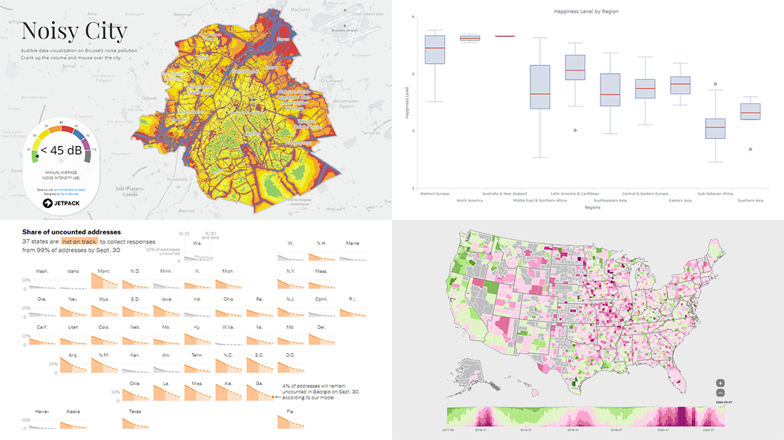 We have put together a roundup of new awesome data visualizations from around the web. Look what we’ve got for you to check out this Friday on DataViz Weekly:
- Noise pollution in Brussels — Karim Douïeb
- Census 2020 undercounts and their consequences — NYT Opinion
- COVID-19 symptoms search trends — Google People + AI Research (PAIR)
- World happiness by region — Wayde Herman
- Categories: Data Visualization Weekly
- No Comments »
Awesome Fresh Data Visualization Projects for Inspiration — DataViz Weekly
September 4th, 2020 by AnyChart Team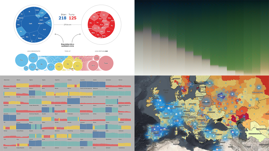 Celebrating the first Friday of September, don’t miss these awesome fresh data visualization projects for inspiration! We have recently met them around the web and are glad to introduce you to them in a quick overview. So our new picks for DataViz Weekly include:
- COVID-19 situation in Europe, a subnational view — WHO/Europe
- Potential outcomes of the U.S. presidential election — The New York Times
- State of democracy worldwide since 2006 — Preity Lodha
- Colors of the American landscape vs electoral map colors — The Upshot
- Categories: Data Visualization Weekly
- 1 Comment »