 DataViz Weekly is back — check out some of the most interesting third-party data visualization projects we have recently come across! Let’s start with a quick list and then take a closer look at each:
- Electricity generation in America since 2001 — NYT
- Subreddits in word clouds — Cloud a Subreddit
- Hate crimes in the United States — UCLA
- McDonald’s ice cream machine status — Rashiq Zahid
Data Visualization Weekly: November 6, 2020 — November 13, 2020
Electricity Generation in America Since 2001
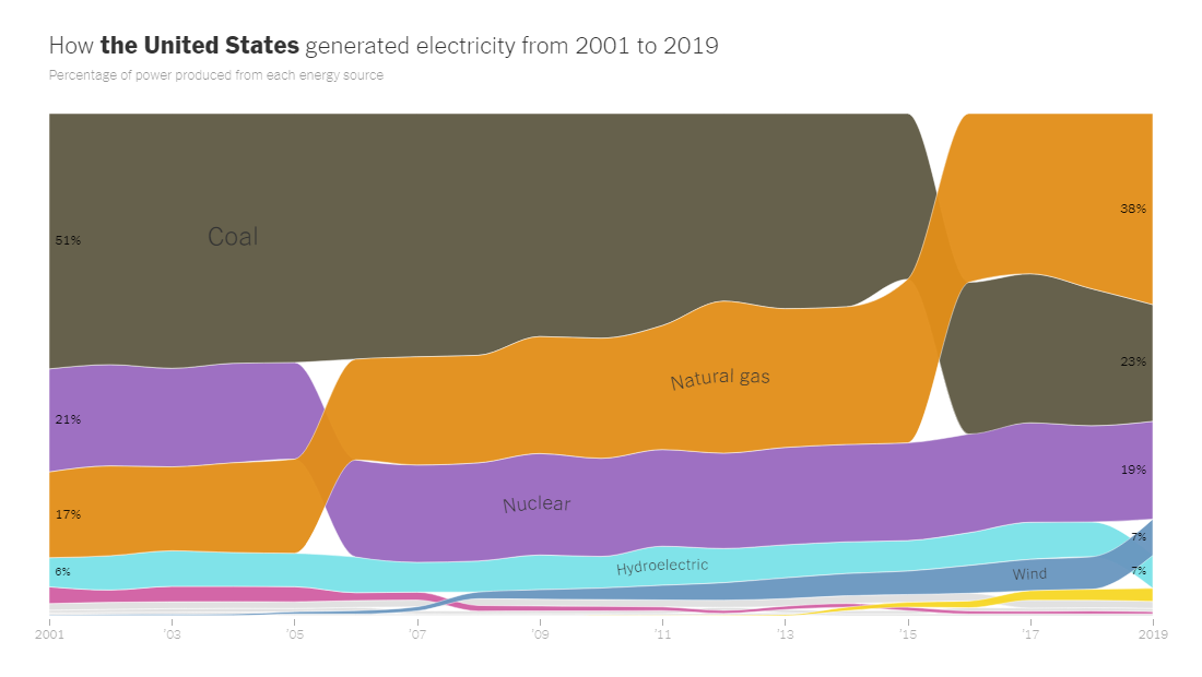
The way the United States generates electricity is changing. To visualize shifts in America’s energy mix over the last two decades, The New York Times used the ribbon chart technique which appears (or is known) to be greatly illustrative and helpful in such data analysis.
While fossil fuels remain generally the largest source of electricity across the United States, coal already yields to natural gas and renewables such as solar panels and wind turbines. In some states, clean energy sources already dominate, like wind in Kansas and Iowa. Coal continues to be the leader in fifteen states; it was the primary source in about twice as many states back in 2001, so progress here is nevertheless evident.
Open the article and you’ll start with the scrollytelling part which provides a look at the big picture and some state highlights. Then you can explore the change in the energy mix from 2001 to 2019 in each state, in standalone ribbon charts.
Word Cloud for Every Subreddit
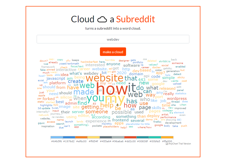
A developer created a stunning Reddit data visualization tool. [Editor’s note: Personal details were removed in response to a GDPR request.] Titled “Cloud a Subreddit,” it can generate a nice interactive tag cloud for any subreddit in an instant, displaying the most popular words from the post titles on the first page of that subreddit. Articles, prepositions, and conjunctions are filtered out.
We noticed this tool when it was announced in a Showoff Saturday post on the /r/webdev subreddit earlier this month, where it was very well received by users. The footnote on the project’s page, however, says it was made in August. What makes us especially excited about this tool is, it’s built with vanilla JavaScript using AnyChart — great use of our JS charting library, indeed!
Give it a look and a try. Type the name of a subreddit and press the button right there to turn it into a word cloud and find out what terms are the most frequently used on that subreddit’s first page right now.
Update: For more details about how the project was built, see our interview with the creator.
Hate Crimes in America
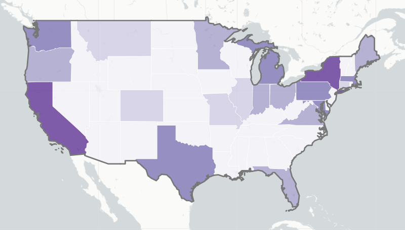
The UCLA American Indian Studies Center (under the Institute of American Cultures) launched an interactive dashboard that represents the (ever-growing) number of hate crimes in each state of the United States of America. It visualizes data from ProPublica’s Documenting Hate project, the Stop AAPI Hate Reporting Center, as well as newspaper reports and self-reporting.
The key element of the dashboard is a choropleth map of the U.S. showing cases per state. Column charts to the right display the details. Hover over a state on the map and look at its charts. Click on a bar to drill down to additional information represented in a pie chart.
Victims of hate-based incidents are encouraged to submit information about their experiences via a special form.
McDonald’s Ice Cream Machine Status Checker
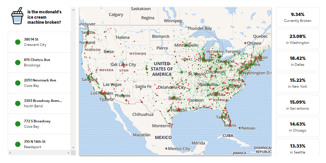
Rashiq Zahid, a software engineer at Yelp, did a cool experiment. He reverse-engineered the McDonald’s ordering API and started querying every single McDonald’s venue all over the United States once a minute, trying to place an order for a McSundae. As a result, his system could find out at which locations ice cream is currently unavailable for ordering and mark such stores as red dots on a map of all McDonald’s stores in the U.S. assuming an ice cream machine there is out of service.
“I’m sorry mcdonald’s data analyst I’m afraid I’m ruining your entire mobile conversion metrics for my own personal amusement,” Rashiq tweeted soon after the public launch. Then he added: “… mcdonald’s keeps track which locations have a broken machine, I’m merely querying for those — no order gets executed, no ice cream is actually wasted.” Wow!
The “mcbroken” project has quickly got great coverage on media and social networks around the Web. Check it out and have fun (and make sure you always get ice cream at McDonald’s when you want it thanks to this awesome data tool).
***
We appreciate your attention and hope you are satisfied with our choice of new awesome data visualization projects from around the web. Stay tuned for our blog and DataViz Weekly in particular!
- Categories: Data Visualization Weekly
- No Comments »