Interesting Recent Graphics Demonstrating Power of Effective Data Visualization — DataViz Weekly
September 30th, 2022 by AnyChart Team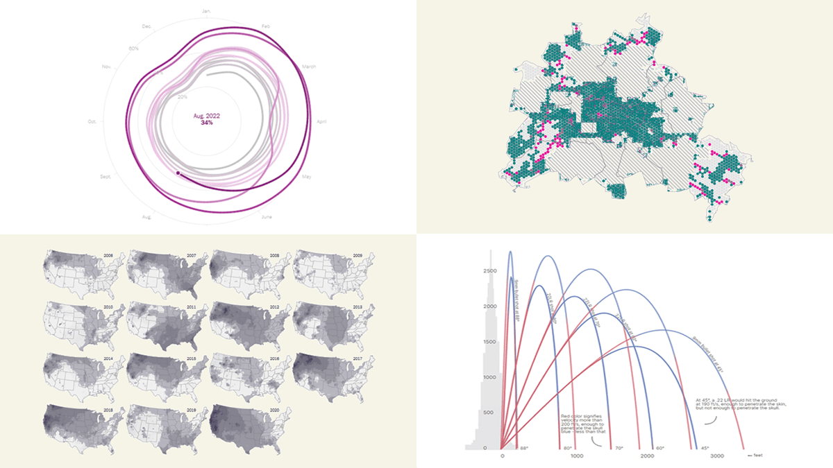 Effective data visualization makes it easy to discover trends and patterns hidden in the data. Now for several years, DataViz Weekly has been showing you real-world examples demonstrating how that can work in practice. The following projects are in the spotlight today:
- U.S. housing market trends — The Washington Post
- Wildfire smoke pollution across the U.S. — The New York Times
- Physics of celebratory gunfire — 1POINT21 Interactive
- Cars in Berlin — Hans Hack
- Categories: Data Visualization Weekly
- No Comments »
Visual Representations of Data in Select New Stories — DataViz Weekly
August 19th, 2022 by AnyChart Team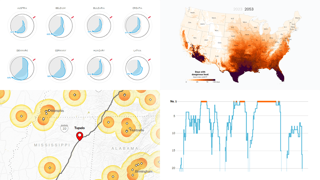 We continue to curate roundups of our favorite data graphics we see each week. Keep reading this new DataViz Weekly to check out four recent stories with cool visualizations that are totally worth a look!
- European gas storage levels — Reuters
- EV charging along popular American roads — Bloomberg
- Serena Williams’s career in tennis — The New York Times
- Perilous heat waves in the U.S. by 2053 — The Washington Post
- Categories: Data Visualization Weekly
- No Comments »
Bringing Data to Life with Exemplary Visualizations — DataViz Weekly
August 5th, 2022 by AnyChart Team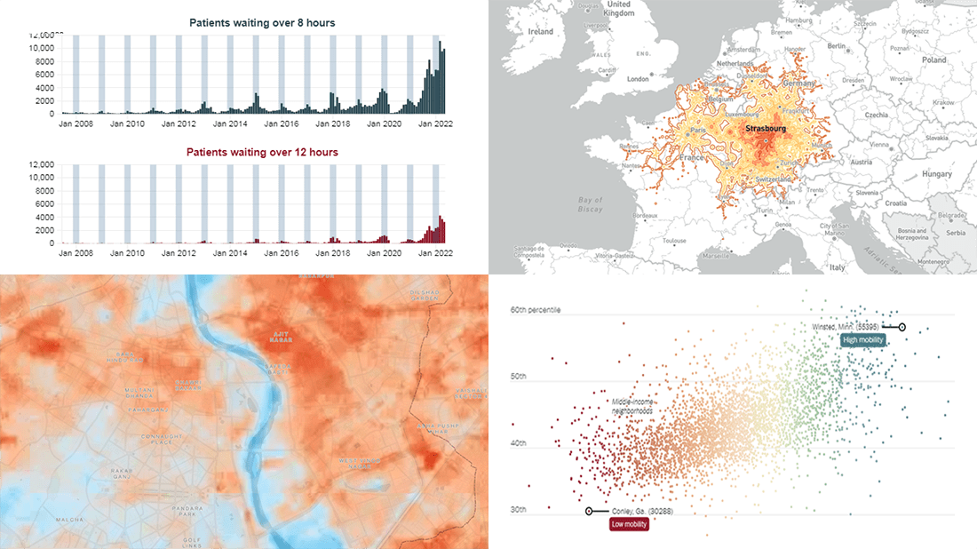 We’ve seen a lot of good new visualizations over the last week. Here are four projects with the best ones, amazing illustrations of how data can (and should) be brought to life with the right graphics. Featured today on DataViz Weekly:
- Five-hour train ride destinations in Europe — Benjamin Td
- Scotland’s NHS waiting times — DC Thomson
- Cool spots inside sweltering cities — Bloomberg Green
- Friendships between poor and rich as a factor of economic mobility — The Upshot
- Categories: Data Visualization Weekly
- No Comments »
Looking at Some Awesome New Graphs & Maps — DataViz Weekly
July 29th, 2022 by AnyChart Team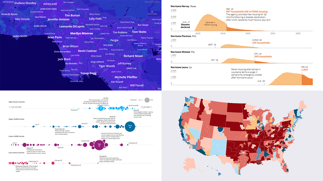 It’s time to check out some awesome new graphs and maps! In this DataViz Weekly roundup, we are glad to put a spotlight on the following great data visualization works:
- Birthplaces of notable people worldwide — Topi Tjukanov
- Global COVID-19 vaccine inequality — The Guardian
- New congressional district boundaries — CNN
- Post-disaster displacements in America — The New York Times
- Categories: Data Visualization Weekly
- No Comments »
Great New Data Visualizations Worth Your Attention — DataViz Weekly
July 15th, 2022 by AnyChart Team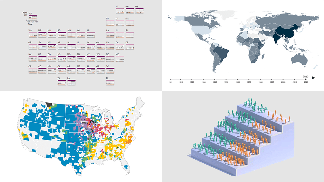 Eager to see some great data visualizations? Your wait is over! DataViz Weekly is back to the AnyChart blog to make sure you have not missed these four new works as they are definitely worth checking out!
- Gun deaths in America — The Washington Post
- Health effects of climate change worldwide — Wellcome
- Economic success of the U.S. immigrants’ children — The New York Times Opinion
- Livestock vs human populations in the United States — Data Stuff
- Categories: Data Visualization Weekly
- No Comments »
Eye-Catching Visual Data Stories on World Media — DataViz Weekly
June 17th, 2022 by AnyChart Team Good visual graphics are helpful in telling good stories based on data. Want to see some fantastic examples? Check out the best visual data stories of all we’ve recently come across, in a brand new issue of DataViz Weekly!
- Lead emissions around small airports in America — Quartz
- Labor shortage in Belgium — De Tijd
- Geography of Russian private jet flights — NYT
- Space debris and its danger — FT
- Categories: Data Visualization Weekly
- No Comments »
Beijing Olympics Medal Trackers — DataViz Weekly
February 25th, 2022 by AnyChart Team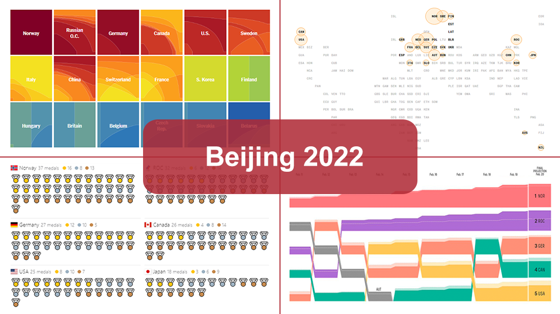 Following sixteen days of thrilling, action-packed competition, the Beijing 2022 Winter Olympics officially came to an end on Sunday, February 20. Norway finished at the top of the leaderboard, with 16 gold and 37 total medals won by its athletes at the Games.
During the Tokyo 2020 Summer Olympics that took place just six months before, we published a special edition of DataViz Weekly looking at four awesome medal trackers produced by The New York Times’s The Upshot, Bloomberg, Axios, and FiveThirtyEight. These interactive data visualization projects were brought back for the Beijing 2022 Winter Olympics. So now, we invite all lovers of charts and sports to look at their newest editions. They offer a frictionless way to explore medal counts and country standings after the Games with the help of stunning visualizations.
- Categories: Data Visualization Weekly
- 1 Comment »
Best New Charts and Maps Not to Miss — DataViz Weekly
February 4th, 2022 by AnyChart Team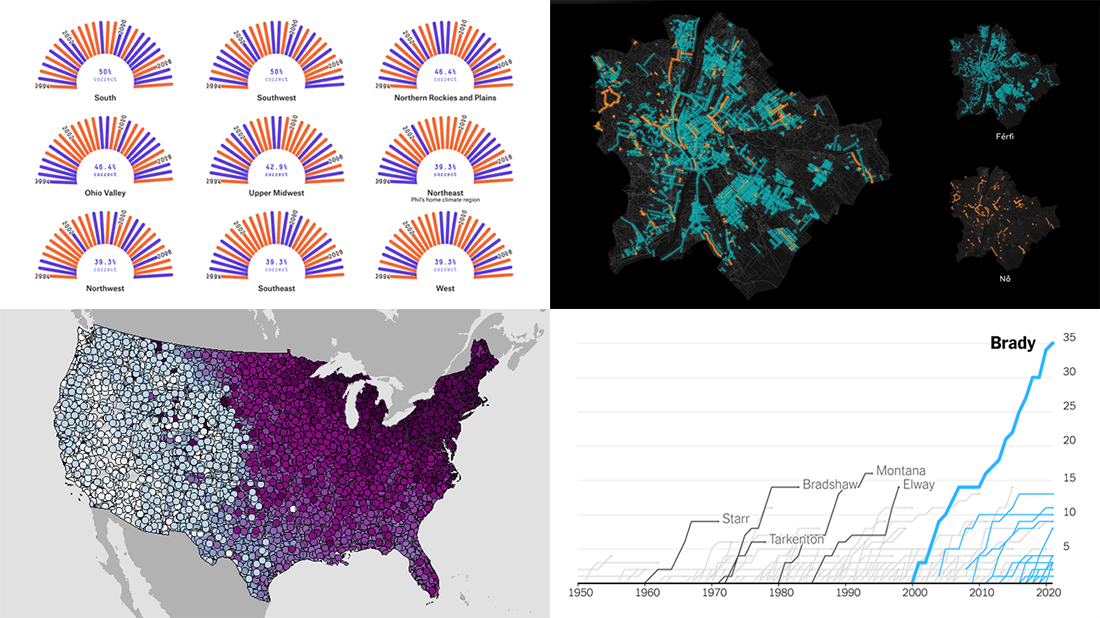 Are you sure you have seen all the best new charts and maps? Let’s see. Check out our new DataViz Weekly roundup and make sure you have not missed these four fascinating data visualization projects!
- Accuracy of Punxsutawney Phil’s and other animal meteorologists’ weather predictions — FiveThirtyEight
- The coldest day of the year across the United States — NOAA NCEI
- Tom Brady’s stellar career in American Football — The Upshot
- Budapest street names — ATLO
- Categories: Data Visualization Weekly
- No Comments »
COVID-19 Risk Assessment App Pandemonium Uses AnyChart for Data Visualization
January 26th, 2022 by AnyChart Team We continue to support initiatives addressing the pandemic crisis by providing them with a full-featured free license for any of our data visualization tools. Today we are honored to be among the first to talk about a new project that joined this program, an innovative COVID-19 risk assessment app and framework called Pandemonium where all charts and maps are powered by AnyChart.
Built by Quantum Risk Analytics, Inc., a charitable nonprofit founded by MIT alumni, Pandemonium uses sophisticated machine learning algorithms to more accurately model the disease spread and provide a highly personalized evaluation of infection risks. It’s not yet publicly launched as the developers want to add a few more major features and data sources before the official release. But the app is already in the testing phase that the team encourages anyone to join.
We asked Richard Hamlin, CEO at Quantum Risk Analytics, Inc., to tell us more about Pandemonium, how it works, and how our data visualization solutions are used. Read on to know all the details.
- Categories: AnyChart Charting Component, AnyMap, Big Data, Dashboards, HTML5, JavaScript, Success Stories
- No Comments »
Most Stunning New Data Visualization Projects from Around Web — DataViz Weekly
January 14th, 2022 by AnyChart Team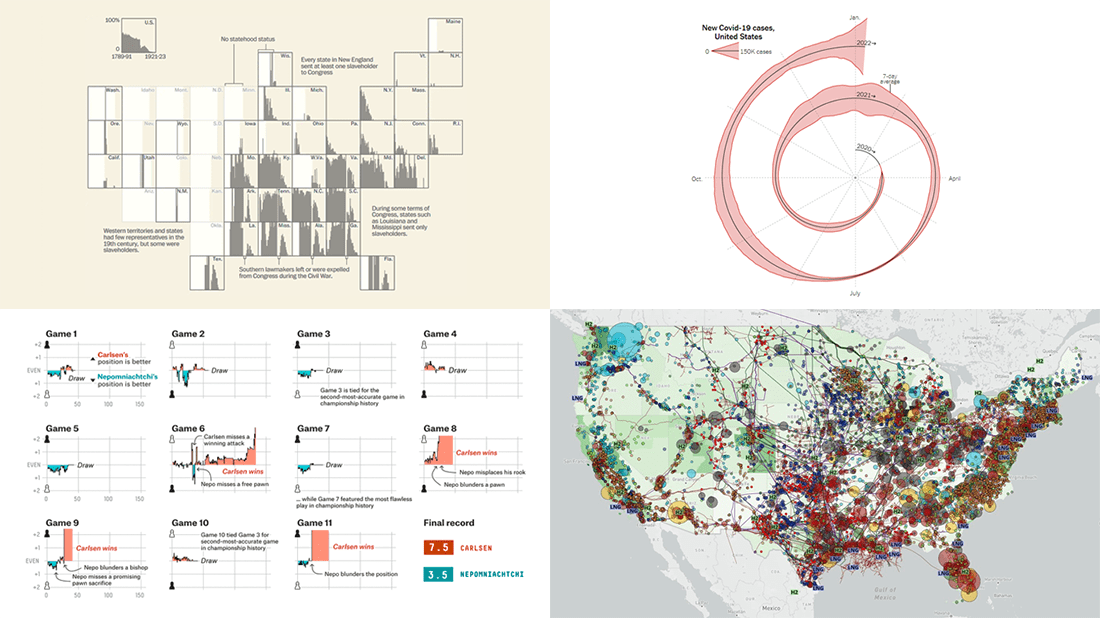 Thanks to your highly positive feedback, we are fully determined to continue DataViz Weekly in the year 2022, a series where the most stunning new data visualization projects are showcased and talked about. So, are you ready for it? Look what made us excited just recently and read on to learn more:
- FIDE World Chess Championship 2021 — FiveThirtyEight
- Slaveholders in the U.S. Congress — The Washington Post
- New COVID-19 cases in the United States, spiralized — The New York Times Opinion Section
- Energy, environment, policy, and society across the U.S. — Rice University’s Baker Institute for Public Policy
- Categories: Data Visualization Weekly
- No Comments »