 Effective data visualization makes it easy to discover trends and patterns hidden in the data. Now for several years, DataViz Weekly has been showing you real-world examples demonstrating how that can work in practice. The following projects are in the spotlight today:
- U.S. housing market trends — The Washington Post
- Wildfire smoke pollution across the U.S. — The New York Times
- Physics of celebratory gunfire — 1POINT21 Interactive
- Cars in Berlin — Hans Hack
Data Visualization Weekly: September 23, 2022 — September 30, 2022
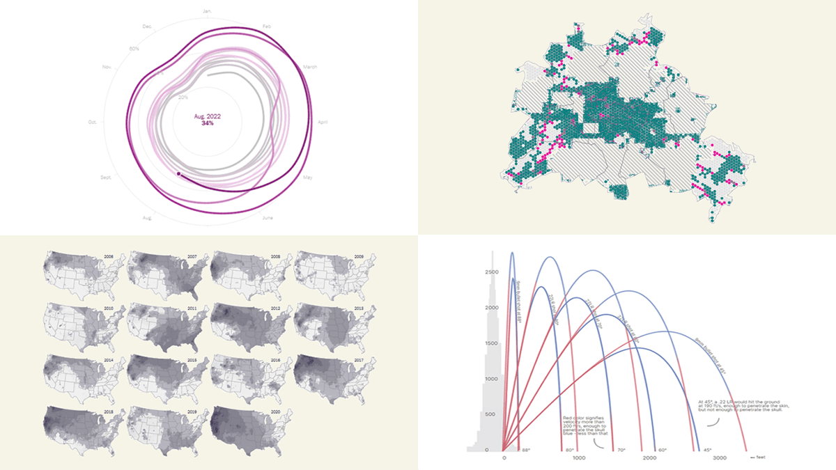
U.S. Housing Market Trends
The housing market in the United States reached new highs during the pandemic. Now, finally, it has begun to cool down.
The Washington Post’s Kevin Schaul and Hamza Shaban used a spiral diagram to visualize the percentage of homes sold in not more than 14 days, showing how the rate has changed over time starting from January 2012. Scrolling lets you discover the figures gradually, with proper annotations. Then you see the big picture followed by a map revealing geographical trends. After that, you can see what has been going on with key housing market figures in individual counties.
See the story on The Post.
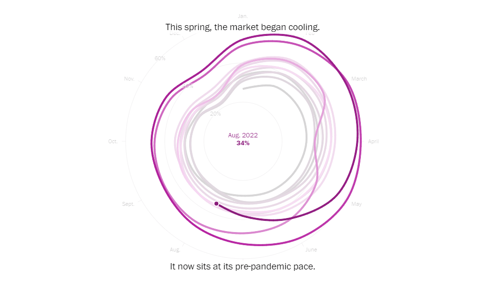
Wildfire Smoke Pollution Across U.S.
Wildfire smoke destroys the progress on clean air and is a growing risk to people’s health.
A group of researchers at Stanford University and the University of California, led by Marissa L. Childs, managed to reveal exposure to smoke from fires across the United States in greater geographic detail than ever before. Maps by The New York Times’s Mira Rojanasakul, representing their data, make it clear how PM2.5 concentrations driven by wildfire smoke spread in recent years, from 2016 to 2020, as well as where this sort of air pollution grew the most over the past decade.
Check out the maps and learn about the major findings on the NYT. In case you are interested, the study itself also has (a lot of) interesting visualizations.
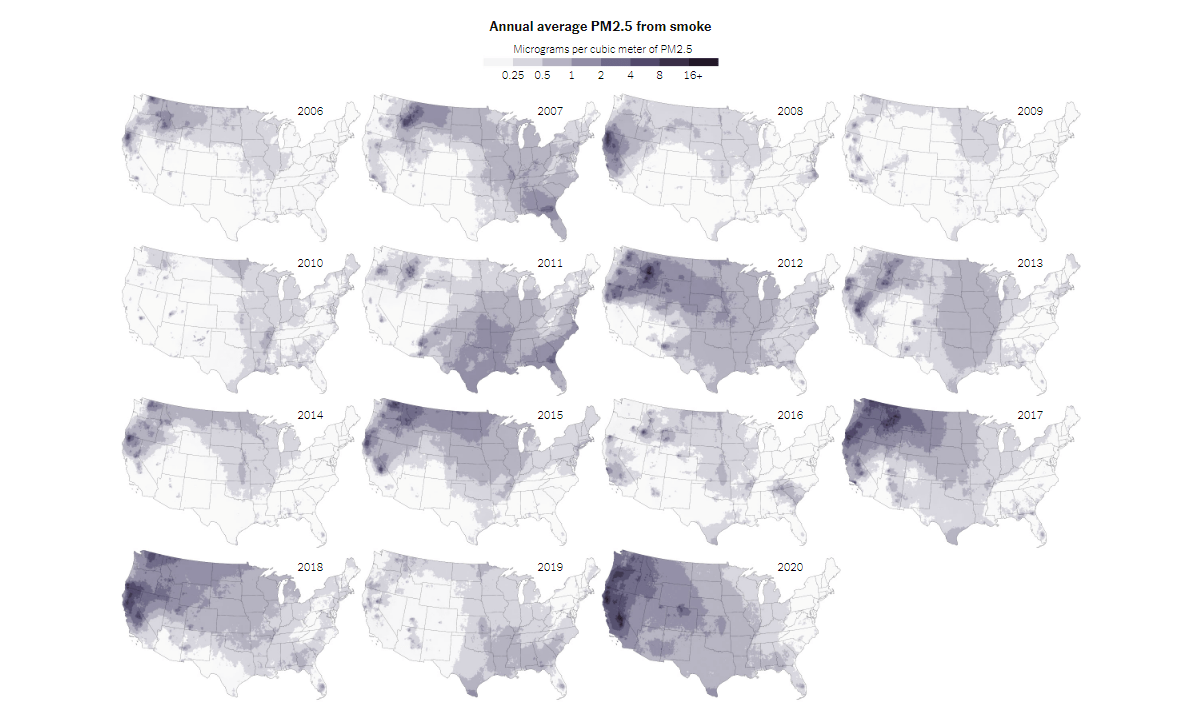
Physics of Celebratory Gunfire
Firing a gun into the air in celebration can be deadly to random people. After a long travel upwards, the bullet falls down and reaches the ground with enough speed to penetrate human skin and even skull.
Digital agency 1POINT21 Interactive worked with experts in ballistics to see what happens to a bullet after a shot and how dangerous it can be when it falls. They simulated common ammunition types at different firing angles. The result is a cool visual explainer of the physics and trajectories of celebratory gunfire.
Scroll through the project on 1POINT21 Interactive’s website.
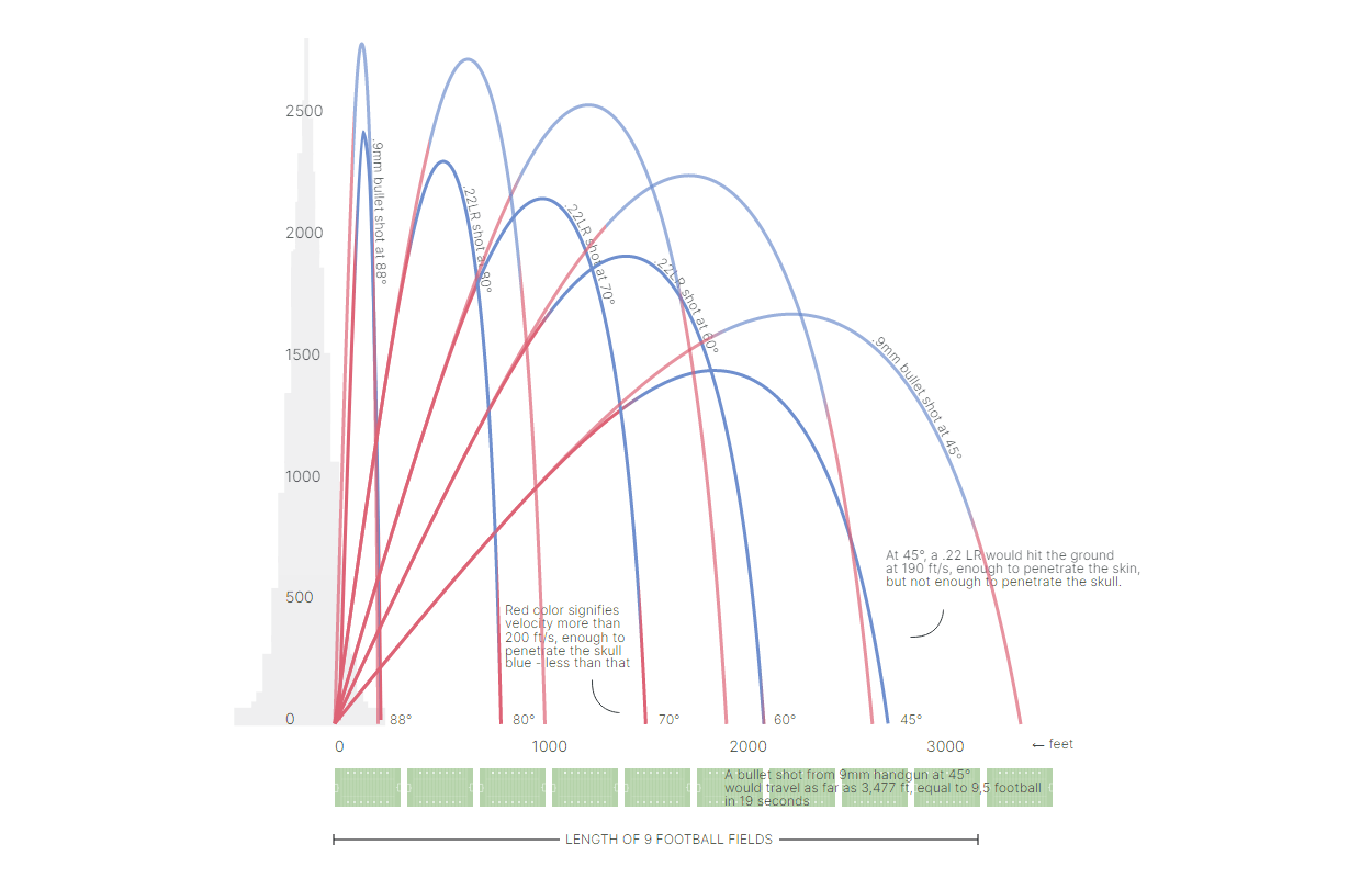
Cars in Berlin
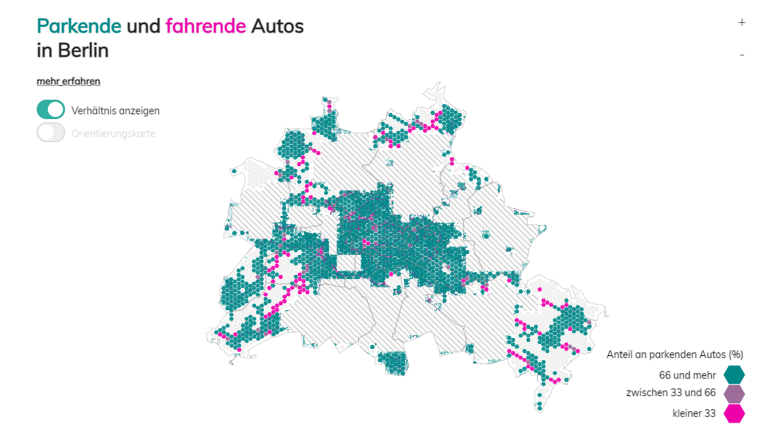
Last but not least, here’s an interesting mapping project.
Last year, dozens of volunteers were asked to tag cars on two aerial images of Berlin taken on April 1 and 6, 2019. Hans Hack made a map showing the result. The map displays the number of cars across Berlin, Germany, with a breakdown by whether they are parked or moving.
Look at the visualization on Hans Hack’s website. The data is available on GitHub.
***
Whenever you come across an interesting data visualization, or have built one by yourself, let us know! We will gladly consider featuring it on DataViz Weekly.
Stay tuned!
- Categories: Data Visualization Weekly
- No Comments »