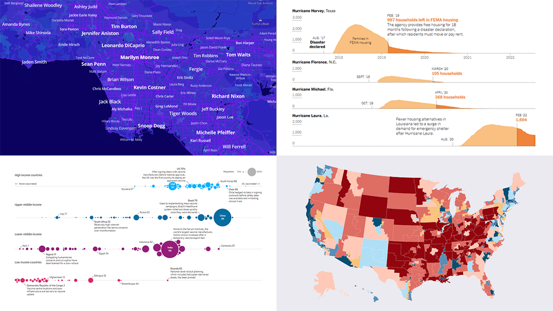
 It’s time to check out some awesome new graphs and maps! In this DataViz Weekly roundup, we are glad to put a spotlight on the following great data visualization works:
- Birthplaces of notable people worldwide — Topi Tjukanov
- Global COVID-19 vaccine inequality — The Guardian
- New congressional district boundaries — CNN
- Post-disaster displacements in America — The New York Times
Data Visualization Weekly: July 22, 2022 — July 29, 2022
Birthplaces of Notable People Worldwide
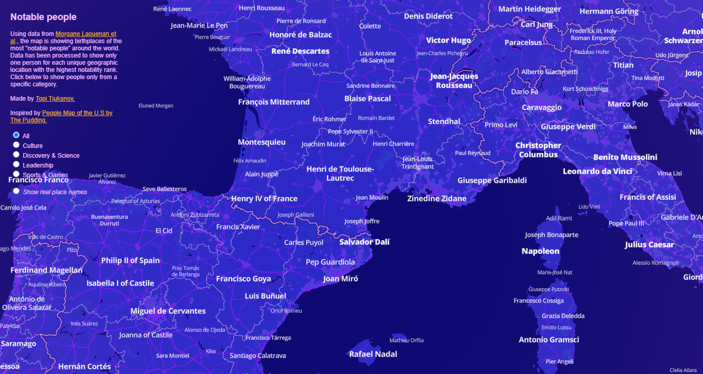
Who of the most notable people was born near where you live? It is easy to find that out straight away!
Topi Tjukanov of Mapbox used the cross-verified database of notable people (3500BC–2018AD) collated by Morgane Laouenan, Palaash Bhargava, Jean-Benoît Eyméoud, et al. to create an awesome map displaying their birthplaces. For each unique location, it shows the name of one individual with the highest notability rank.
Explore the birthplaces of famous people in this mapping project by Topi Tjukanov. By the way, it was inspired by the People Map of the U.S. published on The Pudding and featured on DataViz Weekly three years ago, which is also worth seeing.
Global COVID-19 Vaccine Inequality
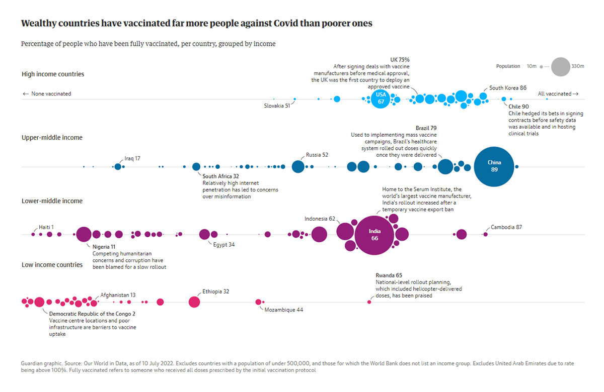
The world failed to achieve the goal to inoculate 70% of the global population against COVID-19 by the end of June 2022. In fact, there are huge vaccine inequalities across the world.
The Guardian analyzed the latest data from Our World in Data and found out that only about 15% of people living in low-income countries can be considered fully vaccinated. Compare that with the 78.7% and 73.5% vaccination rates in upper-middle and high-income countries, respectively. Charts from Ashley Kirk show the existing disparities at a glance.
Look into the global vaccine inequality with the help of data visualizations on The Guardian.
New Congressional District Boundaries
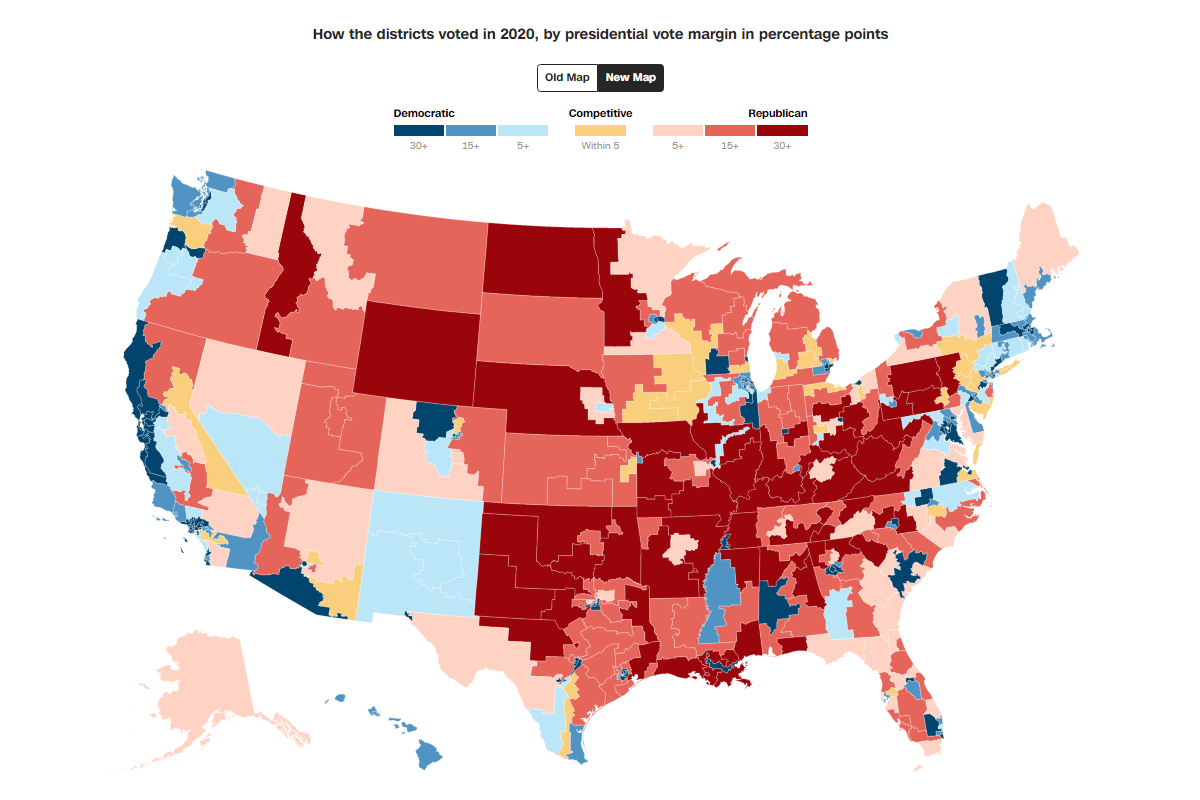
U.S. states review the boundaries of their congressional districts every ten years. That is done to account for changes in population revealed by the decennial census.
The results of the latest redistricting process are greatly represented and explained in CNN’s story made by Janie Boschma, Renée Rigdon, Byron Manley, and Ethan Cohen. To begin with, you can switch between two choropleth maps to understand what the new boundaries are and how they change the voting power across the United States for the next decade. Check out the additional graphics and click the states to learn more.
See how the newly withdrawn districts look and what that means on CNN.
Post-Disaster Displacements in America
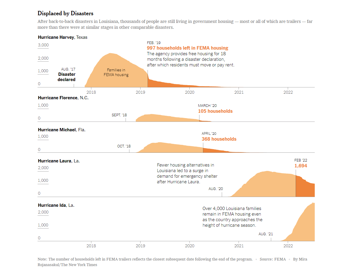
In the United States, after a calamity such as a hurricane or a wildfire, the Federal Emergency Management Agency (FEMA) organizes emergency shelter along with limited home repair, and the Department of Housing and Urban Development (HUD) funds long-term rebuilding. However, climate change has made environmental disasters both more severe and more common in recent years. As a result, these post-disaster programs are now significantly impeded by a lack of planning (and coordination).
The New York Times published an article where Christopher Flavelle delves into the issue of how global warming creates a growing class of Americans displaced by disasters, as well as how the government struggles to support the victims. In this piece, you will find an area graph-based visualization built by Mira Rojanasakul, which shows the consequences of the lagging help.
Take a closer look at the chart and learn more on The New York Times.
***
It’s always a pleasure to see you on our blog! Thank you for your attention! And stay tuned!
- Categories: Data Visualization Weekly
- No Comments »