 Thanks to your highly positive feedback, we are fully determined to continue DataViz Weekly in the year 2022, a series where the most stunning new data visualization projects are showcased and talked about. So, are you ready for it? Look what made us excited just recently and read on to learn more:
- FIDE World Chess Championship 2021 — FiveThirtyEight
- Slaveholders in the U.S. Congress — The Washington Post
- New COVID-19 cases in the United States, spiralized — The New York Times Opinion Section
- Energy, environment, policy, and society across the U.S. — Rice University’s Baker Institute for Public Policy
Data Visualization Weekly: January 7, 2022 — January 14, 2022
FIDE World Chess Championship 2021
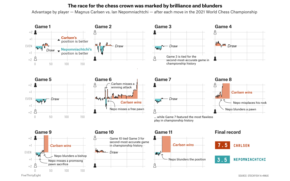
Last month, Norway’s Magnus Carlsen successfully defended his world chess championship title by defeating Russia’s Ian Nepomniachtchi. Of the eleven games played in the final match in Dubai, the world number one won four and never lost.
You can quickly see how it looked from the point of view of data thanks to FiveThirtyEight‘s elegant charts. The first visualizations — check them out in the image above — display how the advantage by player changed after each move according to the chess engine Stockfish. The next part focuses on the sixth game, which became the longest game in the history of the world chess championships, representing minutes remaining after each move. Then, you can look at the board, exploring each grandmaster’s chosen openings and favorite movement destinations.
Finally, find out what comes next for the highest world chess title — see which grandmasters will fight for the right to party challenge Magnus Carlsen this year along with their ratings over time and simulations of their chances against him.
Slaveholders in U.S. Congress
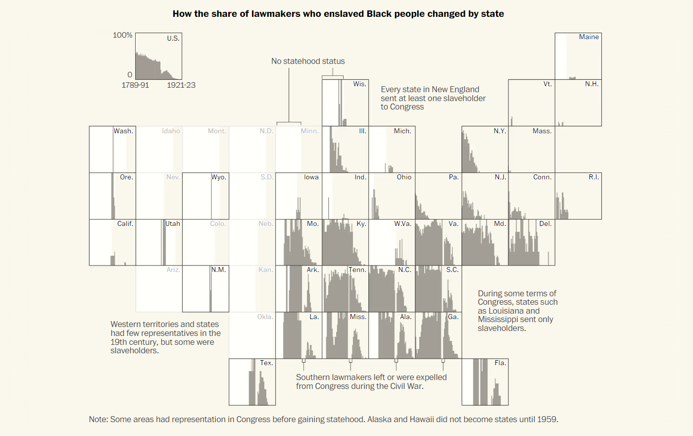
Over 1,700 members of the U.S. Congress once owned human beings. The Washington Post found that in a recent investigation of old census data and other historical records, during which its journalists succeeded to make what is now called the first-ever database of slaveholding congressmen.
In a dedicated article on The Post, Julie Zauzmer Weil, Adrian Blanco, and Leo Dominguez present a closer look at what can be learned from this data, including who those enslavers were and how they did shape the American nation. The piece features several cool visualizations that help grasp the essence of the findings. For example, there is an exciting grid map that makes it simple to understand how the percentage of lawmakers owning a human being changed over time, for each state.
The database of slaveholders in the U.S. Congress can be explored right there in the article and is shared on GitHub.
New COVID-19 Cases in U.S., Spiralized
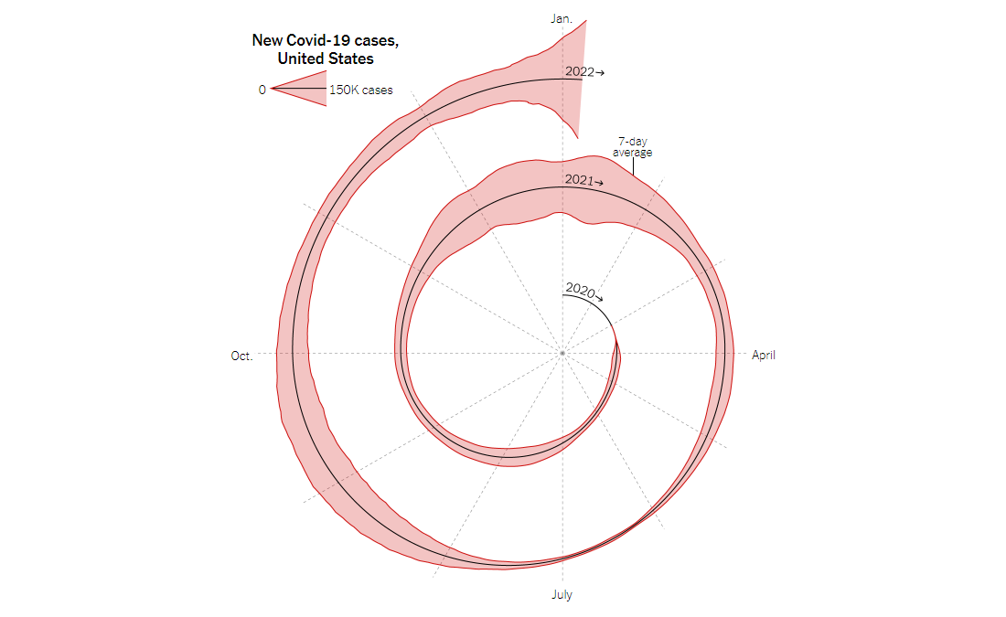
This spiral chart created by Gus Wezerek and Sara Chodosh for an article in The New York Times Opinion Section has sparked a hot debate in the data visualization community. Some people do not like the way it communicates the underlying data. Others are perfectly fine with it. Well, now let’s see what you think.
The graph is one of the two visualizations used to illustrate an opinion piece where epidemiologist Jeffrey Shaman of Columbia University discusses when Omicron should be expected to peak. Apparently, such a spiralized representation form tries to turn the viewer’s attention to (possibly existing) cyclical patterns in how the counts for new COVID-19 cases in the U.S. change during the year. It can also serve as a cool visual metaphor of the pandemic that feels like it will never end. The other chart displayed in this piece is linear, showing total new COVID-19 cases by month along with a projection for January 2022.
Getting back to the spiral visualization, we’ll just add that some data viz practitioners made their own, remixed versions of it and you may well want to check them out as well. For example, look at the creations of Amelia Wattenberger and Sourya Shrestha. Now there are also many versions for other countries, such as Georgia, Indonesia, Bolivia, Switzerland, and the Netherlands.
Energy, Environment, Policy & Society Across U.S.
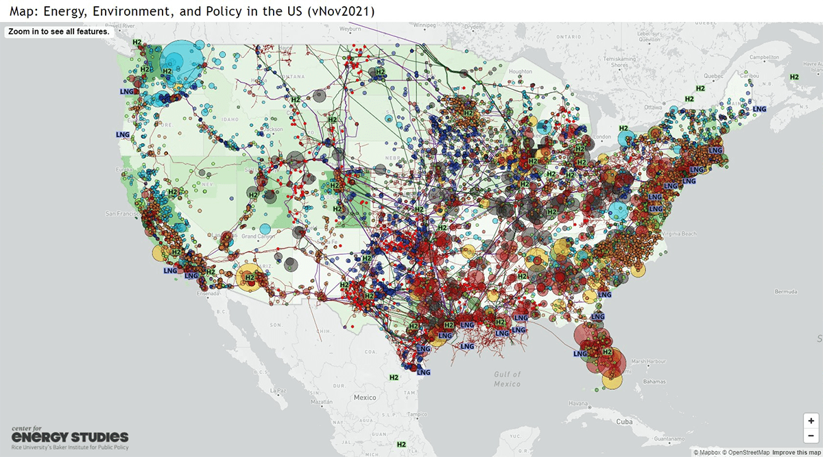
Last but certainly far from least in today’s roundup, we would like to highlight a very cool interactive map that greatly represents the intersection of energy, environment, policy, and society across the United States.
Built by Elsie Hung and Ken Medlock of the Center for Energy Studies at Rice University’s Baker Institute for Public Policy, the map displays the location of the country’s critical energy infrastructure and facilities of environmental importance along with demographic and election statistics at different levels of granularity. The layers can be easily hidden or shown depending on exactly what you need to explore and find out.
The creators say the project will be updated on a regular basis as they are going to add more layers and make sure the latest data is visualized.
***
We appreciate your attention! Stay tuned for Data Visualization Weekly and subscribe to our main social media channels: Twitter, Facebook, LinkedIn, Medium.
- Categories: Data Visualization Weekly
- No Comments »