Fresh Data Visuals That Impressed Us — DataViz Weekly
November 4th, 2024 by AnyChart Team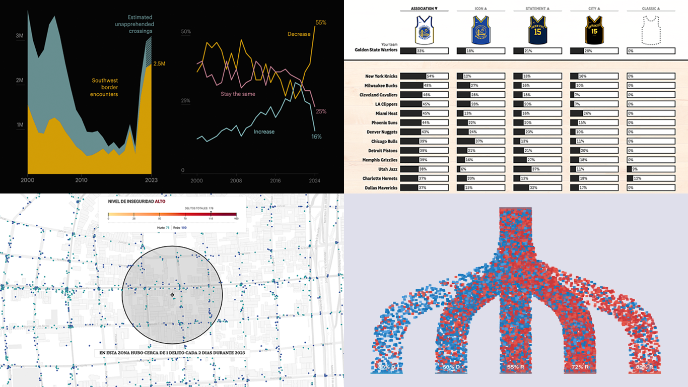 We’re a bit behind schedule after last week’s big release of updates for our Qlik Sense extensions, including the transformative AI Splits feature in the Decomposition Tree. But finally, here we are with a fresh edition of DataViz Weekly! Check out the projects with charts and maps that stood out to us most lately:
- U.S. immigration trends in historical context — ProPublica
- Crime trends in Buenos Aires — LA NACION
- Evolution of NBA uniform colors — The Pudding
- Internal migration and political polarization in the United States — The Upshot
- Categories: Data Visualization Weekly
- No Comments »
How to Create Sankey Diagram (with JavaScript)
May 25th, 2022 by Shachee Swadia Would you like to learn how to quickly create a really cool chart called a Sankey diagram? You’re in the right place! Together, we will build an elegant Sankey chart using JavaScript, and then you’ll be able to produce such data visualizations by yourself with no hassle at all.
Depicting the flow of values from one set to another, Sankey diagrams are ideal when you need to graphically represent a many-to-many mapping between two domains or multiple paths through a number of stages. So, competence in making them will be a great addition to the skill set of anyone dealing with data visualization design and development.
110 years after it sank on April 15, 1912, the Titanic still holds us in its thrall, piquing people’s imagination. Now, we will use the JS Sankey diagramming technique to look at its passengers and crew and find out who survived and perished based on gender, age, and ticket class. Follow along!
Read the JS charting tutorial »
- Categories: AnyChart Charting Component, HTML5, JavaScript, JavaScript Chart Tutorials, Tips and Tricks
- No Comments »
Visualizing Data on Prices, Emissions, Workforce, Palm Oil — DataViz Weekly
November 12th, 2021 by AnyChart Team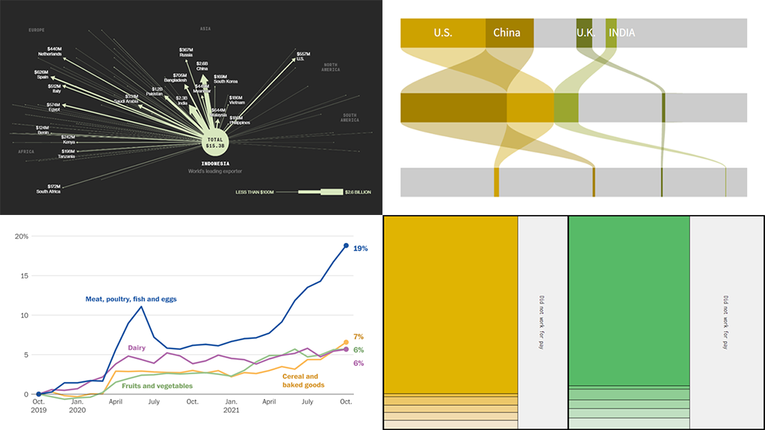 Hi everyone! DataViz Weekly is here to introduce you to some awesome new data visualizations that we have recently found out there and admired!
- Inflation in America — The Washington Post
- Carbon dioxide emissions by country — Reuters
- Shifts in how much U.S. men and women work — Nathan Yau
- Sustainable palm oil problem — Bloomberg Green
- Categories: Data Visualization Weekly
- No Comments »
Amazing New Charts and Maps That Tell Stories — DataViz Weekly
November 5th, 2021 by AnyChart Team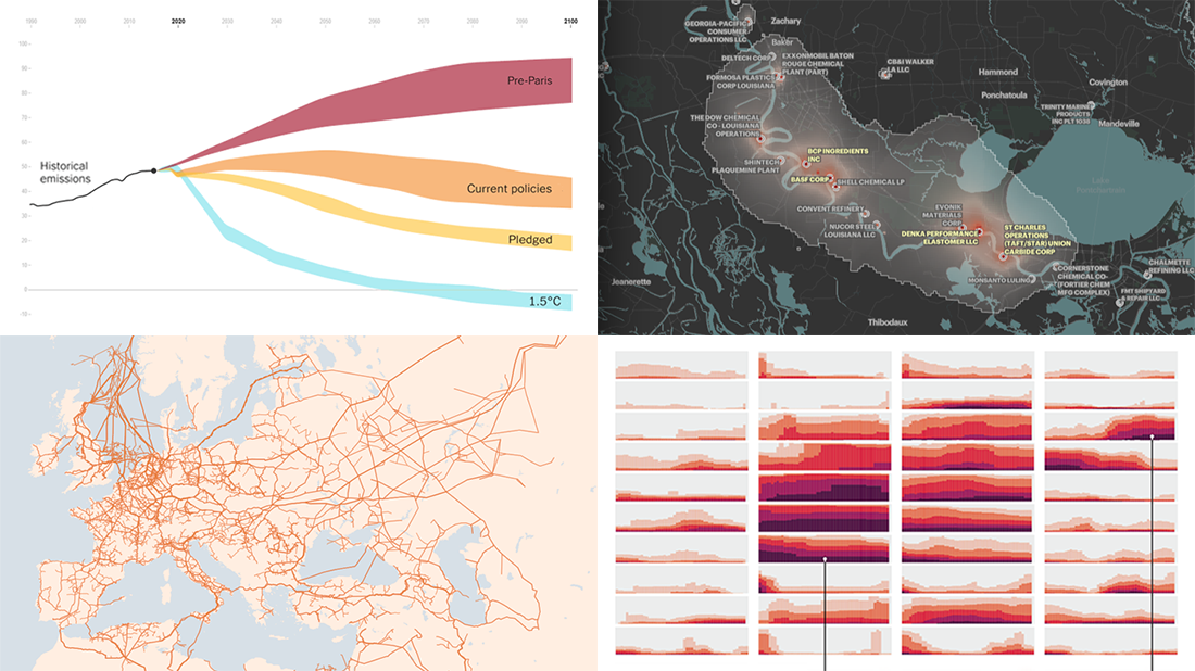 Ready for a new portion of amazing charts and maps for inspiration? We’ve got it for you right here! Join us today on DataViz Weekly as we look at four new visualizations that definitely deserve your attention.
- Greenhouse gas emission pathways and climate goals — The New York Times
- U.S. drought extent patterns by region since 2000 — Scientific American
- Cancer-causing industrial air pollution across the United States — ProPublica
- European natural gas pipeline infrastructure — The Financial Times
- Categories: Data Visualization Weekly
- No Comments »
Cesefor Uses AnyChart to Visualize Forestry Data in Nemus System
August 31st, 2021 by AnyChart Team Many thousands of developers worldwide use our solutions for interactive data visualization. So it is hardly surprising to come across a graphic powered by AnyChart here or there. Some projects, however, deserve a showcase. Such a new interesting one demonstrating great use of AnyChart has recently come to our notice and we are happy to let you know about it.
A Spanish nonprofit, Cesefor used our JavaScript charting library to visualize forestry data for the Spanish region of Castile and León in a whole lot of different charts and maps, aiming to make relevant insights easily accessible and actionable for sustainability.
The project is called Nemus. Shh, it is still in beta, not yet officially launched. But Rodrigo Gómez Conejo, Head of ICT and Knowledge Management Area at Cesefor, allowed us to let you in and even gave us a brief interview disclosing some peculiar details about the system and how AnyChart is employed — check it out below. (Stack: jQuery/CodeIgniter/PostgreSQL.)
- Categories: AnyChart Charting Component, AnyMap, Big Data, Dashboards, HTML5, JavaScript, Success Stories
- No Comments »
New Stunning Data Visualization Examples to See and Learn From — DataViz Weekly
July 9th, 2021 by AnyChart Team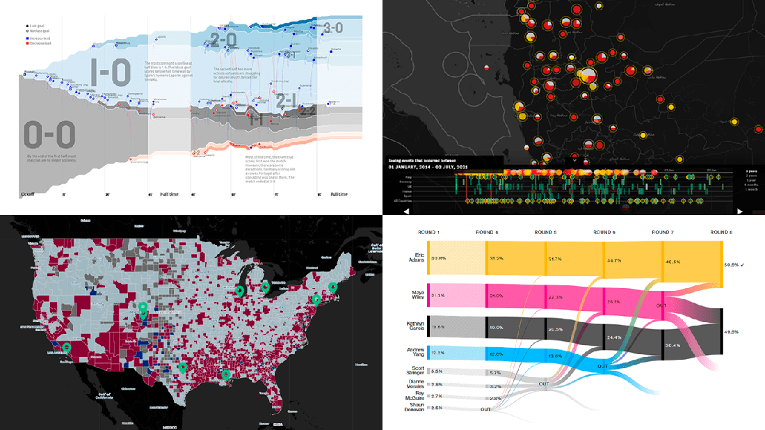 Graphical representation makes data easier to understand and interpret. The DataViz Weekly series on our blog aims to highlight the most vivid examples of clever data visualization in action so you can better realize how it can work or simply have fun exploring new stunning charts and maps.
Today on DataViz Weekly:
- European arms in the bombing of Yemen — Forensic Architecture, Yemeni Archive, ECCHR, and Bellingcat
- All scorelines and goals from the UEFA Euro 2020 group stage — Krist Wongsuphasawat
- Racial residential segregation in the United States — The Othering and Belonging Institute at UC Berkeley
- NYC Democratic mayoral primary vote results — Bloomberg
- Categories: Data Visualization Weekly
- No Comments »
Exploring Voting Bills, Birth Rates, Hospital Billing, Transit Equity — DataViz Weekly
June 25th, 2021 by AnyChart Team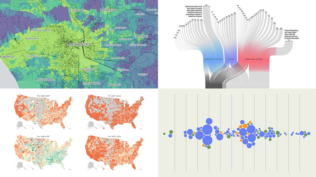 Join us to check out the most awesome data visualizations of all we have come across this week! To begin with, here is a full list of the projects featured today in DataViz Weekly:
- Proposed and passed voting bills across the U.S. in 2021 — Bloomberg
- Change in birth rates among American women — NYT
- Billing practices at the top 100 U.S. hospitals — Axios
- Transit equity in major U.S. cities — TransitCenter
- Categories: Data Visualization Weekly
- No Comments »
Fresh Great Data Visualization Projects on Thanksgiving, COVID, and Tree Equity — DataViz Weekly
December 4th, 2020 by AnyChart Team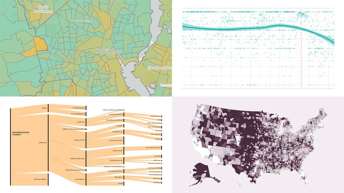 Hey everyone! Continuing to curate the best charts, maps, and infographics from around the Internet, we invite you to meet four fresh great data visualization projects worth checking out.
Today on DataViz Weekly:
- Visualizing the ways the Thanksgiving turkey leftovers were used — Nathan Yau
- Understanding the scale of 250,000 deaths from the coronavirus — The Washington Post
- Finding a correlation between scented candle reviews on Amazon and COVID-19 — Kate Petrova
- Evaluating tree equity in American city neighborhoods — American Forests
- Categories: Data Visualization Weekly
- No Comments »
Visualizing Numbers on Migration, Powerlifting, Commute, and Nature — DataViz Weekly
October 18th, 2019 by AnyChart Team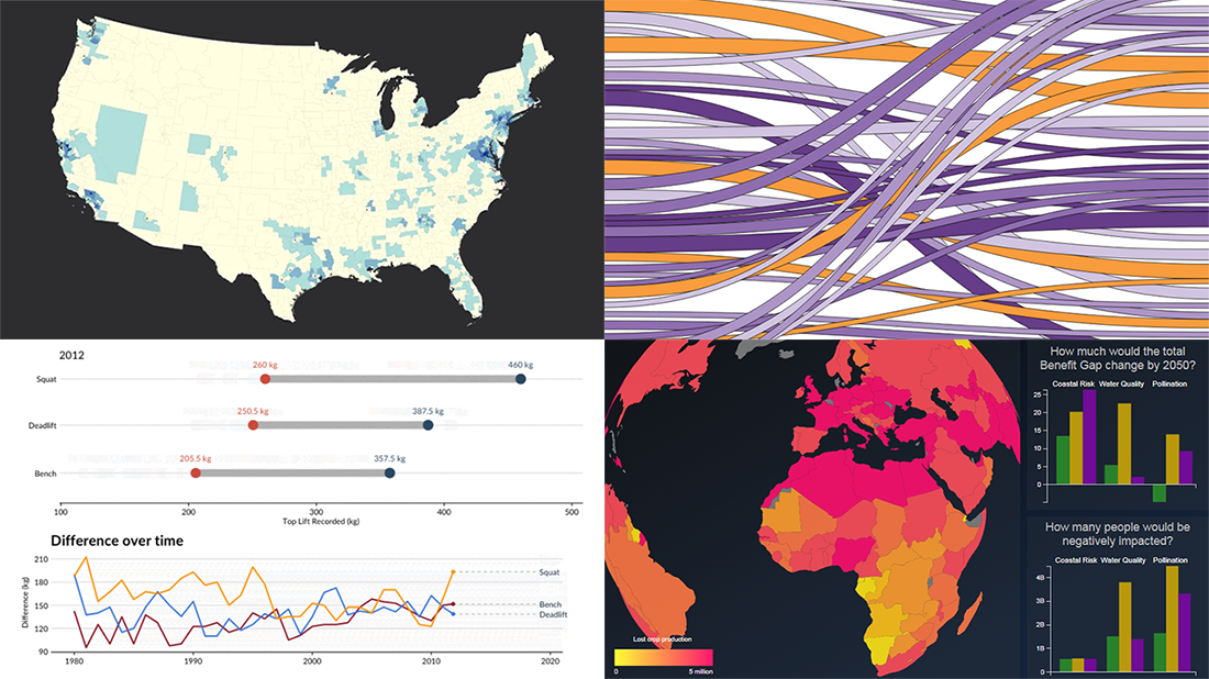 This week, we’ve found more new cool projects that wonderfully demonstrate the power of visualizing numbers. Here are the four most interesting ones where charts and maps actually let data speak — join us as we quickly present them in today’s DataViz Weekly:
- Charting migration pathways worldwide — Bloomberg
- Plotting differences between men’s and women’s top lifts at IPF events — Connor Rothschild, Rice University
- Mapping commute thresholds across the United States of America — Nathan Yau, FlowingData
- Visualizing nature’s contributions to people globally — Natural Capital Project
- Categories: Data Visualization Weekly
- No Comments »
Create Cool Interactive Sankey Diagram Using JavaScript — Tutorial
June 13th, 2019 by Alfrick Opidi Sankey diagrams are becoming more and more popular in data visualization tasks. So, it’s essential for front-end web developers to know how to create charts of this type. Actually, it is quite a simple and straightforward process, especially if you are using one of the good JavaScript charting libraries.
In my tutorial, I’ll show you how to create beautiful, intuitive, interactive JS (HTML5) Sankey diagrams with no fuss.
Read the JS charting tutorial »
- Categories: AnyChart Charting Component, Big Data, Business Intelligence, Charts and Art, HTML5, JavaScript, JavaScript Chart Tutorials, Tips and Tricks
- No Comments »