 Would you like to learn how to quickly create a really cool chart called a Sankey diagram? You’re in the right place! Together, we will build an elegant Sankey chart using JavaScript, and then you’ll be able to produce such data visualizations by yourself with no hassle at all.
Depicting the flow of values from one set to another, Sankey diagrams are ideal when you need to graphically represent a many-to-many mapping between two domains or multiple paths through a number of stages. So, competence in making them will be a great addition to the skill set of anyone dealing with data visualization design and development.
110 years after it sank on April 15, 1912, the Titanic still holds us in its thrall, piquing people’s imagination. Now, we will use the JS Sankey diagramming technique to look at its passengers and crew and find out who survived and perished based on gender, age, and ticket class. Follow along!
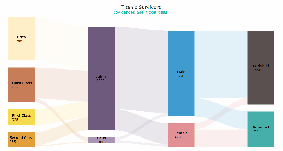
Sankey Diagram Preview
Take a glance at the Sankey diagram we will have built by the end of the tutorial:
Now, the journey begins — read on to learn how to build Sankey charts like this using pure JavaScript!
Building Basic JS Sankey Diagram
A Sankey diagram looks really exciting and is pretty easy to create with JS. Some basic knowledge of web technologies is always beneficial in interactive data visualization. But in reality, everything is uncomplicated and you will understand it all even if you are a beginner.
The process of creating a JavaScript-based Sankey diagram can be split into four steps:
- Create an HTML page.
- Add scripts.
- Set data.
- Write some JS code.
Let’s go through them together.
1. Create an HTML page
To start with, create a basic HTML page to hold the intended Sankey chart and define a block element in it.
To reference this <div> later in the code, give it an identification attribute (“container” in this example) and set the desired style properties (here, the width and height are 100%, which will let the diagram stretch across the entire web page).
<html>
  <head>
    <title>JavaScript Sankey Diagram</title>
    <style type="text/css">
      html, body, #container {
        width: 100%; height: 100%; margin: 0; padding: 0;
      }
    </style>
  </head>
  <body>
    <div id="container"></div>
  </body>
</html>
2. Add scripts
The next step is to add the necessary scripts.
In this tutorial, I am using the AnyChart JavaScript library. It is flexible and easy to use thanks to its comprehensive documentation along with many readymade chart examples.
AnyChart is modular, which lets you minimize the size of the JavaScript code running on your web page by connecting the chart types and features you actually need and nothing more. For the Sankey chart development, you just need the core module along with the specific Sankey module. Add both to the <head> section of the HTML page.
<html>
  <head>
    <title>JavaScript Sankey Diagram</title>
    <script src="https://cdn.anychart.com/releases/8.11.0/js/anychart-core.min.js"></script>
    <script src="https://cdn.anychart.com/releases/8.11.0/js/anychart-sankey.min.js"></script>
    <style type="text/css">
      html, body, #container {
        width: 100%; height: 100%; margin: 0; padding: 0;
      }
    </style>
  </head>
  <body>
    <div id="container"></div>
    <script>
      // All the code for the JS Sankey Diagram will come here.
    </script>
  </body>
</html>
3. Set data
Data for this tutorial is taken from the Titanic dataset on Kaggle. I have only put it in a form suitable for a Sankey diagram.
The dataset is not large, so you can directly add it to the code just like that. (For a particular task, you may opt for another way of working with data, of course.)
const data = [
  {from: 'First Class', to: 'Child', value: 6},
  {from: 'Second Class', to: 'Child', value: 24},
  {from: 'Third Class', to: 'Child', value: 79},
  {from: 'Crew', to: 'Child', value: 0},
  {from: 'First Class', to: 'Adult', value: 319},
  {from: 'Second Class', to: 'Adult', value: 261},
  {from: 'Third Class', to: 'Adult', value: 627},
  {from: 'Crew', to: 'Adult', value: 885},
  {from: 'Child', to: 'Female', value: 45},
  {from: 'Child', to: 'Male', value: 64},
  {from: 'Adult', to: 'Female', value: 425},
  {from: 'Adult', to: 'Male', value: 1667},
  {from: 'Female', to: 'Survived', value: 344},
  {from: 'Female', to: 'Perished', value: 126},
  {from: 'Male', to: 'Survived', value: 367},
  {from: 'Male', to: 'Perished', value: 1364},
]
That’s it, everybody is on board, and now it’s time to set sail by writing a few lines of JS charting code!
4. Write some JS code
It may feel overwhelming to write code if you do not have much experience doing that. But for an elegant Sankey diagram, some very simple basic code is more than enough.
Before anything else, add the anychart.onDocumentReady() function enclosing all the code, which ensures that everything in it will only run once the page is ready. The first thing to add inside is the data.
anychart.onDocumentReady(function () {

  // add data
  const data = [
    {from: 'First Class', to: 'Child', value: 6},
    {from: 'Second Class', to: 'Child', value: 24},
    {from: 'Third Class', to: 'Child', value: 79},
    {from: 'Crew', to: 'Child', value: 0},
    {from: 'First Class', to: 'Adult', value: 319},
    {from: 'Second Class', to: 'Adult', value: 261},
    {from: 'Third Class', to: 'Adult', value: 627},
    {from: 'Crew', to: 'Adult', value: 885},
    {from: 'Child', to: 'Female', value: 45},
    {from: 'Child', to: 'Male', value: 64},
    {from: 'Adult', to: 'Female', value: 425},
    {from: 'Adult', to: 'Male', value: 1667},
    {from: 'Female', to: 'Survived', value: 344},
    {from: 'Female', to: 'Perished', value: 126},
    {from: 'Male', to: 'Survived', value: 367},
    {from: 'Male', to: 'Perished', value: 1364},
  ]

  // everything else goes here

});
Now, create a Sankey diagram instance using the built-in charting function and load the data.
let chart = anychart.sankey();
chart.data(data);
A bit of padding will make sure labels do not get cut off, and a chart title is always helpful.
chart.padding(20, 40);
chart.title('Titanic Survivors');
Lastly, just reference the container element to show where the Sankey chart needs to be displayed and draw the resulting visualization.
chart.container('container');
chart.draw();
Voilà! A fantastic and functional JavaScript-based Sankey diagram is all ready!
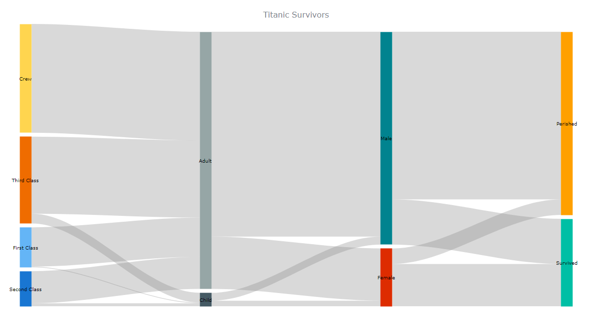
Take a look at this initial JS Sankey chart on AnyChart Playground with the full JS/CSS/HTML code (also provided below for your convenience).
<html>
  <head>
    <title>JavaScript Sankey Diagram</title>
    <script src="https://cdn.anychart.com/releases/8.11.0/js/anychart-core.min.js"></script>
    <script src="https://cdn.anychart.com/releases/8.11.0/js/anychart-sankey.min.js"></script>
    <style type="text/css">
      html, body, #container {
        width: 100%; height: 100%; margin: 0; padding: 0;
      }
    </style>
  </head>
  <body>
    <div id="container"></div>
    <script>
      anychart.onDocumentReady(function () {

        // add data
        const data = [
          {from: "First Class", to: "Child", value: 6},
          {from: "Second Class", to: "Child", value: 24},
          {from: "Third Class", to: "Child", value: 79},
          {from: "Crew", to: "Child", value: 0},
          {from: "First Class", to: "Adult", value: 319},
          {from: "Second Class", to: "Adult", value: 261},
          {from: "Third Class", to: "Adult", value: 627},
          {from: "Crew", to: "Adult", value: 885},
          {from: "Child", to: "Female", value: 45},
          {from: "Child", to: "Male", value: 64},
          {from: "Adult", to: "Female", value: 425},
          {from: "Adult", to: "Male", value: 1667},
          {from: "Female", to: "Survived", value: 344},
          {from: "Female", to: "Perished", value: 126},
          {from: "Male", to: "Survived", value: 367},
          {from: "Male", to: "Perished", value: 1364}
        ];

        // create a sankey diagram instance
        let chart = anychart.sankey();

        // load the data to the sankey diagram instance
        chart.data(data);

        // set the chart's padding
        chart.padding(20, 40);

        // add a title
        chart.title('Titanic Survivors');

        // set the chart container id
        chart.container("container");

        // draw the chart
        chart.draw();

      });
    </script>
  </body>
</html>
Customizing JavaScript Sankey Diagram
A huge advantage of using a robust JS charting library is the ease with which the initial data visualization is created and the flexibility for further customizations. Let’s see how you can enhance the Sankey diagram’s capabilities and tweak its appearance with some simple modifications.
1. Color Palette
To start with, why don’t you add colors that look more intuitive than the default ones? You can create your own color palette by simply listing the colors that you want. Be careful about the sequence when you add the colors.
chart.palette([
  "#f5dc50",
  "#e1a03c",
  "#c87d5a",
  "#fff0c8",
  "#aa96b4",
  "#6e5a7d",
  "#e19196",
  "#419bd2",
  "#46afaa",
  "#5a5050"
]);
2. Nodes
Now that you have got a personalized color palette, let’s increase the width of the nodes to make them more prominent. With larger nodes, you can also make greater padding between them.
chart.nodeWidth("40%");
chart.nodePadding(30);
Larger labels will likely look better as well. Plus, for each node, you can display the corresponding values from the data and make use of HTML to format the text.
chart.node().normal().labels().fontSize(14);
chart.node().labels().useHtml(true);
chart
  .node()
  .labels()
  .format("<span style='font-weight:bold'>{%name}</span><br>{%value}");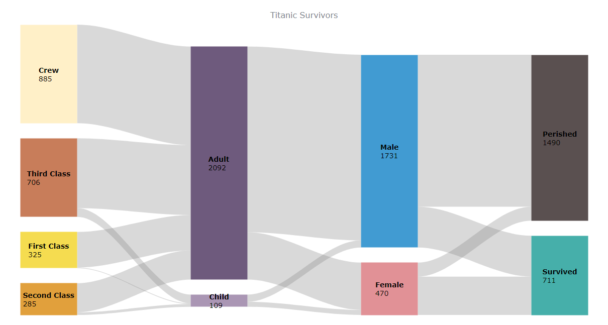
Take a look at the code for this customized JavaScript-based Sankey diagram on AnyChart Playground.
3. Links
Now it’s time to enhance the look of the links. Let’s color them with the same shades as their source nodes. In addition, the links can appear slightly darker when they are hovered over with the mouse.
chart.flow({
  normal: {
    fill: function () {
      return anychart.color.lighten(this.sourceColor, 0.5) + " " + 0.3;
    }
  },
  hovered: {
    fill: function () {
      return this.sourceColor + " " + 0.8;
    }
  }
});
Hovering over a node or a link triggers a tooltip that does not even need changes as it is very informative and looks pretty fine by default.
4. Title
For the final customization, let’s apply HTML-based formatting to make the title stand out and add a subtitle shedding more light on exactly what the Sankey diagram visualizes.
chart
  .title()
  .enabled(true)
  .useHtml(true)
  .text(
    '<span style = "color: #2b2b2b; font-size:20px;">Titanic Survivors</span>' +
      '<br/><span style="color:#00bfa5; font-size: 16px;">(by gender, age, ticket class)</span>'
  );
That’s all! Now the Sankey diagram is looking so very personalized and engaging, isn’t it?

Check out the final code for the interactive JavaScript Sankey diagram below and have fun playing with it further on AnyChart Playground.
<html>
  <head>
    <title>JavaScript Sankey Diagram</title>
    <script src="https://cdn.anychart.com/releases/8.11.0/js/anychart-core.min.js"></script>
    <script src="https://cdn.anychart.com/releases/8.11.0/js/anychart-sankey.min.js"></script>
    <style type="text/css">
      html, body, #container {
        width: 100%; height: 100%; margin: 0; padding: 0;
      }
    </style>
  </head>
  <body>
    <div id="container"></div>
    <script>
      anychart.onDocumentReady(function () {

        // add data
        const data = [
          {from: "First Class", to: "Child", value: 6},
          {from: "Second Class", to: "Child", value: 24},
          {from: "Third Class", to: "Child", value: 79},
          {from: "Crew", to: "Child", value: 0},
          {from: "First Class", to: "Adult", value: 319},
          {from: "Second Class", to: "Adult", value: 261},
          {from: "Third Class", to: "Adult", value: 627},
          {from: "Crew", to: "Adult", value: 885},
          {from: "Child", to: "Female", value: 45},
          {from: "Child", to: "Male", value: 64},
          {from: "Adult", to: "Female", value: 425},
          {from: "Adult", to: "Male", value: 1667},
          {from: "Female", to: "Survived", value: 344},
          {from: "Female", to: "Perished", value: 126},
          {from: "Male", to: "Survived", value: 367},
          {from: "Male", to: "Perished", value: 1364}
        ];

        // create a sankey diagram instance
        let chart = anychart.sankey();

        // load the data to the sankey diagram instance
        chart.data(data);

        // set the chart's padding
        chart.padding(20, 40);

        // configure a custom color palette
        chart.palette([
          "#f5dc50",
          "#e1a03c",
          "#c87d5a",
          "#fff0c8",
          "#aa96b4",
          "#6e5a7d",
          "#e19196",
          "#419bd2",
          "#46afaa",
          "#5a5050"
        ]);

        // customize the nodes:
        // set the width
        chart.nodeWidth("40%");
        // set the padding
        chart.nodePadding(30);
        // customize the labels
        chart.node().normal().labels().fontSize(14);
        chart.node().labels().useHtml(true);
        chart
          .node()
          .labels()
          .format("<span style='font-weight:bold'>{%name}</span><br>{%value}");

        // customize the links
        chart.flow({
          normal: {
            fill: function () {
              return anychart.color.lighten(this.sourceColor, 0.5) + " " + 0.3;
            }
          },
          hovered: {
            fill: function () {
              return this.sourceColor + " " + 0.8;
            }
          }
        });

        // add a title and customize it
        chart
          .title()
          .enabled(true)
          .useHtml(true)
          .text(
            '<span style = "color: #2b2b2b; font-size:20px;">Titanic Survivors</span>' +
              '<br/><span style="color:#00bfa5; font-size: 16px;">(by gender, age, ticket class)</span>'
          );

        // set the chart container id
        chart.container("container");

        // draw the chart
        chart.draw();

      });
    </script>
  </body>
</html>
Conclusion
Sankey is such a fascinating chart type. And creating a beautiful one is so very easy!
Actually, this is just the tip of the iceberg, so go on and take a look at more examples of Sankey diagrams and see the Sankey chart documentation to learn how to do something else about them. Also, feel free to check out other chart types.
Please get in touch with any queries or suggestions.
The team of AnyChart thanks data designer Shachee Swadia for creating this great Sankey diagramming tutorial.
If you want to write a cool guest post, please send your ideas to our Support Team.
Check out more JavaScript charting tutorials on our blog.
- Categories: AnyChart Charting Component, HTML5, JavaScript, JavaScript Chart Tutorials, Tips and Tricks
- No Comments »